

体验css:repeat和grid
| 阿里云国内75折 回扣 微信号:monov8 |
| 阿里云国际,腾讯云国际,低至75折。AWS 93折 免费开户实名账号 代冲值 优惠多多 微信号:monov8 飞机:@monov6 |
文章目录
一、repeat
要想了解grid布局首先了解 repeat() 的作用。
1. 语法
- 见名知意
repeat()函数表示轨道列表的重复片段。 - 目前只有放在
grid-template-columns和grid-template-rows上才有效。 - 语法
repeat([auto-fill | auto-fit | <integer>] , [<line-names> ? [<fixed-size> | <track-size>]] + <line-names>?)- 轨道一行叫行轨道一列叫列轨道。
- 第一个参数
auto-fill和auto-fit会尽量在一行/一列看用的是...columns还是...rows多创建轨道。重复次数就是重复创建多少次。 - 第二个参数轨道名、轨道尺寸。
- 示例
repeat(4, [col-name] 1fr [col-name] 20px)
2. auto-fill和auto-fit
- 我比较喜欢用
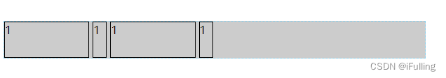
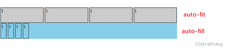
auto-fit可以填满整个父元素。 - 不能只使用 fr、auto、min-content、max-content否则一个占一行。比如
repeat(auto-fill, 1fr min-content) - 在 子元素总宽度 <= 父元素宽度时差异比较明显
<body>
<div class="container">
    <div style="border: 1px solid black;height: 50px;">1</div>
    <div style="border: 1px solid black;height: 50px;">1</div>
    <div style="border: 1px solid black;height: 50px;">1</div>
    <div style="border: 1px solid black;height: 50px;">1</div>
</div>
<div id="container">
    <div style="border: 1px solid black;height: 50px;">1</div>
    <div style="border: 1px solid black;height: 50px;">1</div>
    <div style="border: 1px solid black;height: 50px;">1</div>
    <div style="border: 1px solid black;height: 50px;">1</div>
</div>
</body>
<style>
    .container {
        display: grid;
        width: 600px;
        background-color: #ccc;
        grid-gap: 5px;
        grid-template-columns: repeat(auto-fit, minmax(20px, 1fr));
        border: 1px dashed skyblue;
    }
    #container {
        display: grid;
        width: 600px;
        background-color: skyblue;
        grid-gap: 5px;
        grid-template-columns: repeat(auto-fill, minmax(20px, 1fr));
        border: 1px dashed skyblue;
    }
</style>
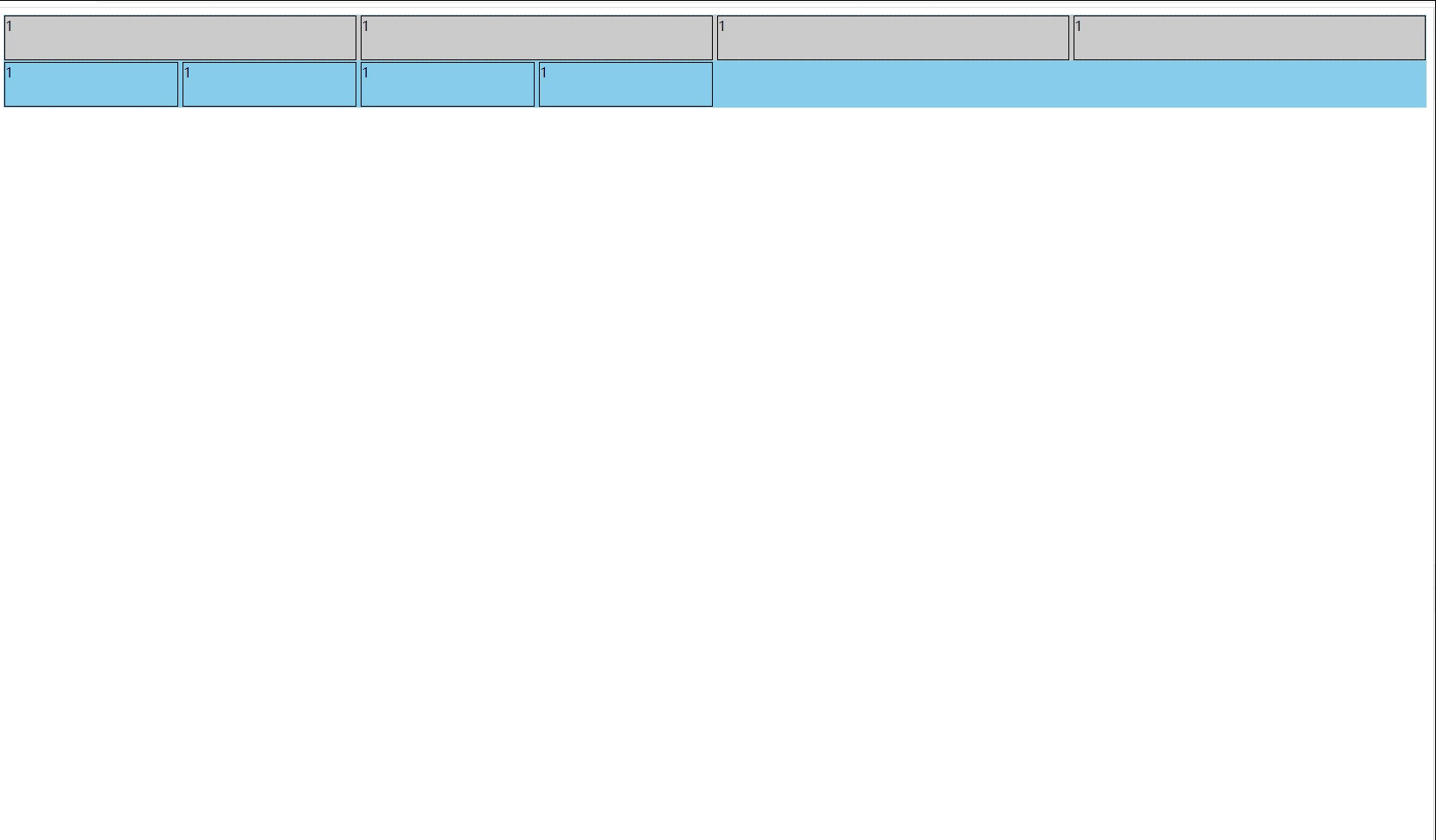
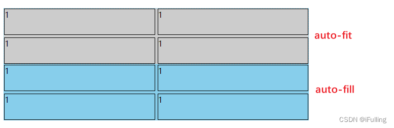
- 在 子元素总宽度 > 父元素宽度时没什么差异
    .container {
	 	...
        grid-template-columns: repeat(auto-fit, minmax(200px, 1fr));
        ...
    }
    #container {
        ...
        grid-template-columns: repeat(auto-fill, minmax(200px, 1fr));
        ...
    }
3. 专属尺寸
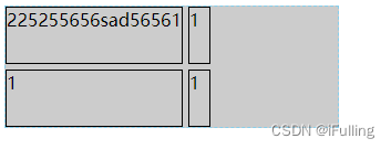
① fr
- fr 单位代表网格容器中可用空间的一等份
② auto
- 由浏览器决定长度。
- 作为最大值等同于 max-content。作为最小值它代表占据网格轨道的网格项目的最小尺寸的最大值如同min-width/min-height所指定的)。
<body>
<div class="container">
    <div style="border: 1px solid black;height: 50px;">225255656sad56561</div>
    <div style="border: 1px solid black;height: 50px;">1</div>
    <div style="border: 1px solid black;height: 50px;">1</div>
    <div style="border: 1px solid black;height: 50px;">1</div>
</div>
</body>
<style>
    .container {
        display: grid;
        width: 300px;
        background-color: #ccc;
        grid-gap: 5px;
        grid-template-columns: repeat(1, auto 20px);
        border: 1px dashed skyblue;
    }
</style>
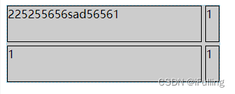
③ max-content
- 代表占据网格轨道的网格项目所分配的最大内容区域的最大值。
<body>
<div class="container">
    <div style="border: 1px solid black;height: 50px;">225255656sad56561</div>
    <div style="border: 1px solid black;height: 50px;">1</div>
    <div style="border: 1px solid black;height: 50px;">1</div>
    <div style="border: 1px solid black;height: 50px;">1</div>
</div>
</body>
<style>
    .container {
        display: grid;
        width: 300px;
        background-color: #ccc;
        grid-gap: 5px;
        grid-template-columns: repeat(1, max-content 20px);
        border: 1px dashed skyblue;
    }
</style>
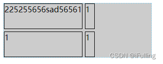
④ min-content
- 代表占据网格轨道的网格项目所分配的最小内容区域的最小值。
<body>
<div class="container">
    <div style="border: 1px solid black;height: 50px;">225255656sad56561</div>
    <div style="border: 1px solid black;height: 50px;">1</div>
    <div style="border: 1px solid black;height: 50px;">1</div>
    <div style="border: 1px solid black;height: 50px;">1</div>
</div>
</body>
<style>
    .container {
        display: grid;
        width: 300px;
        background-color: #ccc;
        grid-gap: 5px;
        grid-template-columns: repeat(1, min-content 20px);
        border: 1px dashed skyblue;
    }
</style>
二、grid
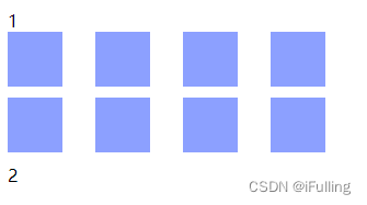
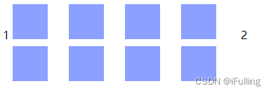
1. 设置grid布局
display: grid块级元素。
<body>
1
<div id="container">
    <div></div>
    <div></div>
    <div></div>
    <div></div>
    <div></div>
    <div></div>
    <div></div>
    <div></div>
</div>
2
</body>
<style>
    #container {
        display: grid;
        grid: repeat(2, 60px) / auto-flow 80px;
    }

    #container > div {
        background-color: #8ca0ff;
        width: 50px;
        height: 50px;
    }
</style>
display: inline-grid行内元素。
<body>
1
<div id="container">
    <div></div>
    <div></div>
    <div></div>
    <div></div>
    <div></div>
    <div></div>
    <div></div>
    <div></div>
</div>
2
</body>
<style>
    #container {
        display: inline-grid;
        grid: repeat(2, 60px) / auto-flow 80px;
    }

    #container > div {
        background-color: #8ca0ff;
        width: 50px;
        height: 50px;
    }
</style>
grid可以用来设置多个属性。比如grid-template-rows、grid-template-columns 和 grid-template-areas等等。类似于 background 可以设置 bgColor、bgPosition。
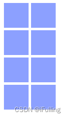
2. 设置列宽行高
grid-template用以定义网格中行、列与分区。grid-template-columns基于网格列的维度定义网格线的名称和网格轨道的尺寸大小grid-template-rows基于网格行的维度定义网格线的名称和网格轨道的尺寸大小
<body>
<div id="container">
    <div></div>
    <div></div>
    <div></div>
    <div></div>
    <div></div>
    <div></div>
    <div></div>
    <div></div>
</div>
</body>
<style>
    #container {
        display: inline-grid;
        grid-gap: 5px;
        grid-template-columns: repeat(2, 50px);
        grid-template-rows: repeat(4, 50px);
    }

    #container > div {
        background-color: #8ca0ff;
        width: 50px;
        height: 50px;
    }
</style>
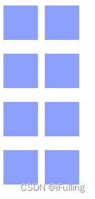
3. 设置间距
grid-row-gap行间距grid-column-gap列间距grid-gap行列间距
<body>
<div id="container">
    <div></div>
    <div></div>
    <div></div>
    <div></div>
    <div></div>
    <div></div>
    <div></div>
    <div></div>
</div>
</body>
<style>
    #container {
        display: inline-grid;
        grid-column-gap: 10px;
        grid-row-gap: 20px;
        grid-template-columns: repeat(2, 50px);
        grid-template-rows: repeat(4, 50px);
    }

    #container > div {
        background-color: #8ca0ff;
        width: 50px;
        height: 50px;
    }
</style>
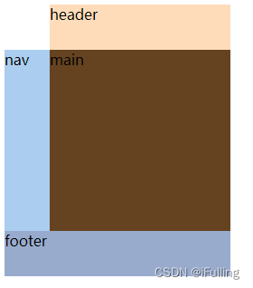
4. 设置分区
grid-template-areas用于划分网格区域。grid-area用于指定网格所属哪个区域。- 取名的名字自己取
.表示不会用到这个区域。
<body>
<div id="container">
    <header>header</header>
    <nav>nav</nav>
    <main>main</main>
    <footer>footer</footer>
</div>
</body>
<style>
    #container {
        display: grid;
        grid-template-columns: 50px 200px;
        grid-template-rows: 50px 200px 50px;
        grid-template-areas: ". head"
                            "nav main"
                            "foot foot";
    }

    header {
        grid-area: head;
        background-color: #fedcba;
    }
    nav {
        grid-area: nav;
        background-color: #abcdef;
    }
    main {
        grid-area: main;
        background-color: #654321;
    }
    footer {
        grid-area: foot;
        background-color: #98abcd;
    }
</style>
5. 设置布局排列顺序
grid-auto-flow控制着自动布局算法怎样运作精确指定在网格中被自动布局的元素怎样排列。指定排列顺序- 语法
grid-auto-flow: [ row | column ] || dense - 默认时row即把一行填满再填下一行。
- column列顺序。
- dense指定自动布局算法使用一种“稠密”堆积算法如果后面出现了稍小的元素则会试图去填充网格中前面留下的空白。这样做会填上稍大元素留下的空白但同时也可能导致原来出现的次序被打乱。
6. 设置单元格内容对齐方式
- 用于设置单元格内容在单元格内的对齐方式。
justify-items内容水平对齐start | end | center | stretch。align-items内容垂直对齐start | end | center | stretch。place-items可以同时设置垂直对齐和水平对齐。- 默认值是
stretch铺满网格。
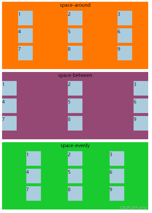
7. 设置整个网格对齐方式
- 用于设置整个内容区域在容器中的对齐方式。
justify-content容器水平对齐start | end | center | stretch | space-around | space-between | space-evenly。align-content容器垂直对齐start | end | center | stretch | space-around | space-between | space-evenly。place-content同时设置垂直对齐和水平对齐。
<body>
<div id="grid">
    <div>1</div>
    <div>2</div>
    <div>3</div>
    <div>4</div>
    <div>5</div>
    <div>6</div>
    <div>7</div>
    <div>8</div>
    <div>9</div>
</div>
</body>
<style>
    #grid {
        height: 500px;
        width: 500px;
        display: grid;
        grid-gap: 10px;
        grid-template: repeat(3, 50px) / repeat(3, 50px);
        grid-auto-flow: row;
        background-color: #f70;
        place-items: stretch stretch;
        /* space-around space-between space-evenly */
        justify-content: space-around;
    }
    #grid > div{
        background-color: #acd;
    }
</style>
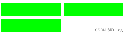
8. 设置隐式网格大小
- 如果一个表格项目被定位在没有使用
grid-template-columns显式指定尺寸的列中隐式的 grid 轨道就会被创建出来支撑它。显式地定位到超出范围的列中或者通过自动布局算法创建额外的列就会发生上述情况。 - 翻译一下上面的如果只设置了两列列宽那这两列是显式网格其他都是隐式网格因为没设置到。
grid-auto-rows、grid-auto-columns设置隐式网格大小。
<body>
<div id="grid">
    <div id="item1"></div>
    <div id="item2"></div>
    <div id="item3"></div>
</div>
</body>
<style>
    #grid {
        height: 100px;
        display: grid;
        grid-template-areas: "a a";
        grid-gap: 10px;
        grid-auto-columns: 200px;
    }

    #grid > div {
        background-color: lime;
    }
</style>
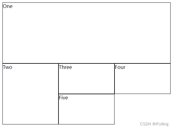
9. 设置网格位置
- grid-column-start、grid-column-end、grid-row-start、grid-row-end设置网格的行列开始或结束在哪个位置。
- 属性值auto为自动放置
area-name 4为该区域的第四行/列。
<body>
<div class="wrapper">
    <div class="box1">One</div>
    <div class="box2">Two</div>
    <div class="box3">Three</div>
    <div class="box4">Four</div>
    <div class="box5">Five</div>
</div>
</body>
<style>
    .wrapper {
        display: grid;
        grid-template-columns: repeat(3, 1fr);
        grid-auto-rows: 100px;
    }

    .wrapper > div {
        border: 1px solid #000;
    }

    .box1 {
        grid-column-start: 1;
        grid-column-end: 4;
        grid-row-start: 1;
        grid-row-end: 3;
    }

    .box2 {
        grid-column-start: 1;
        grid-row-start: 3;
        grid-row-end: 5;
    }
</style>
| 阿里云国内75折 回扣 微信号:monov8 |
| 阿里云国际,腾讯云国际,低至75折。AWS 93折 免费开户实名账号 代冲值 优惠多多 微信号:monov8 飞机:@monov6 |