

CSS画圆以及CSS实现动态圆-CSDN博客
| 阿里云国内75折 回扣 微信号:monov8 |
| 阿里云国际,腾讯云国际,低至75折。AWS 93折 免费开户实名账号 代冲值 优惠多多 微信号:monov8 飞机:@monov6 |
CSS画圆以及CSS实现动态圆
1. 先看基础静态圆
1.1 效果如下
- 如下
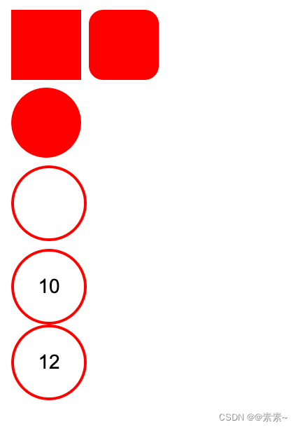
1.2 代码如下
-
如下
<!DOCTYPE html>
<html lang="en">
<head>
    <meta charset="UTF-8">
    <meta name="viewport" content="width=device-width, initial-scale=1.0">
    <title>Document</title>
    <style>

        /* 正方形 */
        .xmbook_red_point_1 {
            width: 50px;
            height: 50px;
            display: inline-block;
            background-color: red;
        }

        /* 圆角正方形 */
        .xmbook_red_point_2 {
            width: 50px;
            height: 50px;
            display: inline-block;
            background-color: red;
            border-radius: 20%;
        }

        /* 实心圆 */
        .xmbook_red_point_3 {
            width: 50px;
            height: 50px;
            /* position: relative; */
            /* bottom: 2px; */
            /* left: 4px; */
            display: inline-block;
            /* background: url(/zh_CN/htmledition/images/icon_xmbook_red_point513f4c.png); */
            background-color: red;
            border-radius: 50%;
        }

        /* 空心圆 */
        .xmbook_red_point_4 {
            width: 50px;
            height: 50px;
            display: inline-block;
            /* background-color: red; */
            border-radius: 50%;
            border: 2px solid;
            border-color: red;
        }


        /* 圈中带字 */
        .xmbook_red_point_5 {
            width: 50px;
            height: 50px;
            display: inline-block;
            /* background-color: red; */
            border-radius: 50%;
            border: 2px solid;
            border-color: red;

            /* 设置圈中字体大小等 */
            font: 14px Arial, sans-serif;

            /* 下面是调整圈中字体位置的 */
            display: flex;
			justify-content: center;
			align-items: center;
			/* text-align: center; */
        }

    </style>
</head>
<body>


    <div class="xmbook_red_point_1"></div>

    <div class="xmbook_red_point_2"></div>


    <div>
        <i class="xmbook_red_point_3"></i>
    </div>

    <div>
        <i class="xmbook_red_point_4"></i>
    </div>

    <!-- 圈中带字 -->
    <div>
        <i class="xmbook_red_point_5">10</i>
    </div>

    <div class="xmbook_red_point_5">12</div>


</body>
</html>
2. 动态圆
2.1 一个动态圆
2.1.1 让圆渐变
-
效果如下
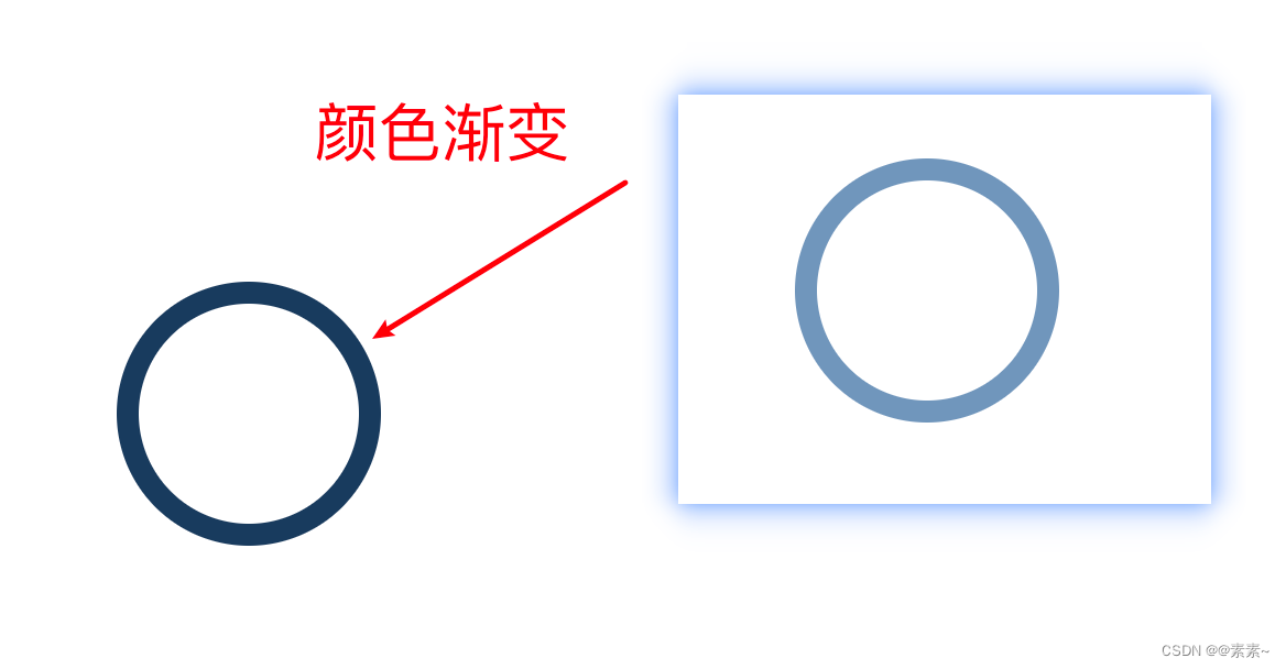
-
实现代码如下
<!DOCTYPE html>
<html lang="en">
<head>
    <meta charset="UTF-8">
    <meta name="viewport" content="width=device-width, initial-scale=1.0">
    <title>Document</title>
    <style>

        /* 空心圆 */
        .xmbook_red_point_4 {
            width: 100px;
            height: 100px;
            /* display: inline-block; */
            /* background-color: red; */
            border-radius: 50%;
            /* border: 2px solid; */
            /* border-color: red; */

            position: absolute;
            top: 150px;
            left: 150px;

            /*
                identifier 3s 控制动的频率
                linear infinite 让动画不断渐变不要停
                transform-origin 控制运动轨迹
            */
            animation: identifier 3s infinite linear;
            transform-origin: 150px 150px ;
        }

        @keyframes identifier{
            /*用“0%-100%” 或者 “from-to” 均可以*/
            from{
                transform: rotate(360deg) scale(1);
                border: 10px solid rgb(143, 182, 222);
            }
            to{
                transform: rotate(360deg) scale(1);
                border: 10px solid rgb(2, 36, 70);
            }
        }

    </style>
</head>
<body>

    <div class="xmbook_red_point_4"></div>

</body>
</html>
2.1.2 圆渐变8秒后消失
-
代码实现如下
<!DOCTYPE html>
<html lang="en">
<head>
    <meta charset="UTF-8">
    <meta name="viewport" content="width=device-width, initial-scale=1.0">
    <title>Document</title>
    <style>

        /* 空心圆 */
        .xmbook_red_point_4 {
            width: 100px;
            height: 100px;
            /* background-color: red; */
            border-radius: 50%;
            /* border-color: red; */

            position: absolute;
            top: 150px;
            left: 150px;

            /*
                identifier 3s 控制动的频率
                linear infinite 让动画不断渐变不要停
                transform-origin 控制运动轨迹
            */
            animation: identifier 8s infinite linear;
            /* transform-origin: 150px 150px ; */
        }

        @keyframes identifier {
            100% {
                /* transform: rotate(360deg) scale(1); */
                border: 10px solid rgb(6, 68, 130);
            }
        }

    </style>
</head>
<body>

    <div class="xmbook_red_point_4"></div>

</body>
</html>
2.1.3 转动的圆单个圆
- 实现效果如下
css实现圆转动单个圆
-
实现代码如下
<!DOCTYPE html>
<html lang="en">
<head>
    <meta charset="UTF-8">
    <meta name="viewport" content="width=device-width, initial-scale=1.0">
    <title>Document</title>
    <style>
        /* 空心圆 */
        .xmbook_red_point_4 {
            width: 100px;
            height: 100px;
            background-color: red;
            border-radius: 50%;
            /* border-color: rgb(0, 98, 255); */

            position: absolute;
            top: 150px;
            left: 150px;

            /*
                identifier 3s 控制动的频率
                linear infinite 让动画不断渐变不要停
                transform-origin 控制运动轨迹
            */
            animation: identifier 5s infinite linear;
            transform-origin: 150px 150px ;
        }

        @keyframes identifier {
            100% {
                transform: rotate(360deg) scale(1);
                /* border: 10px solid rgb(6, 68, 130); */
            }
        }

    </style>
</head>
<body>

    <div class="xmbook_red_point_4"></div>

</body>
</html>
2.2 多个动态圆
- 实现效果如下
css实现多个运动的圆
- 实现代码如下
<!DOCTYPE html>
<html lang="en">
<head>
    <meta charset="UTF-8">
    <meta name="viewport" content="width=device-width, initial-scale=1.0">
    <title>Document</title>
    <style>
        /* 空心圆 */
        .xmbook_red_point_4 {
            width: 100px;
            height: 100px;
            background-color: rgb(9, 163, 30);
            border-radius: 50%;
            /* border-color: rgb(0, 98, 255); */

            position: absolute;
            top: 150px;
            left: 150px;

            /*
                identifier 3s 控制动的频率
                linear infinite 让动画不断渐变不要停
                transform-origin 控制运动轨迹
            */
            animation: identifier 5s infinite linear;
            transform-origin: 100px 100px ;
        }

        /* 如果让三圆重叠把下面的 120px 调成 100px 或更小即可 */
        .xmbook_red_point_4:nth-child(1) {
            animation: identifier 9s infinite linear;
            transform-origin: 120px 120px;
        }

        .xmbook_red_point_4:nth-child(2) {
            animation: identifier 9s infinite -3s linear;
            transform-origin: 120px 120px;

        }

        .xmbook_red_point_4:nth-child(3) {
            animation: identifier 9s infinite -6s linear;
            transform-origin: 120px 120px;
        }


        @keyframes identifier {
            0% {
                transform: rotate(0deg) scale(1);
                border: 10px solid rgb(4, 212, 195);
            }
            30% {
                transform: rotate(120deg) scale(1);
                border: 10px solid rgb(33, 4, 147);
            }
            100% {
                transform: rotate(360deg) scale(1);
                border: 10px solid rgb(132, 7, 9);
            }
        }


    </style>
</head>
<body>

    <div class="xmbook_red_point_4"></div>
    <div class="xmbook_red_point_4"></div>
    <div class="xmbook_red_point_4"></div>
</body>
</html>
| 阿里云国内75折 回扣 微信号:monov8 |
| 阿里云国际,腾讯云国际,低至75折。AWS 93折 免费开户实名账号 代冲值 优惠多多 微信号:monov8 飞机:@monov6 |