

css吸顶特效(elementui vue3官网)
| 阿里云国内75折 回扣 微信号:monov8 |
| 阿里云国际,腾讯云国际,低至75折。AWS 93折 免费开户实名账号 代冲值 优惠多多 微信号:monov8 飞机:@monov6 |
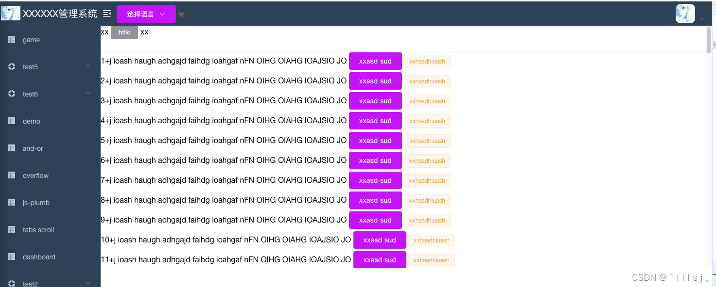
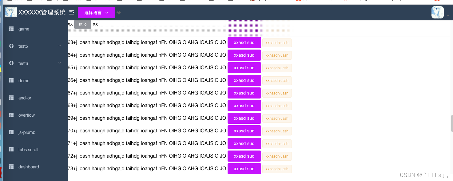
效果如图当浏览器滚轮在最上面的时候 没什么区别。当鼠标滚轮超出最上面高度时会有这种粒子感。吸顶遮盖下面内容
首先要 明确 css 基础属性 position: sticky;的用法。再了解
background-image: radial-gradient(transparent 1px, #fff 1px);
background-size: 4px 4px;
backdrop-filter: saturate(50%) blur(4px);
vue 代码
<template>
  <div style="height: 500px; overflow: auto">
    <div class="top-div">
      <div>
        xx
        <el-button type="info" size="mini">htllo</el-button>
        xx
      </div>
    </div>
    <div>
      <div v-for="item in indexArr" :key="item" style="margin-bottom: 5px">
        {{ item }}+j ioash haugh adhgajd faihdg ioahgaf nFN OIHG OIAHG IOAJSIO JO
        <el-button type="primary">xxasd sud</el-button>
        <el-tag type="warning">xxhasdhiuash </el-tag>
      </div>
    </div>
  </div>
</template>

<script>
export default {
  data() {
    return {
      indexArr: [],
    };
  },
  mounted() {
    setTimeout(() => {
      for (let i = 1; i <= 100; i++) {
        this.indexArr.push(i);
      }
    }, 1000);
  },
  methods: {},
};
</script>

<style lang='scss'>
.top-div {
  position: sticky;
  top: 0;
  left: 0;
  height: 55px;
  border-bottom: 1px solid #ccc;
  background-image: radial-gradient(transparent 1px, #fff 1px);
  background-size: 4px 4px;
  backdrop-filter: saturate(50%) blur(4px);
}
</style>
| 阿里云国内75折 回扣 微信号:monov8 |
| 阿里云国际,腾讯云国际,低至75折。AWS 93折 免费开户实名账号 代冲值 优惠多多 微信号:monov8 飞机:@monov6 |