第四章必备前端基础知识-第二节3:CSS盒模型和浮动
| 阿里云国内75折 回扣 微信号:monov8 |
| 阿里云国际,腾讯云国际,低至75折。AWS 93折 免费开户实名账号 代冲值 优惠多多 微信号:monov8 飞机:@monov6 |
文章目录
一盒模型
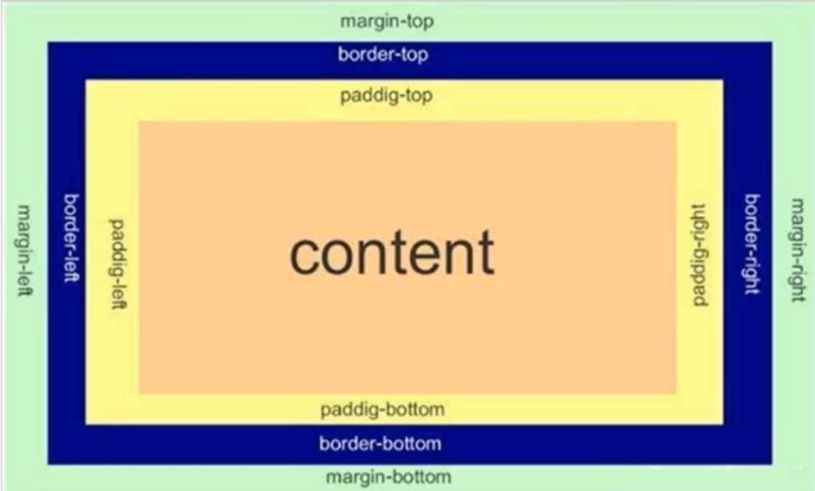
盒模型在HTML中每个标签或元素相当于是一个盒子这个盒子由以下四个部分构成
- 边框
border - 内容
content - 内边距
padding - 外边距
margin
1border
border可以利用以下属性来设置border
border-width边框粗细border-style边框样式solid实现dashed虚线dotted点线
border-color边框颜色
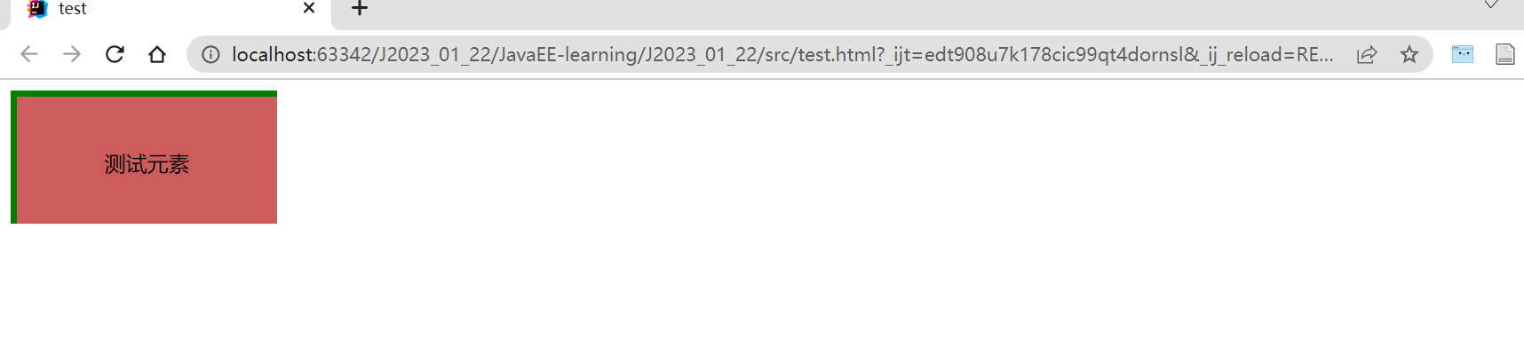
div {
    width: 200px;
    height: 100px;
    background-color: indianred;
    border-width: 5px;
    border-style: solid;
    border-color:green;

}
当然也可以简写为没有顺序要求
div {
    width: 200px;
    height: 100px;
    background-color: indianred;
    border:5px solid green;

}
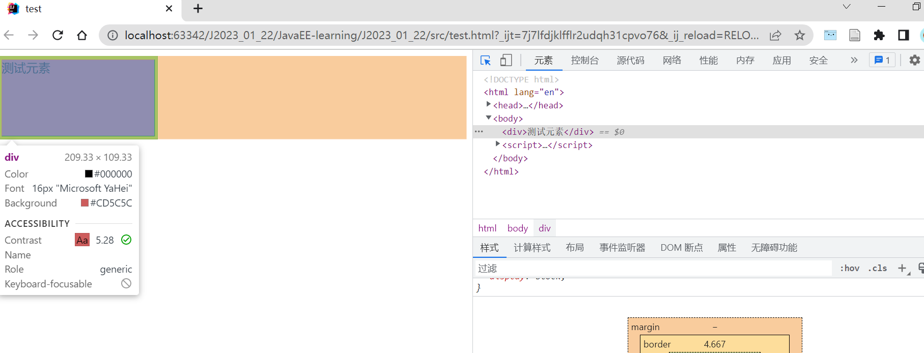
仔细观察上图最终盒子大小并不是设定的200×100而是210×110这是因为边框会撑大盒子这样的行为并不是我们所期望的所以使用box-sizing: border-box禁止这种行为转而让content缩水
另外可以也可以单独设定任意方向上的边框使用border-left/right/bottom/top
div {
    width: 200px;
    height: 100px;
    background-color: indianred;
    border-top:5px solid green;
    border-left:5px solid green;
    box-sizing:border-box;
    text-align: center;
    line-height: 100px;

}
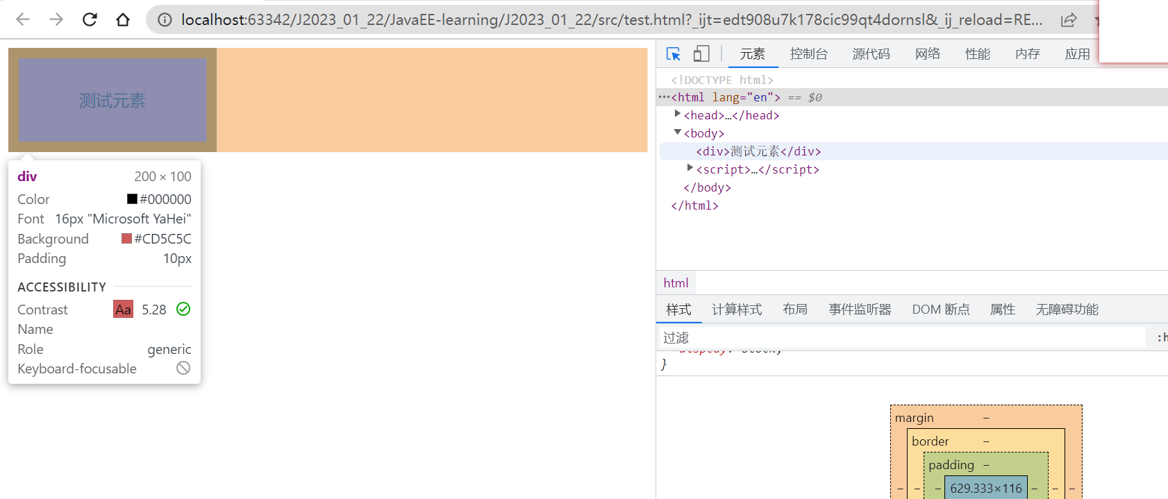
2padding
padding默认状态下内容会紧挨着边框而padding则可以控制这个距离和boarder一样也可以分别在四个方向上设定或者统一设定
padding-toppadding-bottompadding-leftpadding-right
div {
    width: 200px;
    height: 100px;
    background-color: indianred;
    padding: 10px;

    text-align: center;
    line-height: 100px;

}
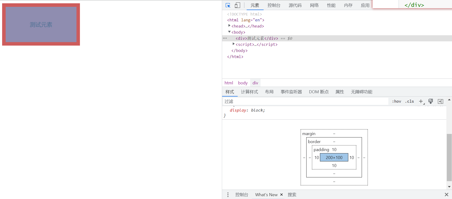
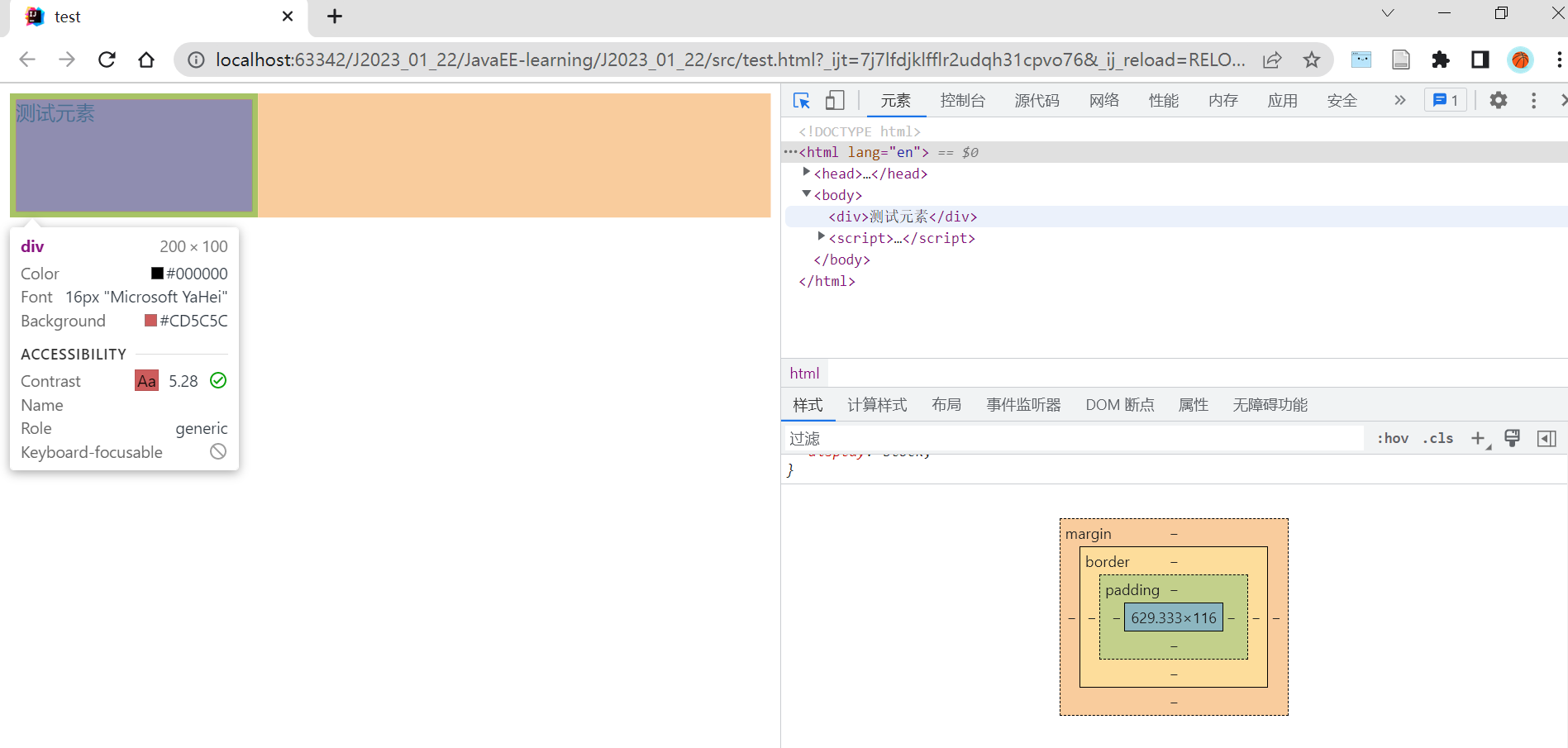
可以看到padding和border一样默认也会撑大盒子所以这里也可以利用box-sizing:border-box
div {
    width: 200px;
    height: 100px;
    background-color: indianred;
    padding: 10px;
    box-sizing: border-box;

    text-align: center;
    line-height: 80px;

}
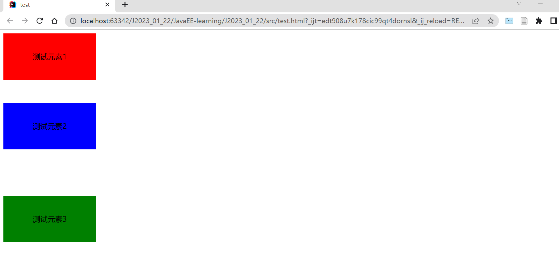
3margin
margin用于控制和盒子与盒子之间的距离写法和border、padding类似
<div id="one">测试元素1</div>
<div id="two">测试元素2</div>
<div id="three">测试元素3</div>
div {
    width: 200px;
    height: 100px;

    text-align: center;
    line-height: 100px;
}

#one {
    background-color: red;
    margin-bottom: 50px;
}

#two {
    background-color: blue;
}

#three {
    margin-top: 100px;
    background-color: green;
}
二flex布局
flex布局又称为弹性布局是W3C于2009年推出的一种布局方式可以简单、快速、响应式的实现各种布局页面现在已经得到了所有主流浏览器的支持
如下设置一个div内部含有3个span
<div>
    <span>1</span>
    <span>2</span>
    <span>3</span>
</div>
div {
    width: 100%;
    height: 150px;
    background-color: red;
}

span {
    width: 100px;
    background-color: green;
}
效果如下并不是我们预期的样子这是因为对于行内标签其宽度、高度、外边距都是不生效的
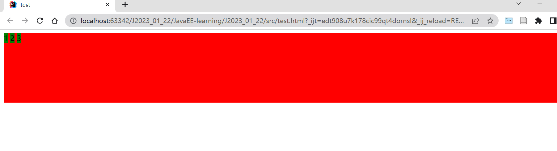
所以这里我们把span转换为块级标签
div {
    width: 100%;
    height: 150px;
    background-color: red;
}

span {
    width: 100px;
    background-color: green;
    display: block;
}
效果如下此时宽度生效但三个标签独占一行
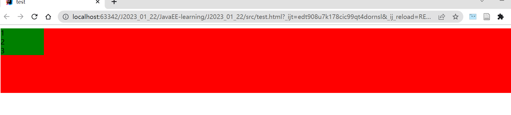
如果我们想要让这几个标签能够在水平方向上排列开就要使用到flex布局注意在设定时要给父标签设定并且它只会作用于子标签
div {
    width: 100%;
    height: 150px;
    background-color: red;
    display: flex;
}

span {
    width: 100px;
    background-color: green;
    display: block;
}
效果如下可以发现此时这几个标签在水平方向上排列开来水平方向上默认左对齐高度和父标签一样当然也可以指定具体大小
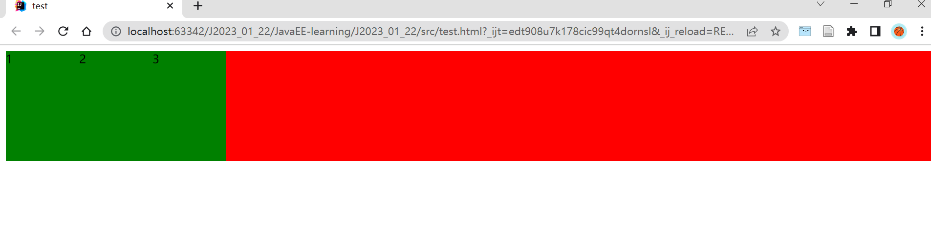
所以flex布局其实解决了如何在一行里排列标签的问题。由于块级标签本身就是按照垂直方向排列所以在实际网页布局的时候就会按照一行一行的方式布局然后在每一行里如果有多个标签并列则会使用flex规则进行布局
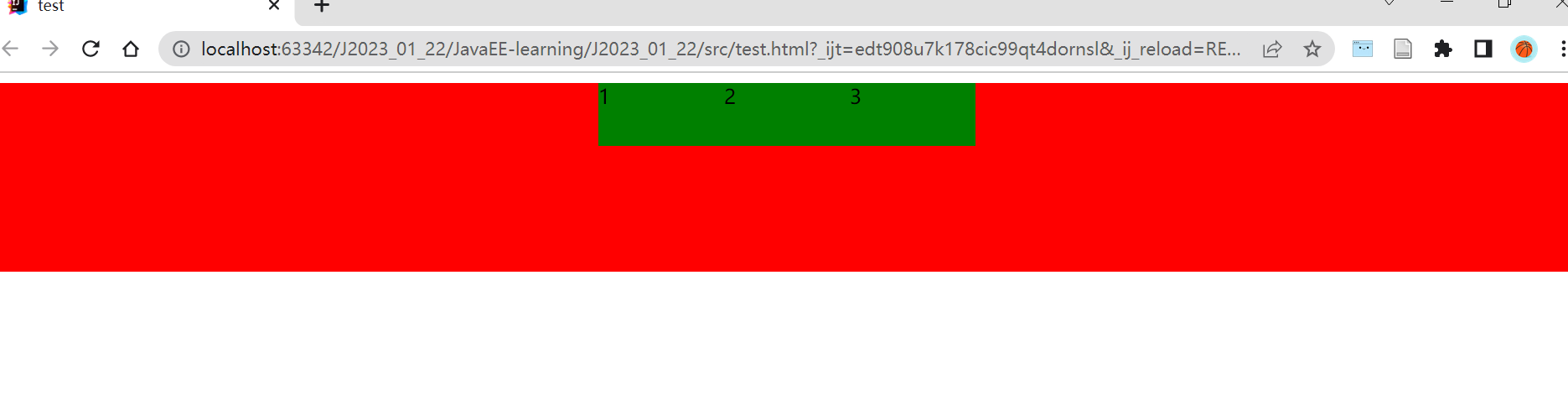
此时我们便可以使用相关属性对这些标签在水平方向上随意布局例如居中
div {
    width: 100%;
    height: 150px;
    background-color: red;
    display: flex;
    justify-content: center;
}

span {
    width: 100px;
    height: 50px;
    background-color: green;
    display: block;
}
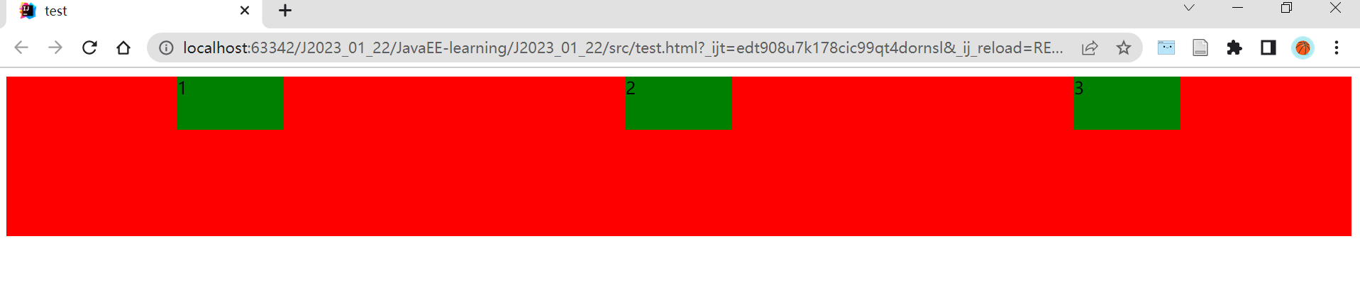
又或者以等间距排列
div {
    width: 100%;
    height: 150px;
    background-color: red;
    display: flex;
    justify-content: space-around;
}

span {
    width: 100px;
    height: 50px;
    background-color: green;
    display: block;
}