

kaggle竞赛 | Quora Insincere Question | 文本情感分析
| 阿里云国内75折 回扣 微信号:monov8 |
| 阿里云国际,腾讯云国际,低至75折。AWS 93折 免费开户实名账号 代冲值 优惠多多 微信号:monov8 飞机:@monov6 |
目录
之前发布了一遍实战类的情感分析的文章包括微博爬虫数据分析相关模型。
可以参考
https://blog.csdn.net/lijiamingccc/article/details/126963413
比赛链接
https://www.kaggle.com/competitions/quora-insincere-questions-classification/overview/description
赛题背景
对于当时的Quora网站来说存在的主要问题是如何处理有毒和分裂性的内容Quora希望解决这个问题使平台成为一个让用户可以放心与世界分享知识的地方。
在本次比赛中希望参赛选手开发算法能识别并检测到Quora中有害和误导的内容。
赛题评价指标
二分类问题使用f1-score进行评价
对于测试集的样本需要预测对应的概率值。并与真是的标签进行评价
数据集分析
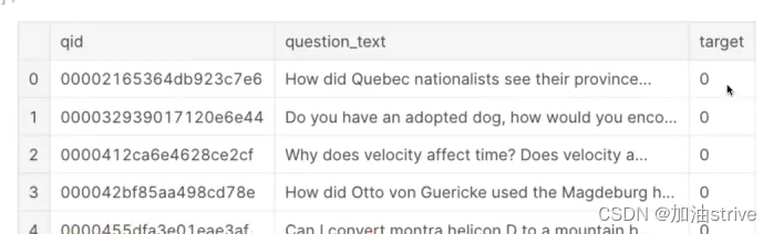
train_df = pd.read_csv("../input/train.csv")
test_df = pd.read_csv("../input/test.csv")
print("Train shape : ", train_df.shape)
print("Test shape : ", test_df.shape)
train_df.head()
## target count ##
cnt_srs = train_df['target'].value_counts()
trace = go.Bar(
    x=cnt_srs.index,
    y=cnt_srs.values,
    marker=dict(
        color=cnt_srs.values,
        colorscale = 'Picnic',
        reversescale = True
    ),
)

layout = go.Layout(
    title='Target Count',
    font=dict(size=18)
)

data = [trace]
fig = go.Figure(data=data, layout=layout)
py.iplot(fig, filename="TargetCount")

## target distribution ##
labels = (np.array(cnt_srs.index))
sizes = (np.array((cnt_srs / cnt_srs.sum())*100))

trace = go.Pie(labels=labels, values=sizes)
layout = go.Layout(
    title='Target distribution',
    font=dict(size=18),
    width=600,
    height=600,
)
data = [trace]
fig = go.Figure(data=data, layout=layout)
py.iplot(fig, filename="usertype")
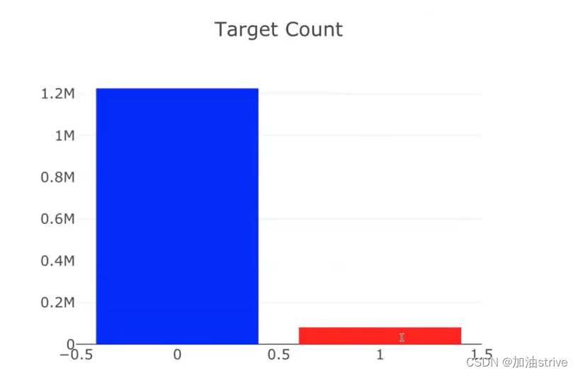
target=1是指不好的问题大概占总数据集的94%
target=0是指好的问题大概占总数据集的6%
Word Cloud
from wordcloud import WordCloud, STOPWORDS

# Thanks : https://www.kaggle.com/aashita/word-clouds-of-various-shapes ##
def plot_wordcloud(text, mask=None, max_words=200, max_font_size=100, figure_size=(24.0,16.0),
                   title = None, title_size=40, image_color=False):
    stopwords = set(STOPWORDS)
    more_stopwords = {'one', 'br', 'Po', 'th', 'sayi', 'fo', 'Unknown'}
    stopwords = stopwords.union(more_stopwords)

    wordcloud = WordCloud(background_color='black',
                    stopwords = stopwords,
                    max_words = max_words,
                    max_font_size = max_font_size,
                    random_state = 42,
                    width=800,
                    height=400,
                    mask = mask)
    wordcloud.generate(str(text))

    plt.figure(figsize=figure_size)
    if image_color:
        image_colors = ImageColorGenerator(mask);
        plt.imshow(wordcloud.recolor(color_func=image_colors), interpolation="bilinear");
        plt.title(title, fontdict={'size': title_size,
                                  'verticalalignment': 'bottom'})
    else:
        plt.imshow(wordcloud);
        plt.title(title, fontdict={'size': title_size, 'color': 'black',
                                  'verticalalignment': 'bottom'})
    plt.axis('off');
    plt.tight_layout()

plot_wordcloud(train_df["question_text"], title="Word Cloud of Questions")
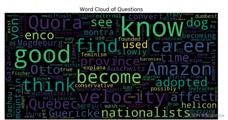
正向词汇出现的频率比较高
正向情感分本和反向情感文本出现的单词频率
from collections import defaultdict
train1_df = train_df[train_df["target"]==1]
train0_df = train_df[train_df["target"]==0]
## custom function for ngram generation ##
def generate_ngrams(text, n_gram=1):
token = [token for token in text.lower().split(" ") if token != "" if token not in STOPWORDS]
ngrams = zip(*[token[i:] for i in range(n_gram)])
return [" ".join(ngram) for ngram in ngrams]
## custom function for horizontal bar chart ##
def horizontal_bar_chart(df, color):
trace = go.Bar(
y=df["word"].values[::-1],
x=df["wordcount"].values[::-1],
showlegend=False,
orientation = 'h',
marker=dict(
color=color,
),
)
return trace
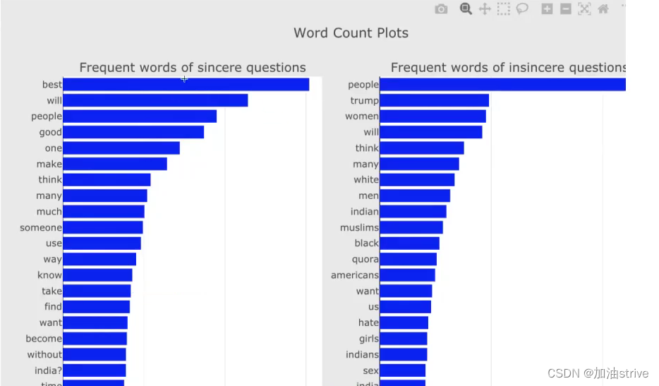
## Get the bar chart from sincere questions ##
freq_dict = defaultdict(int)
for sent in train0_df["question_text"]:
for word in generate_ngrams(sent):
freq_dict[word] += 1
fd_sorted = pd.DataFrame(sorted(freq_dict.items(), key=lambda x: x[1])[::-1])
fd_sorted.columns = ["word", "wordcount"]
trace0 = horizontal_bar_chart(fd_sorted.head(50), 'blue')
## Get the bar chart from insincere questions ##
freq_dict = defaultdict(int)
for sent in train1_df["question_text"]:
for word in generate_ngrams(sent):
freq_dict[word] += 1
fd_sorted = pd.DataFrame(sorted(freq_dict.items(), key=lambda x: x[1])[::-1])
fd_sorted.columns = ["word", "wordcount"]
trace1 = horizontal_bar_chart(fd_sorted.head(50), 'blue')
# Creating two subplots
fig = tools.make_subplots(rows=1, cols=2, vertical_spacing=0.04,
subplot_titles=["Frequent words of sincere questions",
"Frequent words of insincere questions"])
fig.append_trace(trace0, 1, 1)
fig.append_trace(trace1, 1, 2)
fig['layout'].update(height=1200, width=900, paper_bgcolor='rgb(233,233,233)', title="Word Count Plots")
py.iplot(fig, filename='word-plots')
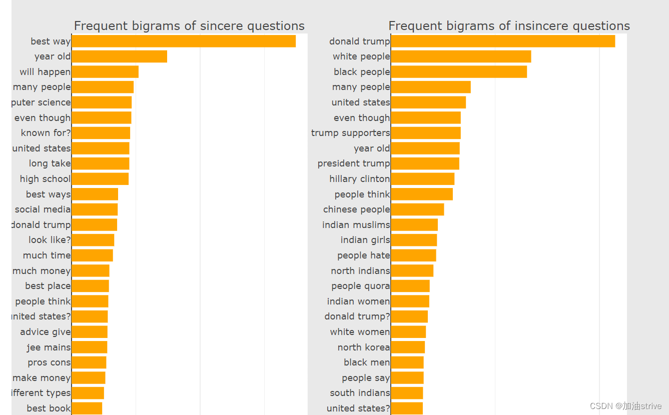
Bigram Count Plots (两个单词组成的词组的词语对排序)
freq_dict = defaultdict(int)
for sent in train0_df["question_text"]:
    for word in generate_ngrams(sent,2):
        freq_dict[word] += 1
fd_sorted = pd.DataFrame(sorted(freq_dict.items(), key=lambda x: x[1])[::-1])
fd_sorted.columns = ["word", "wordcount"]
trace0 = horizontal_bar_chart(fd_sorted.head(50), 'orange')


freq_dict = defaultdict(int)
for sent in train1_df["question_text"]:
    for word in generate_ngrams(sent,2):
        freq_dict[word] += 1
fd_sorted = pd.DataFrame(sorted(freq_dict.items(), key=lambda x: x[1])[::-1])
fd_sorted.columns = ["word", "wordcount"]
trace1 = horizontal_bar_chart(fd_sorted.head(50), 'orange')

# Creating two subplots
fig = tools.make_subplots(rows=1, cols=2, vertical_spacing=0.04,horizontal_spacing=0.15,
                          subplot_titles=["Frequent bigrams of sincere questions",
                                          "Frequent bigrams of insincere questions"])
fig.append_trace(trace0, 1, 1)
fig.append_trace(trace1, 1, 2)
fig['layout'].update(height=1200, width=900, paper_bgcolor='rgb(233,233,233)', title="Bigram Count Plots")
py.iplot(fig, filename='word-plots')
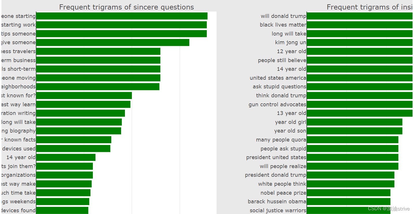
Trigram Count Plots 三个单词组成的词组出现的频率排序
freq_dict = defaultdict(int)
for sent in train0_df["question_text"]:
    for word in generate_ngrams(sent,3):
        freq_dict[word] += 1
fd_sorted = pd.DataFrame(sorted(freq_dict.items(), key=lambda x: x[1])[::-1])
fd_sorted.columns = ["word", "wordcount"]
trace0 = horizontal_bar_chart(fd_sorted.head(50), 'green')


freq_dict = defaultdict(int)
for sent in train1_df["question_text"]:
    for word in generate_ngrams(sent,3):
        freq_dict[word] += 1
fd_sorted = pd.DataFrame(sorted(freq_dict.items(), key=lambda x: x[1])[::-1])
fd_sorted.columns = ["word", "wordcount"]
trace1 = horizontal_bar_chart(fd_sorted.head(50), 'green')

# Creating two subplots
fig = tools.make_subplots(rows=1, cols=2, vertical_spacing=0.04, horizontal_spacing=0.2,
                          subplot_titles=["Frequent trigrams of sincere questions",
                                          "Frequent trigrams of insincere questions"])
fig.append_trace(trace0, 1, 1)
fig.append_trace(trace1, 1, 2)
fig['layout'].update(height=1200, width=1200, paper_bgcolor='rgb(233,233,233)', title="Trigram Count Plots")
py.iplot(fig, filename='word-plots')
## Number of words in the text ##
train_df["num_words"] = train_df["question_text"].apply(lambda x: len(str(x).split()))
test_df["num_words"] = test_df["question_text"].apply(lambda x: len(str(x).split()))

## Number of unique words in the text ##
train_df["num_unique_words"] = train_df["question_text"].apply(lambda x: len(set(str(x).split())))
test_df["num_unique_words"] = test_df["question_text"].apply(lambda x: len(set(str(x).split())))

## Number of characters in the text ##
train_df["num_chars"] = train_df["question_text"].apply(lambda x: len(str(x)))
test_df["num_chars"] = test_df["question_text"].apply(lambda x: len(str(x)))

## Number of stopwords in the text ##
train_df["num_stopwords"] = train_df["question_text"].apply(lambda x: len([w for w in str(x).lower().split() if w in STOPWORDS]))
test_df["num_stopwords"] = test_df["question_text"].apply(lambda x: len([w for w in str(x).lower().split() if w in STOPWORDS]))

## Number of punctuations in the text ##
train_df["num_punctuations"] =train_df['question_text'].apply(lambda x: len([c for c in str(x) if c in string.punctuation]) )
test_df["num_punctuations"] =test_df['question_text'].apply(lambda x: len([c for c in str(x) if c in string.punctuation]) )

## Number of title case words in the text ##
train_df["num_words_upper"] = train_df["question_text"].apply(lambda x: len([w for w in str(x).split() if w.isupper()]))
test_df["num_words_upper"] = test_df["question_text"].apply(lambda x: len([w for w in str(x).split() if w.isupper()]))

## Number of title case words in the text ##
train_df["num_words_title"] = train_df["question_text"].apply(lambda x: len([w for w in str(x).split() if w.istitle()]))
test_df["num_words_title"] = test_df["question_text"].apply(lambda x: len([w for w in str(x).split() if w.istitle()]))

## Average length of the words in the text ##
train_df["mean_word_len"] = train_df["question_text"].apply(lambda x: np.mean([len(w) for w in str(x).split()]))
test_df["mean_word_len"] = test_df["question_text"].apply(lambda x: np.mean([len(w) for w in str(x).split()]))

## Truncate some extreme values for better visuals ##
train_df['num_words'].loc[train_df['num_words']>60] = 60 #truncation for better visuals
train_df['num_punctuations'].loc[train_df['num_punctuations']>10] = 10 #truncation for better visuals
train_df['num_chars'].loc[train_df['num_chars']>350] = 350 #truncation for better visuals

f, axes = plt.subplots(3, 1, figsize=(10,20))
sns.boxplot(x='target', y='num_words', data=train_df, ax=axes[0])
axes[0].set_xlabel('Target', fontsize=12)
axes[0].set_title("Number of words in each class", fontsize=15)

sns.boxplot(x='target', y='num_chars', data=train_df, ax=axes[1])
axes[1].set_xlabel('Target', fontsize=12)
axes[1].set_title("Number of characters in each class", fontsize=15)

sns.boxplot(x='target', y='num_punctuations', data=train_df, ax=axes[2])
axes[2].set_xlabel('Target', fontsize=12)
#plt.ylabel('Number of punctuations in text', fontsize=12)
axes[2].set_title("Number of punctuations in each class", fontsize=15)
plt.show()
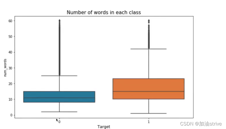
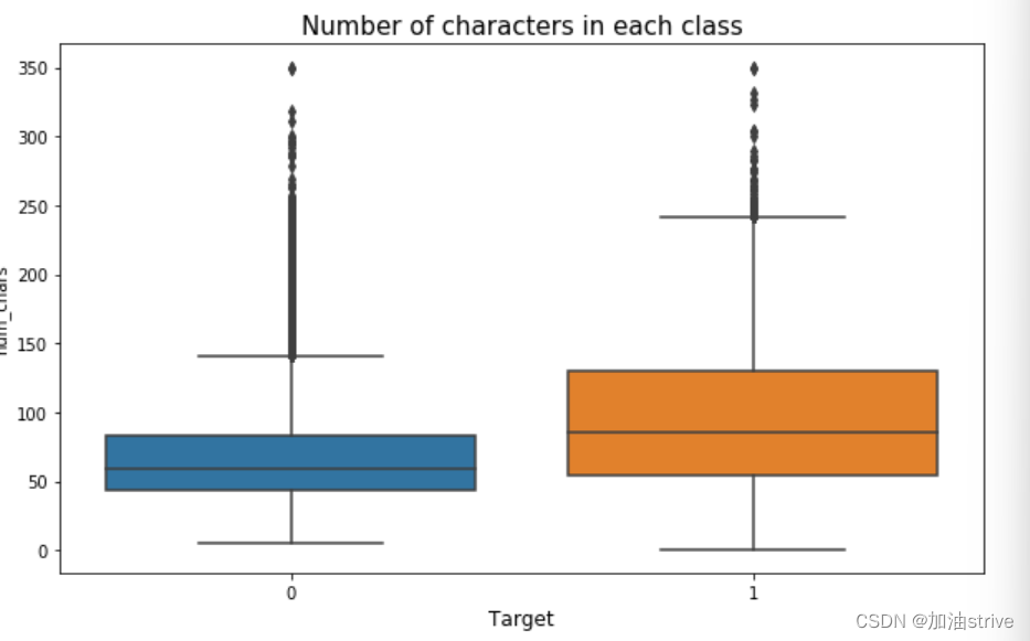
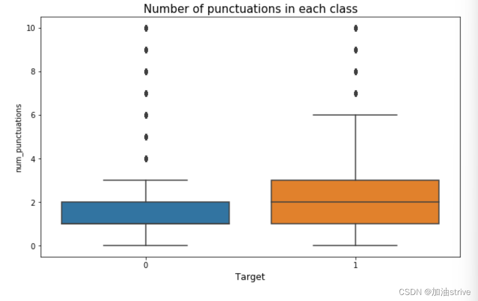
可以看到 负面文本的单词量、标点符号、词汇量是比较多的因为负面文本的数据集比较多
pytorch建模
由于不熟悉pytorch这里只是做了代码思路的学习并没有实践
# 所有的seed保证结果可付现
# 参数初始化
# 数据划分方法
# 数据扩增方法
def seed_torch(seed=1029):
    random.seed(seed)
    os.environ['PYTHONHASHSEED'] = str(seed)
    np.random.seed(seed)
    torch.manual_seed(seed)
    torch.cuda.manual_seed(seed)
    torch.backends.cudnn.deterministic = True

train["target"].value_counts()
代码思路地址
https://www.kaggle.com/code/finlay/qiqc-text-modelling-in-pytorch