

Harmony 个人中心(页面交互、跳转、导航、容器组件)-CSDN博客
| 阿里云国内75折 回扣 微信号:monov8 |
| 阿里云国际,腾讯云国际,低至75折。AWS 93折 免费开户实名账号 代冲值 优惠多多 微信号:monov8 飞机:@monov6 |
个人中心
前言
今天是1024祝各位程序员们钱多事少离家近不秃也强bug黄。在上一篇文章中我们了解了DevEco Studio的主推开发语言ArkTS并写了一个简单的例子本文我们将学习另外一个例子来加深我们对于鸿蒙应用开发的理解。
正文
本文的例子同样来源于HarmonyOS学堂根据源码内容我们来反推开发过程看开发过程中能学到那些知识点。
一、创建工程
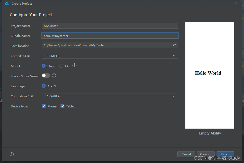
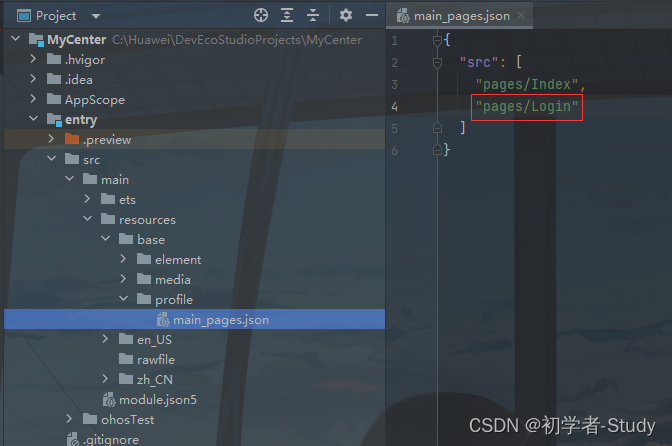
首先我们在DevEco Studio中创建一个名为MyCenter的功能如下图所示
点击Finish创建项目项目创建好之后通过预览就能看到Hello World下面来说明一下这次开发的个人中心App包含的内容首先是一个登录页面登录进去之后可以通过底部导航切换页面内容分别是首页和个人的内容下面我们首先来写登录页面。
二、登录
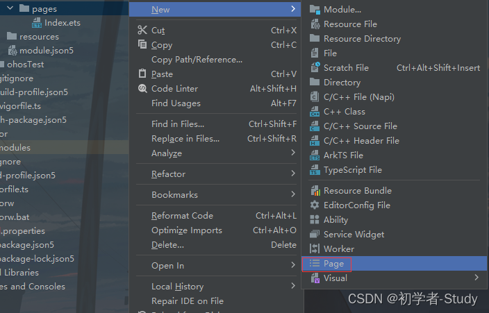
在创建工程时会自带一个页面就是我们所看到的Index.ets那么现在我们需要创建一个登录页面鼠标右键pages→New→Page。
会出现一个弹窗我们输入页面的名称为Login。
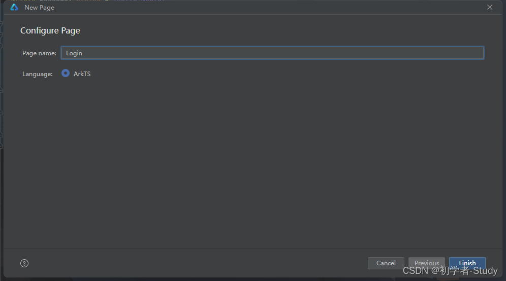
点击Finish完成页面的创建创建完成之后你可以在resource/main/base/profile/main_pages.json中看到我们增加的登录页面的配置。
① 更换启动页面
当前有两个页面Index和Login因为我们一打开App就进入Login页面所以我们将两个内容的位置换一下代码如下所示
{
  "src": [
    "pages/Login",
    "pages/Index"
  ]
}
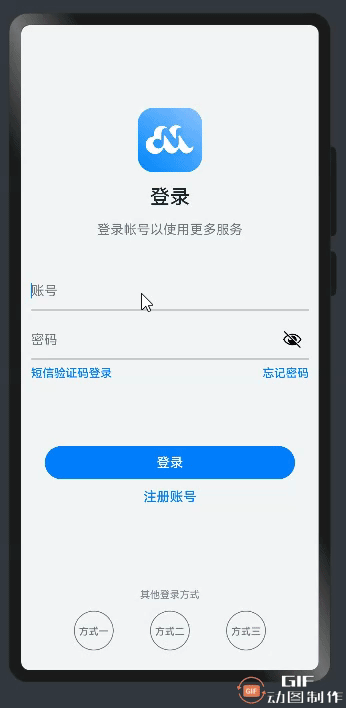
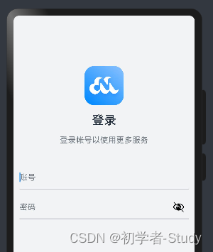
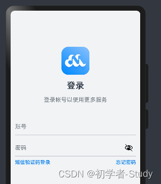
这样当App运行的时候第一个页面就是Login了是不是很简单下面我们要做的就是写这个登录页面的UI和功能先来看看这个页面的UI效果
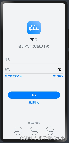
根据这个UI我们可以得出页面整体效果为纵向布局中间两处文字为蓝色文字和底部三个登录方式为横向为了方便使用首先我们增加文字的颜色和图标首先修改resources/base/element/color.json中的代码如下所示
{
  "color": [
    {
      "name": "start_window_background",
      "value": "#FFFFFF"
    },
    {
      "name": "white",
      "value": "#FFFFFF"
    },
    {
      "name": "background",
      "value": "#F1F3F5"
    },
    {
      "name": "title_text_color",
      "value": "#182431"
    },
    {
      "name": "login_more_text_color",
      "value": "#99182431"
    },
    {
      "name": "placeholder_color",
      "value": "#99182431"
    },
    {
      "name": "line_color",
      "value": "#33182431"
    },
    {
      "name": "login_button_color",
      "value": "#007DFF"
    },
    {
      "name": "login_blue_text_color",
      "value": "#007DFF"
    },
    {
      "name": "other_login_text_color",
      "value": "#838D97"
    },
    {
      "name": "loading_color",
      "value": "#182431"
    },
    {
      "name": "mainPage_selected",
      "value": "#1698CE"
    },
    {
      "name": "mainPage_normal",
      "value": "#6B6B6B"
    },
    {
      "name": "mainPage_backgroundColor",
      "value": "#F1F3F5"
    },
    {
      "name": "home_grid_fontColor",
      "value": "#99182431"
    },
    {
      "name": "setting_button_backgroundColor",
      "value": "#E5E8EA"
    },
    {
      "name": "setting_button_fontColor",
      "value": "#FA2A2D"
    }
  ]
}
颜色弄好了然后将源码中resources/base/element/meida下的图标复制到你的项目中即可。
下面我们可以开始写登录页面了首先我们修改build()函数中的内容定义一个纵向布局然后设置颜色内容大小和内容填充代码如下所示
@Entry
@Component
struct Login {

  build() {
    // 页面纵向布局
    Column() {

    .backgroundColor($r('app.color.background'))
    .height('100%')
    .width('100%')
    .padding({
      left: 12,
      right: 12,
      bottom: 24
    })
  }
}
此时保存一下预览效果是一片空白下面我们在Column()中增加一个图标和两段文字代码如下所示
	  //Logo
      Image($r('app.media.logo'))
        .width(78)
        .height(78)
        .margin({ top: 100, bottom: 16 })
      Text('登录')
        .fontSize(24)
        .fontWeight(FontWeight.Medium)
        .fontColor($r('app.color.title_text_color'))
      Text('登录帐号以使用更多服务')
        .fontSize(16)
        .fontColor($r('app.color.login_more_text_color'))
        .margin({ top: 16, bottom: 30 })
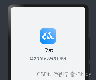
然后再预览一下效果如图所示
下面我们来写账号和密码的输入框添加如下所示代码
	  //账号输入框
      TextInput({ placeholder: '账号' })
        .maxLength(11)
        .type(InputType.Number)
        .placeholderColor($r('app.color.placeholder_color'))
        .height(45)
        .fontSize(18)
        .backgroundColor($r('app.color.background'))
        .width('100%')
        .padding({ left: 0 })
        .margin({ top: 12 })
        .onChange((value: string) => {
          //获取输入的内容

        })
      //下划线
      Line().width('100%')
        .height(2)
        .backgroundColor($r('app.color.line_color'))
      //密码输入框
      TextInput({ placeholder: '密码' })
        .maxLength(8)
        .type(InputType.Password)
        .placeholderColor($r('app.color.placeholder_color'))
        .height(45)
        .fontSize(18)
        .backgroundColor($r('app.color.background'))
        .width('100%')
        .padding({ left: 0 })
        .margin({ top: 12 })
        .onChange((value: string) => {
          //获取输入的内容

        })
      //下划线
      Line().width('100%')
        .height(2)
        .backgroundColor($r('app.color.line_color'))
我们首先预览一下
接下来我们说一下可以说明的点首先就是TextInput的输入类型如果为Password则会自带一个按钮点击可以查看密码的明文内容这一点我还是很喜欢的不用自己写了同时我们看到还有一个onChange()里面会实时同步你输入的内容因此如果我们想要获取输入框的内容就需要定义变量来接收可以在Login中定义变量代码如下所示
  @State account: string = '';
  @State password: string = '';
这是账号和密码的输入值依次为内容赋值将账号输入框下的内容赋值给account 密码输入框下的内容赋值给password 代码如下所示
	  //账号输入框
      TextInput({ placeholder: '账号' })
        ...
        .onChange((value: string) => {
          //获取输入的内容
          this.account = value;
        })
      ...
      //密码输入框
      TextInput({ placeholder: '密码' })
        ...
        .onChange((value: string) => {
          //获取输入的内容
          this.password = value;
        })
      ...
② 拓展修饰符
下面我们介绍一下拓展修饰符首先我们看一下刚才所写的代码如下图所示
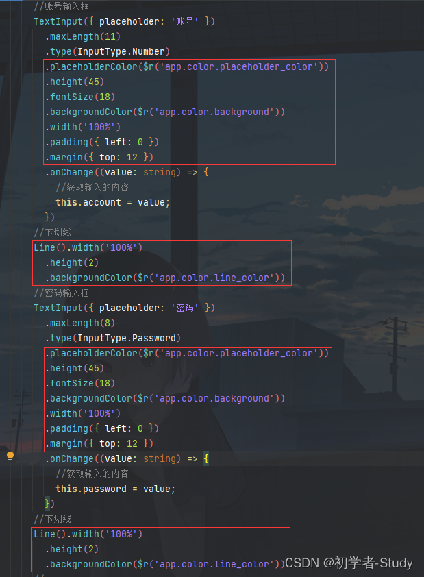
可以看到我标注的部分代码一致但是确实是输入框和线所需要的设置那么我们可以将重复的内容样式通过拓展修饰符封装一个样式函数供同类样式使用下面我们在Login{}外面增加一个inputStyle()函数代码如下所示
/**
 * 输入框的通用样式
 */
@Extend(TextInput) function inputStyle() {
  .placeholderColor($r('app.color.placeholder_color'))
  .height(45)
  .fontSize(18)
  .backgroundColor($r('app.color.background'))
  .width('100%')
  .padding({ left: 0 })
  .margin({ top: 12 })
}
这里我们用到@Extend修饰符它里面是所修饰的类型这里输入的是TextInput组件里面的代码就是刚才的标注的代码挪过来而已然后我们再写一个lineStyle() 函数代码如下所示
@Extend(Line) function lineStyle() {
  .width('100%')
  .height(2)
  .backgroundColor($r('app.color.line_color'))
}
注意这两个函数添加的位置如下图所示
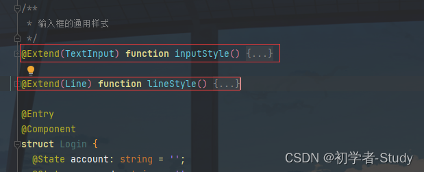
如果你写在组件内部会报错的然后我们再更新一下刚才的输入框和线的代码如下图所示
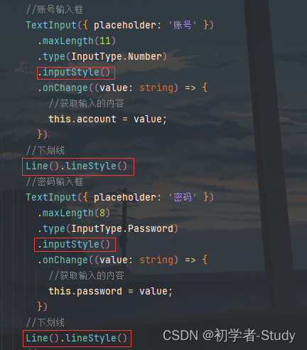
相比上面的原始写法就简洁很多了减少重复的代码因为输入框下方的两个蓝色文字也是一样的样式所以再增加一个扩展样式代码如下所示
@Extend(Text) function blueTextStyle() {
  .fontColor($r('app.color.login_blue_text_color'))
  .fontSize(14)
  .fontWeight(FontWeight.Medium)
}
在下划线后面增加代码如下所示
      Row() {
        Text('短信验证码登录').blueTextStyle()
        Text('忘记密码').blueTextStyle()
      }
      .justifyContent(FlexAlign.SpaceBetween)
      .width('100%')
      .margin({ top: 8 })
通过一个横向布局装载两个Text通过justifyContent(FlexAlign.SpaceBetween)设置布局中的内容左右都靠边看一下预览效果
下面我们写登录按钮和注册的UI在上述代码后面继续增加代码如下所示
      //登录按钮
      Button('登录', { type: ButtonType.Capsule })
        .width('90%')
        .height(40)
        .fontSize(16)
        .fontWeight(FontWeight.Medium)
        .backgroundColor($r('app.color.login_button_color'))
        .margin({ top: 80, bottom: 12 })
        .onClick(() => {
          // 登录

        })
      Text('注册账号')
        .fontColor($r('app.color.login_blue_text_color'))
        .fontSize(16)
        .fontWeight(FontWeight.Medium)
这里的代码其实就没有什么好解释的一目了然重点是点击登录按钮之后在onClick()函数中执行的代码。
③ 页面跳转
下面我们在Login{}里面增加一个登录的函数代码如下所示
  /**
   * 登录
   */
  login(): void {
    if (this.account === '' || this.password === '') {
      //显示Toast
      promptAction.showToast({ message: '账号或密码为空' })
      return
    }
    router.replaceUrl({ url: 'pages/Index' });
  }
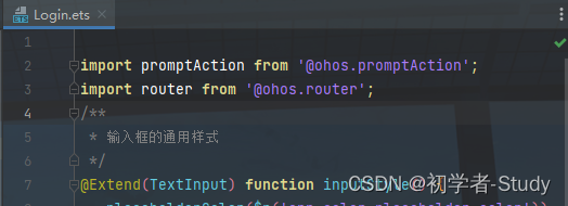
这里的代码用到了promptAction和router两个都是鸿蒙内部的插件你输入后如果发现有红色下划波浪线那么就需要导包鼠标放在波浪线上使用快捷键Alt + Enter会出现一个弹窗
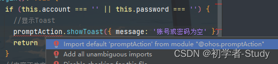
选择第一项就会将所需要的插件导入到当前的组件中导入后就不会报错了导入内容如下图所示
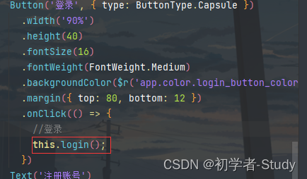
然后在登录按钮的点击事件中调用登录函数如下图所示
重新预览一下点击登录按钮试试看如下图所示
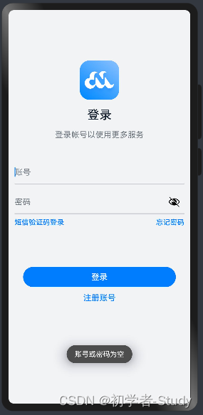
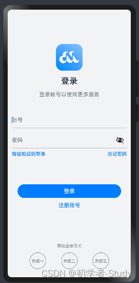
随便输入账号和密码再点击登录就会跳转到Index页面你可以试试看呀不过我们当前登录页面的内容其实还没有写完因为有一些细节还需要处理首先要做的就是页面完整在注册账号的Text后面再添加如下代码
      //空白填充组件具有自动填充容器空余部分的能力。仅当父组件为Row/Column时生效。
      Blank()
      Text('其他登录方式')
        .fontColor($r('app.color.other_login_text_color'))
        .fontSize(12)
        .fontWeight(FontWeight.Medium)
        .margin({ top: 48, bottom: 12 })
      Row({ space: 44 }) {
        this.imageButton($r('app.media.login_method1'))
        this.imageButton($r('app.media.login_method2'))
        this.imageButton($r('app.media.login_method3'))
      }
这里因为3个按钮样式一致只是图片资源不同因此我们可以通过@Builder修饰器构建一个按钮在Login{}中添加如下代码
  /**
   * 其他登录方式按钮
   * @param src
   */
  @Builder
  imageButton(src: Resource) {
    Button({ type: ButtonType.Circle, stateEffect: true }) {
      Image(src)
    }
    .height(48)
    .width(48)
    .backgroundColor($r('app.color.background'))
  }
预览效果如下图所示
④ 等待进度条
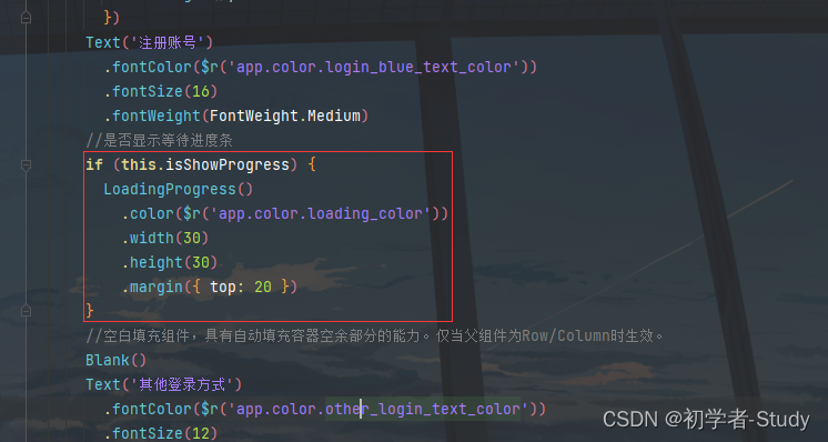
通常来说登录不会是一下子就成功的涉及到登录之后的一些数据处理网络延时通常我们会在点击登录之后显示一个等待进度告诉用户正在登录中稍安勿躁因为如果你登陆的时候没有什么变化然后登录有很久用户会以为你的App卡死了直接就给你卸载。
那我们同样可以定义几个变量在Login{}中添加如下代码
  //是否显示加载条
  @State isShowProgress: boolean = false;
  //超时标识
  private timeOutId: number = -1;
我们通过这个isShowProgress变量来设置是否显示加载进度这个timeOutId用来做超时处理比如登录多久可以进入主页面简单模拟一下首先要做的就是修改这个isShowProgress变量为true修改login()函数代码如下所示
  login(): void {
    if (this.account === '' || this.password === '') {
      //显示Toast
      promptAction.showToast({ message: '账号或密码为空' })
      return
    }
    //内容不为空则显示加载进度条
    this.isShowProgress = true;

    if (this.timeOutId === -1) {
      //设置超时处理两秒后执行页面跳转到主页
      this.timeOutId = setTimeout(() => {
        this.isShowProgress = false;
        this.timeOutId = -1;
        router.replaceUrl({ url: 'pages/Index' });
      }, 2000);
    }
  }
这里我们将isShowProgress赋值为true那么就会触发UI刷新因此我们需要在build()函数中合适的位置判断这个isShowProgress值注意这个加载进度不是一个弹窗它会占用页面的空间所以还记得我们之前所写的那个Blank()组件吗我们在它的上面添加如下代码
      //是否显示等待进度条
      if (this.isShowProgress) {
        LoadingProgress()
          .color($r('app.color.loading_color'))
          .width(30)
          .height(30)
          .margin({ top: 20 })
      }
添加位置如下图所示
这里通过判断isShowProgress来显示等待进度条那么就还有取消显示的地方我们再回到login()函数观察下面这段代码
    if (this.timeOutId === -1) {
      //设置超时处理两秒后执行页面跳转到主页
      this.timeOutId = setTimeout(() => {
        this.isShowProgress = false;
        this.timeOutId = -1;
        router.replaceUrl({ url: 'pages/Index' });
      }, 2000);
    }
首先判断这个参数是否为-1是的话则增加一个2秒超时处理在超时结束时我们将isShowProgress设置为false那么刷新UI的时候就会去掉之前所显示的加载进度条同时将timeOutId 再设置为-1最后跳转页面。我们还可以增加一个生命周期的处理在Login{}中增加如下代码
  /**
   * 组件的生命周期组件销毁时执行
   */
  aboutToDisappear() {
    clearTimeout(this.timeOutId);
    this.timeOutId = -1;
  }
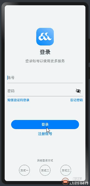
因为当你跳转页面时当前的组件就会销毁就会触发这个生命周期函数所以我们在这里进行销毁超时处理下面我们来看一下运行的效果。
三、导航栏
登录后我们进入Index页面也就是主页面我们先看看主页面的内容
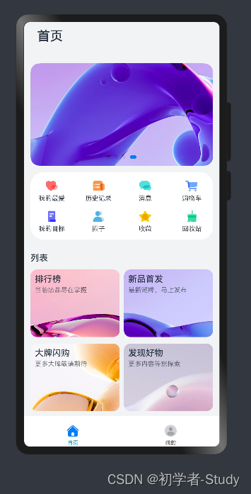
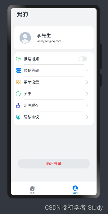
通过这两张图我们可以看到主页面有两部分选项卡和选项卡内容通过底部选项卡点击进行切换那么在写这个页面的时候应该怎么入手呢首先我们应该先写选项卡也就是底部导航这一部分内容。
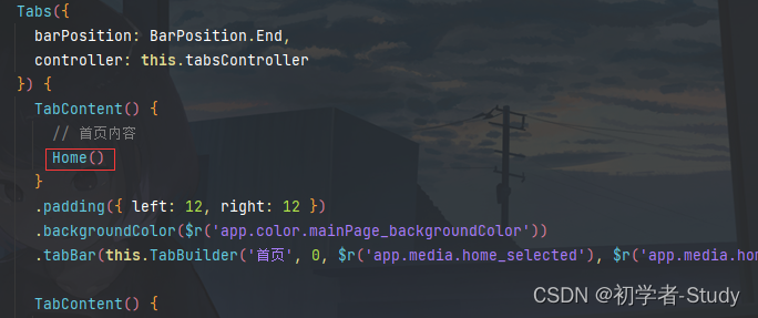
下面我们修改一下Index.ets中的代码如下所示
@Entry
@Component
struct Index {
  @State currentIndex: number = 0

  private tabsController: TabsController = new TabsController()

  @Builder TabBuilder(title: string, index: number, selectedImg: Resource, normalImg: Resource) {
    Column() {
      Image(this.currentIndex === index ? selectedImg : normalImg)
        .width(24)
        .height(24)
      Text(title)
        .margin({ top: 4 })
        .fontSize(10)
        .fontColor(this.currentIndex === index ? $r('app.color.mainPage_selected') : $r('app.color.mainPage_normal'))
    }
    .justifyContent(FlexAlign.Center)
    .height(26)
    .width('100%')
    .onClick(() => {
      this.currentIndex = index
      this.tabsController.changeIndex(this.currentIndex)
    })
  }

  build() {
    Tabs({
      barPosition: BarPosition.End,
      controller: this.tabsController
    }) {
      TabContent() {
        // 首页内容
      }
      .padding({ left: 12, right: 12 })
      .backgroundColor($r('app.color.mainPage_backgroundColor'))
      .tabBar(this.TabBuilder('首页', 0, $r('app.media.home_selected'), $r('app.media.home_normal')))

      TabContent() {
      	// 我的内容
      }
      .padding({ left: 12, right: 12 })
      .backgroundColor($r('app.color.mainPage_backgroundColor'))
      .tabBar(this.TabBuilder('我的', 1, $r('app.media.mine_selected'), $r('app.media.mine_normal')))
    }
    .width('100%')
    .backgroundColor(Color.White)
    .barHeight(56)
    .barMode(BarMode.Fixed)
    .onChange((index: number) => {
      this.currentIndex = index
    })
  }
}
下面我们来分析一下这段代码首先我们定义了currentIndex变量用于记录当前选项卡的下标然后定义了一个tabsController用于进行选项卡的控制接下来使用@Builder装饰器来构建Tab的内容使用纵向布局将图标和文字居中摆放根据currentIndex和当前Index的判断来进行Tab的选中、未选中状态。currentIndex默认为0则是默认选中第一个Tab也就是首页Tab在Tab的点击事件中我们更新currentIndex的值然后再使用this.tabsController.changeIndex(this.currentIndex)进行切换Tab选项。
然后来看build()函数中的代码这里我们使用了Tabs()组件通过页签进行内容视图切换的容器组件每个页签对应一个内容视图。我们看里面传的参数这里重点是第一个参数这个的barPosition不是下标的意思而是设置Tabs的页签位置。默认值BarPosition.Start这里的默认值实际上还要结合Tabs组件的vertical属性来结合使用。
vertical设置为false是为横向Tabs设置为true时为纵向Tabs。默认值false我们没有在代码中设置这个属性所以默认就是纵向的那么我们再结合这个BarPosition的值来看
Startvertical属性方法设置为true时页签位于容器左侧vertical属性方法设置为false时页签位于容器顶部。Endvertical属性方法设置为true时页签位于容器右侧vertical属性方法设置为false时页签位于容器底部。
那么现在就是Tabs就是在屏幕底部Tabs可以在屏幕上下左右进行摆放。
在Tabs()中放置了两个TabContent()TabContent仅在Tabs中使用对应一个切换页签的内容视图这个内容视图我们后面来写这个组件有一个tabBar()属性用于装载Tab内容这里就用到我们之前所构建的TabBuilder()函数。
最后我们再了解一下Tabs()组件的其它两个属性
BarMode有两个属性1. Scrollable每一个TabBar均使用实际布局宽度超过总长度横向Tabs的barWidth纵向Tabs的barHeight后可滑动。2. Fixed所有TabBar平均分配barWidth宽度纵向时平均分配barHeight高度。onChangeTab页签切换后触发的事件。index当前显示的index索引索引从0开始计算。触发该事件的条件1、TabContent支持滑动时组件触发滑动时触发。2、通过控制器API接口调用。3、通过状态变量构造的属性值进行修改。4、通过页签处点击触发。
通过这些说明相信你已经知道Tabs()的用法了下面我们保存预览一下Index默认是Home点击Mine如下图所示
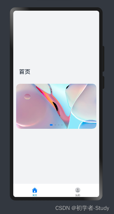
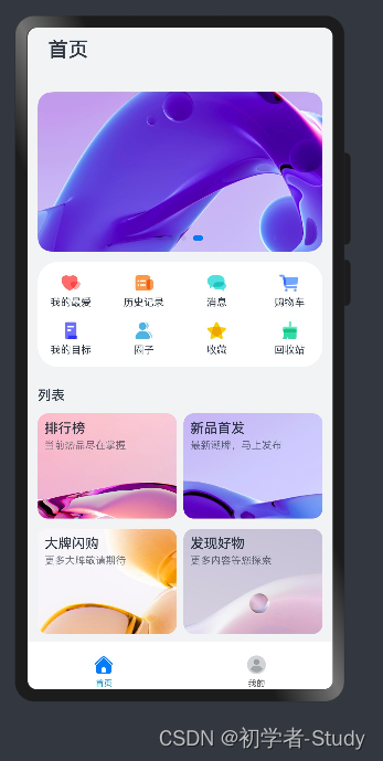
四、首页
在写这个首页的内容之前我们先看一下整个页面的布局如图
首页内容呈纵向摆放同时需要考虑屏幕大小因此我们可以加一个滑动控件再看里面的内容首先是一个标题标题下面是轮播图然后是两个网格列表。这样页面内容就介绍完了那么我么应该怎么来写这个页面的内容呢
① 轮播图
首先我们完成标题和轮播图在ets下创建一个viewmodel包该包下创建一个IndexViewModel.ets文件代码如下所示
export class IndexViewModel {

  /**
   * 获取轮播图数据
   */
  getSwiperImages(): Array<Resource> {
    let swiperImages: Resource[] = [
      $r('app.media.fig1'),
      $r('app.media.fig2'),
      $r('app.media.fig3'),
      $r('app.media.fig4')
    ]
    return swiperImages
  }
}

export default new IndexViewModel()
通过这个getSwiperImages()来获取轮播图数据下面我们可以构建主页面的组件了在在ets下创建一个view包包下新建一个Home.ets文件里面代码如下所示
import mainViewModel from '../viewmodel/IndexViewModel';

/**
 * 首页
 */
@Component
export default struct Home {

  private swiperController: SwiperController = new SwiperController();

  build() {
    Scroll() {
      Column({ space: 12 }) {
        //首页
        Column() {
          Text('首页')
            .fontWeight(FontWeight.Medium)
            .fontSize(24)
            .margin({ top: 12 })
            .padding({ left: 12 })
        }
        .width('100%')
        .alignItems(HorizontalAlign.Start)
        //轮播图
        Swiper(this.swiperController) {
          ForEach(mainViewModel.getSwiperImages(), (img: Resource) => {
            Image(img).borderRadius(16)
          }, (img: Resource) => JSON.stringify(img.id))
        }
        .margin({ top: 24 })
        .autoPlay(true)
      }
    }
    .height('100%')
  }
}
这里的代码就是一个按照我们上面所说的思路来设计的滚动条里面有标题和轮播图并设置轮播图自动轮播在滚动组件中内容未填满页面高度的情况下内容就会居中显示我们将Home放在Index中如下图所示
然后我们预览Index看看预览效果图
② 网格列表
下面我们再来写网格列表首先要做的就是制造一些数据先创建一个数据Bean在ets下创建一个bean包该包下创建一个ItemData.ets文件代码如下所示
export default class ItemData {

  title: Resource|string;
  img: Resource;
  others?: Resource|string;

  constructor(title: Resource|string, img: Resource, others?: Resource|string) {
    this.title = title;
    this.img = img;
    this.others = others;
  }
}
这个Bean中只有三个数据标题、图片其他。下面我们在IndexViewModel中制造一些假数据写两个函数代码如下所示
  /**
   * 获取第一个网格数据
   */
  getFirstGridData(): Array<ItemData> {
    let firstGridData: ItemData[] = [
      new ItemData('我的最爱', $r('app.media.love')),
      new ItemData('历史记录', $r('app.media.record')),
      new ItemData('消息', $r('app.media.message')),
      new ItemData('购物车', $r('app.media.shopping')),
      new ItemData('我的目标', $r('app.media.target')),
      new ItemData('圈子', $r('app.media.circle')),
      new ItemData('收藏', $r('app.media.favorite')),
      new ItemData('回收站', $r('app.media.recycle'))
    ]
    return firstGridData
  }


  /**
   * 获取第二个网格数据
   */
  getSecondGridData(): Array<ItemData> {
    let secondGridData: ItemData[] = [
      new ItemData('排行榜', $r('app.media.top'), '当前热品尽在掌握'),
      new ItemData('新品首发', $r('app.media.new'), '最新潮牌马上发布'),
      new ItemData('大牌闪购', $r('app.media.brand'), '更多大牌敬请期待'),
      new ItemData('发现好物', $r('app.media.found'), '更多内容等您探索')
    ]
    return secondGridData
  }
这里我们需要导入ItemData还记得是怎么导入的吗因为创建others?: Resource|string;的时候使用了一个?表示可以为空下面我们在Home中增加这两个网格的UI展示代码如下所示
import mainViewModel from '../viewmodel/IndexViewModel';
import ItemData from '../bean/ItemData';

/**
 * 首页
 */
@Component
export default struct Home {

  private swiperController: SwiperController = new SwiperController();

  build() {
    Scroll() {
      Column({ space: 12 }) {
        //首页
        ...
        //轮播图
        ...
        //第一个网格布局
        Grid() {
          ForEach(mainViewModel.getFirstGridData(), (item: ItemData) => {
            GridItem() {
              Column() {
                Image(item.img)
                  .width(24)
                  .height(24)
                Text(item.title)
                  .fontSize(12)
                  .margin({ top: 4 })
              }
            }
          }, (item: ItemData) => JSON.stringify(item))
        }
        .columnsTemplate('1fr 1fr 1fr 1fr')
        .rowsTemplate('1fr 1fr')
        .columnsGap(8)
        .rowsGap(12)
        .padding({ top: 12, bottom: 12 })
        .height(124)
        .backgroundColor(Color.White)
        .borderRadius(24)

        Text('列表')
          .fontSize(16)
          .fontWeight(FontWeight.Medium)
          .width('100%')
          .margin({ top: 12 })
        //第二个网格布局
        Grid() {
          ForEach(mainViewModel.getSecondGridData(), (secondItem: ItemData) => {
            GridItem() {
              Column() {
                Text(secondItem.title)
                  .fontSize(16)
                  .fontWeight(FontWeight.Medium)
                Text(secondItem.others)
                  .margin({ top: 4 })
                  .fontSize(12)
                  .fontColor($r('app.color.home_grid_fontColor'))
              }
              .alignItems(HorizontalAlign.Start)
            }
            .padding({ top: 8, left: 8 })
            .borderRadius(12)
            .align(Alignment.TopStart)
            .backgroundImage(secondItem.img)
            .backgroundImageSize(ImageSize.Cover)
            .width('100%')
            .height('100%')
          }, (secondItem: ItemData) => JSON.stringify(secondItem))
        }
        .width('100%')
        .height(260)
        .columnsTemplate('1fr 1fr')
        .rowsTemplate('1fr 1fr')
        .columnsGap(8)
        .rowsGap(12)
        .margin({ bottom: 55 })
      }
    }
    .height('100%')
  }
}
这里注意一下我将之前写过的一些代码省略了所以这里你就不要复制粘贴了其实网格列表和普通列表在数据渲染的方式上一样只不过网格列表有一些其他的属性我们需要了解。
columnsTemplatestring类型设置当前网格布局列的数量不设置时默认1列。例如 ‘1fr 1fr 1fr 1fr’ 是将父组件分4列将父组件允许的宽分为4等份第一列占1份第二列占1份第三列占1份第四列占1份。设置为’0fr’时该列的列宽为0不显示GridItem。设置为其他非法值时GridItem显示为固定1列。rowsTemplatestring类型设置当前网格布局行的数量不设置时默认1行。例如‘1fr 1fr’是将父组件分两行将父组件允许的高分为2等份第一行占1份第二行占1份设置为’0fr’则这一行的行宽为0这一行GridItem不显示。设置为其他非法值按固定1行处理。columnsGapLength类型设置列与列的间距。默认值0设置为小于0的值时按默认值显示。rowsGapLength类型设置行与行的间距。默认值0设置为小于0的值时按默认值显示。
其余的属性就没有什么好说的下面我们再预览一下Index如下图所示
此时你点击我的可以看到什么也没有下面我们来写我的。
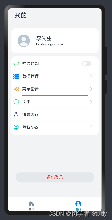
五、我的
首先我们看一下我的页面的图
内容同样是呈纵向摆放的上面是个人信息中间这里是一个功能列表最下面是退出按钮下面我们首先提供列表的数据在IndexViewModel中写一个函数代码如下所示
  /**
   * 获取设置列表数据
   */
  getSettingListData(): Array<ItemData> {
    let settingListData: ItemData[] = [
      new ItemData('推送通知', $r('app.media.news'), '开关'),
      new ItemData('数据管理', $r('app.media.data'), null),
      new ItemData('菜单设置', $r('app.media.menu'), null),
      new ItemData('关于', $r('app.media.about'), null),
      new ItemData('清除缓存', $r('app.media.storage'), null),
      new ItemData('隐私协议', $r('app.media.privacy'), null)
    ]
    return settingListData
  }
然后我们在view包下先建一个Mine.ets代码如下所示
import router from '@ohos.router';
import promptAction from '@ohos.promptAction';
import ItemData from '../bean/ItemData';
import mainViewModel from '../viewmodel/IndexViewModel';
/**
* 我的
*/
@Component
export default struct Mine {
@Builder settingCell(item: ItemData) {
Row() {
Row({ space: 12 }) {
Image(item.img)
.width(22)
.height(22)
Text(item.title)
.fontSize(16)
}
// 设置功能item最右侧的功能项
if (item.others === null) {
//可以进入下一级页面
Image($r('app.media.right_grey'))
.width(12)
.height(24)
} else {
//开关
Toggle({ type: ToggleType.Switch, isOn: false })
}
}
.justifyContent(FlexAlign.SpaceBetween)
.width('100%')
.padding({
left: 8,
right: 22
})
}
build() {
Scroll() {
Column({ space: 12 }) {
Column() {
Text('我的')
.fontWeight(FontWeight.Medium)
.fontSize(24)
.margin({ top: 12 })
.padding({ left: 12 })
}
.width('100%')
.alignItems(HorizontalAlign.Start)
// 个人信息
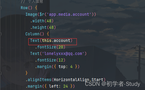
Row() {
Image($r('app.media.account'))
.width(48)
.height(48)
Column() {
Text('李先生')
.fontSize(20)
Text('lonelyxxx@qq.com')
.fontSize(12)
.margin({ top: 4 })
}
.alignItems(HorizontalAlign.Start)
.margin({ left: 24 })
}
.margin({ top: 24 })
.alignItems(VerticalAlign.Center)
.width('100%')
.height(96)
.backgroundColor(Color.White)
.padding({ left: 24 })
.borderRadius(16)
// 功能列表
List() {
ForEach(mainViewModel.getSettingListData(), (item: ItemData) => {
ListItem() {
//构建每一个item
this.settingCell(item)
}
.height(48)
}, (item: ItemData) => JSON.stringify(item))
}
.backgroundColor(Color.White)
.width('100%')
.height('42%')
// 为列表增加分隔线
.divider({
strokeWidth: 1,
color: Color.Grey,
startMargin: 42,
endMargin: 42
})
.borderRadius(16)
.padding({ top: 4, bottom: 4 })
Blank()
Button('退出登录', { type: ButtonType.Capsule })
.width('90%')
.height(40)
.fontSize(16)
.fontColor($r('app.color.setting_button_fontColor'))
.fontWeight(FontWeight.Medium)
.backgroundColor($r('app.color.setting_button_backgroundColor'))
.margin({ bottom: 55 })
.onClick(() => {
promptAction.showToast({ message: '退出登录' })
router.replaceUrl({ url: 'pages/Login' })
})
}
.height('100%')
}
}
}
这个代码乍一看很多下面我们来分析一下从上往下来首先是标题和个人信息这部分就是UI效果没有什么好说的然后最关键的功能列表这里通过@Builder 来装饰settingCell()函数。通过item的other来判断是否需要显示不同的效果代码如下所示
	  if (item.others === null) {
        //可以进入下一级页面
        Image($r('app.media.right_grey'))
          .width(12)
          .height(24)
      } else {
        //开关
        Toggle({ type: ToggleType.Switch, isOn: false })
      }
为null就是一个向右的图标不为null就是一个开关默认为false。中间的列表加载就没有什么好说二的最后的退出登录按钮点击之后就会调用router.replaceUrl({ url: 'pages/Login' })返回到登录页面这里使用的是replaceUrl用应用内的某个页面替换当前页面并销毁被替换的页面。
下面我们通过Index预览一下看看效果
① 带参数跳转
现在我们登录后的账号并没有其他作用我们可以把账号替换为李先生首先我们需要修改登录按钮点击事件的代码如下所示
		router.replaceUrl({
          url: 'pages/Index',
          params: {
            account: this.account
          }
        });
就是在跳转页面的时候添加一个params属性然后放入键和值然后我们在Mine组件中增加一行代码
  //接收传递过来的参数
  @State account: string = router.getParams()?.['account'];
这样就能拿到传递的参数值然后设置到Text中即可。
下面运行一下看看效果
本文就到这里了鸿蒙提供的一些学习资料是很全面的通过阅读加上实操过程中的测试可以很快上手应用开发。
六、源码
如果对你有所帮助的话不妨 Star 或 Fork山高水长后会有期~
源码地址MyCenter
| 阿里云国内75折 回扣 微信号:monov8 |
| 阿里云国际,腾讯云国际,低至75折。AWS 93折 免费开户实名账号 代冲值 优惠多多 微信号:monov8 飞机:@monov6 |