

html学习(布局方式(layout)、浮动(float)、定位(position)、弹性盒(flex))
| 阿里云国内75折 回扣 微信号:monov8 |
| 阿里云国际,腾讯云国际,低至75折。AWS 93折 免费开户实名账号 代冲值 优惠多多 微信号:monov8 飞机:@monov6 |
布局方式(layout)
文档流
文档流normal flow
文档流通俗的讲就是一个web页面中每一个模块只能从上到下从左往右的方式排列在页面上。
将窗口自下而上分成一行一行应在每行中按从左至右的依次排放元素即为文档流
我们创建的的元素默认都在文档流中。
这里与其它如移动端iOS开发是不太一样的布局方式。
    元素在文档流中有什么特点
        - 块元素 <div>
            - 块元素会在页面中独占一行
            - 默认宽度是父元素的全部会把父元素撑满
            - 默认高度是被内容撑起开或者是子元素
        - 行内元素 <span>
            - 行内元素不会独占页面的一行只占自身的大小。
            - 行内元素在页面中从左向右水平排列如果一行之中不能容纳下所有的行内元素则会自动换行。
            - 行内元素的默认宽高都是被内容撑开
盒模型
盒模型一般由内容区(content)和边框(border)构成然后由padding和margin确定内距和外距横向
<!DOCTYPE html>
<html lang="en">
<head>
    <meta charset="UTF-8">
    <meta http-equiv="X-UA-Compatible" content="IE=edge">
    <meta name="viewport" content="width=device-width, initial-scale=1.0">
    <title>Document</title>

    <style>
        .box {
            /*
                内容区content元素中的所有子元素和文本内容都在内容区排列
                    内容去的大小由width 和 height两个属性设置
             */
            width: 100px;
            height: 100px;
            background-color: aqua;
            /*
                边框border边框属于盒子内容的边缘。
                要设置边框需要至少设置三个样式。
                    边框的宽度 border-width
                    边框的颜色 border-color
                    边框的样式 border-style
             */

             /*
                 border-width 默认值 一般都是3px
                 border-width可以用来指定四个方向的宽度
                    值的情况
                        四个值 上 右 下 左
                        三个值 上 左右 下
                        两个值 上下 左右
                        一个值 上下左右
                除了border-width还有一组 border-xxx-width
                    xxx 可以是 top right left bottom
              */
            border-width: 2px;
             /*
                border-color同样可以指定四个边的边框颜色规则跟border-width一样
                如果省略自动使用color属性的值
              */
            border-color: blue;
             /*
                border-style同样可以指定四个边框的样式
                    solid 实线
                    dotted 点状虚线
                    dashed 虚线
                    double 双线
              */
            border-style: solid;

             /* border: 2px blue solid; */
        }


        .box1 {
            background-color: limegreen;
            width: 200px;
            height: 200px;
            border: 10px orange solid;


            /*
            内边距padding
                - 内容和编剧之间的距离是内边距
                - 一共有四个方向的内边距
                    padding-top
                    padding-right
                    padding-bottom
                    padding-left

                - 内边距的设置会影响盒子的大小
            一个盒子的可见框的大小由内容区、内边距和边框共同决定

             */
            /* padding-left: 100px;
            padding-top: 100px;
            padding-right: 100px;
            padding-bottom: 100px; */
        }

        /* .inner {
            width: 50px;
            height: 50px;
            background-color: yellow;
        } */

        .box2 {
            /*
                外边距margin
                    - 外边距不会影响盒子可见框的大小但是外边距会影响盒子的位置
                    - 一共有四个方向外边距
                        margin-top  上外边距 设置正值元素向下移动
                        margin-right
                        margin-bottom 下边距 设置正值下边的元素会向下移动
                        margin-left 左外边距 设置正值元素会像右移动
                    - 元素在页面中是按照自左向右的顺序排列的所以默认情况下如果我们设置了左和上外边距会移动元素自身
                    而设置下和右边距会移动其他元素。
                    - margin会影响到盒子实际占用空间。
             */
            background-color: limegreen;
            width: 200px;
            height: 200px;
            border: 50px orange solid;
            margin-bottom: 50px;
        }

        .box3 {
            background-color: yellow;
            width: 220px;
            height: 220px;
            border: 22px rgba(157, 14, 26, 0.577);
            margin-bottom: 50px;
        }
        .box4 {

            background-color: limegreen;
            width: 200px;
            height: 50px;
            border: 50px rgb(58, 74, 176) solid;
            margin-bottom: 50px;
        }
        .box4::after{
            color: #2e1599;
            content:"bye-bye" ;
        }
    </style>

</head>
<body>
    <!--
        盒模型box model
            - CSS将页面中的所有元素都设置为一个矩形的盒子
            - 将元素设置成盒子后对页面的布局就变成不同盒子的摆放到不同位置
            - 每个盒子都由以下几个部分组成
                内容区content   决定盒子的大小
                内边距padding   决定盒子的大小
                边框  border    决定盒子的大小
                外边距margin    决定盒子的位置
     -->

     <!-- <div class="box"></div> -->

    <!-- <div class="box1">
        <div class="inner"></div>
    </div> -->

    <div class="box2"></div>
    <div class="box3"></div>
    <div class="box4">hellp</div>
</body>
</html>
布局
元素的布局方式分为水平布局和垂直布局的两种方式
水平布局
元素在其父元素中水平方向的位置由以下几个属性共同决定
margin-left
border-left
padding-left
width
padding-right
border-right
margin-right
注意 一个元素在其父元素中水平布局必须满足以下等式
margin-left + border-left + padding-left + width + padding-right + border-right + margin-right = 其父元素内容区的宽度必须满足
0 + 0 + 0 + 200 + 0 + 0 + 0 = 800
- 以上等式必须满足如果相加结果使不等式不成立则成为过渡约束则等式会自动调整
- 调整情况
- 如果这七个值中没有为auto的情况则浏览器会自动调整marig-right的值以使等式满足
- 这七个值中有三个值可设置为auto
widht
marign-left
margin-right
- 如果某个值为auto则会自动调整为auto的那个值以使等式成立
<!DOCTYPE html>
<html lang="en">
<head>
    <meta charset="UTF-8">
    <meta http-equiv="X-UA-Compatible" content="IE=edge">
    <meta name="viewport" content="width=device-width, initial-scale=1.0">
    <title>Document</title>
    <style>
        .outer {
            width: 800px;
            height: 200px;
            border: 10px red solid;

            /* padding-left: 200px; */
        }

        .inner {
            width: 200px;
            height: 200px;
            background-color: aqua;


            margin-left: 100px;     /* 100 + 0 + 0 + 200 + 0 + 0 + ? = 800 */

            /* width: auto;    /* widht的值默认是auto */


            /*
                如果将一个宽度和一个外边距设置为auto则宽度会调整为最大。设置为auto的外边距会自动为0
                如果将三个值都设置为auto则外边距都是0宽度最大
             */
            width: auto;
            margin-left: auto;


            width: 400px;
            margin-left: auto;
            margin-right: auto;
        }
    </style>
</head>
<body>
    <div class="outer">
        <div class="inner"></div>
    </div>
</body>
</html>
垂直布局
            子元素是在父元素的内容区排列的
                如果子元素的大小超过了父元素则子元素会从父元素中溢出
                使用 overflow 属性来设置父元素处理溢出的子元素

                可选值
                    visabe: 默认值 子元素会从父元素中溢出
                    hidden: 溢出内容将会被裁剪不会显示
                    scroll: 滑动显示但是会生成2个方向的滑动指示器
                    auto:   根据内容需要生成滚动指示器。
                overflow-x
                overflow-y
<!DOCTYPE html>
<html lang="en">
<head>
    <meta charset="UTF-8">
    <meta http-equiv="X-UA-Compatible" content="IE=edge">
    <meta name="viewport" content="width=device-width, initial-scale=1.0">
    <title>Document</title>

    <style>
        /* 默认情况下父元素的高度被内容撑开就是高度自适应没有设置height属性的时候 */

        .box {
            background-color: aquamarine;
        }

        .inner {
            height: 300px;
            width: 100px;
            background-color: cadetblue;
        }
         .box1 {
            width: 200px;
            height: 200px;
            background-color: deeppink;


            overflow:scroll;
        }

        .box2 {
            width: 50px;
            height: 300px;
            background-color: rgb(229, 122, 29);

        }
    </style>
</head>
<body>
 <!-- <div class="box">
        <div class="inner"></div>
        <div class="inner"></div>
    </div>  -->

    <div class="box1">
        <div class="box2"></div>
    </div>
</body>
</html>
外边距折叠
        垂直外边距的重叠折叠
            - 相邻垂直方向外边距会发生重叠现象。
            - 兄弟元素
                - 兄弟元素间的相邻垂直外边距会去两者之前的最大值两者都是正值
                - 特殊情况
                    如果相邻的外边距一正一负则取两者的和
                    如果相邻的外边距都是负值则取两者中绝对值大的那一个
                - 兄弟元素之间外边距的重叠对开发是有利的所以我们不需要进行处理。
            - 父子元素
                - 父子元素间相邻外边距子元素的会传递给父元素上外边距
                - 父子外边距的折叠会影响到页面的布局必须要进行处理。
那应该如何解决呢
<!DOCTYPE html>
<html lang="en">
<head>
    <meta charset="UTF-8">
    <meta http-equiv="X-UA-Compatible" content="IE=edge">
    <meta name="viewport" content="width=device-width, initial-scale=1.0">
    <title>Document</title>

    <style>
        .box1, .box2 {
            width: 200px;
            height: 200px;
            font-size: 100px;
            /* text-align: center; */
        }


        /* 看看 这么设置会发生什么问题 */
        .box1 {
            background-color: aqua;

            /* 1 */
            margin-bottom: 100px;
        }

        .box2 {
            background-color: yellowgreen;

            /* 2 */
            margin-top: 100px;
        }

        /* 第一种解决方案 */
        /* .box3 {
            background-color: aqua;
            width: 200px;
            height: 100px;

            padding-top: 100px;
        }

        .box4 {
            width: 100px;
            height: 100px;
            background-color: yellowgreen;
        } */

        /* 第二种解决方案 */
        .box3 {
            background-color: aqua;
            width: 200px;
            height: 100px;
            border-top: 1px aqua solid;
        }

        .box4 {
            width: 100px;
            height: 100px;
            background-color: yellowgreen;

            margin-top: 100px;
        }

    </style>
</head>
<body>
    <!-- 兄弟关系 -->
    <div class="box1">1</div>
    <div class="box2">2</div>

    <!-- <div class="box3">
        <div class="box4"></div>
    </div> -->
</body>
</html>
行内元素盒模型
行内元素的盒模型
- 行内元素不支持设置宽度和高度
- 行内元素可以设置padding但是垂直方向padding不会影响页面的布局。
- 行内元素可以设置border,但是垂直方向border不会影响页面的布局。
- 行内元素可以设置margin但是垂直方向的margin不会影响布局。
       <!DOCTYPE html>
<html lang="en">
<head>
    <meta charset="UTF-8">
    <meta http-equiv="X-UA-Compatible" content="IE=edge">
    <meta name="viewport" content="width=device-width, initial-scale=1.0">
    <title>Document</title>

    <style>
        span {
            background-color: yellow;


            /* width: 100px;
            height: 100px; */

            /* padding: 100px; */
            /* border: 100px solid red; */
            /* margin: 120px; */
        }
        .box {
            width: 200px;
            height: 200px;
            background-color: yellowgreen;
            font: inherit;
        }

        a {
            background-color: orange;
            width: 100px;
            height: 100px;
            /*
                display 用来设置元素显示的类型
                    可选值
                        inline 将元素设置为行内元素
                        block  将元素设置为块元素
                        inline-block 将元素设置为行内块元素 行内块既可以设置宽、高又不会独占一行
                        table 将元素设置为一个表格
                        none 元素不在页面中显示

                visiblity 用来设置元素的显示状态
                    可选值
                        visible 默认值元素在页面中正常显示
                        hidden  元素在页面中隐藏 不显示但是依然占据页面的位置。
             */

            display: inline-block;
            /* visibility: hidden; */
        }
    </style>
</head>
<body>
    <a href="">超链接</a>
    <a href="">超链接</a>
    <div class="box"></div>
    <span class="s1">我是行内元素</span>
</body>
</html>
盒子大小
如何设置盒子大小区间呢
<!DOCTYPE html>
<html lang="en">
<head>
    <meta charset="UTF-8">
    <meta http-equiv="X-UA-Compatible" content="IE=edge">
    <meta name="viewport" content="width=device-width, initial-scale=1.0">
    <title>Document</title>

    <style>
    .box1 {
        width: 100px;
        height: 100px;
        background-color: #bfc;
        padding: 10px;
        border: 10px solid red;

        /*
            默认情况下盒子可见框的大小由内容区、内边距和边框共同决定。

                box-sizing 用来设置盒子尺寸的计算方式设置width和height的作用
                    可选值
                        content-box 默认值宽度和高度用来设置内容去的大小。
                        border-box 宽度和高度用来设置整个盒子可见框的大小
                            width 和 height 只得是内容区和内边距和边框的总大小 实际是改了内容区的大小内边距与边框的大小不变。
         */

        box-sizing: border-box;
    }
    </style>
</head>
<body>
    <div class="box1"></div>
</body>
</html>
轮廓阴影与圆角
对盒子进行样式设置边框阴影四角度数
<!DOCTYPE html>
<html lang="en">
<head>
    <meta charset="UTF-8">
    <meta http-equiv="X-UA-Compatible" content="IE=edge">
    <meta name="viewport" content="width=device-width, initial-scale=1.0">
    <title>Document</title>

    <style>
        .box {
            width: 200px;
            height: 200px;
            background-color: #bff;

            /* border: 10px solid red; */

            /*
                outline 用来设置元素的轮廓线用法和border一模一样
                    轮廓和边框不同的点就是轮廓不会影响到可见框的大小
            */

            /* outline: 10px  solid red; */

            /*
                box-shadow 用来设置元素的阴影效果阴影不会影响页面布局
                第一个值 X轴偏移量设置阴影水平位置的偏移正值向右移动负值向左移动
                第二个值 Y轴偏移量设置阴影垂直位置的偏移正值向下移动负值向上移动
                第三个值 阴影的模糊半径
                第四个值 阴影的颜色
             */

            box-shadow: 0px 0px 3px burlywood;

            /*
                圆角 border-radius 用来设置圆角 可以分别指定四个叫的圆角
                    四个值 -- 左上 右上 右下 左下
                    三个值 -- 左上 右上&&左下 右下
                    两个值个值 -- 左上&&右下 左下&&右上
                    一个值 -- 四个角


                border-top-left-radius
                border-top-right-radius
                border-bottom-left-radius
                border-bottom-right-radius
             */

            border-radius: 100px;
            border-radius: 50%;

            /* 有“/”斜杠 第二个值表示是Y轴的半径 */
            border-radius: 30px / 50px;
        }
    </style>
</head>
<body>
    <div class="box"></div>
    <span>span</span>
</body>
</html>
浮动(float)
简介
通过浮动可以使一个元素向其父元素的左侧与右侧移动
使用 float 属性来设置子元素的浮动
可选值
none 默认值元素不浮动
left 元素向左移动
right 元素想右移动
                注意元素设置浮动以后水平布局的等式便不需要强制成立。
                元素设置浮动以后会完全从文档流中脱离不再占用文档流的位置所以元素下边的还在文档流中的元素会自动向上移动。

                浮动的特点
                    1、浮动元素会完全脱离文档流不再占据文档流中的位置。
                    2、设置浮动以后元素会向父元素的左侧或者右侧移动。
                    3、浮动元素默认不会从父元素中移出。
                    4、浮动元素向左或者向右移动时不会超过它前边的其它浮动元素。
                    5、如果浮动元素的上边是一个没有浮动的块元素则浮动元素无法上移。
                    6、浮动元素不会超过它上一个浮动的兄弟元素最多就是跟它一样高。
简单总结
浮动目前来讲它的主要作用就是让页面的元素可以水平排列通过浮动可以制作一些水平方向的布局。
特点
-
浮动元素不会盖住文字文字会自动环绕在浮动元素的周围所以我们可以利用浮动来设置文字环绕图片的效果。
-
元素设置浮动以后将会从文档流中脱离从文档流中脱离后元素的一些特点也会发生变化。
         脱离文档流的特点
             块元素
                 1、块元素不再独占一行
                 2、脱离文档流以后块元素的宽度和高度默认都被内容撑开
             行内元素
                 行内元素脱离文档流后会变成块元素但是不会独占一行特点跟块元素一样。

             脱离文档流后不再区分块与行内元素。
网页布局
<!DOCTYPE html>
<html lang="en">
<head>
    <meta charset="UTF-8">
    <meta http-equiv="X-UA-Compatible" content="IE=edge">
    <meta name="viewport" content="width=device-width, initial-scale=1.0">
    <title>Document</title>

    <style>
        * {
            margin: 0;
            padding: 0;
        }

        .box1 {
            width: 100px;
            height: 100px;
            background-color: green;

        }

        .box2 {
            background-color: coral;


            float: left;
        }

        .box3 {
            background-color: darkorchid;
        }

        .s1 {
            background-color: yellowgreen;
            width: 100px;
            height: 100px;

            /* float: left; */
        }
    </style>
</head>
<body>
    <div class="box1"></div>
    <p>
        在我的后园可以看见墙外有两株树一株是枣树还有一株也是枣树。这上面的夜的天空奇怪而高我生平没有见过这样奇怪而高的天空。他仿佛要离开人间而去使人们仰面不再看见。然而现在却非常之蓝闪闪地〖目夹〗着几十个星星的眼冷眼。他的口角上现出微笑似乎自以为大有深意而将繁霜洒在我的园里的野花上。我不知道那些花草真叫什么名字人们叫他们什么名字。我记得有一种开过极细小的粉红花现在还开着但是更极细小了她在冷的夜气中瑟缩地做梦梦见春的到来梦见秋的到来梦见瘦的诗人将眼泪擦在她最末的花瓣上告诉她秋虽然来冬虽然来而此后接着还是春胡蝶乱飞蜜蜂都唱起春词来了。她于是一笑虽然颜色冻得红惨惨地仍然瑟缩着。枣树他们简直落尽了叶子。先前还有一两个孩子来打他们别人打剩的枣子现在是一个也不剩了连叶子也落尽了。他知道小粉红花的梦秋后要有春他也知道落叶的梦春后还是秋。他简直落尽叶子单剩干子然而脱了当初满树是果实和叶子时候的弧形欠伸得很舒服。但是有几枝还低亚着护定他从打枣的竿梢所得的皮伤而最直最长的几枝却已默默地铁似的直刺着奇怪而高的天空使天空闪闪地鬼〖目夹〗眼直刺着天空中圆满的月亮使月亮窘得发白。鬼〖目夹〗眼的天空越加非常之蓝不安了仿佛想离去人间避开枣树只将月亮剩下。然而月亮也暗暗地躲到东边去了。而一无所有的干子却仍然默默地铁似的直刺着奇怪而高的天空一意要制他的死命不管他各式各样地〖目夹〗着许多蛊惑的眼睛。哇的一声夜游的恶鸟飞过了。我忽而听到夜半的笑声吃吃地似乎不愿意惊动睡着的人然而四围的空气都应和着笑。夜半没有别的人我即刻听出这声音就在我嘴里我也即刻被这笑声所驱逐回进自己的房。灯火的带子也即刻被我旋高了后窗的玻璃上丁丁地响还有许多小飞虫乱撞。不多久几个进来了许是从窗纸的破孔进来的。他们一进来又在玻璃的灯罩上撞得丁丁地响。一个从上面撞进去了他于是遇到火而且我以为这火是真的。两三个却休息在灯的纸罩上喘气。那罩是昨晚新换的罩雪白的纸折出波浪纹的叠痕一角还画出一枝猩红色的栀子。猩红的栀子开花时枣树又要做小粉红花的梦青葱地弯成弧形了……我又听到夜半的笑声我赶紧砍断我的心绪看那老在白纸罩上的小青虫头大尾小向日葵子似的只有半粒小麦那么大遍身的颜色苍翠得可爱可怜。我打一个呵欠点起一支纸烟喷出烟来对着灯默默地敬奠这些苍翠精致的英雄们。
    </p>

    <div class="box2">hello</div>
    <div class="box3">world</div>

    <span class="s1">我是一个行内元素</span>
    <span class="s2">我是第二个行内元素</span>
</body>
</html>
高度塌陷
            高度塌陷问题
                在浮动布局中父元素的高度默认是被子元素撑开的
                当子元素浮动后其会完全脱离文档流子元素从文档流中脱离
                将会无法撑起父元素的高度导致父元素的高度丢失。

            父元素高度丢失以后其下边元素会自动上移导致页面布局混乱
            所以高度塌陷是浮动布局中比较常见的一个问题这个问题我们必须处理
BFC
            BFC(Block Formatting Content) 块级格式化环境
                - BFC是CSS中的一个隐含属性可以为一个元素开启BFC
                    开启BFC该元素会变成一个独立的布局区域。
                - 元素开启BFC后的特点
                    1.开启BFC的元素不会被浮动元素所覆盖。
                    2.开启BFC的元素 子元素和父元素的外边距不会重叠。
                    3.开启BFC的元素可以包含浮动的子元素。

                - 可以通过一些特殊的方式来开启元素的BFC
                    1.设置元素的浮动(不推荐)
                    2.将元素设置为行内块元素不推荐
                    3.将元素的overflow设置为一个非visible的值。
                        - 常用的方式 为元素设置 overflow:hidden
<!DOCTYPE html>
<html lang="en">
<head>
    <meta charset="UTF-8">
    <meta http-equiv="X-UA-Compatible" content="IE=edge">
    <meta name="viewport" content="width=device-width, initial-scale=1.0">
    <title>Document</title>
    <style>
        .box1 {
            width: 200px;
            height: 200px;
            background-color: aqua;
            float: left;
        }

        .box2 {
            width: 200px;
            height: 200px;
            background-color: orange;
            border: 10px solid red;

            overflow: hidden;
        }

        .box3 {
            width: 100px;
            height: 100px;
            background-color: yellow;

            margin-top: 100px;
        }
    </style>
</head>
<body>
    <div class="box1">
        <div class="box3"></div>
    </div>
    <!-- <div class="box2"></div> -->
</body>
</html>
CLEAR
clear
- 作用清除浮动元素对当前元素所产生的影响
- 可选值
left 清除左侧浮动元素对当前元素的影响
right 清除右侧浮动元素对当前元素的影响
both 清除两侧中最大影响的那侧
   - 原理
 设置清除浮动以后浏览器会自动为元素添加一个上外边距使其位置不受其它元素的影响。
<!DOCTYPE html>
<html lang="en">
<head>
    <meta charset="UTF-8">
    <meta http-equiv="X-UA-Compatible" content="IE=edge">
    <meta name="viewport" content="width=device-width, initial-scale=1.0">
    <title>Document</title>

    <style>
        div {
            font-size: 50px;
        }

        .box1 {
            width: 200px;
            height: 200px;
            background-color: aqua;

            float: left;
        }

        .box2 {
            width: 400px;
            height: 400px;
            background-color: orange;

            float: right;
        }

        .box3 {
            width: 200px;
            height: 200px;
            background-color: yellow;

            /*
                由于box1的浮动导致box3位置上移
                    也就是box3收到了box1浮动的影响位置发生了改变

                如果我们不希望某个元素因为其它元素浮动的影响而改变位置可以
                通过clear属性来清楚浮动元素对当前元素所产生的影响。


             */

            /* clear: right; */
        }
    </style>
</head>
<body>
    <div class="box1">1</div>
    <div class="box2">2</div>
    <div class="box3">3</div>
</body>
</html>
高度塌陷最终布局
<!DOCTYPE html>
<html lang="en">
<head>
    <meta charset="UTF-8">
    <meta http-equiv="X-UA-Compatible" content="IE=edge">
    <meta name="viewport" content="width=device-width, initial-scale=1.0">
    <title>Document</title>

    <style>
        .box1 {
            border: 10px solid red;

            /* overflow: hidden; */
        }

        .box2 {
            width: 100px;
            height: 100px;
            background-color: aqua;
            float: left;
        }

        .box3 {
            float: left;
        }


        /* 想想除了加标签还能怎么解决 */
        .box1::after  {
            /* 伪元素是行内元素 */
            clear: both;
            display: block;
        }
    </style>
</head>
<body>
    <div class="box1">
        <div class="box2"></div>
        <div class="box3">aaaa</div>
    </div>
</body>
</html>
CLEAR FIX
<!DOCTYPE html>
<html lang="en">
<head>
    <meta charset="UTF-8">
    <meta http-equiv="X-UA-Compatible" content="IE=edge">
    <meta name="viewport" content="width=device-width, initial-scale=1.0">
    <title>Document</title>

    <style>
        .box1 {
            width: 200px;
            height: 200px;
            background-color: darkorchid;
        }

        .box1::before {
            /* content: 'as'; */

            /* display: table; */
        }

        .box2 {
            width: 100px;
            height: 100px;
            background-color: orange;

            /* 1 */
            margin-top: 100px;
        }

        .clearfix::before, .clearfix::after {
            content: '';
            display: table;
            clear: both;
        }
    </style>
</head>
<body>
    <div class="box1 clearfix">
        <div class="box2"></div>
    </div>
</body>
</html>
定位(position)
定位
定位position
- 定位是一种更高级的布局手段
- 通过定位可以将元素摆放页面的任意位置
- 使用position属性来设置定位
可选值
static 默认值元素是静止的没有开启定位。
relative 开启元素的相对定位
absolute 开启元素的绝对定位
fixed 开启元素的固定定位
sticky 开启元素的粘滞定位
                - 相对定位
                    - 当元素的position属性设置为relative时则开启了元素的相对定位
                    - 相对定位特点
                        1. 元素开启相对定位以后如果不设置偏移量元素不会发生任何变化。
                        2. 相对定位是参照与元素在文档流中的位置进行定位的。
                        3. 相对定位会提升元素的层级。
                        4. 相对定位不会使元素脱离文档流。
                        5. 相对定位会不改变元素的性质块还是快行内还是行内。

                - 偏移量offset
                    - 当元素开启了定位以后可以通过偏移量来设置元素位置。
                        top 定位元素和定位位置上边的距离
                        bottom  定位元素和定位位置下边的距离
                            定位元素垂直方向的位置由top和bottom两个属性来控制
                                通常情况下我们只会使用其中之一
                            top值越大定位元素越向下。bottom值越大定位元素越想上。
                        left  定位元素和定位位置左边的距离
                        right 定位元素和定位位置右边的距离
<!DOCTYPE html>
<html lang="en">
<head>
    <meta charset="UTF-8">
    <meta http-equiv="X-UA-Compatible" content="IE=edge">
    <meta name="viewport" content="width=device-width, initial-scale=1.0">
    <title>Document</title>
    <style>
        /* 实现然第二个元素排到第一个元素之后 */
        .box1 {
            width: 200px;
            height: 200px;
            background-color: violet;
        }
        .box2 {
            width: 200px;
            height: 200px;
            background-color: orange;

            /* 第一种实现方式 */
            /* margin-top: -200px;
            margin-left: 200px; */
              .box3 {
            width: 200px;
            height: 200px;
            background-color: yellow;
        }
    </style>
</head>
<body>
    <div class="box1"></div>
    <div class="box2"></div>
    <div class="box3"></div>
</body>
</html>
绝对定位
绝对定位
- 当元素的position属性设置为absolute时则开启了元素的相对定位.
- 绝对定位的特点
1. 开启绝对定位后如果不设置偏移量元素的位置不会发生改变。
2. 开启绝对定位后元素会从文档流脱离
3. 绝对定位会改变元素的性质行内变成块块的宽高被内容撑开
4. 绝对定位会使元素提升一个层级。
5. 绝对定位元素是相对其包含块进行定位的。
                    包含块containing block
                        - 正常情况下
                            包含块就是离当前元素最近的祖先块元素

                        - 绝对定位的包含块
                            包含块离它最近的开启了定位的祖先元素。
                            如果所有的祖先元素都没有开启定位则根元素就是它的包含块。

                        - html(根元素、初始包含块)
<!DOCTYPE html>
<html lang="en">
<head>
    <meta charset="UTF-8">
    <meta http-equiv="X-UA-Compatible" content="IE=edge">
    <meta name="viewport" content="width=device-width, initial-scale=1.0">
    <title>Document</title>
    <style>
        .box1 {
            width: 200px;
            height: 200px;
            background-color: violet;
        }
        .box2 {
            width: 200px;
            height: 200px;
            background-color: orange;


            position: absolute;

            top: 100px;
        }
        .box3 {
            width: 200px;
            height: 200px;
            background-color: yellow;
        }

        .box4 {
            width: 400px;
            height: 400px;
            background-color: lawngreen;

            position: relative;
        }

        .box5 {
            width: 300px;
            height: 300px;
            background-color: salmon;
        }
    </style>

</head>
<body>
    <div class="box1"></div>
    <!-- <div class="box2"></div> -->
    <div class="box4">
        <div class="box5">
            <div class="box2"></div>
        </div>
    </div>
    <div class="box3"></div>
</body>
</html>
固定定位
            固定定位
                - 将元素的position属性设置为fixed则开启了元素的固定定位
                - 固定定位也是一种绝对定位所以固定定位的大部分特点和绝对定位一样。
                    固定定位永远参照语浏览器的视口进行定位
                    固定定位不会随网页的滚动条滚动
<!DOCTYPE html>
<html lang="en">
<head>
    <meta charset="UTF-8">
    <meta http-equiv="X-UA-Compatible" content="IE=edge">
    <meta name="viewport" content="width=device-width, initial-scale=1.0">
    <title>Document</title>
    <style>
        .box1 {
            width: 200px;
            height: 200px;
            background-color: violet;
        }
        .box2 {
            width: 200px;
            height: 200px;
            background-color: orange;


        }
        .box3 {
            width: 200px;
            height: 200px;
            background-color: yellow;
        }

        .box4
            width: 400px;
            height: 400px;
            background-color: lawngreen;

            position: relative;
        }

        .box5 {
            width: 300px;
            height: 300px;
            background-color: salmon;
        }
    </style>

</head>
<body>
    <div class="box1"></div>
    <!-- <div class="box2"></div> -->
    <div class="box4">
        <div class="box5">
            <div class="box2"></div>
        </div>
    </div>
    <div class="box3"></div>
</body>
</html>
粘滞定位
            粘滞定位
                - 当元素的position属性设置为sticky时则开启了元素的粘滞定位。
                - 粘滞定位和相对定位的特点基本一致不同的是粘滞定位可以在元素到达某个位置时将其固定。
<!DOCTYPE html>
<html lang="en">
<head>
    <meta charset="UTF-8">
    <meta http-equiv="X-UA-Compatible" content="IE=edge">
    <meta name="viewport" content="width=device-width, initial-scale=1.0">
    <title>Document</title>
    <style>
        body {
            height: 3000px;
        }
        .box1 {
            width: 200px;
            height: 200px;
            background-color: violet;
            position: sticky;
            top: 0;

        }
        .box2 {
            width: 200px;
            height: 200px;
            background-color: orange;
        }
        .box3 {
            width: 200px;
            height: 200px;
            background-color: yellow;
        }

        .box4 {
            width: 400px;
            height: 400px;
            background-color: lawngreen;
        }

        .box5 {
            width: 300px;
            height: 300px;
            background-color: salmon;
        }
    </style>

</head>
<body>
    <div class="box1"></div>
    <!-- <div class="box2"></div> -->
    <div class="box4">
        <div class="box5">
            <div class="box2"></div>
        </div>
    </div>
    <div class="box3"></div>
</body>
</html>
绝对定位布局
            水平布局
            margin-left + border-left + padding-left + width + pdding-right + border-right + margin-right = 包含块的内容宽度
            开启定位后多了left right.

            - 当开启绝对定位后
                水平放心布局等式就需要添加left和right两个值
                此时规则和之前一样只是添加了两个值
                    当发生过度约束
                        如果9个值中没有auto则自动调整right值以使等式满足
                        如果有auto则自动调整auto的值以使等式满足- 可设置auto的值
                        margin width left right注意left、right的值默认是auto所以如果不知道left和right的值
                    则等式不满足时会自动调整这两个值。

                垂直方向布局的等式也必须满足。
                top + margin-top + border-top + padding-top + height + pdding-bottom + border-bottom + margin-bottom + bottom = 包含块的内容宽度
<!DOCTYPE html>
<html lang="en">
<head>
    <meta charset="UTF-8">
    <meta http-equiv="X-UA-Compatible" content="IE=edge">
    <meta name="viewport" content="width=device-width, initial-scale=1.0">
    <title>Document</title>
    <style>
        .box1 {
            width: 500px;
            height: 500px;
            background-color: aquamarine;
        }

        .box2 {
            width: 50px;
            height: 50px;
            background-color: orange;


        }
    </style>
</head>
<body>
    <div class="box1">
        <div class="box2"></div>
    </div>
</body>
</html>
元素层级
开启了定位的元素可以通过z-index属性来指定元素的层级
z-index需要一个整数作为参数值约到元素层级越高层级越高优先展示。
祖先的元素的层级再高也不会盖住后代元素。
<!DOCTYPE html>
<html lang="en">
<head>
    <meta charset="UTF-8">
    <meta http-equiv="X-UA-Compatible" content="IE=edge">
    <meta name="viewport" content="width=device-width, initial-scale=1.0">
    <title>Document</title>
    <style>
        .box1 {
            width: 200px;
            height: 200px;
            background-color: violet;

            position: absolute;


        }
        .box2 {
            width: 200px;
            height: 200px;
            background-color: orange;
            position: absolute;
            top: 50px;
            left: 50px;
        }
        .box3 {
            width: 200px;
            height: 200px;
            background-color: yellow;
            position: absolute;
            top: 100px;
            left: 100px;
        }
    </style>
</head>
<body>
    <div class="box1"></div>
    <div class="box2"></div>
    <div class="box3"></div>
</body>
</html>
弹性盒(flex)
布局的传统解决方案基于盒状模型依赖 display 属性 + position属性 + float属性。它对于那些特殊布局非常不方便比如垂直居中就不容易实现。
2009年W3C 提出了一种新的方案----Flex 布局可以简便、完整、响应式地实现各种页面布局。目前它已经得到了所有浏览器的支持这意味着现在就能很安全地使用这项功能。那就是flex
Flex 布局是什么
Flex 是 Flexible Box 的缩写意为"弹性布局"用来为盒状模型提供最大的灵活性。
任何一个容器都可以指定为 Flex 布局。
- 基本概念
采用 Flex 布局的元素称为 Flex 容器flex container简称"容器"。它的所有子元素自动成为容器成员称为 Flex 项目flex item简称"项目"。
容器默认存在两根轴水平的主轴main axis和垂直的交叉轴cross axis。主轴的开始位置与边框的交叉点叫做main start结束位置叫做main end交叉轴的开始位置叫做cross start结束位置叫做cross end。
项目默认沿主轴排列。单个项目占据的主轴空间叫做main size占据的交叉轴空间叫做cross size。
弹性盒
弹性元素的属性
flex-grow 指定弹性元素的伸展系数
- 当父元素有多余空间的时候子元素如何伸展 默认值是0
                flex-shrink 指定弹性元素的收缩系数
                - 当父元素中的空间不足以容纳所有的子元素时如何对子元素进行收缩。默认值是1
<!DOCTYPE html>
<html lang="en">
<head>
    <meta charset="UTF-8">
    <meta http-equiv="X-UA-Compatible" content="IE=edge">
    <meta name="viewport" content="width=device-width, initial-scale=1.0">
    <title>Document</title>

    <style>
        * {
            margin: 0;
            padding: 0;
            list-style: none;
        }
        ul {
            width: 800px;
            border: 10px solid red;

            /* 将ul设置为弹性容器 */
            display: flex;

            /*
                flex-direction 指定容器中弹性元素的排列方式
                可选值
                    row 默认值弹性元素在容器中水平排列左向右
                    row-reverse 弹性元素在容器中反向水平排列右向左
                    column 弹性元素纵向排列自上向下
                    column-reverse 弹性元素纵向排列自下向上

                主轴
                    弹性元素的排列方向为主轴
                交叉轴
                    与主轴垂直方向的称为交叉轴
             */

            flex-direction: row;
        }

        li {
            width: 100px;
            height: 100px;
            background-color: aquamarine;

            /* float: left; */

            /*
                弹性元素的属性
                    flex-grow 指定弹性元素的伸展系数
                    - 当父元素有多余空间的时候子元素如何伸展 默认值是0

                    flex-shrink 指定弹性元素的收缩系数
                    - 当父元素中的空间不足以容纳所有的子元素时如何对子元素进行收缩。默认值是1
             */
            flex-grow: 0;
            flex-shrink: ;
        }

        li:nth-child(2) {
            background-color: coral;
            flex-grow: 2;
        }

        li:nth-child(3) {
            background-color: magenta;
            flex-grow: 3;
        }
    </style>
</head>
<body>


    <ul>
        <li>1</li>
        <li>2</li>
        <li>3</li>
    </ul>
</body>
</html>
弹性盒的样式
/*
flex-wrap
设置弹性元素是否在弹性容器中自动换行
可选值
nowrap 默认值元素不会自动换行
wrap 元素沿着交叉轴方向自动换行
warp-reverse 元素沿着交叉轴反方向换行
            flex-flow: wrap和direction的组合简写属性
        */

        /*
            justify-content
                - 如何分配主轴上的空白空间主轴上的元素如何排列
                - 可选值
                    flex-start 元素沿着主轴起边排列
                    flex-end 元素沿着主轴终边排列
                    center 元素居中排列
                    space-around 项目均匀分布在行中周围空间相等。请注意视觉上的空间是不相等的因为所有项目的两边都有相等的空间。第一个项目将在容器边缘有一个空间单位但下一个项目之间有两个空间单位因为下一个项目有自己的适用间距。
                    space-evenly 项目分布使得任何两个项目之间的间距以及边缘的空间相等。
                    space-between 空白分不到元素之间
        */

        /*
            align-items:
                - 元素在交叉轴上如何对齐
                - 元素间的关系
                    - 可选值
                        stretch 默认值将元素的长度设置为相同的值。
                        flex-start 元素不会拉伸,沿着交叉轴起边对齐。
                        flet-end 沿着交叉轴的终边对齐。
                        center 居中对齐
                        baseline 基线对齐
        */

        /*
            align-content: 交叉轴空白空间的分布。
        */
<!DOCTYPE html>
<html lang="en">
<head>
    <meta charset="UTF-8">
    <meta http-equiv="X-UA-Compatible" content="IE=edge">
    <meta name="viewport" content="width=device-width, initial-scale=1.0">
    <title>Document</title>

    <style>
        * {
            margin: 0;
            padding: 0;
            list-style: none;
        }
        ul {
            width: 500px;
            border: 10px solid red;

            display: flex;


        }

        li {
            width: 200px;
            height: 100px;
            background-color: aquamarine;

            flex-shrink: 0;

            /* align-self: 用来覆盖当前弹性元素上的align-items */
        }

        li:nth-child(2) {
            background-color: coral;
        }

        li:nth-child(3) {
            background-color: magenta;
        }
    </style>
</head>
<body>
    <ul>
        <li>1</li>
        <li>2</li>
        <li>3</li>
    </ul>
</body>
</html>
弹性元素的样式
flex 可以设置弹性元素所有的三个样式
flex 增长 缩减 基础
initial: 0 1 auto
auto: 1 1 auto
none: 0 0 auto 弹性元素没有弹性
<!DOCTYPE html>
<html lang="en">
<head>
    <meta charset="UTF-8">
    <meta http-equiv="X-UA-Compatible" content="IE=edge">
    <meta name="viewport" content="width=device-width, initial-scale=1.0">
    <title>Document</title>

    <style>
        * {
            margin: 0;
            padding: 0;
            list-style: none;
        }
        ul {
            width: 500px;
            border: 10px solid red;

            display: flex;
        }

        li {
            width: 200px;
            height: 100px;
            background-color: aquamarine;

            flex-grow: 1;

            flex-shrink: 1;
            /*
                元素的基础长度
                    如果主轴是横轴则指定的是元素的宽度。
                    如果主轴是纵轴则指定的是元素的高度。
                    - 默认值是auto表示参考元素自身的高度或者宽度。
                    - 如果传递了一个具体的数值则一该值为准。
            */
            flex-basis: 100px;


            flex: initial;


        }
        li:nth-child(1) {
            /* order 决定弹性元素的排列顺序 */
            order: 3;
        }

        li:nth-child(2) {
            background-color: coral;
        }

        li:nth-child(3) {
            background-color: magenta;
        }
    </style>
</head>
<body>
    <ul>
        <li>1</li>
        <li>2</li>
        <li>3</li>
    </ul>
</body>
</html>
例题----骰子六面
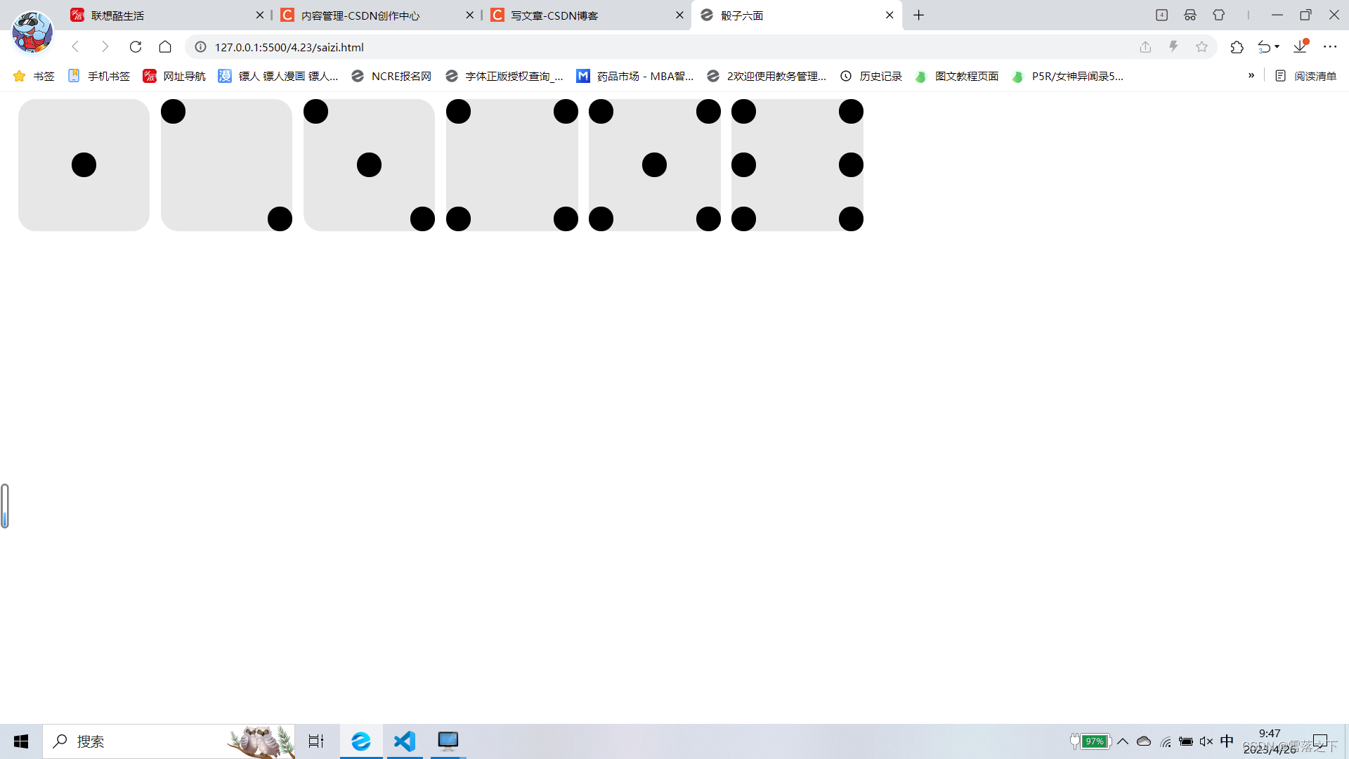
答案
<!DOCTYPE html>
<html lang="en">
<head>
    <meta charset="UTF-8">
    <meta http-equiv="X-UA-Compatible" content="IE=edge">
    <meta name="viewport" content="width=device-width, initial-scale=1.0">
    <title>骰子六面</title>
    <style>
.first-face {
    width: 150px;
    height: 150px;
    background-color: #e7e7e7;
  display: flex;
  /* justify-content: center;
  align-items: center; */
  justify-content: center;
  align-items: center;
  border-radius: 20px / 20px;
  float: left;
  margin-left: 12.5px;
}
.pip{
    width: 28px;
    height: 28px;
    background-color: black;
    border-radius: 20px / 20px;
}
.second-face{
    width: 150px;
    height: 150px;
    background-color: #e7e7e7;
  display: flex;
  /* justify-content: center;
  align-items: center; */

  border-radius: 20px / 20px;
}
.second-face {
  display: flex;
  justify-content: space-between;
  float: left;
  margin-left: 12.5px;
}
.second-face .pip:nth-of-type(2) {
  align-self: flex-end;
}
.second-face .pip:nth-of-type(1) {
  align-self: flex-start;
}

.third-face{
    width: 150px;
    height: 150px;
    background-color: #e7e7e7;
    display: flex;
    justify-content: space-between;
    border-radius: 20px / 20px;
    float: left;
    margin-left: 12.5px;
}
.third-face .pip:nth-of-type(2) {
    align-self: center;
}
.third-face .pip:nth-of-type(3) {
    align-self: flex-end;
}

.fouth-face {
    width: 150px;
    height: 150px;
    background-color: #e7e7e7;
    display: flex;
    justify-content: space-between;
    border-radius: 20px / 20px;
    float: left;
    margin-left: 12.5px;
}
.fouth-face .s-face {
    display: flex;
  flex-direction: column;
  justify-content: space-between;
}

.fifth-face {
    width: 150px;
    height: 150px;
    background-color: #e7e7e7;
    display: flex;
    justify-content: space-between;
    border-radius: 20px / 20px;
    float: left;
    margin-left: 12.5px;
}
.fifth-face .f-face {
    display: flex;
  flex-direction: column;
  justify-content: space-between;
}
.fifth-face .f-face:nth-of-type(2){

    justify-content: center;

}

.sixth-face{
    width: 150px;
    height: 150px;
    background-color: #e7e7e7;
    display: flex;
    justify-content: space-between;
    border-radius: 20px / 20px;
    float: left;
    margin-left: 12.5px;
}
.sixth-face .s-face{
    display: flex;
  flex-direction: column;
  justify-content: space-between;
}
.box{
    width: 1000px;
    height: 150px;
    /* background-color: rgb(111, 111, 111); */
}
    </style>
</head>
<body>
    <div class="box">
    <div class="first-face">
        <span class="pip"></span>

      </div>
    <div class="second-face">
        <span class="pip"></span>
        <span class="pip"></span>
    </div>

    <div class="third-face">
        <span class="pip"></span>
        <span class="pip"></span>
        <span class="pip"></span>
    </div>

    <div class="fouth-face">
        <div class="s-face">
            <span class="pip"></span>
            <span class="pip"></span>
        </div>
        <div class="s-face">
            <span class="pip"></span>
            <span class="pip"></span>
        </div>
    </div>

    <div class="fifth-face">
        <div class="f-face">
            <span class="pip"></span>
            <span class="pip"></span>
        </div>
        <div class="f-face">
        <span class="pip"></span>
    </div>
        <div class="f-face">
            <span class="pip"></span>
            <span class="pip"></span>
        </div>
    </div>

    <div class="sixth-face">
        <div class="s-face">
            <span class="pip"></span>
            <span class="pip"></span>
            <span class="pip"></span>
          </div>
          <div class="s-face">
            <span class="pip"></span>
            <span class="pip"></span>
            <span class="pip"></span>
          </div>
    </div>
</div>
</body>
</html>
| 阿里云国内75折 回扣 微信号:monov8 |
| 阿里云国际,腾讯云国际,低至75折。AWS 93折 免费开户实名账号 代冲值 优惠多多 微信号:monov8 飞机:@monov6 |