CSS 加载进度条
| 阿里云国内75折 回扣 微信号:monov8 |
| 阿里云国际,腾讯云国际,低至75折。AWS 93折 免费开户实名账号 代冲值 优惠多多 微信号:monov8 飞机:@monov6 |
CSS 加载进度条
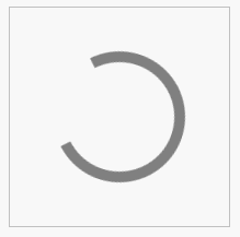
环形加载条
<!DOCTYPE html>
<html>
	<head>
		<meta charset="utf-8">
		<title>环形加载条</title>
		<style type="text/css">
			.box {
				width: 200px;
				height: 200px;
				border: 1px solid silver;
				display: flex;
				justify-content: center;
				align-items: center;
			}

			.circle {
				width: 100px;
				height: 100px;
				border: 10px solid gray;
				border-radius: 50%;
				border-right-color: transparent;
				animation: progress 1s infinite linear;
			}

			@keyframes progress {
				0% {
					transform: rotate(0);
				}

				100% {
					transform: rotate(360deg);
				}
			}
		</style>
	</head>
	<body>
		<div class="box">
			<div class="circle"></div>
		</div>
	</body>
</html>
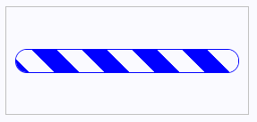
条形加载条
<!DOCTYPE html>
<html>
	<head>
		<meta charset="utf-8">
		<title>条形加载条</title>
		<style type="text/css">
			.box {
				width: 250px;
				height: 100px;
				border: 1px solid silver;
				padding: 10px;
				display: flex;
				align-items: center;
				justify-content: center;
			}

			.progress {
				width: 100%;
				height: 25px;
				border: 1px solid blue;
				border-radius: 25px;
				overflow: hidden;
			}

			.bar {
				width: 100%;
				height: 25px;
				background-image: repeating-linear-gradient(45deg, white 0px, white 20px, blue 20px, blue 40px);
				background-size: 56px 25px;
				animation: move 0.8s linear infinite;
			}

			@keyframes move {
				from {
					background-position: 0 0;
				}

				to {
					background-position: 56px 0;
				}
			}
		</style>
	</head>
	<body>
		<div class="box">
			<div class="progress">
				<div class="bar"></div>
			</div>
		</div>
	</body>
</html>

