

Web前端—CSS高级(定位、高级技巧、CSS修饰属性、综合案例:购物网站轮播图)-CSDN博客
| 阿里云国内75折 回扣 微信号:monov8 |
| 阿里云国际,腾讯云国际,低至75折。AWS 93折 免费开户实名账号 代冲值 优惠多多 微信号:monov8 飞机:@monov6 |
版本说明
当前版本号[20231108]。
| 版本 | 修改说明 |
|---|---|
| 20231107 | 初版 |
| 20231108 | 对知识点圆点进行补充 |
目录
文章目录
day08-CSS高级
目标掌握定位的作用及特点掌握 CSS 高级技巧
01-定位
作用灵活的改变盒子在网页中的位置
实现
1.定位模式position
2.边偏移设置盒子的位置
- left
- right
- top
- bottom
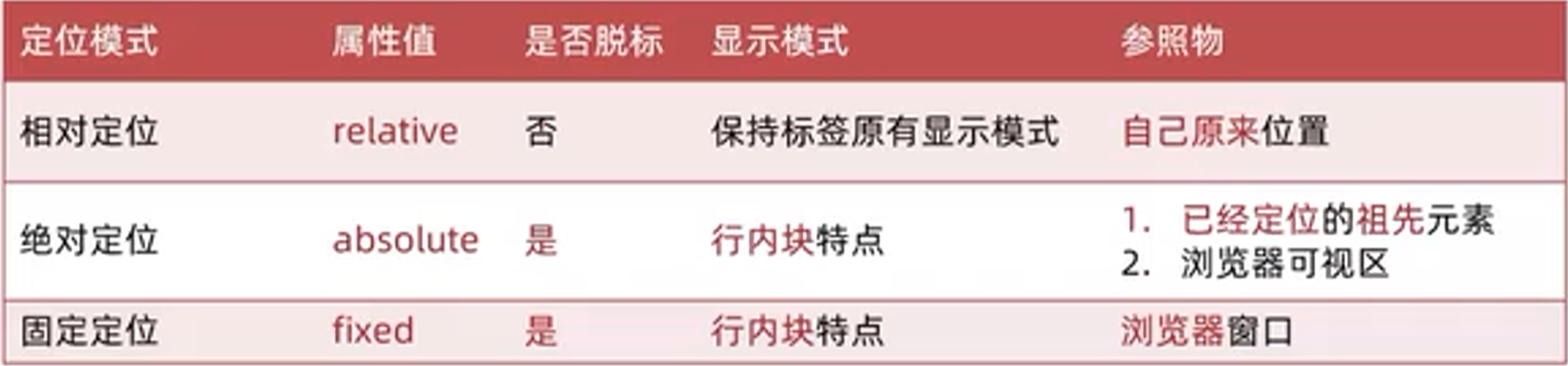
相对定位
position: relative
特点
- 不脱标占用自己原来位置
- 标签显示模式特点保持不变。原来是什么模式相对定位之后还是什么模式。
- 设置边偏移则相对自己原来位置移动
div {
  position: relative;
  top: 100px;
  left: 200px;
}
示例
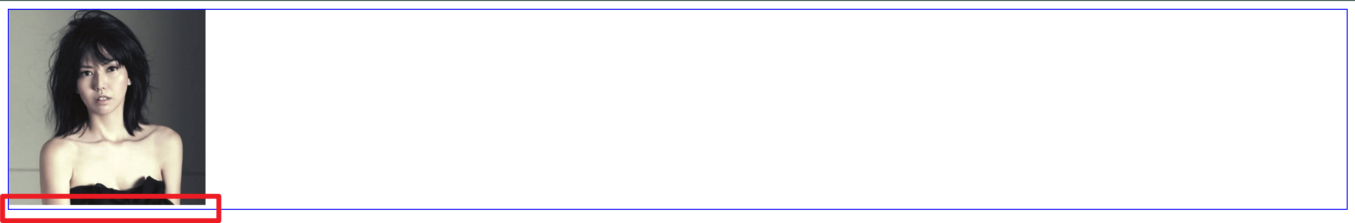
1、原来的文字与图片的位置。
2、加上相对定位可看出图片相对于文字是可以移动的。
.div{
	position: relative; /* 相对定位 */
	top: 100px;
}
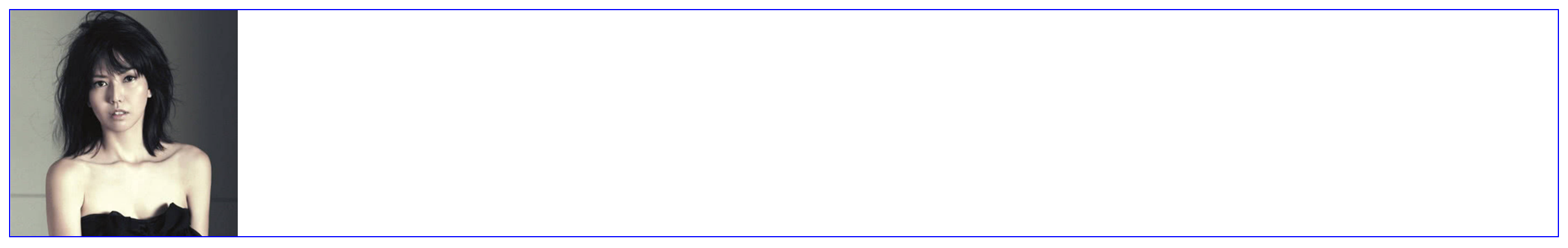
3、加上左边距让图片往右边走。
.div{
	position: relative;
	top: 100px;
	left: 200px;
}
绝对定位
position: absolute
使用场景子级绝对定位父级相对定位子绝父相
特点
- 脱标不占位
- 显示模式具备行内块特点宽高生效
- 设置边偏移则相对最近的已经定位的祖先元素改变位置
- 如果祖先元素都未定位则相对浏览器可视区改变位置
.father {
  position: relative;
}

.father span {
  position: absolute;
  top: 0;
  right: 0;
}
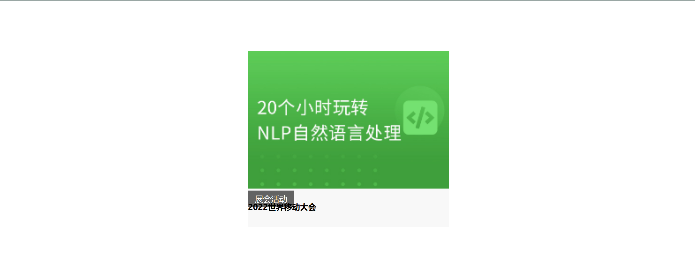
举个例子
写一份样式代码初步把图片及文字大体输出出来
<!DOCTYPE html>
<html>
	<head>
		<meta charset="utf-8">
		<title></title>
		<style>
			img{
				width: 400px;
			}

			.news{
				margin: 100px auto;
				width: 400px;
				height: 350px;
				background-color: #f8f8f8;
			}

			.news span{
				display: block;
				width: 92px;
				height: 32px;
				background-color: rgba(0, 0, 0, 0.6);
				text-align: center;
				line-height: 32px;
				color: #fff;
			}
		</style>
	</head>
	<body>
		<div class="news">
			<img src="./学成在线/uploads/ai03.png" alt="">
			<span>展会活动</span>
			<h4>2022世界移动大会</h4>
		</div>
	</body>
</html>
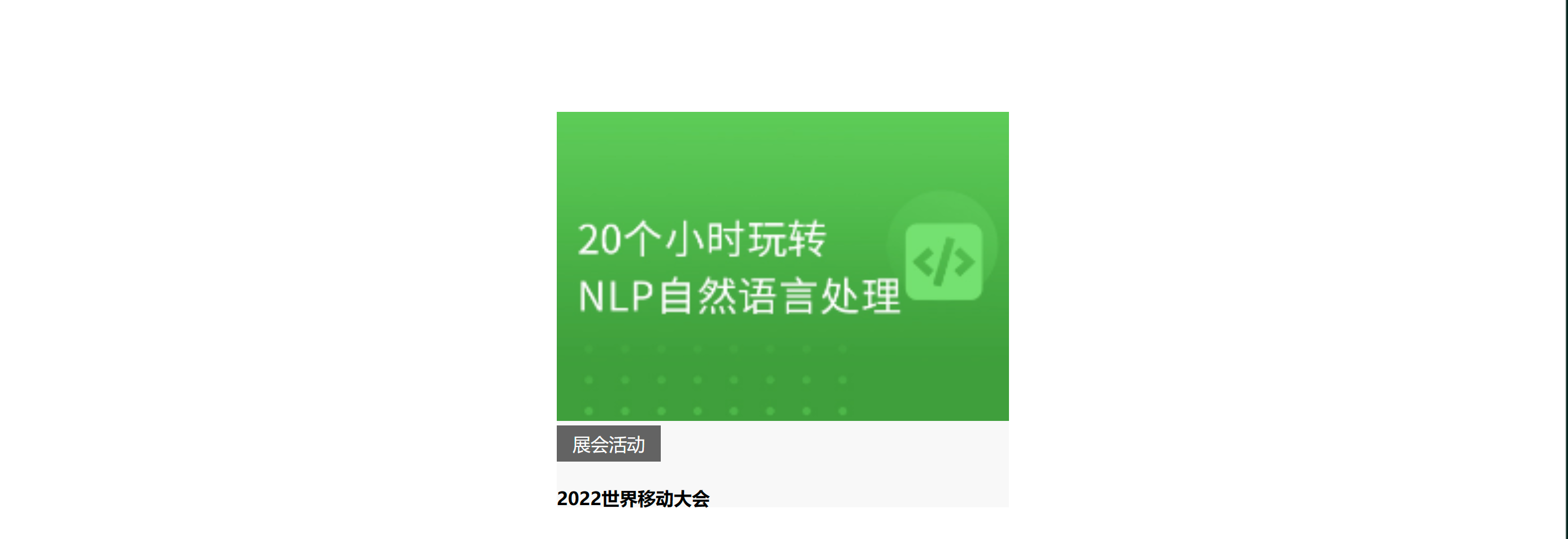
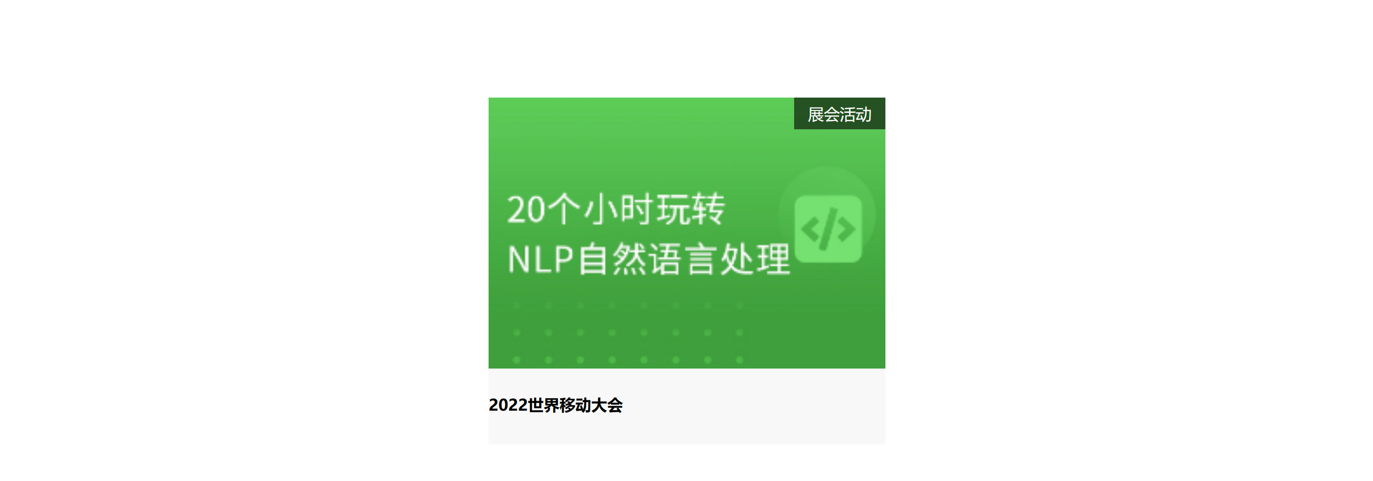
第二步子绝父相子类为绝对定位父类为相对定位可看见“展会活动”定在了文字的上面。
.news{
				/* 如果其他元素在它上面或者左边
				那么这个元素就会相对于那个元素进行定位。 */
				position: relative;
				margin: 100px auto;
				width: 400px;
				height: 350px;
				background-color: #f8f8f8;
			}

.news span{
				/* 元素的位置是相对于最近的已定位祖先元素进行定位。
				如果没有已定位的祖先元素则相对于初始包含块进行定位。 */
				position: absolute;
				display: block;
				width: 92px;
				height: 32px;
				background-color: rgba(0, 0, 0, 0.6);
				text-align: center;
				line-height: 32px;
				color: #fff;
			}
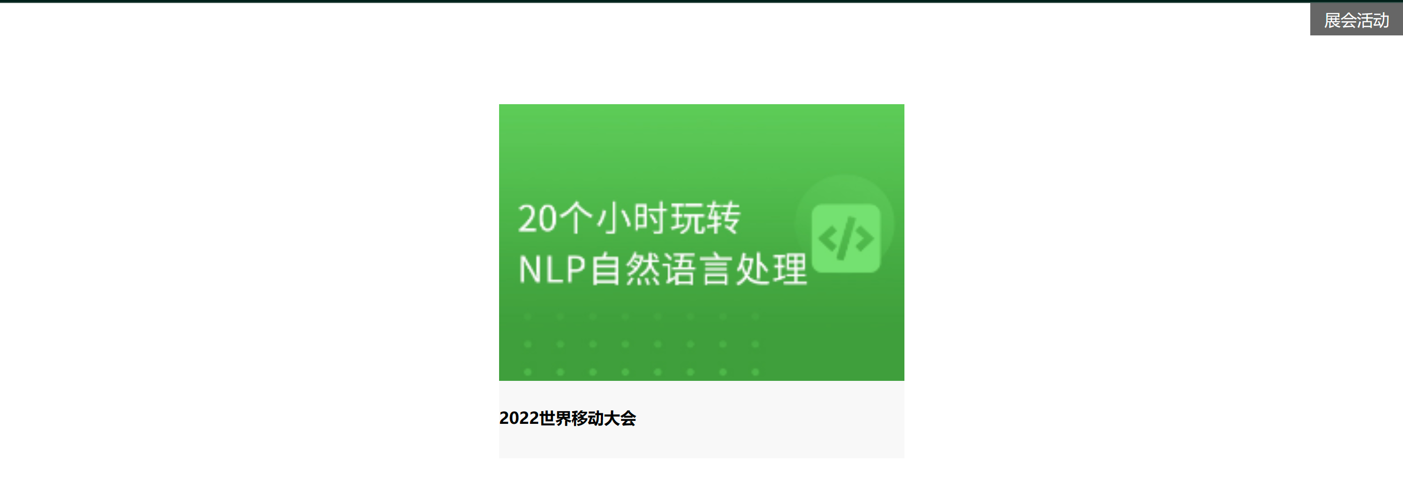
3、想让展会活动在最右上角使用边偏移。
.news span{
				/* 元素的位置是相对于最近的已定位祖先元素进行定位。
				如果没有已定位的祖先元素则相对于初始包含块进行定位。 */
				position: absolute;
				top: 0;
				right: 0;
				display: block;
				width: 92px;
				height: 32px;
				background-color: rgba(0, 0, 0, 0.6);
				text-align: center;
				line-height: 32px;
				color: #fff;
			}
4、如果不遵守子绝父相的原则则聚会活动可能会跑出去到整个页面的最右上角。
.news{
				/* 如果其他元素在它上面或者左边
				那么这个元素就会相对于那个元素进行定位。 */
				/* position: relative; */
				margin: 100px auto;
				width: 400px;
				height: 350px;
				background-color: #f8f8f8;
			}
定位居中
实现步骤
- 绝对定位
- 水平、垂直边偏移为 50%
- 子级向左、上移动自身尺寸的一半
- 左、上的外边距为 –尺寸的一半
- transform: translate(-50%, -50%)
img {
  position: absolute;
  left: 50%;
  top: 50%;

  /* margin-left: -265px;
  margin-top: -127px; */

  /* 方便 50% 就是自己宽高的一半 */
  transform: translate(-50%, -50%);
}
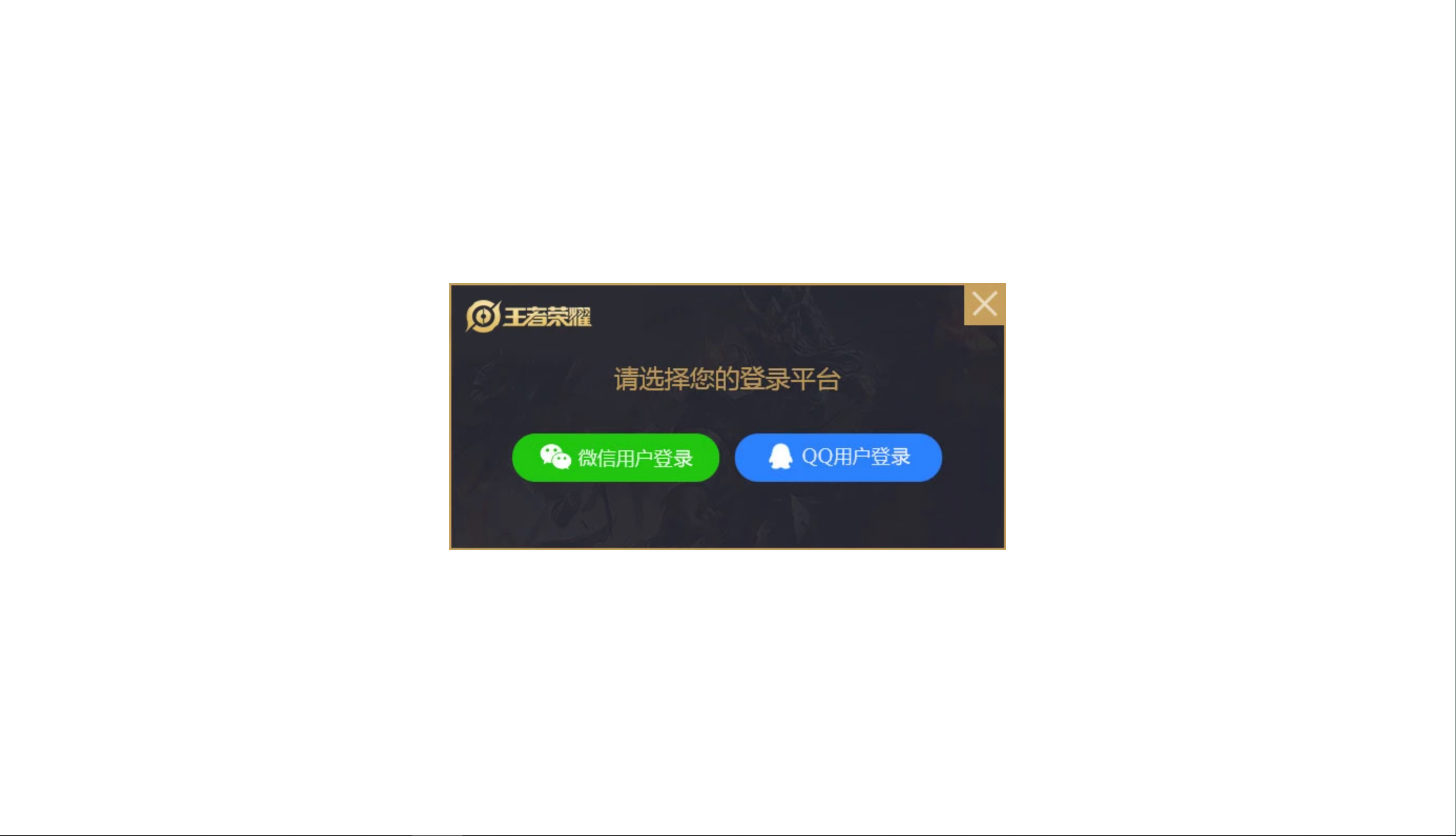
就比如将下图以绝对定位的形式来居中
<!DOCTYPE html>
<html>
	<head>
		<meta charset="utf-8">
		<title></title>
		<style>
			img{
				position: absolute;
				left: 50%;
				top: 50%;
				transform: translate(-50%, -50%);
			}
		</style>
	</head>
	<body>
			<img src="../img/login.webp" alt="">
	</body>
</html>
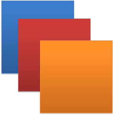
固定定位
position: fixed
场景元素的位置在网页滚动时不会改变
特点
- 脱标不占位
- 显示模式具备行内块特点
- 设置边偏移相对浏览器窗口改变位置
div {
  position: fixed;
  top: 0;
  right: 0;

  width: 500px;
}
可见即使往下滚动右边绿色的图片也不会动。

堆叠层级 z-index
默认效果按照标签书写顺序后来者居上
作用设置定位元素的层级顺序改变定位元素的显示顺序
属性名z-index
属性值整数数字默认值为0取值越大层级越高
.box1 {
  background-color: pink;
  /* 取值是整数默认是0取值越大显示顺序越靠上 */
  z-index: 1;
}

.box2 {
  background-color: skyblue;
  left: 100px;
  top: 100px;

  z-index: 2;
}
1、首先建立两个div模型。
<!DOCTYPE html>
<html>
	<head>
		<meta charset="utf-8">
		<title>定位</title>
		<style>
			div{
				width: 200px;
				height: 200px;
			}
			.box1{
				background-color: pink;
			}
			.box2{
				background-color: skyblue;
			}
		</style>
	</head>
	<body>
		<div class="box1">box1</div>
		<div class="box2">box2</div>
	</body>
</html>
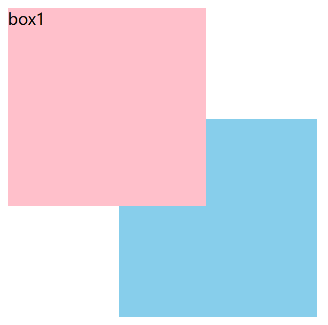
2、两个模型的位置如下。
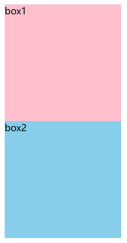
3、设置div元素的定位方式为绝对定位。
position: absolute;
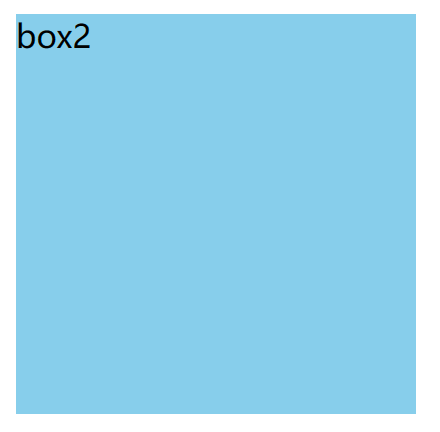
4、当打开检查后就可以发现其实是蓝色的box2盖住了粉红的box1把蓝色底色去掉粉红色就暴露出来了。
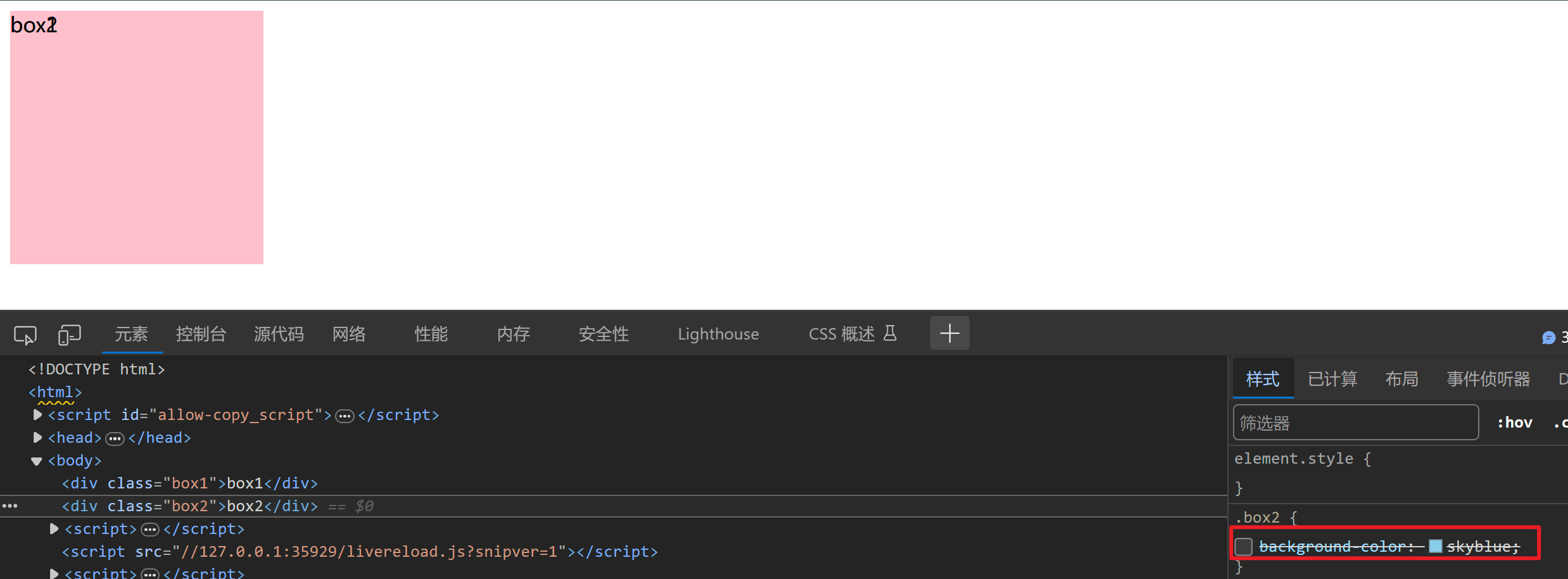
5、那就改变box1定位元素的层级顺序和显示顺序。为了更好让粉红色box1显示在蓝色box2前面可以给蓝色box2增加一些left和top的距离。
.box1{
				background-color: pink;
				/* 取值是整数默认是0
				取值越大显示顺序越靠上 */
				z-index: 1;
			}
.box2{
				background-color: skyblue;
				left: 120px;
				top: 120px;
			}
6、看得出来目前box1已经显示在了box2的前面了。
定位总结
02-高级技巧
CSS精灵
CSS 精灵也叫 CSS Sprites是一种网页图片应用处理方式。把网页中一些背景图片整合到一张图片文件中再background-position 精确的定位出背景图片的位置。

优点减少服务器被请求次数减轻服务器的压力提高页面加载速度
实现步骤
- 创建盒子盒子尺寸与小图尺寸相同
- 设置盒子背景图为精灵图
- 添加 background-position 属性改变背景图位置
3.1 使用 PxCook 测量小图片左上角坐标
3.2 取负数坐标为 background-position 属性值向左上移动图片位置
如想在以下大图中找到“N”
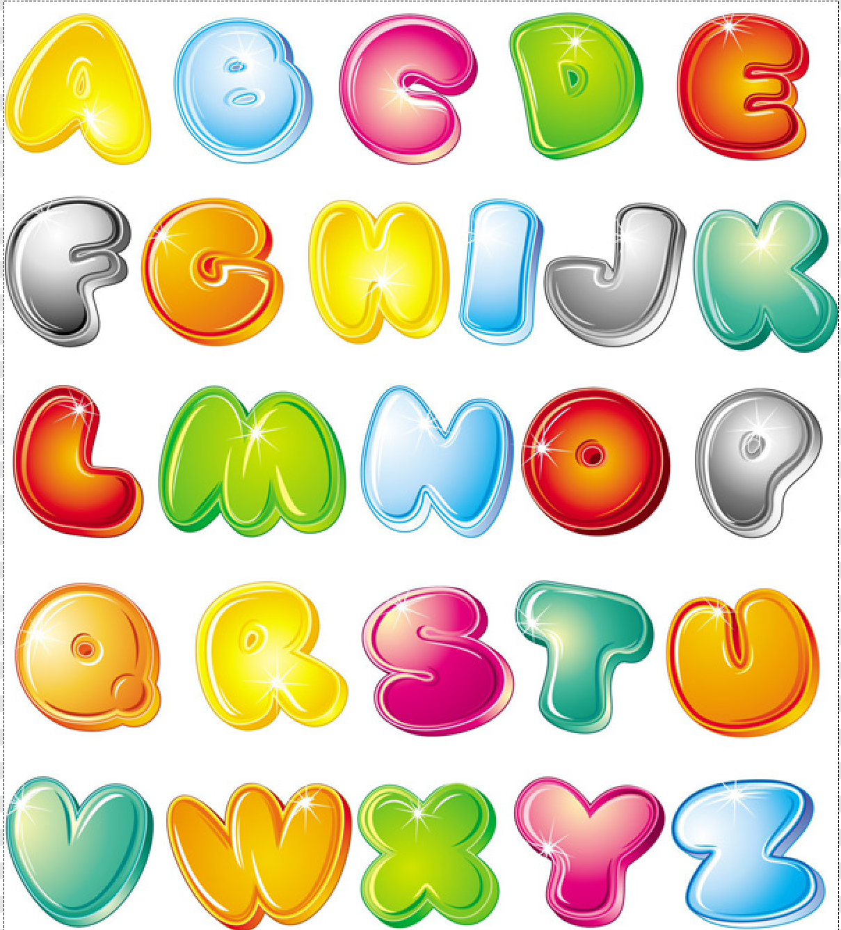
1、创建盒子盒子尺寸与小图尺寸相同。
width: 112px;
height: 110px;
background-color: pink;
2、设置盒子背景图为精灵图。
background-image: url(../img/abcd.jpg);
3、添加 background-position 属性后面跟着 精灵图左上角坐标 从而改变背景图位置
要记得取的是负数坐标!才能往左上角去移动) 。
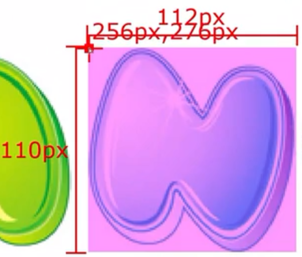
代码为
div{
				width: 112px;
				height: 110px;
				background-color: pink;
				background-image: url(../img/abcd.jpg);
				background-position: -256px -276px;
			}
最后得到我们想要的

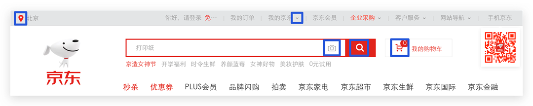
案例-京东服务
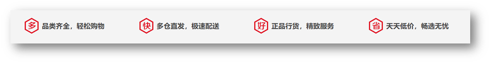
HTML结构
<div class="service">
  <ul>
    <li>
      <h5></h5>
      <p>品类齐全轻松购物</p>
    </li>
    <li>
      <h5></h5>
      <p>多仓直发极速配送</p>
    </li>
    <li>
      <h5></h5>
      <p>正品行货精致服务</p>
    </li>
    <li>
      <h5></h5>
      <p>天天低价畅选无忧</p>
    </li>
  </ul>
</div>
CSS样式
<style>
  * {
    margin: 0;
    padding: 0;
    box-sizing: border-box;
  }

  li {
    list-style: none;
  }

  .service {
    margin: 100px auto;
    width: 1190px;
    height: 42px;
    /* background-color: pink; */
  }

  .service ul {
    display: flex;
  }

  .service li {
    display: flex;
    padding-left: 40px;
    width: 297px;
    height: 42px;
    /* background-color: skyblue; */
  }

  .service li h5 {
    margin-right: 10px;
    width: 36px;
    height: 42px;
    /* background-color: pink; */
    background: url(./images/sprite.png) 0 -192px;
  }

  .service li:nth-child(2) h5 {
    background-position: -41px -192px;
  }

  .service li:nth-child(3) h5 {
    background-position: -82px -192px;
  }

  .service li:nth-child(4) h5 {
    background-position: -123px -192px;
  }

  .service li p {
    font-size: 18px;
    color: #444;
    font-weight: 700;
    line-height: 42px;
  }
</style>
1、首先写好版心
*选择器表示匹配页面中的所有元素。通过将margin、padding和box-sizing属性设置为0可以消除所有元素的外边距和内边距并使用border-box布局模型来包含元素的边框和内边距。li选择器表示匹配所有的列表项元素<li>。通过将list-style属性设置为none可以移除列表项前的默认样式通常是圆点或数字。.service选择器表示匹配具有类名service的元素。设置元素水平居中固定好元素的宽度和高度。最后将元素的背景颜色设置为粉红色。
*{
    margin: 0;
    padding: 0;
    box-sizing: border-box;
}
li{
    list-style: none;
}
.service{
    margin: 100px auto;
    width: 1190px;
    height: 42px;
    background-color: pink;
}
2、将具有类名 service 的元素中的四个无序列表进行样式化使其以弹性盒子的形式布局并且每个列表项具有固定的宽度、高度和背景颜色。
.service ul{
    display: flex;
}

.service li{
    width: 297px;
    height: 42px;
    background-color: skyblue;
}

3、设置元素的左内边距。调整指定元素内容与左侧边框之间的空间大小。通过设置 padding-left 为 40px元素的内容将在其左侧留出40像素的空白区域。
padding-left: 40px;

4、填写文字。
.service li{
				display: flex;
				padding-left: 40px;
				width: 297px;
				height: 42px;
				background-color: skyblue;
			}
<li>
					<h5>1</h5>
					<p>品类齐全轻松购物</p>
				</li>

5、插入图片并定好位。
.service li h5{
				width: 36px;
				height: 42px;
				background-image: url(../img/sprite.png);
				background-position: 0px -192px;
			}

6、为具有类名 “service” 的元素中的列表项<li>内的标题<h5>和段落<p>元素设置样式。标题元素的背景图像和位置根据指定的路径和偏移量进行设置而段落元素则设置了顶部外边距和字体大小。
.service li h5{
    width: 36px;
    height: 42px;
    margin-right: 15px;
    background-image: url(../img/sprite.png);
    background-position: 0px -192px;
}

.service li p{
    margin-top: 10px;
    font-size: 17px;
}

7、然后把li标签全部复制好粘上去。

8、通过css标签修改第二个精灵图。
.service li:nth-child(2) h5{
    background-position: -41px -192px;
}

9、通过像素工厂对设计图进行测量得出以下所需数据。

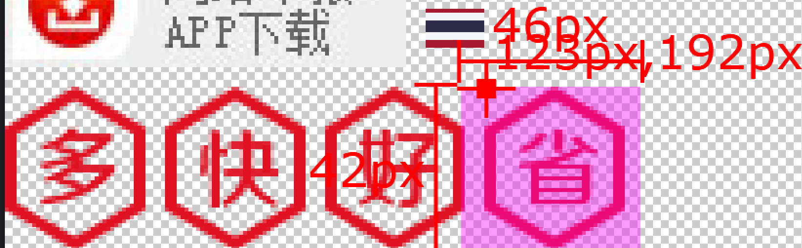
.service li:nth-child(3) h5{
    background-position: -82px -192px;
}
.service li:nth-child(4) h5{
    background-position: -123px -192px;
}

10、改变字体大小。
.service li p{
				font-size: 18px;
				color: #444;
				font-weight: 700;
				line-height: 42px;
			}

11、最后去除蓝色和粉红色的背景颜色。

字体图标
字体图标展示的是图标本质是字体
作用在网页中添加简单的、颜色单一的小图标
优点
- 灵活性灵活地修改样式例如尺寸、颜色等
- 轻量级体积小、渲染快、降低服务器请求次数
- 兼容性几乎兼容所有主流浏览器
- 使用方便先下载再使用
下载字体
iconfont 图标库https://www.iconfont.cn/
登录 → 素材库 → 官方图标库 → 进入图标库 → 选图标加入购物车 → 购物车添加至项目确定 → 下载至本地
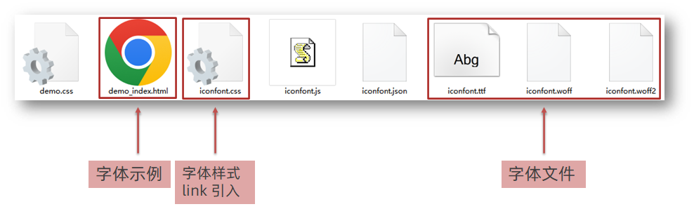
使用字体
- 引入字体样式表iconfont.css
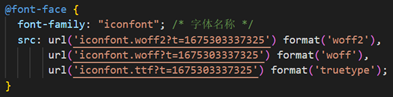
也可以是
<link rel="stylesheet" href="../../Iconfont/iconfont.css">
- 标签使用字体图标类名
- iconfont字体图标基本样式字体名字体大小等等
- icon-xxx图标对应的类名

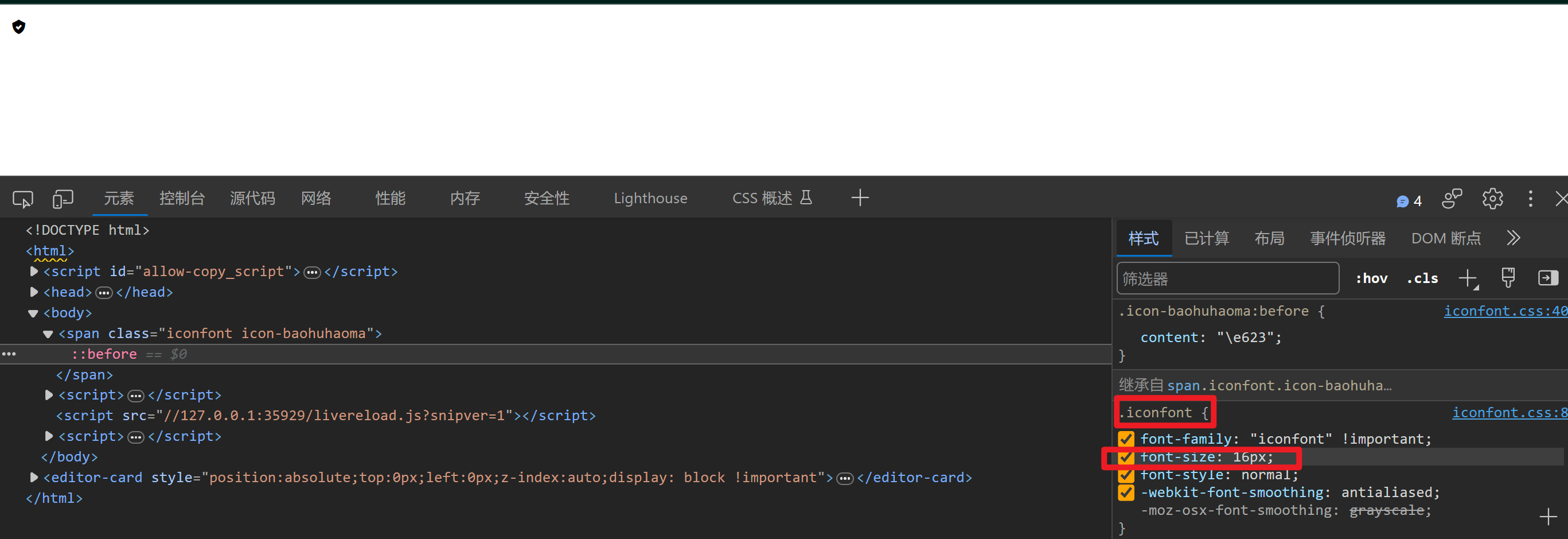
1、如果想使用的话可以打开iconfont 的html页面 切换到 Font class。
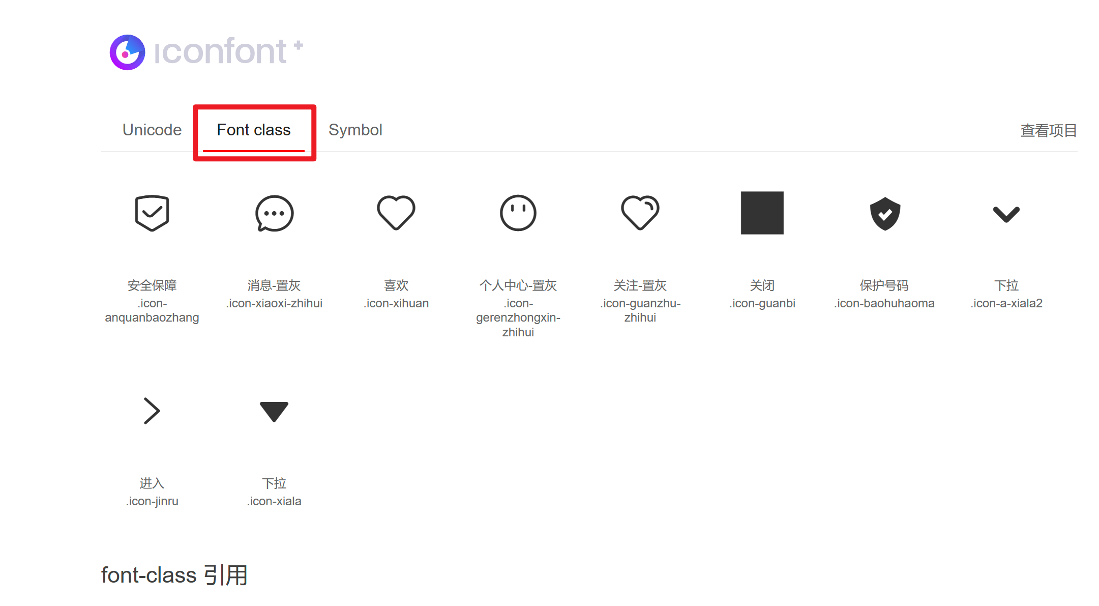
2、直接复制下面的类名即可【如果有 . 的话要记得删除嗷】。
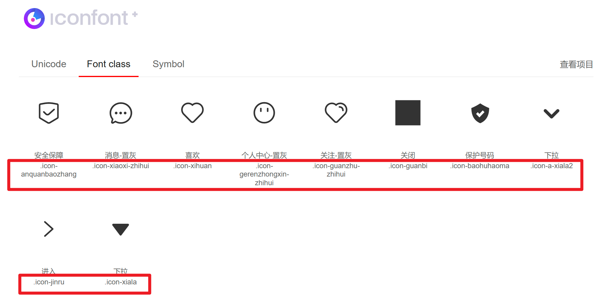
3、就可以得到了。
<!DOCTYPE html>
<html>
<head>
<meta charset="utf-8">
<title>图标使用</title>
<link rel="stylesheet" href="../../Iconfont/iconfont.css">
</head>
<body>
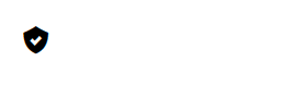
<span class="iconfont icon-baohuhaoma"></span>
</body>
</html>
4、如果需要修改字体图标的大小或颜色可以使用类选择器 .iconfont 进行修改。
<style>
		.iconfont{
			font-size: 200px;
			color: aqua;
		}
	</style>
5、如果你使用了span 标签选择器由于类选择器权限比span大因此会出现部分代码无法生效。
<style>
		.span{
			font-size: 200px;
			color: aqua;
		}
	</style>
上传矢量图
作用项目特有的图标上传到 iconfont 图标库生成字体

上传步骤上传 → 上传图标 → 选择 svg 矢量图打开 → 提交 → 系统审核
03-CSS修饰属性
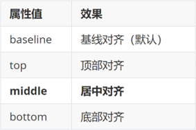
垂直对齐方式
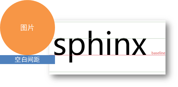
属性名vertical-align
1、首先设置一个框。
2、接着在css代码中加入 vertical-align 去测试效果。
PSvertical-align: middle; 使图像和文字的垂直对齐方式设置为居中
注在这里哪个占的空间大就在哪个标签下加入这段代码
img{
   /* 将图像的垂直对齐方式设置为居中使其在父容器中垂直方向上居中对齐。 */
    vertical-align: middle;
}
3、居中对齐效果如下。
img{
				height: 200px;
				/* vertical-align: middle; */
				/* 顶对齐最高内容的顶部 */
				vertical-align: top;
			}
4、顶部对齐效果如下。
img{
				height: 200px;
				/* vertical-align: middle; */
				/* 顶对齐最高内容的顶部 */
				/* vertical-align: top; */
				/* 底对齐最高内容的底部 */
				vertical-align: bottom;
			}
5、底部对齐效果如下。
6、如果只是想让图片下面与边框没有空格的话
7、可以使用display: block;。
因为他可以将元素显示为块级元素。块级元素会独占一行其宽度默认为100%并且可以设置高度、内外边距和边框等属性。
过渡
作用可以为一个元素在不同状态之间切换的时候添加过渡效果
属性名transition复合属性
属性值过渡的属性 花费时间 (s)
提示
- 过渡的属性可以是具体的 CSS 属性
- 也可以为 all两个状态属性值不同的所有属性都产生过渡效果
- transition 设置给元素本身
img {
  width: 200px;
  height: 200px;
  transition: all 1s;
}

img:hover {
  width: 500px;
  height: 500px;
}
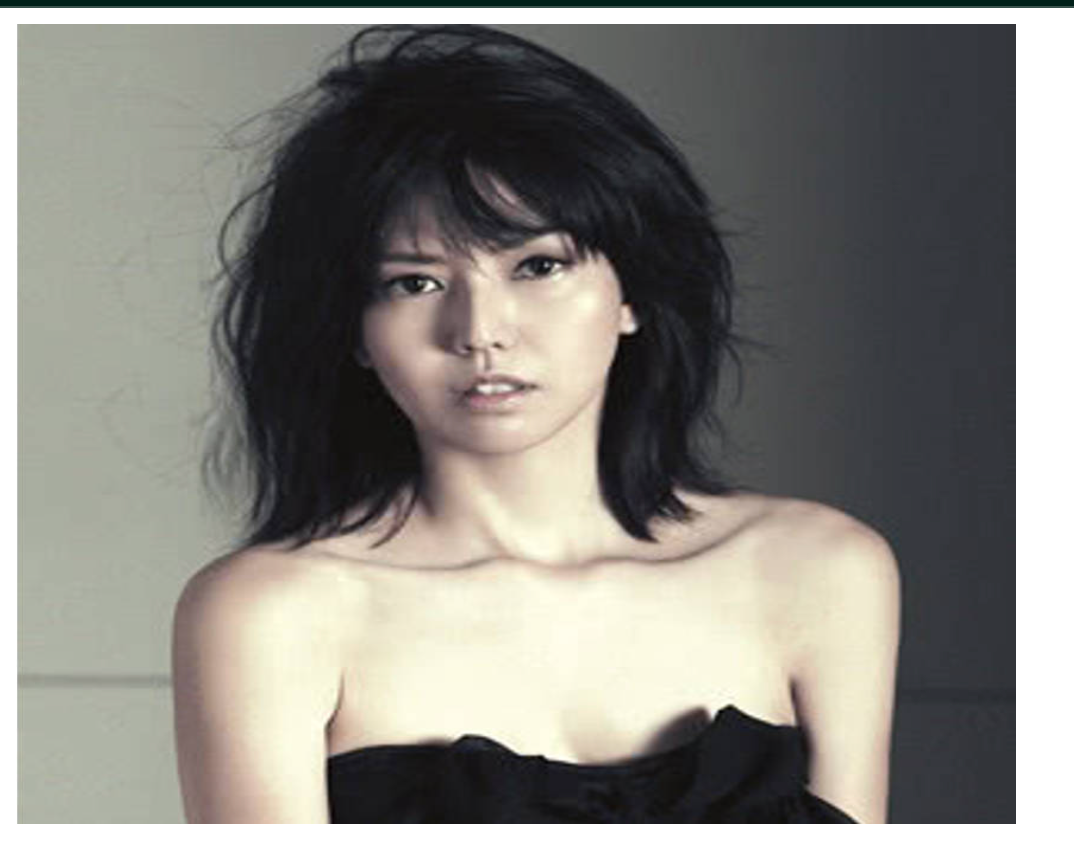
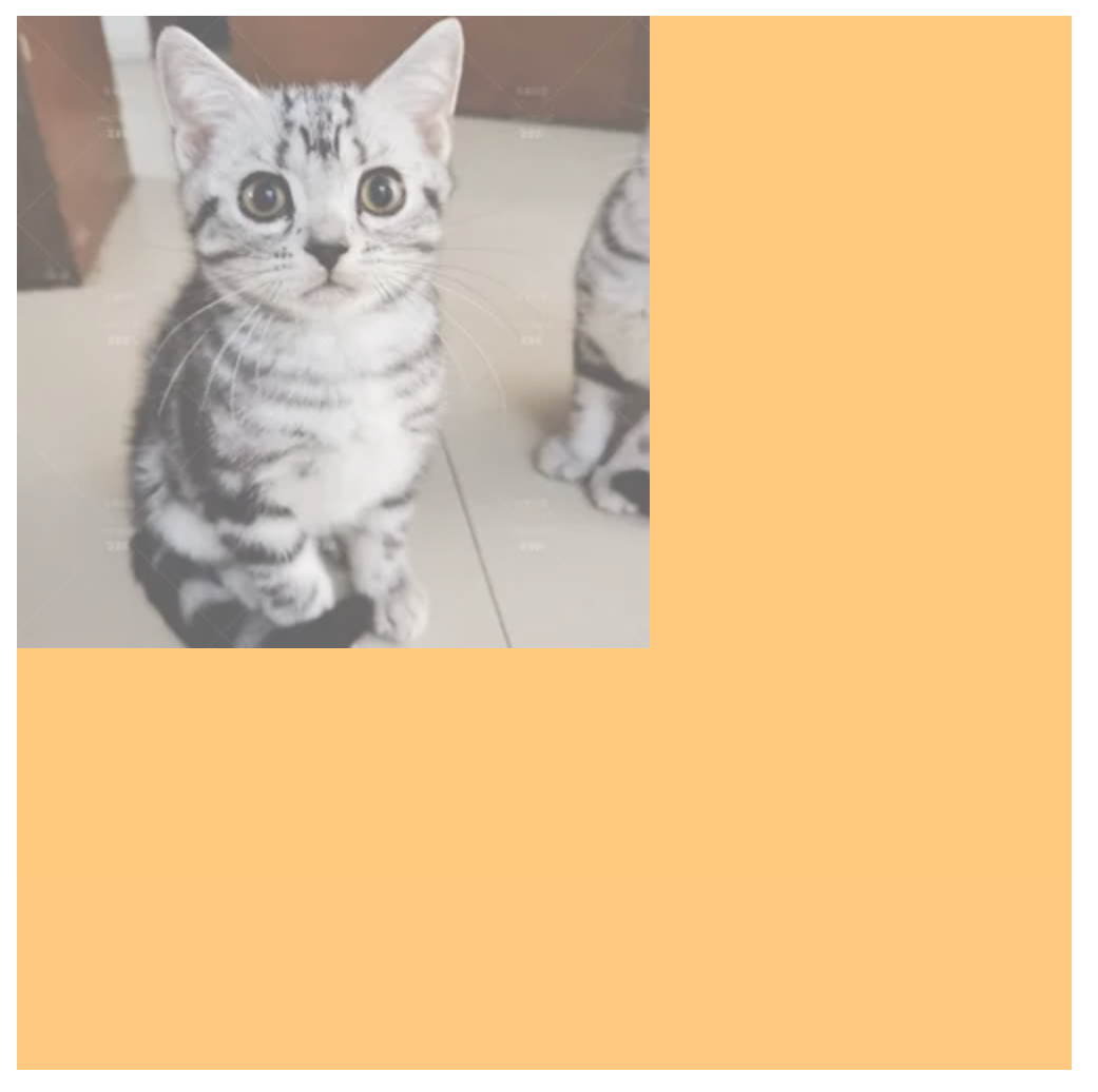
1、先插入一张照片。

2、实现图片的缩放可变大可变小效果。
<style>
			img{
				width: 200px;
				height: 150px;
				transition: all 0.5s;
			}
			img:hover{
				width: 500px;
				height: 400px;
			}
		</style>
透明度opacity
作用设置整个元素的透明度包含背景和内容
属性名opacity
属性值0 – 1
- 0完全透明元素不可见
- 1不透明
- 0-1之间小数半透明
1、首先先插入一张图片。
<style>
			div{
				width: 500px;
				height: 500px;
				background-color: orange;
			}
		</style>
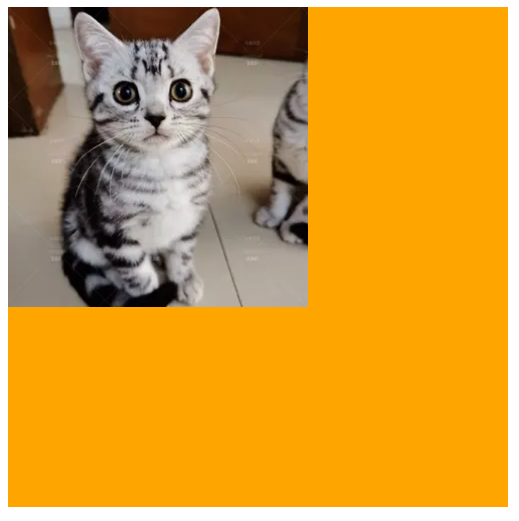
2、加上透明效果
opacity: 0.6;
光标类型cursor
作用鼠标悬停在元素上时指针显示样式
属性名cursor
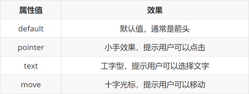
<style>
			div{
				width: 200px;
				height: 200px;
				cursor: pointer;
			}
		</style>
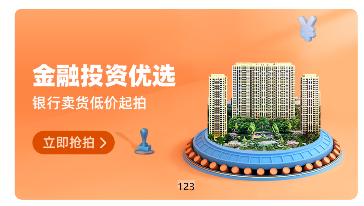
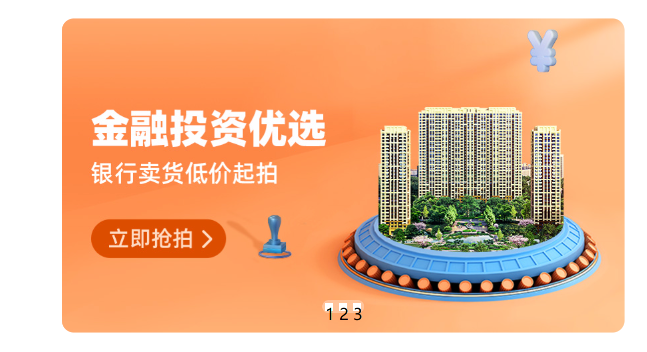
04-综合案例-轮播图
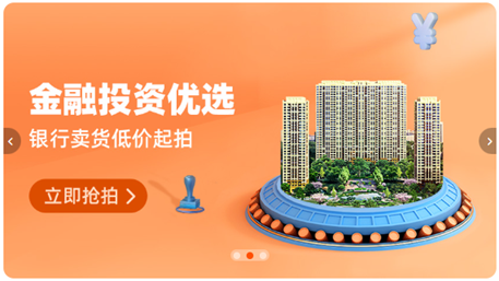
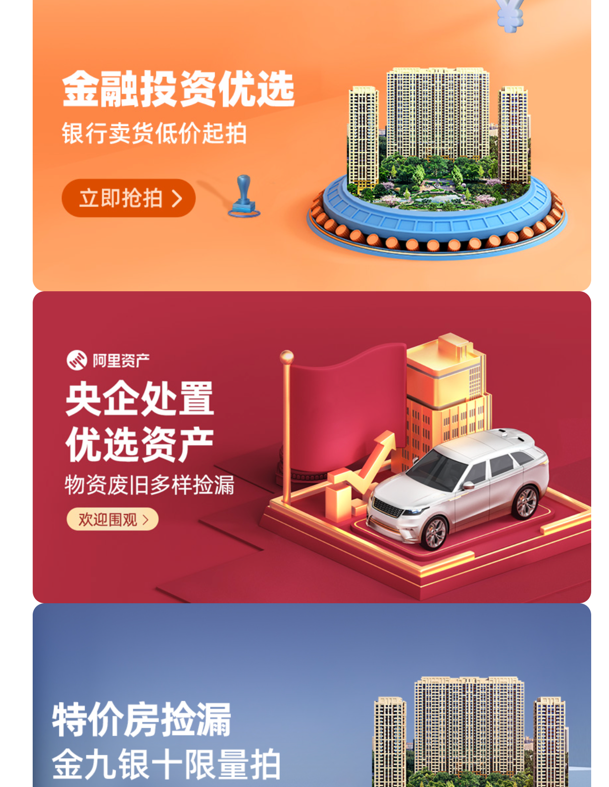
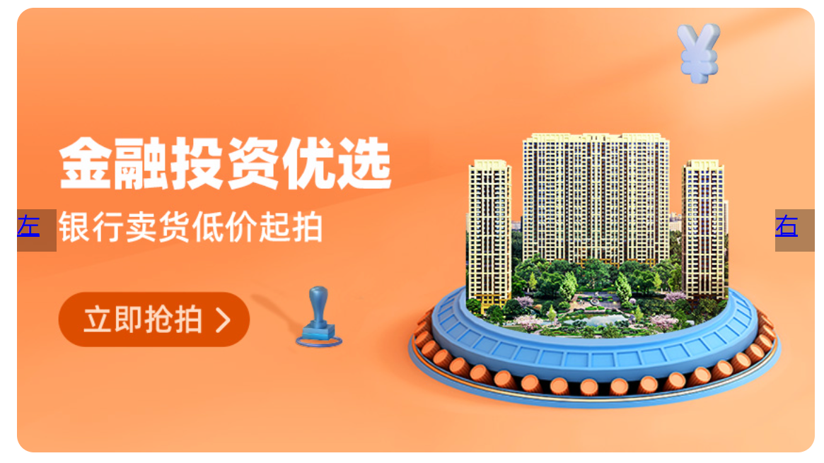
图片效果
HTML结构
<div class="banner">
    <!-- 图: ul > li -->
    <ul>
      <li><a href="#"><img src="./images/banner1.jpg" alt=""></a></li>
      <li><a href="#"><img src="./images/banner2.jpg" alt=""></a></li>
      <li><a href="#"><img src="./images/banner3.jpg" alt=""></a></li>
    </ul>
</div>
CSS样式
* {
  margin: 0;
  padding: 0;
  box-sizing: border-box;
}

li {
  list-style: none;
}

.banner {
  position: relative;
  margin: 100px auto;
  width: 564px;
  height: 315px;
  /* background-color: pink; */
  overflow: hidden;
}

/* 图片 */
.banner img {
  width: 564px;
  border-radius: 12px;
  vertical-align: middle;
}

.banner ul {
  display: flex;
}
1、初步建立框架。
<!DOCTYPE html>
<html>
	<head>
		<meta charset="utf-8">
		<title>淘宝</title>
		<style>
			*{
				margin: 0;
				padding: 0;
				box-sizing: border-box;
			}
			li{
				list-style: none;
			}
			.banner{
				margin: 100px auto;
				width: 564px;
				height: 315px;
				background-color: pink;
			}
			.banner img{
				width: 564px;
			}
		</style>
	</head>
	<body>
		<div class="banner">
			<ul>
				<li><a href="#"><img src="../img/banner1.jpg" alt=""></a></li>
			</ul>
		</div>
	</body>
</html>

2、列出三个li标签并让他们不留空隙的对齐。
vertical-align:用于设置元素的垂直对齐方式。当设置为 middle 时元素会相对于它的父容器的基线进行垂直居中对齐。
vertical-align: middle;
3、把剩下三个隐藏。
.banner{
				margin: 100px auto;
				width: 564px;
				height: 315px;
				/* background-color: pink; */
				/* 用于设置元素的溢出内容是否显示。
				当设置为 hidden 时
				元素的内容超出其容器范围时会被隐藏
				不会显示在页面上。 */
				overflow: hidden;
			}
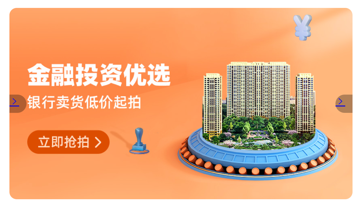
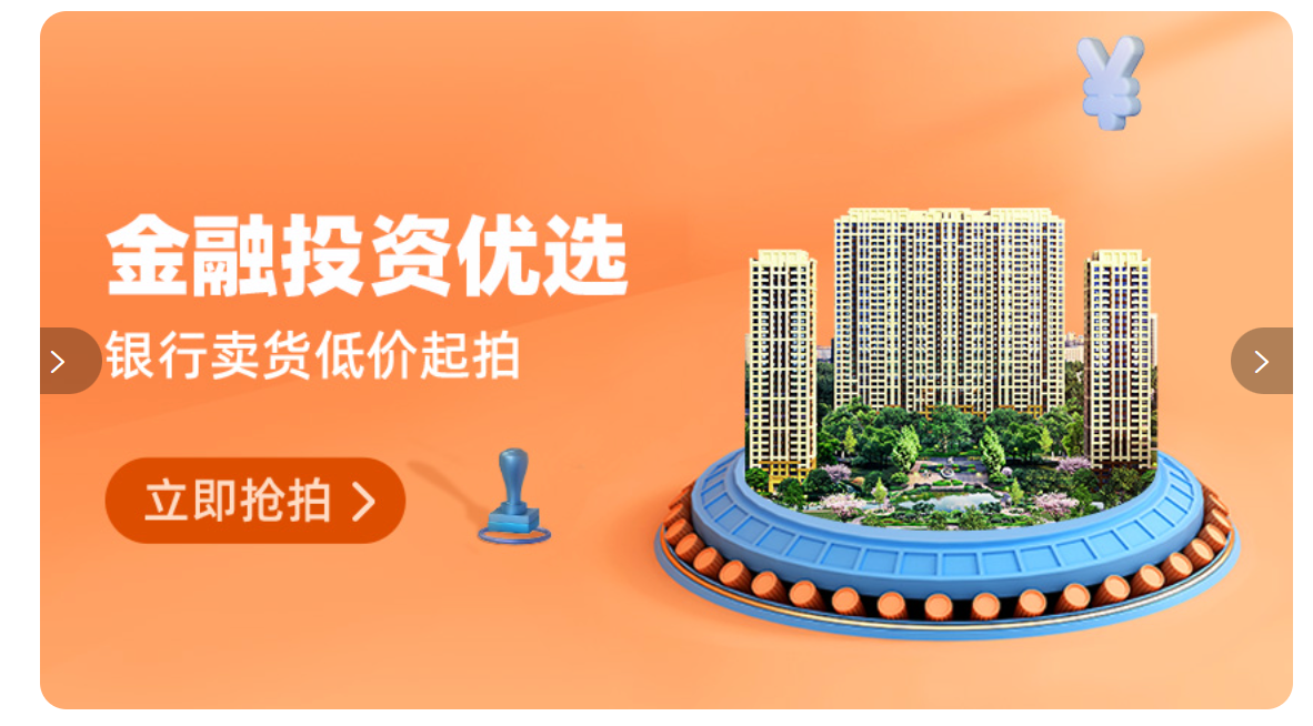
箭头
HTML结构
<!-- 箭头 -->
<!-- 上一张 prev -->
<a href="#" class="prev">
  <i class="iconfont icon-zuoce"></i>
</a>
<!-- 下一张 next -->
<a href="#" class="next">
  <i class="iconfont icon-youce"></i>
</a>
CSS样式
/* 箭头 */
.banner .prev,
.banner .next {
  /* 隐藏 */
  display: none;
  position: absolute;
  top: 50%;
  transform: translateY(-50%);

  width: 20px;
  height: 30px;
  background-color: rgba(0,0,0, 0.3);

  text-decoration: none;
  color: #fff;
  line-height: 30px;
}

/* 鼠标滑到banner区域箭头要显示 display:block */
.banner:hover .prev,
.banner:hover .next {
  display: block;
}

.banner .prev {
  left: 0;
  border-radius: 0 15px 15px 0;
}

.banner .next {
  right: 0;
  border-radius: 15px 0 0 15px;
  text-align: center;
}
1、先把一边弄出来。
<!DOCTYPE html>
<html>
	<head>
		<meta charset="utf-8">
		<title>淘宝</title>
		<style>
			*{
				margin: 0;
				padding: 0;
				box-sizing: border-box;
			}
			li{
				list-style: none;
			}
			.banner{
				position: relative;
				margin: 100px auto;
				width: 564px;
				height: 315px;
				/* background-color: pink; */
				overflow: hidden;
			}
			.banner img{
				width: 564px;
				border-radius: 12px;
				vertical-align: middle;
			}
			.banner ul{
				display: flex;
			}
			/* 对于两个有相同的内容放这里 */
			.banner .prev,
			.banner .next{
				position: absolute;
				top: 50%;
				transform: translateY(-50%);
				width: 28px;
				height: 30px;
				background-color: rgba(0, 0, 0, 0.3);
			}
			.banner .prev{

			}
			.banner .next{

			}
		</style>
	</head>
	<body>
		<div class="banner">
			<ul>
				<li><a href="#"><img src="../img/banner1.jpg" alt=""></a></li>
				<li><a href="#"><img src="../img/banner2.jpg" alt=""></a></li>
				<li><a href="#"><img src="../img/banner3.jpg" alt=""></a></li>
			</ul>
			<!-- 箭头 -->
			<!-- 上一张 prev -->
			<a href="#" class="prev">左</a>
			<!-- 下一张 next -->
			<a href="#" class="next">右</a>
		</div>
	</body>
</html>

2、然后把左、右的定位都弄出来。
.banner .prev{
				left: 0;
			}
			.banner .next{
				right: 0;
			}
3、然后把两边边框弄圆每一个都只需要弄一边即可。
.banner .prev{
				left: 0;
				border-radius: 0 15px 15px 0;
			}
			.banner .next{
				right: 0;
				border-radius: 15px 0 0 15px;
			}

4、引入字体图标让两个箭头显现。
<!-- 上一张 prev -->
			<a href="#" class="prev">
				<i class="iconfont icon-jinru"></i>
			</a>
			<!-- 下一张 next -->
			<a href="#" class="next">
				<i class="iconfont icon-jinru"></i>
			</a>
5、改好样式。
/* 对于两个有相同的内容放这里 */
			.banner .prev,
			.banner .next{
				position: absolute;
				top: 50%;
				transform: translateY(-50%);
				width: 28px;
				height: 30px;
				background-color: rgba(0, 0, 0, 0.3);
				text-decoration: none;
				color: #fff;
				line-height: 30px;
			}
			.banner .prev{
				left: 0;
				border-radius: 0 15px 15px 0;
			}
			.banner .next{
				right: 0;
				border-radius: 15px 0 0 15px;
				text-align: center;
			}
6、将这两个箭头先隐藏。
.banner .prev,
.banner .next{
	display: none;
}
7、再显现实现只有鼠标移动到该区域箭头才会显现。
			/* 当鼠标移动banner区域prev和next箭头就显现 */
			.banner:hover .prev,
			.banner:hover .next{
				display: block;
			}
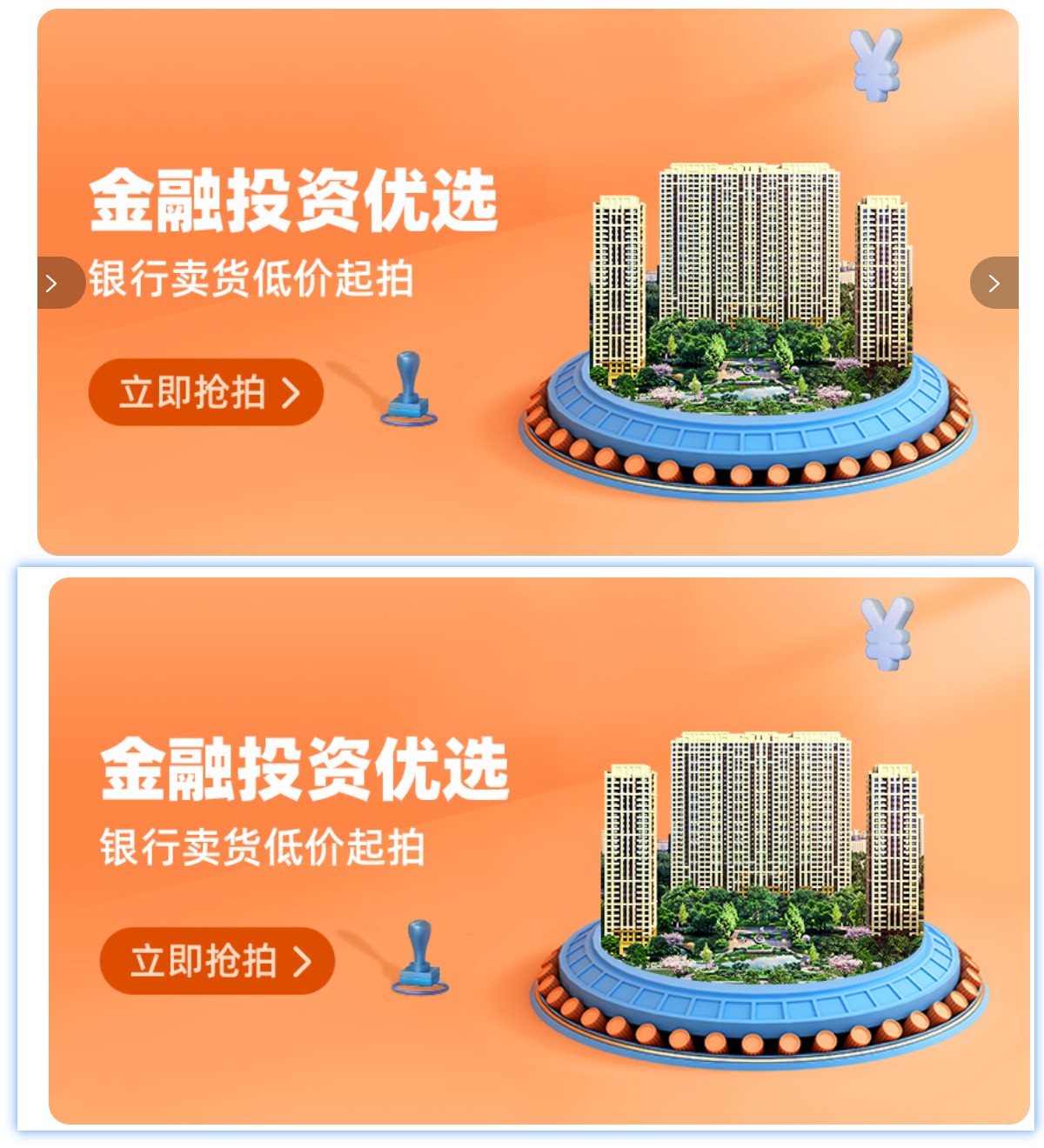
圆点
HTML结构
<!-- 圆点 -->
<ol>
  <li></li>
  <li class="active"></li>
  <li></li>
</ol>
CSS样式
/* 圆点 */
.banner ol {
  position: absolute;
  bottom: 20px;
  left: 50%;
  transform: translateX(-50%);
  height: 13px;
  background-color: rgba(255,255,255,0.3);

  display: flex;

  border-radius: 10px;
}

.banner ol li {
  margin: 3px;
  width: 8px;
  height: 8px;
  background-color: #fff;
  border-radius: 50%;
  cursor: pointer;
}

/* 橙色的li */
.banner ol .active {
  background-color: #ff5000;
}
1、给圆点建ol标签。
.banner ol{
				position: absolute;
				height: 13px;
				background-color: rgba(255,255,255,0.3);
				bottom: 20px;
				left: 50%;
				transform: translatex(-50%);
			}
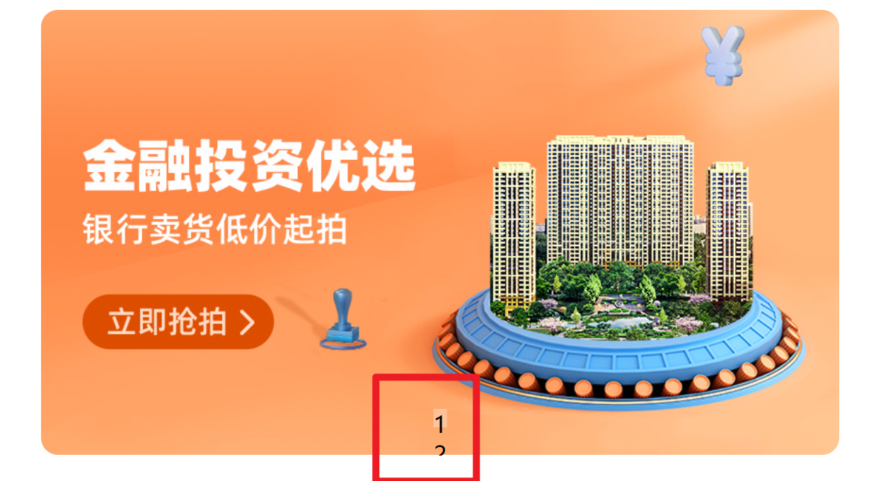
2、使其并排。
display: flex;
3、改变成圆角的形式。
border-radius: 10px;
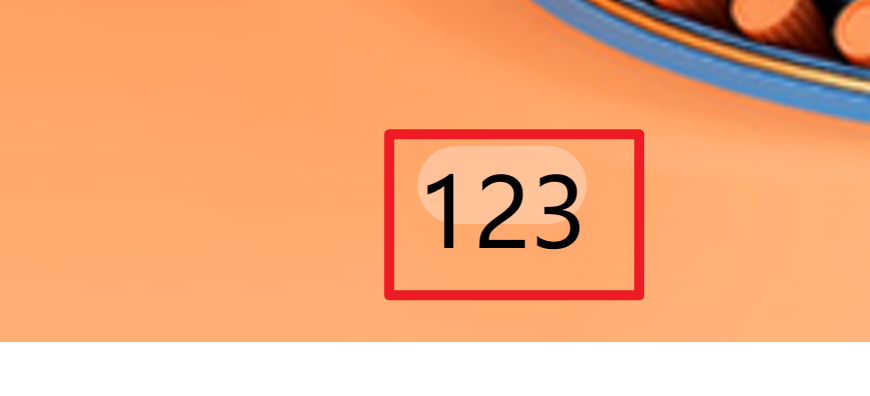
4、形成圆点。
.banner ol li{
				margin: 3px;
				width: 8px;
				height: 8px;
				background-color: #fff;
				background-repeat: 50%;
			}
5、将关键的圆点变为橙色。
.banner ol .active{
				background-color: #ff500f;
			}
<ol>
				<li></li>
				<li class="active"></li>
				<li></li>
			</ol>
| 阿里云国内75折 回扣 微信号:monov8 |
| 阿里云国际,腾讯云国际,低至75折。AWS 93折 免费开户实名账号 代冲值 优惠多多 微信号:monov8 飞机:@monov6 |