

Layout布局(element ui)
| 阿里云国内75折 回扣 微信号:monov8 |
| 阿里云国际,腾讯云国际,低至75折。AWS 93折 免费开户实名账号 代冲值 优惠多多 微信号:monov8 飞机:@monov6 |
Layout布局
嘚吧嘚
其实layout布局的使用在element官网上都有相关描述也有相关示例很容易快速上手。但是在实际使用的过程还是发现一些问题于是做了一些学习研究在此和大家分享一下。
gutter
为了能更清楚的看到效果给每列都加了背景色。
示例
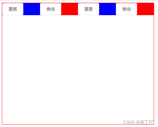
先来一个没有gutter效果的
<template>
  <div style="width: 500px; height: 400px; border: red 1px solid">
    <el-row>
      <el-row>
        <el-col :span="6" style="background: blue;">
          <el-button>重置</el-button>
        </el-col>
        <el-col :span="6" style="background: red;">
          <el-button>查询</el-button>
        </el-col>
        <el-col :span="6" style="background: blue;">
          <el-button>重置</el-button>
        </el-col>
        <el-col :span="6" style="background: red;">
          <el-button>查询</el-button>
        </el-col>
      </el-row>
    </el-row>
  </div>
</template>
效果图
再来一个加上gutter的
<template>
  <div style="width: 500px; height: 400px; border: red 1px solid">
    <el-row>
      <el-row gutter="20">
        <el-col :span="6" style="background: blue;">
          <el-button>重置</el-button>
        </el-col>
        <el-col :span="6" style="background: red;">
          <el-button>查询</el-button>
        </el-col>
        <el-col :span="6" style="background: blue;">
          <el-button>重置</el-button>
        </el-col>
        <el-col :span="6" style="background: red;">
          <el-button>查询</el-button>
        </el-col>
      </el-row>
    </el-row>
  </div>
</template>
效果图如下
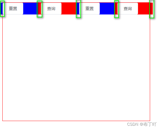
发现
是不是好像发现了什么
没错最后一列(el-col)短了一节。
从效果图上来看gutter就是在每列前面加上一块来实现分栏间隔的。第1列前面加上一块但是是在div外面不影响里面但是最后一列被挤出div一块超出边界相当于被覆盖了。
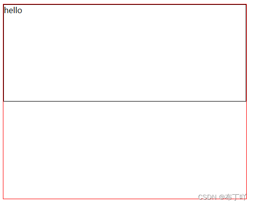
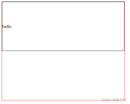
el-row行内容居中
默认局左上角
为了能跟直观的看到效果将行高度设置为200px加上黑色边框。
<template>
  <div style="width: 500px; height: 400px; border: red 1px solid">
    <el-row>
      <el-row style="height: 200px; border: black 1px solid">
        <span>hello</span>
      </el-row>
    </el-row>
  </div>
</template>
效果如下
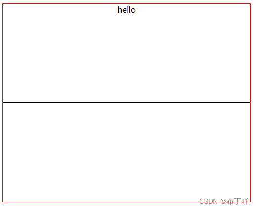
水平居中
在el-row上加上type="flex"和justify="center"就可以了。
<template>
  <div style="width: 500px; height: 400px; border: red 1px solid">
    <el-row>
      <el-row type="flex" justify="center" style="height: 200px; border: black 1px solid">
        <span>hello</span>
      </el-row>
    </el-row>
  </div>
</template>
效果图如下
垂直居中
在el-row上加上type="flex"和align="middle"就行了。
<template>
  <div style="width: 500px; height: 400px; border: red 1px solid">
    <el-row>
      <el-row type="flex" align="middle" style="height: 200px; border: black 1px solid">
        <span>hello</span>
      </el-row>
    </el-row>
  </div>
</template>
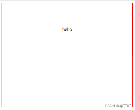
水平垂直居中
在el-row上加上type="flex"、justify="center"和align="middle"就行了。
<template>
  <div style="width: 500px; height: 400px; border: red 1px solid">
    <el-row>
      <el-row type="flex" justify="center" align="middle" style="height: 200px; border: black 1px solid">
        <span>hello</span>
      </el-row>
    </el-row>
  </div>
</template>
本次分享就结束了有什么不对欢迎指正也欢迎大家补充。