

文字流光效果
| 阿里云国内75折 回扣 微信号:monov8 |
| 阿里云国际,腾讯云国际,低至75折。AWS 93折 免费开户实名账号 代冲值 优惠多多 微信号:monov8 飞机:@monov6 |
提示文字流光动画效果炫酷标题
前言
提示以下是本篇文章的代码内容,供大家参考,相互学习
一、html代码
<!DOCTYPE html>
<html>
<head>
<meta http-equiv="content-type" content="text/html; charset=utf-8">
<meta name="viewport" content="width=device-width,initial-scale=1,maximum-scale=1,user-scalable=no">
<title>好玩的聚光灯效果</title>
<link rel="stylesheet" href="../css.css">
</head>
<body>
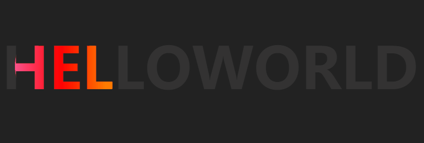
<h1>helloworld</h1>
</body>
</html>二、css代码
*{
    /* 初始化 取消页面元素内外边距 */
    margin: 0;
    padding: 0;
}
body{
    background-color: #222;
    /* 弹性布局 水平、垂直居中 */
    display: flex;
    justify-content: center;
    align-items: center;
    /* 100%窗口高度 */
    height: 100vh;
}
h1{
    color: #333;
    /* 转大写 */
    text-transform: uppercase;
    font-size: 112px;
    /* 相对定位 */
    position: relative;
}
h1::after{
    content: "helloworld";
    /* 颜色为透明 */
    color: transparent;
    position: absolute;
    top: 0;
    left: 0;
    background: linear-gradient(to right,#ff69b3,#fe0000,#ffa401,#ffff01,#008102,#40e1d2,#410098,#9400d4);
    /* 以文字的范围来裁剪背景图片 */
    background-clip: text;
    -webkit-background-clip: text;
    /* 将元素裁剪为一个圆形100px表示圆的直径0% 50%表示圆心的位置 */
    clip-path: circle(100px at 0% 50%);
    /* 执行动画动画 时长 infinite表示无限次播放 */
    animation: light 5s infinite;
}

/* 定义动画 改变圆心的位置 */
@keyframes light{
    0%{
        clip-path: circle(100px at 0% 50%);
    }
    50%{
        clip-path: circle(100px at 100% 50%);
    }
    100%{
        clip-path: circle(100px at 0% 50%);
    }
}
总结
- 通用选择器 * 重置了所有 HTML 元素的内外边距为 0。
- flexbox 实现了水平、垂直居中布局。
- 设置了渐变背景其中使用了线性渐变、八个颜色值以及 to right 表示从左到右渐变。
- ::after 伪元素为 h1 元素添加了一个 helloworld 文本。
- text-transform 属性将文本转换为大写。
- position:relative 属性为 h1 元素创建了相对定位为 ::after 伪元素的绝对定位提供依据。
- position:absolute 属性为 ::after 伪元素创建了绝对定位以在 h1 元素内部定位。
- clip-path 属性为 ::after 伪元素添加了圆形剪切遮罩将其裁剪为圆形并指定了圆心的位置和直径。
- background-clip 属性将背景限制为文字范围内并在不同浏览器中添加了私有前缀。
- 定义了一个名为 light 的关键帧动画通过改变 clip-path 属性值的方式使圆形剪切遮罩水平移动并设置了动画的时长和重复次数。