

uni-app微信小程序开发自定义select下拉多选内容篇
| 阿里云国内75折 回扣 微信号:monov8 |
| 阿里云国际,腾讯云国际,低至75折。AWS 93折 免费开户实名账号 代冲值 优惠多多 微信号:monov8 飞机:@monov6 |
分享-2023年资深前端进阶前端登顶之巅-最全面的前端知识点梳理总结
技术框架公司的选型uni-app + uni-ui + vue3 + vite4 + ts
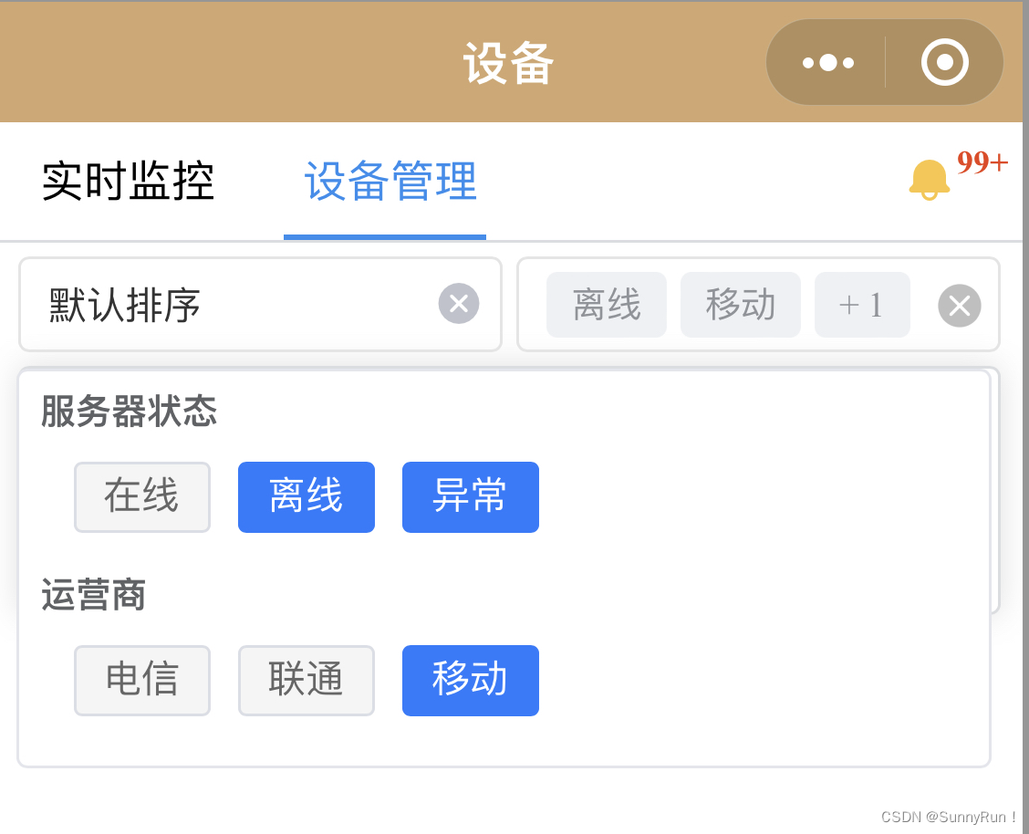
需求分析微信小程序-uni-ui内容
1、创建一个自定义的下拉支持多个内容的同时多选
2、定义好出入参数支持回显内容等
3、绑定对应的v-model数据响应
1、代码信息
<template>
  <view tabindex="1" ref="customSelectRef" class="uni-select" @click.stop="handleClickDiv">
    <view>
      <template v-if="modelLabel.length">
        <span class="custom-tag" :key="index" v-for="(item, index) in modelLabel">
          <span>{{ item }}</span>
        </span>
      </template>
      <span class="custom-tag" v-if="modelLabel.length && checkList.length - maxLength > 0">
        + {{ checkList.length - maxLength }}
      </span>
      <span v-if="!modelLabel.length" class="cus_placeholder">{{ placeholder }}</span>
      <img
        class="icon-delete"
        v-if="modelLabel.length"
        @click.stop="handleRemove"
        :src="'../../static/icons/delete.png'"
      />
    </view>
    <transition>
      <view class="cus_select_background" ref="cusSelectDropdown" v-if="isShowDropdown" @click="handleMemory">
        <view class="cus_tabs" :key="index" v-for="(item, index) in cusDataListChecked">
          <template v-if="item.children">
            <view class="cus_tabs_title">{{ item.text }}</view>
            <view class="cus_tabs_body">
              <uni-data-checkbox
                mode="tag"
                :multiple="multiple"
                v-model="item.checkList"
                :localdata="item.children"
                @change="(val) => handleCheckedChange(val, item)"
              ></uni-data-checkbox>
            </view>
          </template>
        </view>
      </view>
    </transition>
    <view v-if="isShowDropdown" class="custom_mask"></view>
  </view>
</template>

<script setup lang="ts">
import { watch } from "vue";
import { toRaw } from "vue";
import { ref, onMounted, nextTick, onBeforeMount } from "vue";

const props = withDefaults(
  defineProps<{
    dataSource: any;
    modelValue?: any;
    placeholder?: string;
    multiple?: boolean;
    maxLength?: number;
  }>(),
  {
    multiple: true,
    dataSource: [],
    modelValue: [],
    maxLength: 3,
    placeholder: "请选择",
  }
);

const emit = defineEmits(["update:modelValue", 'change']);

const customSelectRef = ref();

const cusSelectDropdown = ref();

const modelLabel = ref<Record<string, any>[]>([]);

const checkList = ref<string[]>([]);

const cusDataListChecked = ref<Record<string, any>[]>([]);

const isShowDropdown = ref<boolean>(false);

const isShowDownMemory = ref<boolean>(false);

const handleClickDiv = () => {
  isShowDropdown.value = isShowDownMemory.value ? true : !isShowDropdown.value;
  isShowDownMemory.value = false;
};

const handleMemory = () => {
  isShowDownMemory.value = true;
};

const handleCheckedChange = (e: Record<string, any>, row: Record<string, any>) => {
  const { data } = e.detail;
  row.checkLabel = data.map((opt) => opt.text);
  getModelVal();
};

const getModelVal = () => {
  const newValue = toRaw(cusDataListChecked.value);
  const newLabel = newValue.map((item) => item.checkLabel);
  const newModelVal = newValue.map((item) => item.checkList);
  const deconstructLabel = newLabel?.flat();
  const deconstructVal = newModelVal?.flat();
  modelLabel.value = deconstructLabel.slice(0, props.maxLength);
  checkList.value = deconstructVal;
  emit("update:modelValue", newModelVal);
};

const handleRemove = (e) => {
  modelLabel.value = [];
  checkList.value = [];
  if (isShowDropdown.value) {
    isShowDropdown.value = false;
  }
  if (props.multiple) {
    cusDataListChecked.value = addCheckProperties(props.dataSource);
  }
  emit("update:modelValue", []);
};

const addCheckProperties = (treeData) => {
  let result = [];
  result = JSON.parse(JSON.stringify(treeData));
  result.forEach((node) => {
    const child = node.children;
    node.checkList = [];
    node.checkLabel = [];
    if (child && child.length > 0) {
      addCheckProperties(child);
    }
  });
  return result;
};

const findTreeChecked = (treeData) => {
  const newLabel = [];
  const val = toRaw(props.modelValue);
  treeData.forEach((node, index) => {
    if (node.children?.length) {
      const child = node.children;
      const bool = child.some((opt) => {
        const isExist = val[index] && val[index].includes(opt.value);
        isExist ? newLabel.push(opt.text) : void null;
        return isExist;
      });
      if (bool) {
        node.checkLabel = newLabel;
        node.checkList = val[index];
      }
    }
  });
  return treeData;
};

watch(isShowDropdown, (newVal) => {
  emit('change', newVal, props.modelValue)
})

onBeforeMount(() => {
  if (props.multiple) {
    cusDataListChecked.value = addCheckProperties(props.dataSource);
  }
});

onMounted(async () => {
  await nextTick();
  if (props.multiple && props.modelValue.length) {
    cusDataListChecked.value = findTreeChecked(cusDataListChecked.value);
    getModelVal();
  }
});
</script>

<style lang="scss" scoped>
.uni-select {
  font-size: 14px;
  border: 1px solid #e5e5e5;
  box-sizing: border-box;
  border-radius: 4px;
  padding: 0 5px 0 10px;
  position: relative;
  display: flex;
  user-select: none;
  flex-direction: row;
  align-items: center;
  border-bottom: solid 1px #e5e5e5;
  width: 100%;
  flex: 1;
  height: 35px;
  position: relative;
}

.cus_placeholder {
  color: #6a6a6a;
  font-size: 12px;
}

.icon-delete {
  position: absolute;
  width: 18px;
  height: 18px;
  right: 5px;
  margin-top: 3.5px;
  z-index: 10;
}

.cus_select_background {
  width: 95vw;
  max-height: 260px;
  box-sizing: border-box;
  border-radius: 4px;
  font-size: 13px;
  color: #606266;
  background: #ffffff;
  border: 1px solid #e4e7ed;
  position: absolute;
  top: 40px;
  left: 0px;
  padding: 5px 8px;
  z-index: 10;
}

.cus_tabs {
  margin-bottom: 8px;
  .cus_tabs_title {
    font-weight: 600;
    margin-bottom: 4px;
  }
  .cus_tabs_body {
    margin-left: 12px;
  }
}

.custom-tag {
  color: #909399;
  display: inline-flex;
  justify-content: center;
  align-items: center;
  height: 24px;
  padding: 0 9px;
  line-height: 1;
  border-radius: 4px;
  white-space: nowrap;
  font-size: 13px;
  margin-right: 5px;
  background-color: #f0f2f5;
}

.custom_mask {
  position: fixed;
  top: 0;
  bottom: 0;
  left: 0;
  right: 0;
  z-index: 1;
  display: flex;
  justify-content: center;
  align-items: center;
}
</style>
2、使用api介绍
1、树形结构入参
dataSource=[{ ext: "服务器状态", children: [{ text: "在线", value: 0}]}]
2、标签引用<ivuSelect :maxLength="2" ref="ivuSelectRef" v-model="customSelect" :dataSource="deviceDataList" style="width: 100%; margin-left: 5px" />
3、相关api说明文档在文章底部
| 参数 | 说明 | 类型 | 默认值 | 必填项 |
|---|---|---|---|---|
| dataSource | [{}]-label,value;树形结构 | Array[] | [] | 是 |
| modelValue | 当前选中项内容 | Array | [] | 否 |
| placeholder | 输入框内容 | String | 请输入 | 否 |
| multiple | 是否开启多选 | Boolean | false | 否 |
| maxLength | 输入框最大标签长度 | Number | 3 | 否 |
| 阿里云国内75折 回扣 微信号:monov8 |
| 阿里云国际,腾讯云国际,低至75折。AWS 93折 免费开户实名账号 代冲值 优惠多多 微信号:monov8 飞机:@monov6 |