

html、css学习记录【uniapp前奏】-CSDN博客
| 阿里云国内75折 回扣 微信号:monov8 |
| 阿里云国际,腾讯云国际,低至75折。AWS 93折 免费开户实名账号 代冲值 优惠多多 微信号:monov8 飞机:@monov6 |
Html
声明该学习笔记源于菜鸟自学网站特此记录笔记。很多示例源于此官网若有侵权请联系删除。
文章目录
- Html
- CSS
- CSS里的ID与Class [CSS里的ID跟Class](https://www.runoob.com/css/css-id-class.html)
- 背景样式background [光看不练白瞎](https://www.runoob.com/css/css-background.html)
- 外边距margin [点一点](https://www.runoob.com/css/css-margin.html)
- 内边距padding [我是超超超链接](https://www.runoob.com/css/css-padding.html)
- 文本样式Text [TEXT](https://www.runoob.com/css/css-text.html)
- 边框 border [菜鸟网站的boder](https://www.runoob.com/css/css-border.html)
- 尺寸Dimension[Dimension常用属性](https://www.runoob.com/css/css-dimension.html)
- 展示Display与可见性Visibility [占不占空间与android里的visibility属性](https://www.runoob.com/css/css-display-visibility.html)
- Overflow 有滚动条的scrollview [Overflow](https://www.runoob.com/css/css-overflow.html)
- Float浮动 [Float浮动链接](https://www.runoob.com/css/css-float.html)
- CSS圆角border-radius [border-radius圆角属性](https://www.runoob.com/css3/css3-border-radius.html)
- CSS3中的渐变 [渐变Gradients](https://www.runoob.com/css3/css3-gradients.html)
- 按钮 [按钮的各种效果](https://www.runoob.com/css3/css3-buttons.html)
这是一个简单的html也是最最最原始的“道生一一生二二生三三生万物”里面的一
<!DOCTYPE html>
<html>

<head>
头
</head>

<body>
身体
</body>

</html>
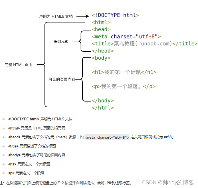
它有个头有身体头里面一般放网页的元meat一个定义网页编码格式的属性声明以及网页的title就是网页在你的360或者2345或者IE或者火狐或者谷歌浏览器里展示出来的时候标签栏里的内容。
身体里面一般放页面的主体展示内容比如标题啊段落啊,图片啊之类的…
这是一个示例可以copy下来放到一个新建.txt文件里再给后缀改为.html双击打开看一下效果
<!DOCTYPE html>
<html>
<head>
<meta charset="utf-8">
<title>菜鸟教程(runoob.com)</title>
</head>
<body>

<h1>我的第一个标题</h1>

<p>我的第一个段落。</p>

</body>
</html>
一些常见的疑问什么是html什么是html标签什么是html元素可以访问菜鸟教学的官网进行理论知识补充这里不再记录。我是链接点我
一些常用的标签
基本标签
<h1>最大的标题</h1>
<h2> 次大的标题</h2>
<h3> . . . </h3>
<h4> . .</h4>
<h5> . </h5>
<h6>最小的标题</h6>

<p>这是一个段落它前后都会有空行</p>
<br> 换行可以理解为回车键
<hr> 水平线就是这个 -------
<!-- 这是注释 -->

文本格式化标签
<b>粗体文本</b>
<code>计算机代码</code>
<em>强调文本</em>
<i>斜体文本</i>
<kbd>键盘输入</kbd>
<pre>预格式化文本</pre>
<small>更小的文本</small>
<strong>重要的文本</strong>

<abbr> 缩写
<address> 联系信息
<bdo> 文字方向
<blockquote> 从另一个源引用的部分
<cite> 工作的名称
<del> 删除的文本
<ins> 插入的文本
<sub> 下标文本
<sup> 上标文本
链接的标签
普通的链接<a href="http://www.example.com/">链接文本</a>
图像链接 <a href="http://www.example.com/"><img decoding="async" src="URL" alt="替换文本"></a>
邮件链接 <a href="mailto:webmaster@example.com">发送e-mail</a>
书签
<a id="tips">提示部分</a>
<a href="#tips">跳到提示部分</a>
是不是发现跟上面的基本标签不一样了标签开始里面多了属性《标签 属性》《/标签》。
菜鸟教程对属性的介绍是这样的属性可以在元素中添加附加信息属性一般描述于开始标签属性总是以名称/值对的形式出现比如name=“value”。
最常用的链接标签就需要属性来辅助了<a href="网址www....com">链接文本</a>
这是上面常见标签的展示
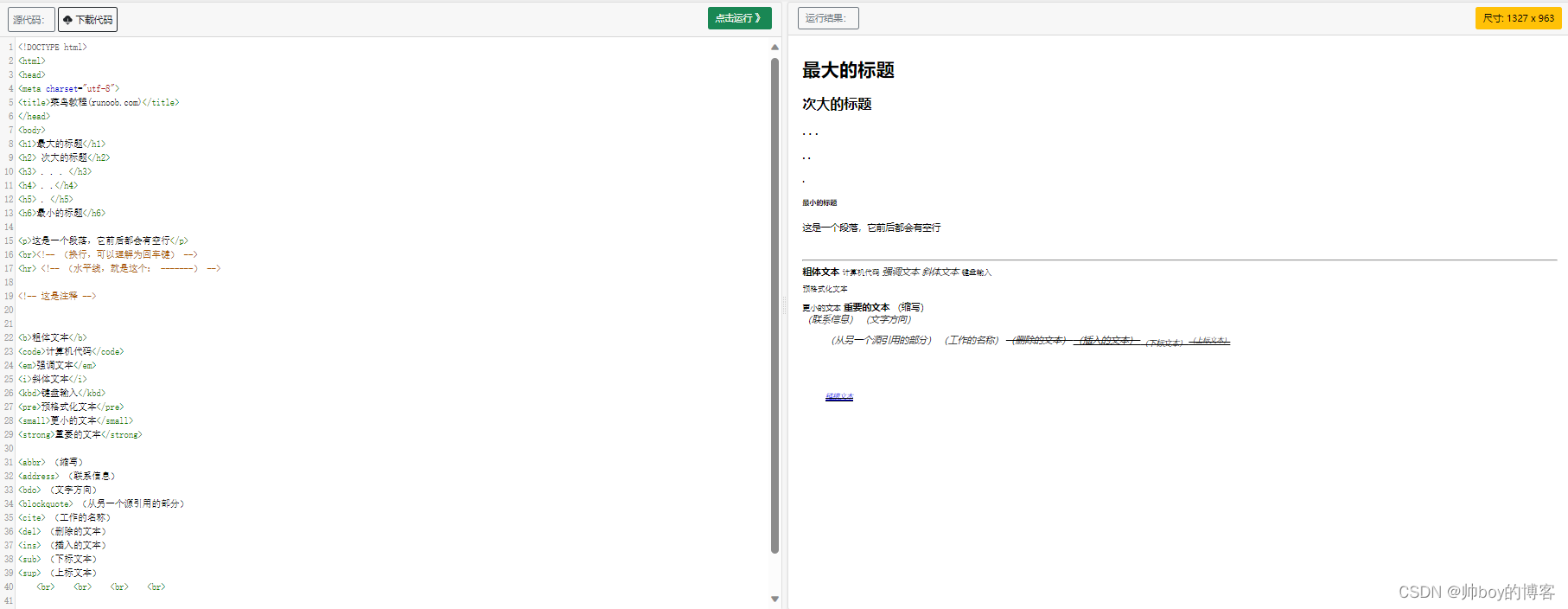
对应的网页index.html
<!DOCTYPE html>
<html>
<head>
<meta charset="utf-8">
<title>菜鸟教程(runoob.com)</title>
</head>
<body>
<h1>最大的标题</h1>
<h2> 次大的标题</h2>
<h3> . . . </h3>
<h4> . .</h4>
<h5> . </h5>
<h6>最小的标题</h6>

<p>这是一个段落它前后都会有空行</p>
<br><!-- 换行可以理解为回车键 -->
<hr> <!-- 水平线就是这个 ------- -->

<!-- 这是注释 -->


<b>粗体文本</b>
<code>计算机代码</code>
<em>强调文本</em>
<i>斜体文本</i>
<kbd>键盘输入</kbd>
<pre>预格式化文本</pre>
<small>更小的文本</small>
<strong>重要的文本</strong>

<abbr> 缩写
<address> 联系信息
<bdo> 文字方向
<blockquote> 从另一个源引用的部分
<cite> 工作的名称
<del> 删除的文本
<ins> 插入的文本
<sub> 下标文本
<sup> 上标文本
	<br>	<br>	<br>	<br>

<a href="http://www.example.com/">链接文本</a>
</body>
</html>
至此网页的核心已经说了一部分了下面将讲解最最最最重要的另一部分了css:
<a>
上面说了链接的标签<a href="https://www.runoob.com/">访问菜鸟教程</a>里面的href叫做标签a的属性。关于属性的介绍呢这里也只说一下链接部分的属性更多属性知识想了解点击这里去学习菜鸟属性学习
链接的标签a中可以存放的属性有这些
- href指定链接目标的URL这是链接的最重要属性。可以是另一个网页的URL、文件的URL或其他资源的URL。
- target可选指定链接如何在浏览器中打开。常见的值包括 _blank在新标签或窗口中打开链接和 _self在当前标签或窗口中打开链接
- title可选提供链接的额外信息通常在鼠标悬停在链接上时显示为工具提示。
- rel可选指定与链接目标的关系如 nofollow、noopener 等。

源码在这儿可以自己试一下index.html
<!DOCTYPE html>
<html>
<head>
<meta charset="utf-8">
<title>菜鸟教程(runoob.com)</title>
</head>
<body>
<a href="https://www.runoob.com/" target="_blank">访问菜鸟教程!</a>
<p>如果你将 target 属性设置为 "_blank", 链接将在新窗口打开。</p>
</body>
</html>
<head>
说一下head标签:head 元素包含了所有的头部标签元素。在 元素中你可以插入脚本scripts, 样式文件CSS及各种meta信息。
可以添加在头部区域的元素标签为:
<title>, <style>, <meta>, <link>, <script>, <noscript> 和 <base>。
这里面提到了一个样式文件CSS脚本Script。我们先说样式文件CSS你可以这么理解它如果说html是一个网页的骨头的话它就是血肉细胞Script则是网页的血管和神经网络。
先说head标签里面能放的东西
- meat开头已经说了它叫元声明整个网页的编码格式像这样
<meta charset="utf-8">写在html的head里浏览器在打开你的网页之后就知道你这个网页用的是utf-8编码了就不会导致乱码了。 - base标签描述了基本的链接地址/链接目标该标签作为HTML文档中所有的链接标签的默认链接:
<base href="http://www.runoob.com/images/" target="_blank">像这样你的整个网页的默认链接就声明好了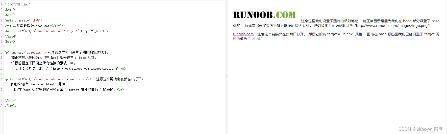
- link标签定义了文档与外部资源之间的关系。
- link标签通常用于链接到样式表:
<link rel="stylesheet" type="text/css" href="mystyle.css">能观察到它的属性跟上面提到的标签a有两个一样的它的href在a标签里是填要跳转的网络地址的在这儿功能一样但是要跳转的不再是网络链接地址了而是被链接的文档位置rel还是原来的功能,type是规定被链接文档的 MIME 类型。下面是一些link的相关属性介绍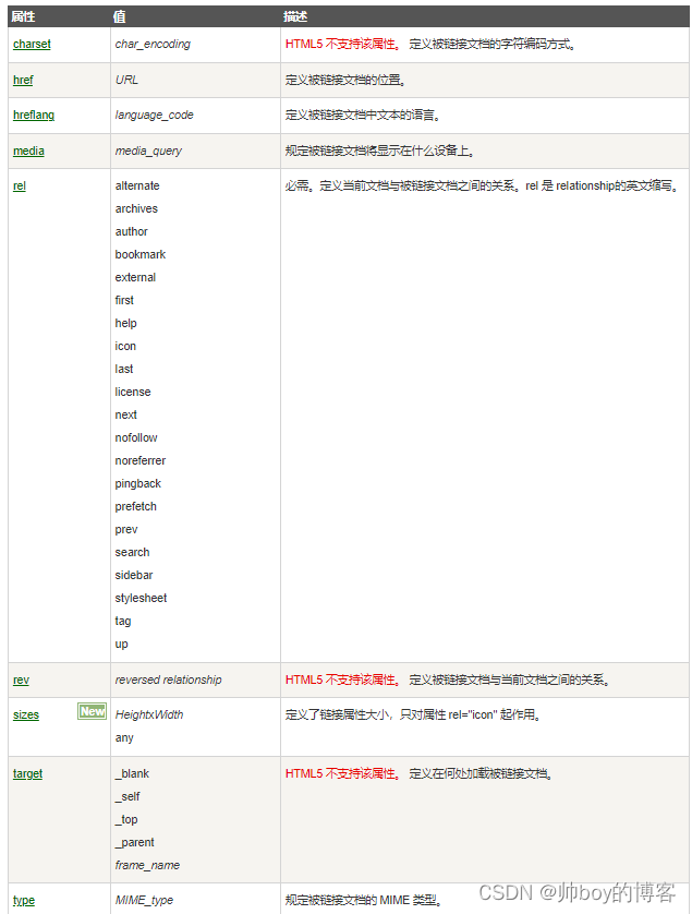
- style上面说的外部资源呢讲的就是CSS资源了在正式进入CSS学习之前在讲一个标签叫style标签定义了HTML文档的样式文件引用地址。在style元素中你也可以直接添加样式来渲染 HTML 文档 :下面你将读到一段非常重要的声明重要到你对于后面uniapp的理解以及学习进度。
声明 CSS 全称 Cascading Style Sheets层叠样式表。是一种用来为结构化文档如 HTML 文档或 XML 应用添加样式字体、间距和颜色等的计算机语言CSS 文件扩展名为 .css。通过使用 CSS 我们可以大大提升网页开发的工作效率
CSS
问什么是CSS?
- CSS 指层叠样式表 (Cascading Style Sheets)
- 样式定义如何显示 HTML 元素
- 样式通常存储在样式表中
- 把样式添加到 HTML 4.0 中是为了解决内容与表现分离的问题
- 外部样式表可以极大提高工作效率
- 外部样式表通常存储在 CSS 文件中
- 多个样式定义可层叠为一个
样式表~~~~~~~~~~~~~~~~~~~~~~~~~~~~~~~~~~~~~~~~~~~~~~~~~~~~~~~~~~~~~~~~~~~~~~~~~~~~~~~~
当读到一个样式表时浏览器会根据它来格式化 HTML 文档。如何插入样式表插入样式表的方法有三种
外部样式表(External style sheet)
内部样式表(Internal style sheet)
内联样式(Inline style)
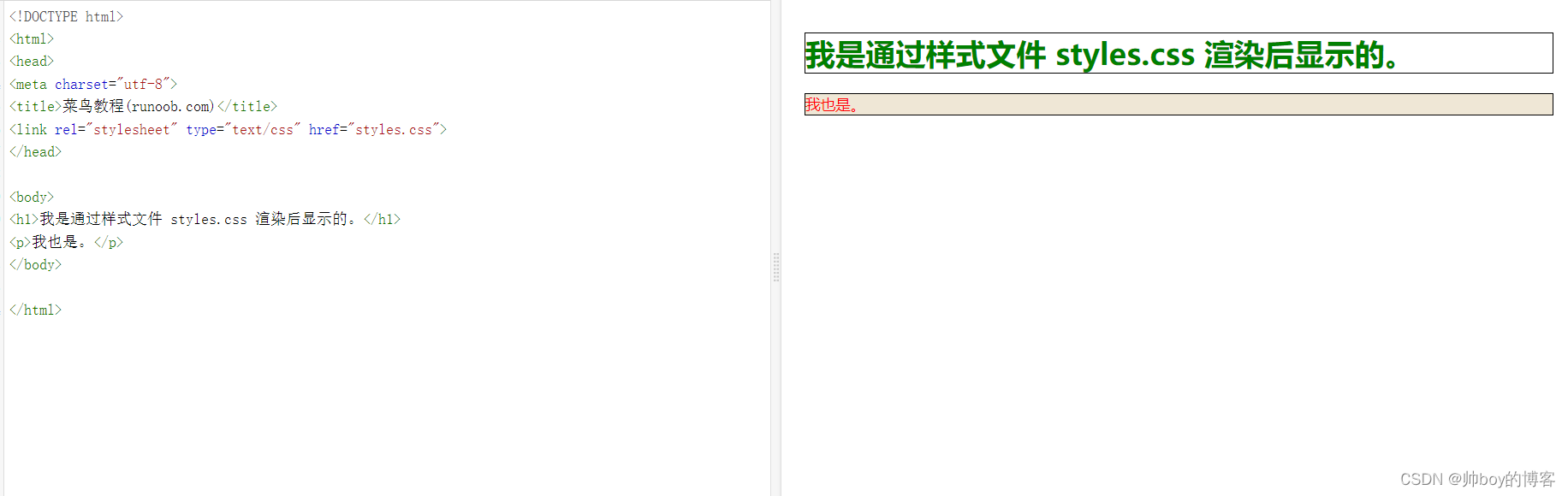
外部样式 当样式需要应用于很多页面时外部样式表将是理想的选择。在使用外部样式表的情况下你可以通过改变一个文件来改变整个站点的外观。每个页面使用 标签链接到样式表。 标签在文档的头部
index.html
<head>
<link rel="stylesheet" type="text/css" href="mystyle.css">
</head>
浏览器会从文件 mystyle.css 中读到样式声明并根据它来格式文档。
外部样式表可以在任何文本编辑器中进行编辑。文件不能包含任何的 html 标签。样式表应该以 .css 扩展名进行保存。下面是一个样式表文件的例子
mystyle.css
hr {color:sienna;}
p {margin-left:20px;}
body {background-image:url("/images/back40.gif");}
内部样式 当单个文档需要特殊的样式时就应该使用内部样式表。你可以使用
<head>
<style>
hr {color:sienna;}
p {margin-left:20px;}
body {background-image:url("images/back40.gif");}
</style>
</head>
内联样式 由于要将表现和内容混杂在一起内联样式会损失掉样式表的许多优势。请慎用这种方法例如当样式仅需要在一个元素上应用一次时。要使用内联样式你需要在相关的标签内使用样式style属性。Style 属性可以包含任何 CSS 属性。本例展示如何改变段落的颜色和左外边距
<p style="color:sienna;margin-left:20px">这是一个段落。</p>
跟java的继承特性一样css也有自己的继承特性
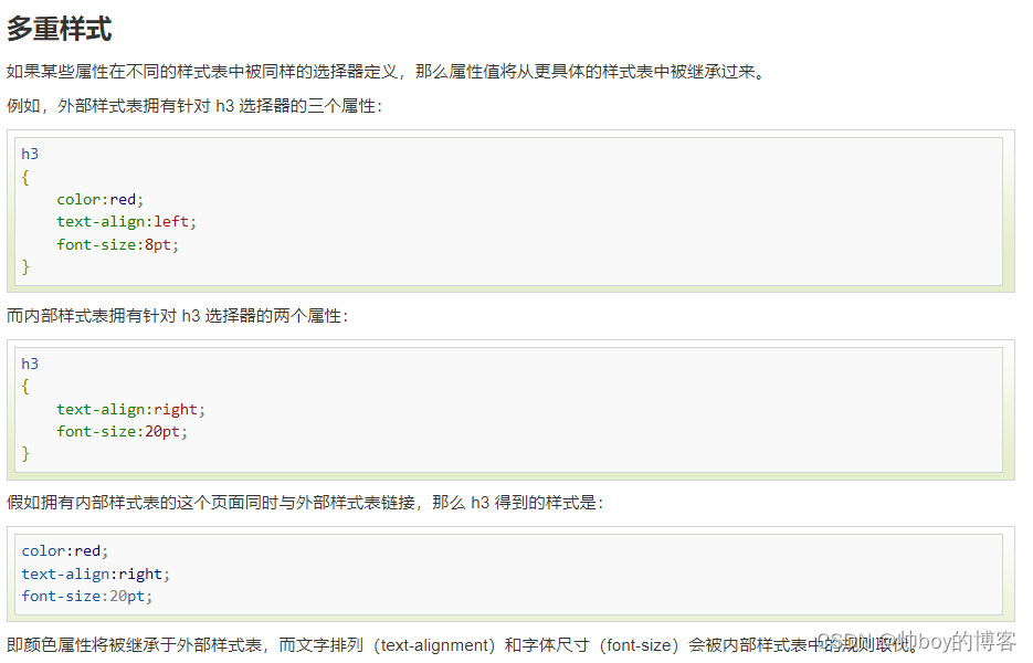
也就是说它有一个优先级
多重样式优先级样式表允许以多种方式规定样式信息。样式可以规定在单个的 HTML 元素中在 HTML 页的头元素中或在一个外部的 CSS 文件中。甚至可以在同一个 HTML 文档内部引用多个外部样式表。
一般情况下优先级如下
内联样式Inline style > 内部样式Internal style sheet >外部样式External style sheet > 浏览器默认样式
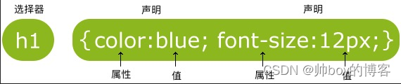
CSS 规则由两个主要的部分构成选择器以及一条或多条声明:
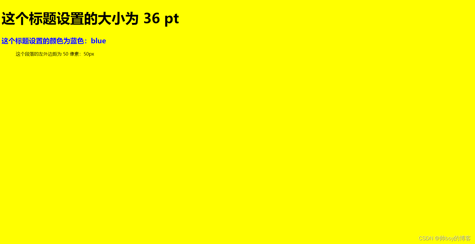
示例一
<!DOCTYPE html>
<html>
<head>
<meta charset="utf-8">
<title>菜鸟教程(runoob.com)</title>
<style>
body {background-color:yellow;}
h1   {font-size:36pt;}
h2   {color:blue;}
p    {margin-left:50px;}
</style>
</head>

<body>

<h1>这个标题设置的大小为 36 pt</h1>
<h2>这个标题设置的颜色为蓝色blue</h2>

<p>这个段落的左外边距为 50 像素50px</p>

</body>
</html>
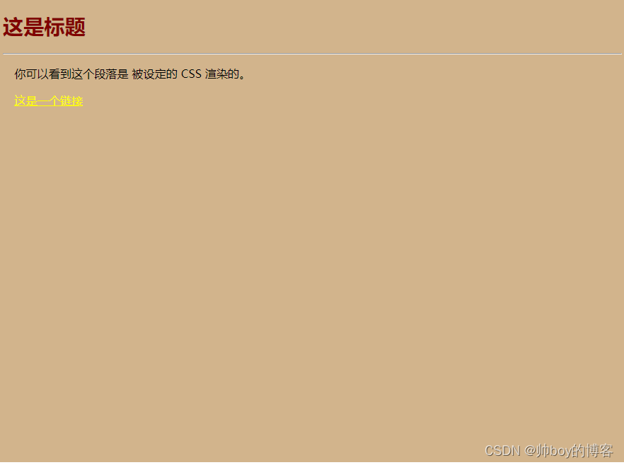
效果图
示例二
<!DOCTYPE html>
<html>
<head>
<meta charset="utf-8">
<title>菜鸟教程(runoob.com)</title>
<style>
body {background-color:tan;}
h1   {color:maroon;font-size:20pt;}
hr   {color:navy;}
p    {font-size:11pt;margin-left:15px;}
a:link    {color:green;}
a:visited {color:yellow;}
a:hover   {color:black;}
a:active  {color:blue;}
</style>
</head>

<body>

<h1>这是标题</h1>
<hr>

<p>你可以看到这个段落是
被设定的 CSS 渲染的。</p>

<p><a href="https://www.runoob.com"
target="_blank">这是一个链接</a></p>

</body>
</html>
CSS里的ID与Class CSS里的ID跟Class
id以 # 来定义
class以 . 来定义
在html元素中设置CSS样式你需要在元素中设置ID和Class选择器。
id选择器可以为标有特定id的HTML元素指定特定的样式HTML元素以id属性来设置id选择器CSS中id选择器以#来定义。以下示例规则应用于元素属性id=”para1“:
#para1
{
    text-align:center;
    color:red;
}
ID属性不要以数字开头数字开头的ID在 Mozilla/Firefox 浏览器中不起作用。
class选择器用于描述一组元素的样式class选择器有别于id选择器class可以在多个元素中使用。class选择器在HTML中以class属性表示在css中类选择器以一个.号显示
.center {text-align:center;}
当然还可以这么用多个class选择器可以使用空格分开
CSS的一些常见常用属性
背景样式background 光看不练白瞎
   background-color:#F5E2EC; /*背景颜色*/
  background:transparent; /*透视背景*/
  background-image : url(/image/bg.gif); /*背景图片*/
  background-attachment : fixed; /*浮水印固定背景*/
  background-repeat : repeat; /*重复排列-网页默认*/
  background-repeat : no-repeat; /*不重复排列*/
  background-repeat : repeat-x; /*在x轴重复排列*/
  background-repeat : repeat-y; /*在y轴重复排列*/
  指定背景位置
  background-position : 90% 90%; /*背景图片x与y轴的位置*/
  background-position : top; /*向上对齐*/
  background-position : buttom; /*向下对齐*/
  background-position : left; /*向左对齐*/
  background-position : right; /*向右对齐*/
  background-position : center; /*居中对齐*/

CSS3之后增加了
	background-image   //CSS3中可以通过background-image属性添加背景图片 不同的背景图像和图像用逗号隔开所有的图片中	显示在最顶端的为第一张。
	background-size   //background-size指定背景图像的大小。之前背景图像大小由图像的实际大小决定。CSS3中可以指定背景图片让我们重新在不同的环境中指定背景图片的大小。您可以指定像素或百分比大小。你指定的大小是相对于父元素的宽度和高度的百分比的大小。
	background-origin  //指定了背景图像的位置区域。content-box, padding-box,和 border-box区域内可以放置背景图像
	background-clip   //背景剪裁属性是从指定位置开始绘制。

———————————————————————————————————————————————————————————————————
外边距margin 点一点
margin-top:100px;
margin-bottom:100px;
margin-right:50px;
margin-left:50px;
margin属性可以有一到四个值。
- margin:25px 50px 75px 100px;
上边距为25px
右边距为50px
下边距为75px
左边距为100px - margin:25px 50px 75px;
上边距为25px
左右边距为50px
下边距为75px - margin:25px 50px;
上下边距为25px
左右边距为50px - margin:25px;
所有的4个边距都是25px
还可以指定厘米margin-top:2cm;
还可以指定距离某一个控件有多远margin-bottom:25%;
内边距padding 我是超超超链接
Padding属性可以有一到四个值。
- padding:25px 50px 75px 100px;
上填充为25px
右填充为50px
下填充为75px
左填充为100px - padding:25px 50px 75px;
上填充为25px
左右填充为50px
下填充为75px - padding:25px 50px;
上下填充为25px
左右填充为50px - padding:25px;
所有的填充都是25px
厘米和百分比它也支持的
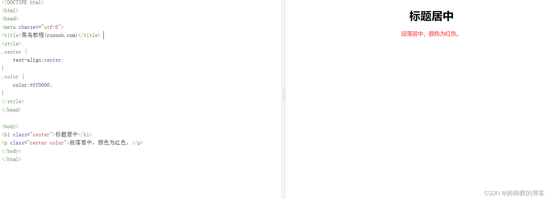
文本样式Text TEXT
添加颜色部分
body {color:red;}
h1 {color:#00ff00;}
h2 {color:rgb(255,0,0);}
- text-align文本对齐方式
h1 {text-align:center;}
p.date {text-align:right;}
p.main {text-align:justify;}
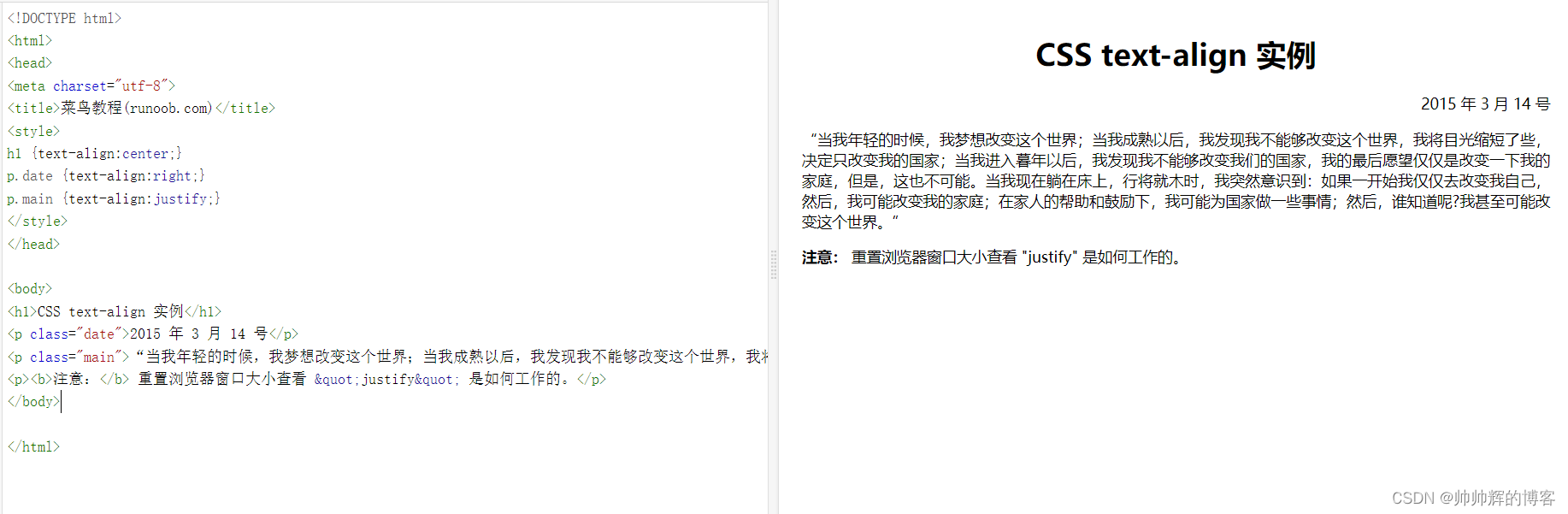
- text-decoration 属性用来设置或删除文本的装饰。
a {text-decoration:none;}//从设计的角度看 text-decoration属性主要是用来删除链接的下划线的

h1 {text-decoration:overline;}//字体头上有划线
h2 {text-decoration:line-through;}//字体中间有划线
h3 {text-decoration:underline;}//字体底部有下划线
大小写文本转换
p.uppercase {text-transform:uppercase;} //THIS IS SOME TEXT.全部大写
p.lowercase {text-transform:lowercase;} //this is some text.全部小写
p.capitalize {text-transform:capitalize;} //This Is Some Text.首字母大写
- text-indent文本缩进
p {text-indent:50px;} //一段话第一行的缩进
小总结
 序号 中文说明 标记语法
  1 行 间 距 {line-height:数值|inherit|normal;}
  2 文本修饰 {text-decoration:inherit|none|underline|overline|line-through|blink}
  3 段首空格 {text-indent:数值|inherit}
  4 水平对齐 {text-align:left|right|center|justify}
  5 垂直对齐 {vertical-align:inherit|top|bottom|text-top|text-bottom|baseline|middle|sub|super}
  6 书写方式 {writing-mode:lr-tb|tb-rl}


    color : #999999; /*文字颜色*/
  font-family : 宋体,sans-serif; /*文字字体*/
  font-size : 9pt; /*文字大小*/
  font-style:itelic; /*文字斜体*/
  font-variant:small-caps; /*小字体*/
  letter-spacing : 1pt; /*字间距离*/
  line-height : 200%; /*设置行高*/
  font-weight:bold; /*文字粗体*/
  vertical-align:sub; /*下标字*/
  vertical-align:super; /*上标字*/
  text-decoration:line-through; /*加删除线*/
  text-decoration: overline; /*加顶线*/
  text-decoration:underline; /*加下划线*/
  text-decoration:none; /*删除链接下划线*/
  text-transform : capitalize; /*首字大写*/
  text-transform : uppercase; /*英文大写*/
  text-transform : lowercase; /*英文小写*/
  text-align:right; /*文字右对齐*/
  text-align:left; /*文字左对齐*/
  text-align:center; /*文字居中对齐*/
  text-align:justify; /*文字分散对齐*/
  vertical-align属性
  vertical-align:top; /*垂直向上对齐*/
  vertical-align:bottom; /*垂直向下对齐*/
  vertical-align:middle; /*垂直居中对齐*/
  vertical-align:text-top; /*文字垂直向上对齐*/
  vertical-align:text-bottom; /*文字垂直向下对齐*/

————————————————-
小总结来自博客【~heart将心比心】
原文链接https://blog.csdn.net/qq_42412061/article/details/127691649
CSS3之后新增的文本特性
- text-shadow
- box-shadow
- text-overflow
- word-wrap
- word-break
h1
{
//指定了水平阴影垂直阴影模糊的距离以及阴影的颜色
    text-shadow: 5px 5px 5px #FF0000;
}

div {
//CSS3 中 CSS3 box-shadow 属性适用于盒子阴影 有模糊效果
    box-shadow: 10px 10px 5px #888888;
}
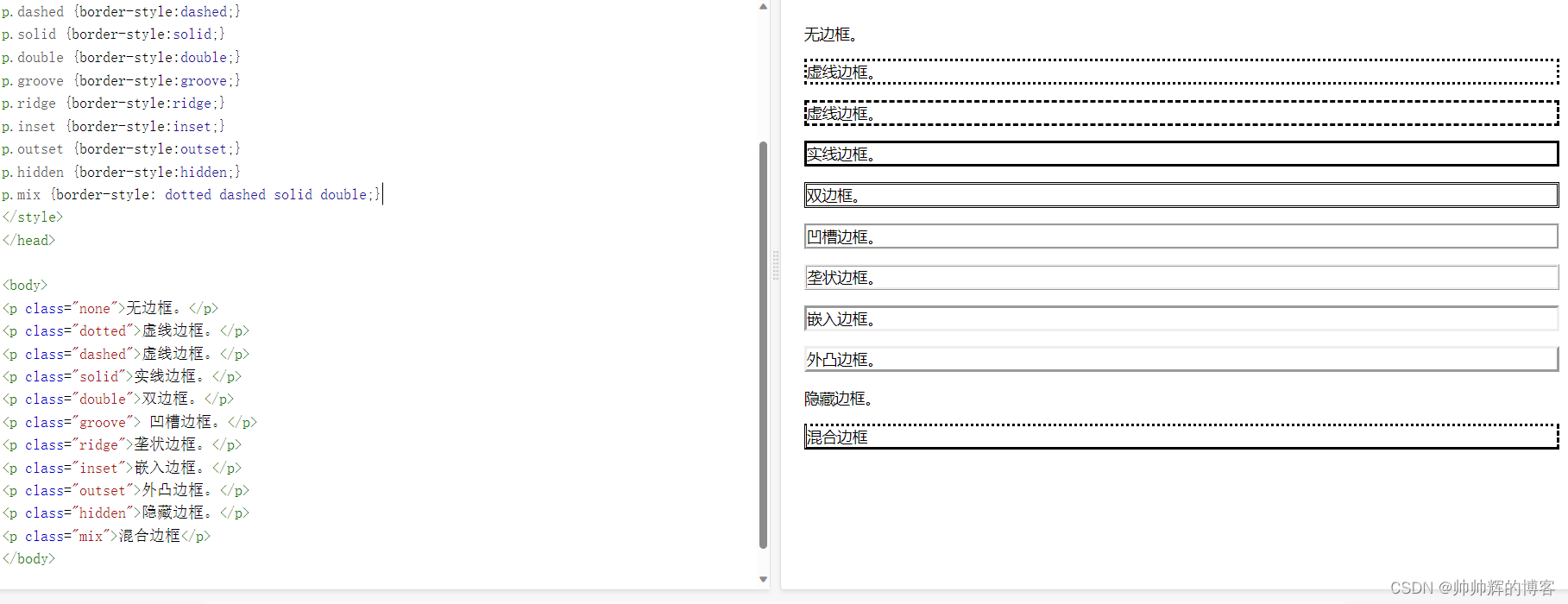
边框 border 菜鸟网站的boder
1定义边框的大样式
p.none {border-style:none;} //无边框
p.dotted {border-style:dotted;} //点虚线边框
p.dashed {border-style:dashed;} //粗虚线边框
p.solid {border-style:solid;}  //实线边框
p.double {border-style:double;}  //双边框
p.groove {border-style:groove;} //凹槽边框
p.ridge {border-style:ridge;} //垄状边框
p.inset {border-style:inset;}  //嵌入边框
p.outset {border-style:outset;} //外凸边框
p.hidden {border-style:hidden;} //隐藏边框
p.mix {border-style: dotted dashed solid double;} //混合边框
展示一下UI显示
2边框的宽度 border-width
// thick , medium , thin

p.one
{
    border-style:solid;
    border-width:5px;
}
p.two
{
    border-style:solid;
    border-width:medium;
}
3,边框颜色 border-color
p.one
{
    border-style:solid;
    border-color:red;
}
p.two
{
    border-style:solid;
    border-color:#98bf21;
}
1中边框的样式也可以各设各的
border-style属性可以有1-4个值

 - 1border-style:dotted solid double dashed;
		上边框是 dotted
		右边框是 solid
		底边框是 double
		左边框是 dashed
 - 2border-style:dotted solid double;
		上边框是 dotted
		左、右边框是 solid
		底边框是 double
 - 3border-style:dotted solid;
		上、底边框是 dotted
		右、左边框是 solid
 - 4border-style:dotted;
		四面边框是 dotted

各设各的就是这样
<style>
p
{
    border-top-style:dotted;
    border-right-style:solid;
    border-bottom-style:dotted;
    border-left-style:solid;
}
</style>
尺寸DimensionDimension常用属性
属性				描述
height			设置元素的高度。
line-height		设置行高。
max-height		设置元素的最大高度。
max-width		设置元素的最大宽度。
min-height		设置元素的最小高度。
min-width		设置元素的最小宽度。
width			设置元素的宽度。
展示Display与可见性Visibility 占不占空间与android里的visibility属性
display属性设置一个元素应如何显示visibility属性指定一个元素应可见还是隐藏。
跟安卓布局文件里的none invisibility的区别是一样的
隐藏元素 - display:none或visibility:hidden
隐藏一个元素可以通过把display属性设置为"none"或把visibility属性设置为"hidden"。但是请注意这两种方法会产生不同的结果。visibility:hidden可以隐藏某个元素但隐藏的元素仍需占用与未隐藏之前一样的空间。也就是说该元素虽然被隐藏了但仍然会影响布局。
display:none;  //隐藏控件且不占空间
visibility:hidden;  //控件不可见 但是还在原地
display:inline; //把原有的展示在一行
display:block;  //把原有的块儿给展开
Overflow 有滚动条的scrollview Overflow
div {
    width: 200px;
    height: 50px;
    background-color: #eee;
    overflow: scroll;
}
CSS overflow 属性可以控制内容溢出元素框时在对应的元素区间内添加滚动条。
overflow属性有以下值
| 值 | 描述 |
|---|---|
| visible | 默认值。内容不会被修剪会呈现在元素框之外。 |
| hidden | 内容会被修剪并且其余内容是不可见的。 |
| scroll | 内容会被修剪但是浏览器会显示滚动条以便查看其余的内容。 |
| auto | 如果内容被修剪则浏览器会显示滚动条以便查看其余的内容。 |
| inherit | 规定应该从父元素继承 overflow 属性的值。 |
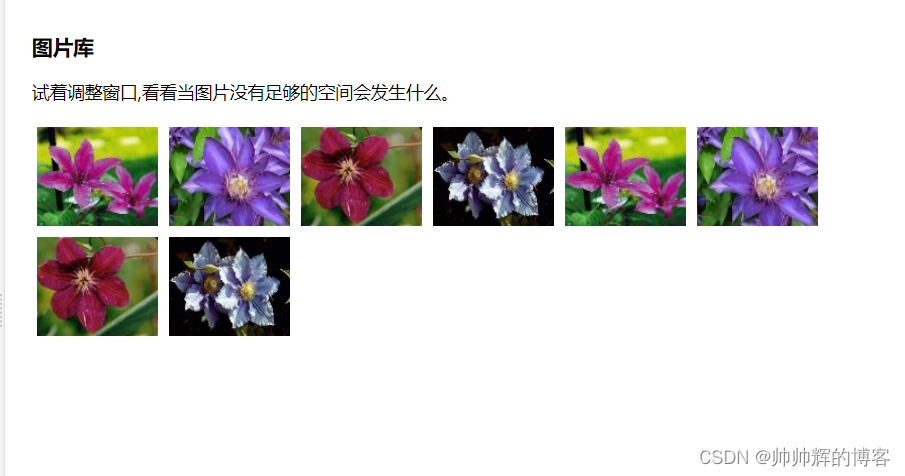
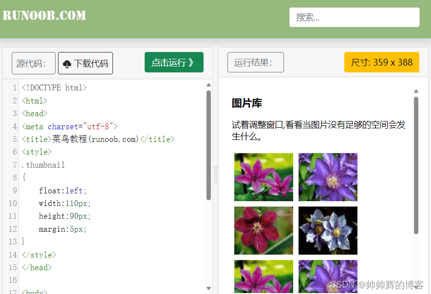
Float浮动 Float浮动链接
可以理解为word文本里图片插入字符时的几种状况会随着窗口变化。
.类名
{
  ==  float:left;  ==
    width:110px;
    height:90px;
    margin:5px;
}
元素浮动之后周围的元素会重新排列为了避免这种情况使用 clear 属性。
clear 属性指定元素两侧不能出现浮动元素。
.text_line
{
    clear:both;
}
像这样
CSS3边框
border-radius 圆角边框
box-shadow阴影属性
border-image 允许你指定一个图片作为边框
 border-radius: 50px 20px; //如果设置了两个值第一个用于左上角和右下角第二个用于右上角和左下角
 border-radius:25px;//四个角都是圆形
| 属性 | 说明 |
|---|---|
| border-image | 设置所有边框图像的速记属性。 |
| border-radius | 一个用于设置所有四个边框- *-半径属性的速记属性 |
| box-shadow | 附加一个或多个下拉框的阴影 |
CSS圆角border-radius border-radius圆角属性
#rcorners1 {
   border-radius: 25px;
   background: #8AC007;
   padding: 20px;
   width: 200px;
   height: 150px;
   }
#rcorners2 {
   border-radius: 25px;
   border: 2px solid #8AC007;
   padding: 20px;
   width: 200px;
   height: 150px;
   }
 #rcorners3 {
   border-radius: 25px;
   background: url(paper.gif);
   background-position: left top;
   background-repeat:  repeat;
   padding: 20px;
   width:   200px;
   height: 150px;
    }
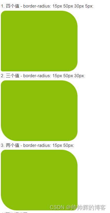
CSS3 border-radius - 指定每个圆角
如果你在 border-radius 属性中只指定一个值那么将生成 4 个 圆角。
但是如果你要在四个角上一一指定可以使用以下规则
- 四个值: 第一个值为左上角第二个值为右上角第三个值为右下角第四个值为左下角。
- 三个值: 第一个值为左上角, 第二个值为右上角和左下角第三个值为右下角
- 两个值: 第一个值为左上角与右下角第二个值为右上角与左下角
- 一个值 四个圆角值相同
<!DOCTYPE html>
<html>
<head>
<meta charset="utf-8">
<title>菜鸟教程(runoob.com)</title>
<style>
#rcorners4 {
    border-radius: 15px 50px 30px 5px;
    background: #8AC007;
    padding: 20px;
    width: 200px;
    height: 150px;
}

#rcorners5 {
    border-radius: 15px 50px 30px;
    background: #8AC007;
    padding: 20px;
    width: 200px;
    height: 150px;
}

#rcorners6 {
    border-radius: 15px 50px;
    background: #8AC007;
    padding: 20px;
    width: 200px;
    height: 150px;
}
</style>
</head>
<body>

<p>四个值 - border-radius: 15px 50px 30px 5px:</p>
<p id="rcorners4"></p>

<p>三个值 - border-radius: 15px 50px 30px:</p>
<p id="rcorners5"></p>

<p>两个值 - border-radius: 15px 50px:</p>
<p id="rcorners6"></p>

</body>
</html>
效果图
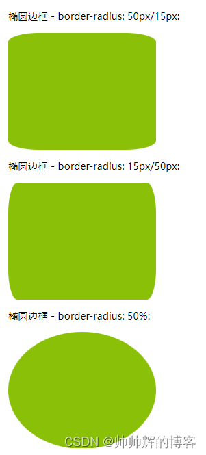
还有椭圆形的
<!DOCTYPE html>
<html>
<head>
<meta charset="utf-8">
<title>菜鸟教程(runoob.com)</title>
<style>
#rcorners7 {
    border-radius: 50px/15px;
    background: #8AC007;
    padding: 20px;
    width: 200px;
    height: 150px;
}
#rcorners8 {
    border-radius: 15px/50px;
    background: #8AC007;
    padding: 20px;
    width: 200px;
    height: 150px;
}

#rcorners9 {
    border-radius: 50%;
    background: #8AC007;
    padding: 20px;
    width: 200px;
    height: 150px;
}
</style>
</head>
<body>

<p>椭圆边框 - border-radius: 50px/15px:</p>
<p id="rcorners7"></p>

<p> 椭圆边框 - border-radius: 15px/50px:</p>
<p id="rcorners8"></p>

<p>椭圆边框 - border-radius: 50%:</p>
<p id="rcorners9"></p>

</body>
</html>
小总结
| 属性 | 描述 |
|---|---|
| border-radius | 所有四个边角 border---radius 属性的缩写 |
| border-top-left-radius | 定义了左上角的弧度 |
| border-top-right-radius | 定义了右上角的弧度 |
| border-bottom-right-radius | 定义了右下角的弧度 |
| border-bottom-left-radius | 定义了左下角的弧度 |
CSS3中的渐变 渐变Gradients
下面的实例演示了从顶部开始的线性渐变。起点是红色慢慢过渡到蓝色
#grad {
    background-image: linear-gradient(#e66465, #9198e5);
}
- 线性渐变 - 从左到右
下面的实例演示了从左边开始的线性渐变。起点是红色慢慢过渡到黄色
#grad {
  height: 200px;
  background-image: linear-gradient(to right, red , yellow);
}
- 线性渐变 - 对角
你可以通过指定水平和垂直的起始位置来制作一个对角渐变。
下面的实例演示了从左上角开始到右下角的线性渐变。起点是红色慢慢过渡到黄色
#grad {
  height: 200px;
  background-image: linear-gradient(to bottom right, red, yellow);
}
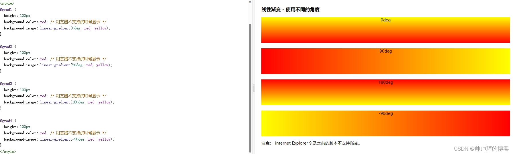
- 使用角度
如果你想要在渐变的方向上做更多的控制你可以定义一个角度而不用预定义方向to bottom、to top、to right、to left、to bottom right等等。
background-image: linear-gradient(angle, color-stop1, color-stop2);
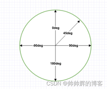
但是请注意很多浏览器Chrome、Safari、firefox等的使用了旧的标准即 0deg 将创建一个从左到右的渐变90deg 将创建一个从下到上的渐变。换算公式 90 - x = y 其中 x 为标准角度y为非标准角度。
下面的实例演示了如何在线性渐变上使用角度
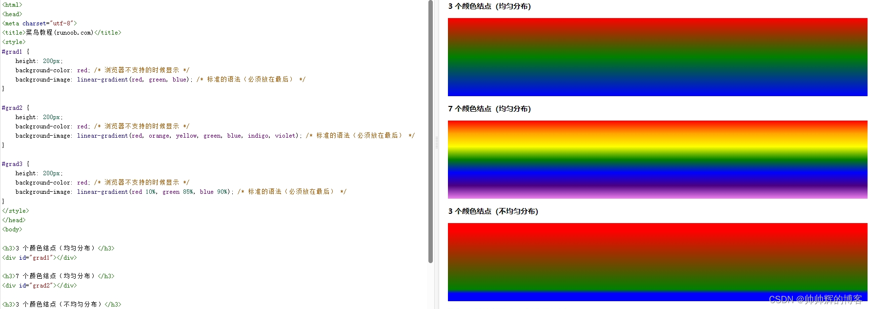
当然也可以创建多个颜色节点
#grad {
  background-image: linear-gradient(red, yellow, green);
}

#grad {
  /* 标准的语法 */
  background-image: linear-gradient(to right, red,orange,yellow,green,blue,indigo,violet);
}
像下面这样
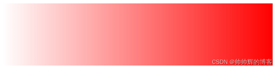
- 使用透明度transparent
CSS3 渐变也支持透明度transparent可用于创建减弱变淡的效果。
为了添加透明度我们使用 rgba() 函数来定义颜色节点。rgba() 函数中的最后一个参数可以是从 0 到 1 的值它定义了颜色的透明度0 表示完全透明1 表示完全不透明。
#grad {
  background-image: linear-gradient(to right, rgba(255,0,0,0), rgba(255,0,0,1));
}
- 一个重复的线性渐变
#grad {
  /* 标准的语法 */
  background-image: repeating-linear-gradient(red, yellow 10%, green 20%);
}
圆形渐变radial-gradient略。。。。
按钮 按钮的各种效果
- 按钮的样式
<style>
.button {
background-color: #4CAF50;
border: none;
color: white;
padding: 15px 32px;
text-align: center;
text-decoration: none;
display: inline-block;
font-size: 16px;
margin: 4px 2px;
cursor: pointer;
}
</style>
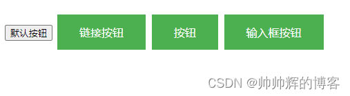
----------------------------------------------------------------------------------------
<button>默认按钮</button>
<a href="#" class="button">链接按钮</a>
<button class="button">按钮</button>
<input type="button" class="button" value="输入框按钮">
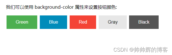
- 按钮颜色
<style>
.button {
    background-color: #4CAF50; /* 绿色 */
    border: none;
    color: white;
    padding: 15px 32px;
    text-align: center;
    text-decoration: none;
    display: inline-block;
    font-size: 16px;
    margin: 4px 2px;
    cursor: pointer;
}

.button2 {background-color: #008CBA;} /* 蓝色 */
.button3 {background-color: #f44336;} /* 红色 */
.button4 {background-color: #e7e7e7; color: black;} /* 灰色 */
.button5 {background-color: #555555;} /* 黑色 */
</style>
-----------------------------------------------------------------------------------------
<button class="button">Green</button>
<button class="button button2">Blue</button>
<button class="button button3">Red</button>
<button class="button button4">Gray</button>
<button class="button button5">Black</button>
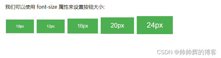
- 按钮大小
<style>
.button {
    background-color: #4CAF50; /* Green */
    border: none;
    color: white;
    padding: 15px 32px;
    text-align: center;
    text-decoration: none;
    display: inline-block;
    font-size: 16px;
    margin: 4px 2px;
    cursor: pointer;
}

.button1 {font-size: 10px;}
.button2 {font-size: 12px;}
.button3 {font-size: 16px;}
.button4 {font-size: 20px;}
.button5 {font-size: 24px;}
</style>
---------------------------------------------------------------------------------------
<button class="button button1">10px</button>
<button class="button button2">12px</button>
<button class="button button3">16px</button>
<button class="button button4">20px</button>
<button class="button button5">24px</button>
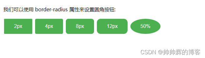
- 圆角按钮
<style>
.button {
    background-color: #4CAF50; /* Green */
    border: none;
    color: white;
    padding: 15px 32px;
    text-align: center;
    text-decoration: none;
    display: inline-block;
    font-size: 16px;
    margin: 4px 2px;
    cursor: pointer;
}

.button1 {border-radius: 2px;}
.button2 {border-radius: 4px;}
.button3 {border-radius: 8px;}
.button4 {border-radius: 12px;}
.button5 {border-radius: 50%;}
</style>

-------------------------------------------------------------------------------------
<button class="button button1">2px</button>
<button class="button button2">4px</button>
<button class="button button3">8px</button>
<button class="button button4">12px</button>
<button class="button button5">50%</button>
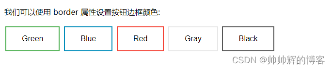
- 按钮边框
<style>
.button {
    background-color: #4CAF50; /* Green */
    border: none;
    color: white;
    padding: 15px 32px;
    text-align: center;
    text-decoration: none;
    display: inline-block;
    font-size: 16px;
    margin: 4px 2px;
    cursor: pointer;
}

.button1 {
    background-color: white;
    color: black;
    border: 2px solid #4CAF50;
}

.button2 {
    background-color: white;
    color: black;
    border: 2px solid #008CBA;
}

.button3 {
    background-color: white;
    color: black;
    border: 2px solid #f44336;
}

.button4 {
    background-color: white;
    color: black;
    border: 2px solid #e7e7e7;
}

.button5 {
    background-color: white;
    color: black;
    border: 2px solid #555555;
}
</style>

---------------------------------------------------------------------------------------
<button class="button button1">Green</button>
<button class="button button2">Blue</button>
<button class="button button3">Red</button>
<button class="button button4">Gray</button>
<button class="button button5">Black</button>
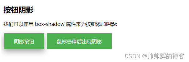
- 按钮阴影
<style>
.button {
    background-color: #4CAF50; /* Green */
    border: none;
    color: white;
    padding: 15px 32px;
    text-align: center;
    text-decoration: none;
    display: inline-block;
    font-size: 16px;
    margin: 4px 2px;
    cursor: pointer;
    -webkit-transition-duration: 0.4s; /* Safari */
    transition-duration: 0.4s;
}

.button1 {
    box-shadow: 0 8px 16px 0 rgba(0,0,0,0.2), 0 6px 20px 0 rgba(0,0,0,0.19);
}

//hover 这个是有悬停阴影效果的
.button2:hover {
    box-shadow: 0 12px 16px 0 rgba(0,0,0,0.24),0 17px 50px 0 rgba(0,0,0,0.19);
}
</style>
-------------------------------------------------------------------------------------------
<button class="button button1">阴影按钮</button>
<button class="button button2">鼠标悬停后出现阴影</button>
效果
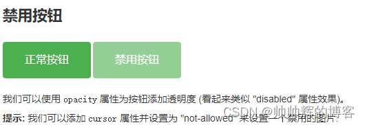
- 禁用按钮
<style>
.button {
    background-color: #4CAF50; /* Green */
    border: none;
    color: white;
    padding: 15px 32px;
    text-align: center;
    text-decoration: none;
    display: inline-block;
    font-size: 16px;
    margin: 4px 2px;
    cursor: pointer;
}

.disabled {
    opacity: 0.6;
    cursor: not-allowed;
}
</style>

-------------------------------------------------------------------------------------
<button class="button">正常按钮</button>
<button class="button disabled">禁用按钮</button>
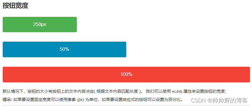
- 按钮宽度
<style>
.button {
    background-color: #4CAF50; /* Green */
    border: none;
    color: white;
    padding: 15px 32px;
    text-align: center;
    text-decoration: none;
    display: inline-block;
    font-size: 16px;
    margin: 4px 2px;
    cursor: pointer;
}

.button1 {width: 250px;}
.button2 {width: 50%;}
.button3 {
    padding-left: 0;
    padding-right: 0;
    width: 100%;
}
</style>
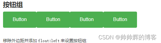
- 按钮组
<style>
.button {
    background-color: #4CAF50; /* Green */
    border: none;
    color: white;
    padding: 15px 32px;
    text-align: center;
    text-decoration: none;
    display: inline-block;
    font-size: 16px;
    cursor: pointer;
    float: left;
}

.button:hover {
    background-color: #3e8e41;
}
</style>

-----------------------------------------------------------------------------------------
<button class="button">Button</button>
<button class="button">Button</button>
<button class="button">Button</button>
<button class="button">Button</button>
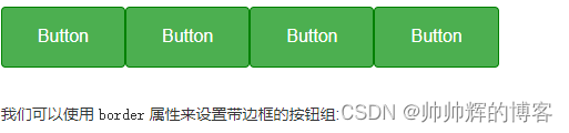
- 带边框按钮组
.button {
    float: left;
    border: 1px solid green
}
| 阿里云国内75折 回扣 微信号:monov8 |
| 阿里云国际,腾讯云国际,低至75折。AWS 93折 免费开户实名账号 代冲值 优惠多多 微信号:monov8 飞机:@monov6 |