

WPF从零到1教程详解,适合新手上路
| 阿里云国内75折 回扣 微信号:monov8 |
| 阿里云国际,腾讯云国际,低至75折。AWS 93折 免费开户实名账号 代冲值 优惠多多 微信号:monov8 飞机:@monov6 |
视频相关链接:https://www.bilibili.com/video/BV1iY411w7zD
Windows Presentation Foundation (简称 WPF)
WPF的概述
WPF 的核心是一个与分辨率无关且基于矢量的呈现引擎旨在充分利用现代图形硬件。 WPF 通过一套完善的应用程序开发功能对该核心进行了扩展这些功能包括可扩展应用程序标记语言 (XAML)、控件、数据绑定、布局、二维和三维图形、动画、样式、模板、文档、媒体、文本和版式。 WPF 属于 .NET因此可以生成整合 .NET API 其他元素的应用程序。
简介
Windows用户界面框架,统一的编程模型、语言和框架做到了界面设计与后端开发分离。
特点
1.呈现效果不受分辨率的影响
2.基于DirectX 3d技术可以做出炫酷的界面
3.提供UI框架集成了矢量图形、流动文字支持、3d视觉效果和控件模型框架、
4. UI与业务逻辑彻底分离UI-XAML描述(底层wpf引擎是把元素解释成对应的对象)
5. xp server2003 到 window7及以后的操作系统版本 都可以支持
6.基于数据驱动数据是核心
学习前提:
基础首先我们需要先入门C# / VB
开发工具 Visual Studio 2019
下载链接 https://pan.baidu.com/s/1uMH8C2rg5T8pNXrObXddXw 提取码: hatd
框架环境: .net core 3.1 或者.net framework4.0+
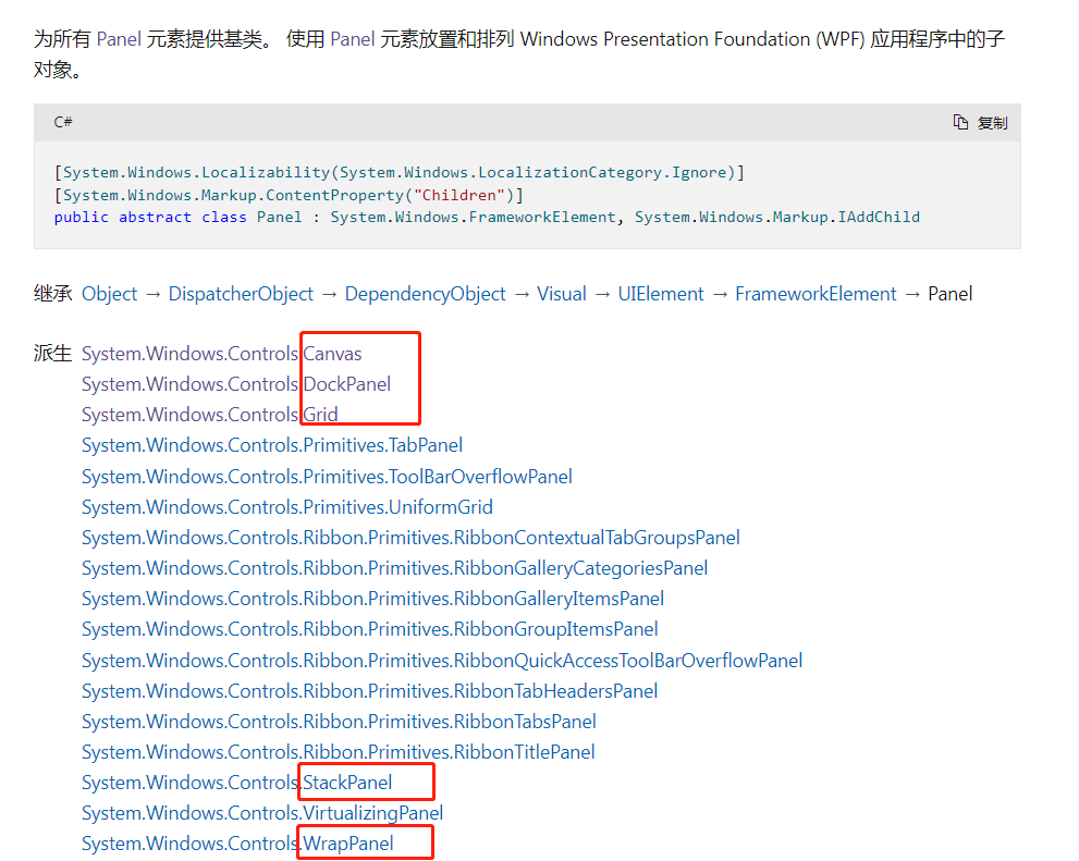
所有控件
| System.Windows.Controls (程序集PresentationFramework.dll) | ||
|---|---|---|
| 文档地址https://docs.microsoft.com/zh-cn/dotnet/api/system.windows.controls?view=windowsdesktop-6.0 | ||
| Label 表示控件的文本标签并提供访问密钥支持。 | TextBox(显示或编辑无格式文本) | TextBlock(一个轻型控件用于显示少量流内容) |
| Border 边框控件 作用 在另一个元素四周绘制边框和/或背景 | Button按钮控件 | Calendar 日历控件 |
| CheckBox选择框 | ComboBox 下拉框 | Image (图片控件) |
| Menu菜单 | ContextMenu内容菜单) | RadioButton(表示可由用户选择但不能清除的按钮,代码能清除) |
| DataGrid数据网格–Table | ListBox包含可选项列表 | ListView表示用于显示数据项列表的控件 |
| DockPanel(定义一个区域从中可以按相对位置水平或垂直排列各个子元素。)—码头;港区 | Grid(定义由列和行组成的灵活的网格区域。) | GroupBox(组控件— 表示一个控件该控件用于创建具有用户界面 (UI) 内容边框和标题的容器。) |
| PrintDialog调用标准的 Microsoft Windows 打印对话框 | ProgressBar(指示操作进度) | Canvas 画布控件 |
| RichTextBox(表示对 FlowDocument 对象进行操作的丰富编辑控件) | ToolBar(一组命令或控件提供容器) | Expander折叠控件 表示一种控件该控件显示具有可折叠内容显示窗口的标题。 |
| TabControl(表示包含多个项的控件这些项共享屏幕上的同一空间) | Frame一种支持导航的内容控件 | Rectangle(矩形区域) |
| StackPanel(将子元素排列成水平或垂直的一行。) | WrapPanel (按从左到右的顺序位置定位子元素在包含框的边缘处将内容切换到下一行。) |
什么是 XAML
XAML 是一种声明性标记语言。 应用于 .NET Core 编程模型时XAML 简化了为 .NET Core 应用创建 UI 的过程。 XAML 文件是通常具有 .xaml 扩展名的 XML 文件。 可通过任何 XML 编码对文件进行编码但通常以 UTF-8 编码。
<StackPanel>
    <Button Content="Click Me"/>
</StackPanel>
对象元素语法
对象元素语法 是 XAML 标记语法它通过声明 XML 元素来实例化 CLR 类或结构。 此语法类似于其他标记语言如 HTML的元素语法。
- 单标签格式。 。
- 双标签格式。 【可嵌入其他的标签】
XAML 根元素
一个 XAML 文件只能有一个根元素这样才能同时作为格式正确的 XML 文件和有效的 XAML 文件。 对于典型 WPF 方案可使用在 WPF 应用模型中具有突出意义的根元素例如页面的 Window 或 Page。
在根标签下面有且只能有一个二级标签。在二级标签里面我们可以写多个三级 四级标签。
<Window>

<【布局标签】>
  【其他标签....】
</【布局标签】>

</Window>
<Page>
    <Window.Resources>
      ....
    </Window.Resources>

<【布局标签】>
  【其他标签....】
</【布局标签】>

</Page>
WPF 和 XAML 命名空间声明
在许多 XAML 文件的根标记中的命名空间声明内通常可看到两个 XML 命名空间声明。 第一个声明默认映射整个 WPF 客户端/框架 XAML 命名空间
xmlns=“http://schemas.microsoft.com/winfx/2006/xaml/presentation”
第二个声明映射单独的 XAML 命名空间通常将其映射到 x: 前缀。
xmlns:x=“http://schemas.microsoft.com/winfx/2006/xaml”
这些声明之间的关系是 x: 前缀映射支持作为 xaml 语言定义一部分的内部函数而 WPF 是一种将 xaml 用作语言的实现并为 xaml 定义了其对象的词汇。
<Window x:Class="MyWpfApp.MainWindow"
        xmlns="http://schemas.microsoft.com/winfx/2006/xaml/presentation"
        xmlns:x="http://schemas.microsoft.com/winfx/2006/xaml"
        xmlns:d="http://schemas.microsoft.com/expression/blend/2008"
        xmlns:mc="http://schemas.openxmlformats.org/markup-compatibility/2006"
        xmlns:local="clr-namespace:MyWpfApp"
        mc:Ignorable="d"
        Title="MainWindow" Height="450" Width="800"
        >
//d  表达式
//mc 标记兼容性

    <【布局标签】 >

    </【布局标签】>


</Window>
(CLR指的是公共语言运行库
课程目标
前六章的课程目标
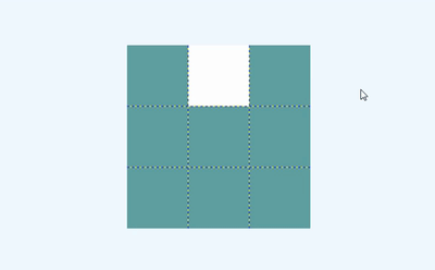
实现一个可移动的方块盒子:
<Window x:Class="Ken.Wpf.移动方块.WindowMoveBox"
        xmlns="http://schemas.microsoft.com/winfx/2006/xaml/presentation"
        xmlns:x="http://schemas.microsoft.com/winfx/2006/xaml"
        xmlns:d="http://schemas.microsoft.com/expression/blend/2008"
        xmlns:mc="http://schemas.openxmlformats.org/markup-compatibility/2006"
        xmlns:local="clr-namespace:Ken.Wpf.移动方块"
        mc:Ignorable="d"
        Title="WindowMoveBox" Height="450" Width="800" KeyDown="Grid_KeyDown">
    <Grid ShowGridLines="True" Background="Teal" Name="gridContent">

        <!--
        使用Grid.ColumnDefinitions将grid 分成三列
        -->
        <Grid.ColumnDefinitions>
            <ColumnDefinition></ColumnDefinition>
            <ColumnDefinition></ColumnDefinition>
            <ColumnDefinition></ColumnDefinition>
        </Grid.ColumnDefinitions>

        <!--
        使用Grid.RowDefinitions将grid 分成三行
        -->
        <Grid.RowDefinitions>
            <RowDefinition></RowDefinition>
            <RowDefinition></RowDefinition>
            <RowDefinition></RowDefinition>
        </Grid.RowDefinitions>

        <Border Name="b1"  Background="Transparent" Grid.Row="0" Grid.Column="0"></Border>
        <Border Name="b2" Background="White" Grid.Row="0" Grid.Column="1"></Border>
        <Border Name="b3"  Background="Transparent" Grid.Row="0" Grid.Column="2"></Border>


        <Border Name="b4"  Background="Transparent" Grid.Row="1" Grid.Column="0"></Border>
        <Border Name="b5" Background="Transparent" Grid.Row="1" Grid.Column="1"></Border>
        <Border Name="b6"  Background="Transparent" Grid.Row="1" Grid.Column="2"></Border>


        <Border Name="b7"  Background="Transparent" Grid.Row="2" Grid.Column="0"></Border>
        <Border Name="b8" Background="Transparent" Grid.Row="2" Grid.Column="1"></Border>
        <Border Name="b9" Background="Transparent" Grid.Row="2" Grid.Column="2"></Border>
    </Grid>
</Window>
        private void Grid_KeyDown(object sender, KeyEventArgs e)
        {
            //首先判断按键的方位 比如上下左右

            //向上移动 移到格子每次减3  向下移动  移到格子每次加3
            //向左移动  每次减1  向右移动 每次加1

            //获取白色的border元素

            UIElementCollection children = gridContent.Children;

            Border curBorder =null;
            for (int i = 0; i < children.Count; i++)
            {

                if (children[i] is Border )
                {
                    if(((children[i] as Border).Background as SolidColorBrush).Color.Equals(Colors.White))
                    {
                        curBorder = children[i] as Border;
                    }
                    (children[i] as Border).Background = new SolidColorBrush(Colors.Transparent);
                }
            }

            string name = curBorder.Name;
            int index = Convert.ToInt32(name.Replace("b", ""));

            if (e.Key.Equals(Key.Up))//上
            {
                index = index - 3 >= 1 ? index - 3 : index;
            }
            else if (e.Key.Equals(Key.Down))//下
            {
                index = index + 3 <= 9 ? index + 3 : index;
            }
            else if(e.Key.Equals(Key.Left))//左
            {
                index = index - 1 >= 1 ? index - 1 : index;
            }
            else if (e.Key.Equals(Key.Right))//右
            {
                index = index +1 <=9 ? index +1 : index;
            }

            object control = gridContent.FindName("b" + index);

            if (control != null)
            {
                (control as Border).Background = new SolidColorBrush(Colors.White);
            }
        }
【后期】展示列表、新增/编辑页面涉及到数据库
【后期】模仿界面

控件篇
继承关系
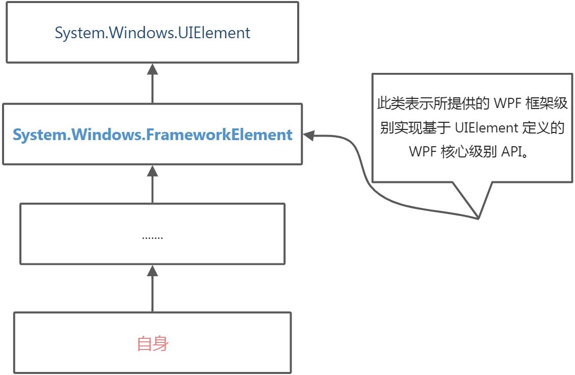
| 对象System.Windows.FrameworkElement | ||
|---|---|---|
| 属性 | ||
| 属性名 | 对象类型 | 作用 |
| Width | double | 获取或设置元素的宽度。【(元素的高度以 与设备无关的单位每个单位 1/96 英寸 为单位。 )】 |
| Height | double | 获取或设置元素的高度。【元素的高度以 与设备无关的单位每个单位 1/96 英寸 为单位。 】 |
| ActualWidth | double | 获取此元素的呈现的宽度。 |
| ActualHeight | double | 获取此元素的呈现的高度。 |
| Name | string | 获取或设置元素的标识名称。 该名称提供引用以便代码隐藏如事件处理程序代码可以引用标记元素在 XAML 处理器的处理过程中构造该元素之后。 |
| Style | Style | 获取或设置此元素呈现时所使用的样式。 |
| Margin | Thickness | 获取或设置元素的外边距。 |
| HorizontalAlignment | HorizontalAlignment | 获取或设置在父元素(如 Panel 或项控件)中组合此元素时所应用的水平对齐特征。【水平对齐设置它是一个枚举值。】 |
| VerticalAlignment | VerticalAlignment | 获取或设置在父元素如面板或项控件中组合此元素时所应用的垂直对齐特征。 |
| FocusVisualStyle | Style | 获取或设置一个属性该属性允许自定义此元素在捕获到键盘焦点时要应用于此元素的外观、效果或其他样式特征。 |
| FlowDirection | FlowDirection | 获取或设置方向文本和其他 用户界面 (UI) 元素在任何控制其布局的父元素中都按此方向流动。 |
| DataContext | object | 获取或设置元素参与数据绑定时的数据上下文。 |
| Resources | ResourceDictionary | 获取或设置本地定义的资源字典。 |
| 方法 | ||
| 方法名 | 参数 | 作用 |
| BringIntoView | 尝试将此元素放入视图它包含在任何可滚动区域内。 | |
| BringIntoView(Rect targetRectangle) | 指定也放入视图的元素的大小。(targetRectangle) | 尝试将放入视图它包含在任何可滚动区域内的此元素提供的区域大小。 |
| FindName(string name) | 所请求元素的名称name | 查找具有提供的标识符名的元素。 |
| FindResource(object resourceKey) | 所请求的资源键标识符resourceKey | 搜索具有指定键的资源并在引发异常如果找不到所请求的资源。 |
| 事件 | ||
| 事件名称 | 作用 | |
| Loaded | 当对元素进行布局、呈现且可将其用于交互时发生。 | |
| KeyDown | 当焦点在该元素上时按下某个键后发生。 | |
| GotFocus | 在此元素获得逻辑焦点时发生 | |
| MouseDown | 在指针位于此元素上并且按下任意鼠标按钮时发生。 | |
| MouseMove | 在鼠标指针位于此元素上并且移动鼠标指针时发生。 | |
| Click | 控件的点击事件 |
控件分类
内容控件、文本控件、条目控件、布局控件、其它控件
| 内容控件 System.Windows.Controls.ContentControl | ||
|---|---|---|
| System.Windows.Controls.Label | ||
| System.Windows.Controls.TextBlock | 继承自FrameworkElement类 | |
| System.Windows.Controls.Button | ||
| System.Windows.Controls.Border | 继承自Decorator类 | |
| System.Windows.Controls.RadioButton | ||
| System.Windows.Controls.CheckBox | ||
| System.Windows.Controls.ToolTip | ||
| System.Windows.Controls.GroupBox | ||
| System.Windows.Controls.Expander | ||
| System.Windows.Controls.Frame |
| 文本控件 System.Windows.Controls.TextBoxBase | ||
|---|---|---|
| System.Windows.Controls.TextBox | ||
| System.Windows.Controls.RichTextBox |
| 条目控件 (System.Windows.Controls.ItemsControl) | ||
|---|---|---|
| System.Windows.Controls.ComboBox | ||
| System.Windows.Controls.Menu | ||
| System.Windows.Controls.ContextMenu | ||
| System.Windows.Controls.TabControl | ||
| System.Windows.Controls.ToolBar | ||
| System.Windows.Controls.ToolBarTray | ||
| System.Windows.Controls.ListBox | ||
| System.Windows.Controls.DataGrid | ||
| System.Windows.Controls.TreeView |
| 布局控件 (System.Windows.Controls.Panel) | ||
|---|---|---|
| System.Windows.Controls.Grid | ||
| System.Windows.Controls.StackPanel | ||
| System.Windows.Controls.DockPanel | ||
| System.Windows.Controls.WrapPanel | ||
| System.Windows.Controls.Canvas |
| 其他控件 | ||
|---|---|---|
| System.Windows.Controls.Calendar | ||
| System.Windows.Controls.Image | ||
| System.Windows.Controls.ProgressBar | ||
| System.Windows.Shapes.Rectangle |
代码区域
公共工具类
using Ken.Wpf.Entity;
using System;
using System.Collections.Generic;
using System.Text;
using System.Windows.Media;

namespace Ken.Wpf.Utils
{
    public class MenuHelper
    {

        public static List<MenuInfo> CreateMenus()
        {
            List<MenuInfo> menus = new List<MenuInfo>();

            MenuInfo m1 = new MenuInfo("出入库管理",null);
            MenuInfo m2 = new MenuInfo("请假管理", null);
            MenuInfo m3 = new MenuInfo("考勤管理",null);

            MenuInfo m3_1 = new MenuInfo("日报管理", m3);
            MenuInfo m3_2 = new MenuInfo("请假管理", m3);

            MenuInfo m4 = new MenuInfo("商品管理",null);
            MenuInfo m4_1 = new MenuInfo("单位管理", m4);
            MenuInfo m4_2 = new MenuInfo("类别管理", m4);

            menus.Add(m1);
            menus.Add(m2);
            menus.Add(m3);
            menus.Add(m4);
            return menus;
        }
    }
}
Label的演示代码
    <!--
            宽度为width
            高度为height
            内容为content
            水平方向排列设置 需要用到HorizontalAlignment
            垂直方向排列设置 需要用到VerticalAlignment
            外边距 使用Margin 四个数字 对应方向分别为 左上右下,一个数字 代表所有方向的外边距
            两个数字 分别代表 左右  上下
        -->
        <Label  Width="180" Height="30" Content="我是个label控件"
                HorizontalAlignment="Right"
                VerticalAlignment="Top" Margin="0,10" FontSize="18" Foreground="Blue"/>
TextBlock的演示代码
        <!--
            1.TextBlock 设置的text内容 如果标签里面有文本内容 会将其加到text内容后面
            2.如果想进行换行操作 可以在Textblock双标签里面 加上LineBreak标签
            在之后的内容就会换行
        -->
        <TextBlock  Text="我是个TextBlock33" FontSize="30" FontWeight="Light" Foreground="Red">
            我是文本一<LineBreak/>
            我是文本二<LineBreak/>
            我是文本三
        </TextBlock>
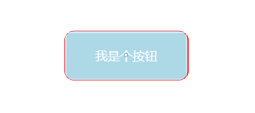
Button的演示代码
<Button Width="100" Height="30" HorizontalAlignment="Left" VerticalAlignment="Top"
        Content="我是个按钮" Margin="20,20,0,0" Background="Teal"
        BorderThickness="5,0,10,0" BorderBrush="Transparent" Foreground="White"
        Click="Button_Click_1"  MouseMove="Button_MouseMove"
          >
Border的演示效果
 <!--
            BorderThickness边框宽度默认为0 直接设置一个参数 代表的是四周宽度
             BorderThickness 有四个参数时 分别代表左边 上边 右边 下边
            我们设置边框颜色加上边框宽度 才能准确显示边框的效果
            如果我们需要设置角的弧度 需要使用CornerRadius属性
        -->
        <Border Width="200" Height="80" Background="LightBlue"
            BorderBrush="Red"  BorderThickness="1,1,2,1" CornerRadius="15">

            <!--<Label HorizontalAlignment="Center" VerticalAlignment="Center"
                   FontSize="20" Foreground="White">我是label1</Label>-->

            <Button Background="Transparent" FontSize="20" Foreground="White"
                    Content="我是个按钮" Click="Button_Click" BorderBrush="Transparent">
            </Button>

            <!--<Grid>
                <Label
                   FontSize="20" Foreground="White">我是label1</Label>
                <Label HorizontalAlignment="Center" VerticalAlignment="Center"
                   FontSize="20" Foreground="White">我是label2</Label>
            </Grid>-->

        </Border>
RadioButton的演示效果
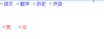
<!--
            radioButton 如果需要实现分组的效果
            1. 使用布局容器来嵌套 如grid /stackPanel等等
            2. 可以使用groupName进行区分 分组
        -->
        <RadioButton Content="男" GroupName="sex"  Margin="10,100"  FontSize="20" Foreground="red" VerticalAlignment="Top" HorizontalAlignment="Left" ></RadioButton>
        <RadioButton Content="女" GroupName="sex" Margin="80,100"  FontSize="20" Foreground="red" VerticalAlignment="Top" HorizontalAlignment="Left" ></RadioButton>


        <RadioButton Content="语文" GroupName="course" FontSize="20" Foreground="Blue" VerticalAlignment="Top" HorizontalAlignment="Left" ></RadioButton>
        <RadioButton Content="数学"  GroupName="course" Margin="70,0" FontSize="20" Foreground="Blue" VerticalAlignment="Top" HorizontalAlignment="Left" ></RadioButton>
        <RadioButton Content="历史"  GroupName="course" Margin="140,0"  FontSize="20" Foreground="Blue" VerticalAlignment="Top" HorizontalAlignment="Left" ></RadioButton>
        <RadioButton Content="外语"  GroupName="course" Margin="210,0"  FontSize="20" Foreground="Blue" VerticalAlignment="Top" HorizontalAlignment="Left" ></RadioButton>
CheckBox演示效果
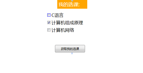
<Grid Name="gridMain">

        <Label VerticalAlignment="Top" Width="120" FontSize="20" Background="Orange" Foreground="White">我的选课:</Label>

        <CheckBox Content="C语言" Margin="300,50" VerticalAlignment="Top"
                  HorizontalAlignment="Left" Width="120" Height="30" FontSize="18" BorderBrush="blue"></CheckBox>

        <CheckBox Content="计算机组成原理" Margin="300,80" VerticalAlignment="Top"
                  HorizontalAlignment="Left" Width="150" Height="30" FontSize="18" IsChecked="True"></CheckBox>

        <CheckBox Content="计算机网络" Margin="300,110" VerticalAlignment="Top"
                  HorizontalAlignment="Left" Width="120" Height="30" FontSize="18"></CheckBox>

        <Button Content="获取我的选课"
                Width="120" Height="30" Click="Button_Click"
                HorizontalAlignment="Left" Margin="331,182,0,0" VerticalAlignment="Top"/>

    </Grid>
private void Button_Click(object sender, RoutedEventArgs e)
{
    UIElementCollection children = gridMain.Children;
    StringBuilder sbf = new StringBuilder("我的选课为:");
    foreach (UIElement item in children)
    {
        if(item is CheckBox && (item as CheckBox).IsChecked.Value)
        {
            sbf.Append((item as CheckBox).Content+",");
        }
    }
    MessageBox.Show(sbf.ToString());
 }
ToolTip的演示代码
   <!--
            1.只有控件继承了FrameworkElement 都有ToolTip属性
            2. 如果ToolTip标签单独使用 需要嵌入元素的ToolTip属性内
        -->
        <Label HorizontalAlignment="Left" FontSize="20">我是个label
            <Label.ToolTip>
                <ToolTip >
                    <Grid>
                        <TextBlock>1000000001.</TextBlock>
                        <TextBlock>1000000002.</TextBlock>
                        <TextBlock>1000000003.</TextBlock>
                    </Grid>
                </ToolTip>
            </Label.ToolTip>
        </Label>

        <Button Width="180" Height="50" HorizontalAlignment="Left" FontSize="20" Margin="200,10">我是个button
            <Button.ToolTip>
                <TextBlock>Useful information goes here.</TextBlock>
            </Button.ToolTip>
        </Button>
GroupBox的演示代码
<Window x:Class="Ken.Wpf.Controls.WindowGroupBox"
xmlns="http://schemas.microsoft.com/winfx/2006/xaml/presentation"
xmlns:x="http://schemas.microsoft.com/winfx/2006/xaml"
xmlns:d="http://schemas.microsoft.com/expression/blend/2008"
xmlns:mc="http://schemas.openxmlformats.org/markup-compatibility/2006"
xmlns:local="clr-namespace:Ken.Wpf.Controls"
mc:Ignorable="d"
Title="WindowGroupBox" Height="450" Width="800">
<Window.Resources>
<ControlTemplate x:Key="myGroupBox" TargetType="GroupBox">
<Grid>
<Grid.RowDefinitions>
<RowDefinition Height="40"></RowDefinition>
<RowDefinition Height="*"></RowDefinition>
</Grid.RowDefinitions>
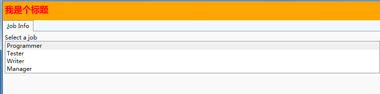
<Border Grid.Row="0" Background="Orange">
<Label Foreground="Red" FontWeight="Bold" FontSize="18">
我是个标题
</Label>
</Border>
<Border Grid.Row="1" Background="AliceBlue">
<StackPanel>
<TabControl Name="myTabControl"
TabStripPlacement="Top"
Margin="0, 0, 0, 10" Height="350"
>
<TabItem>
<TabItem.Header>_Job Info</TabItem.Header>
<StackPanel>
<TextBlock>Select a job</TextBlock>
<ListBox Name ="job" >
<ListBoxItem IsSelected="true">Programmer</ListBoxItem>
<ListBoxItem>Tester</ListBoxItem>
<ListBoxItem>Writer</ListBoxItem>
<ListBoxItem>Manager</ListBoxItem>
</ListBox>
</StackPanel>
</TabItem>
</TabControl>
</StackPanel>
</Border>
</Grid>
</ControlTemplate>
</Window.Resources>
<Grid>
<Grid.RowDefinitions>
<RowDefinition Height="*"></RowDefinition>
<RowDefinition Height="*"> </RowDefinition>
</Grid.RowDefinitions>
<!--
1.需要注意Header属性的使用
2.groupbox的内容可以自由组合
3.我们使用自定义模板==》我们是在Window.Resources里面使用ControlTemplate 需要指定key 需要指定作用模板
-->
<GroupBox Template="{StaticResource myGroupBox}" Grid.Row="0">
</GroupBox>
<GroupBox Template="{StaticResource myGroupBox}" Grid.Row="1">
</GroupBox>
<!--<GroupBox Header="GroupBox"/>-->
<!--<GroupBox >
<GroupBox.Header>
<Label Foreground="blue">这个是groupbox的标题</Label>
</GroupBox.Header>
<StackPanel>
<TabControl Name="myTabControl"
TabStripPlacement="Top"
Margin="0, 0, 0, 10" Height="350"
>
<TabItem Name="PersonalInfo">
<TabItem.Header>_Personal Info</TabItem.Header>
<StackPanel>
<TextBlock>Employee</TextBlock>
<TextBlock>Select your name</TextBlock>
<ListBox Name="empName" >
<ListBoxItem IsSelected="true">Esther</ListBoxItem>
<ListBoxItem>George</ListBoxItem>
<ListBoxItem>Alan</ListBoxItem>
<ListBoxItem>Eric</ListBoxItem>
</ListBox>
</StackPanel>
</TabItem>
<TabItem>
<TabItem.Header>_Job Info</TabItem.Header>
<StackPanel>
<TextBlock>Select a job</TextBlock>
<ListBox Name ="job" >
<ListBoxItem IsSelected="true">Programmer</ListBoxItem>
<ListBoxItem>Tester</ListBoxItem>
<ListBoxItem>Writer</ListBoxItem>
<ListBoxItem>Manager</ListBoxItem>
</ListBox>
</StackPanel>
</TabItem>
<TabItem Name="Skill">
<TabItem.Header>_Skill</TabItem.Header>
<StackPanel>
<TextBlock>
Select your strongest skill
</TextBlock>
<ListBox Name="skills" >
<ListBoxItem IsSelected="true">C#</ListBoxItem>
<ListBoxItem>Visual Basic</ListBoxItem>
<ListBoxItem>.NET</ListBoxItem>
<ListBoxItem>JScript</ListBoxItem>
</ListBox>
</StackPanel>
</TabItem>
<TabItem Name="Summary" >
<TabItem.Header>Su_mmary</TabItem.Header>
<StackPanel>
<TextBlock Name="emp"/>
<TextBlock Name="ejob"/>
<TextBlock Name="eskill"/>
</StackPanel>
</TabItem>
</TabControl>
<Button Content="Show Summary" />
</StackPanel>
</GroupBox>-->
</Grid>
</Window>
Expander的演示代码
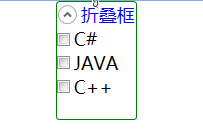
<!--
         1.如果内容需要跟Expander宽高保持一致 我们需要设置水平和垂直方向的排列 需要设置为非拉伸的状态

         2.若要使控件Expander正常工作
         ExpandDirection设置为Down或Up时我们不能设置它的高度。
         ExpandDirection设置为Left或Right时我们不能设置它的宽度。
        -->

        <Expander Header="折叠框" FontSize="18" Foreground="Blue" IsExpanded="True"
                  BorderThickness="1" BorderBrush="Green"  ExpandDirection="Down"
                 VerticalAlignment="Top" HorizontalAlignment="Center" Height="100">
            <StackPanel Orientation="Vertical">
                <CheckBox FontSize="18">C#</CheckBox>
                <CheckBox FontSize="18">JAVA</CheckBox>
                <CheckBox FontSize="18">C++</CheckBox>
            </StackPanel>
        </Expander>
Frame的演示代码
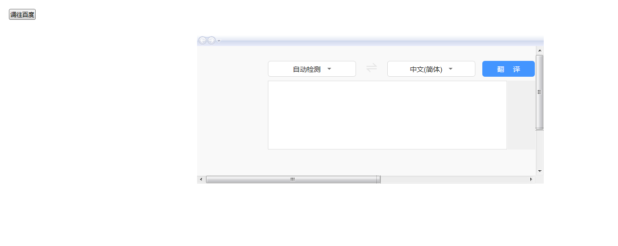
        <Button Click="Button_Click" Content="调往百度" HorizontalAlignment="Left" Margin="230,27,0,0" VerticalAlignment="Top"/>

        <Frame Name="myFrame" Source="https://fanyi.baidu.com/"
               VerticalAlignment="Top" HorizontalAlignment="Center"
               Width="700" Height="300" Margin="30,80" NavigationUIVisibility="Visible" LoadCompleted="myFrame_LoadCompleted"></Frame>
private void Button_Click(object sender, RoutedEventArgs e)
{
    //1.使用source
    //this.myFrame.Source = new Uri("https://www.bilibili.com/", UriKind.Absolute);

    //2.使用Navigate跳转
    //使用 对象
    //MyPage my = new MyPage();
    //this.myFrame.Navigate(my);
    //使用uri
    //this.myFrame.Navigate(new Uri("https://www.bilibili.com/", UriKind.Absolute));

    //3.使用Navigate跳转 携带参数
    MyPage my = new MyPage();
    this.myFrame.Navigate(my,"我是个参数");
}

private void myFrame_LoadCompleted(object sender, System.Windows.Navigation.NavigationEventArgs e)
{
    object extraData = e.ExtraData;
    Console.WriteLine(extraData);
 }
TextBox的演示代码
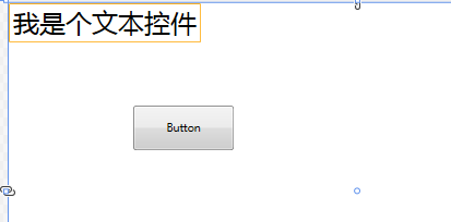
<TextBox Name="myTextBox"  FontSize="30" VerticalAlignment="Top"
                 HorizontalAlignment="Left" BorderBrush="Orange" SelectionBrush="Teal">
           我是个文本控件
        </TextBox>
        <Button Content="Button" HorizontalAlignment="Left" Margin="142,118,0,0" VerticalAlignment="Top" Height="51" Width="116" Click="Button_Click"/>
RichTextBox的演示代码
        <RichTextBox Name="richTB">
            <FlowDocument>
                <Paragraph TextIndent="20">
                    将 HTML 内容粘贴到 RichTextBox 应用程序中可能会导致意外行为因为 RichTextBox 使用 RTF 格式而不是直接使用 HTML 格式。
文本始终换行 。
                    <LineBreak/>
                    RichTextBox 如果不希望文字换行请将 PageWidth on FlowDocument 设置为大于宽度 RichTextBox。 但是到达页面宽度后文本仍会换行。
                </Paragraph>
                <Paragraph>
                    <!--<Label>111</Label>
                    <CheckBox>1112</CheckBox>
                    <GroupBox Header="GroupBox"> </GroupBox>-->
                    <Run>Paragraph 2</Run>
                </Paragraph>

                <!--BlockUIContainer 块状容器 只支持一个子元素 如果需要多个标签 需要在最外面嵌入一个布局容器-->
                <BlockUIContainer>
                    <StackPanel>
                        <Label>Paragraph 2</Label>
                        <CheckBox>1112</CheckBox>
                    </StackPanel>
                </BlockUIContainer>

                <!--实现数学公式 x的4次方+y的3次方 = 99 -->
                <Paragraph FontSize="50">
                    <Run>x</Run>
                    <InlineUIContainer >
                        <Label Margin="-10,0,0,0" FontSize="30">4</Label>
                    </InlineUIContainer>
                    <Run>+</Run>
                    <Run>y</Run>
                    <InlineUIContainer >
                        <Label Margin="-10,0,0,0" FontSize="30">3</Label>
                    </InlineUIContainer>
                    <Run>=</Run>
                    <Run>99</Run>
                </Paragraph>

            </FlowDocument>
        </RichTextBox>
ComboBox的演示代码
using Ken.Wpf.Entity;
using System;
using System.Collections.Generic;
using System.Text;
using System.Windows;
using System.Windows.Controls;
using System.Windows.Data;
using System.Windows.Documents;
using System.Windows.Input;
using System.Windows.Media;
using System.Windows.Media.Imaging;
using System.Windows.Shapes;

namespace Ken.Wpf.Controls
{
/// <summary>
/// WindowComboBox.xaml 的交互逻辑
/// </summary>
public partial class WindowComboBox : Window
{
public WindowComboBox()
{
InitializeComponent();
}

private void Window_Loaded(object sender, RoutedEventArgs e)
{
//1.使用items
/*this.comboBox1.Items.Add("C#");
this.comboBox1.Items.Add("Java");
this.comboBox1.Items.Add("Python");*/

//2.使用DataContext 进行绑定
List<ClassInfo> list = new List<ClassInfo>();
list.Add(new ClassInfo() { ClassName = "高三一班", Code = "301" });
list.Add(new ClassInfo() { ClassName = "高三二班", Code = "302" });
list.Add(new ClassInfo() { ClassName = "高三三班", Code = "303" });

/*this.comboBox1.DataContext = list;

this.comboBox1.DisplayMemberPath = "ClassName";
this.comboBox1.SelectedValuePath = "Code";*/


//3.使用ItemsSource 进行绑定
this.comboBox1.ItemsSource = list;
this.comboBox1.DisplayMemberPath = "ClassName";
this.comboBox1.SelectedValuePath = "Code";

}

private void Button_Click(object sender, RoutedEventArgs e)
{
List<ClassInfo> lists = this.comboBox1.ItemsSource as List<ClassInfo>;

lists.RemoveAt(0);
this.comboBox1.ItemsSource = null;
this.comboBox1.ItemsSource = lists;
}
}
}

------
namespace Ken.Wpf.Entity
{
class VacationSpots : ObservableCollection<string>
{
public VacationSpots()
{

Add("Spain");
Add("France");
Add("Peru");
Add("Mexico");
Add("Italy");
}
}
}

------
using System;
using System.Collections.Generic;
using System.Text;

namespace Ken.Wpf.Entity
{
public class ClassInfo
{
    public string ClassName { get; set; }

    public string Code { get; set; }

}
}
       <!--1.使用静态资源-->
        <!--<StackPanel  Grid.Column="0"
             Grid.Row="6">
            <StackPanel.Resources>
                <src:VacationSpots x:Key="myVacations"/>
            </StackPanel.Resources>
            <ComboBox Name="comboBox1"
            ItemsSource="{StaticResource myVacations}"
            Text="My Cities"
            IsEditable="True"
            IsReadOnly="False"/>

            <TextBlock Text="{Binding ElementName=comboBox1, Path=SelectedItem}"/>
        </StackPanel>-->


        <!--2.使用硬编码编写-->
        <!--<ComboBox Name="comboBox1"
            Text="My Cities"
            IsEditable="True"
            IsReadOnly="False" Width="120" Height="30" VerticalAlignment="Top">
            <ComboBoxItem>选项1</ComboBoxItem>
            <ComboBoxItem>选项2</ComboBoxItem>
            <ComboBoxItem>选项3</ComboBoxItem>
            <Label>选项4</Label>
            <CheckBox>年级</CheckBox>
            <CheckBox>性别</CheckBox>
        </ComboBox>-->

        <!--3.使用代码动态编写-->
        <ComboBox Name="comboBox1"
            Text="My Cities"
            IsEditable="True" ItemsSource="{Binding}"
            IsReadOnly="False" Width="120" Height="30" VerticalAlignment="Top">
        </ComboBox>

        <Button Click="Button_Click" Content="移除一项" HorizontalAlignment="Left" Margin="362,52,0,0" VerticalAlignment="Top"/>
Menu的演示代码
<Window x:Class="Ken.Wpf.Controls.WindowMenu"
        xmlns="http://schemas.microsoft.com/winfx/2006/xaml/presentation"
        xmlns:x="http://schemas.microsoft.com/winfx/2006/xaml"
        xmlns:d="http://schemas.microsoft.com/expression/blend/2008"
        xmlns:mc="http://schemas.openxmlformats.org/markup-compatibility/2006"
        xmlns:local="clr-namespace:Ken.Wpf.Controls"
        mc:Ignorable="d"
        Title="WindowMenu" Height="450" Width="800">

    <Window.Resources>

        <!--Control colors.-->
        <Color x:Key="WindowColor">#FFE8EDF9</Color>
        <Color x:Key="ContentAreaColorLight">#FFC5CBF9</Color>
        <Color x:Key="ContentAreaColorDark">#FF7381F9</Color>

        <Color x:Key="DisabledControlLightColor">#FFE8EDF9</Color>
        <Color x:Key="DisabledControlDarkColor">#FFC5CBF9</Color>
        <Color x:Key="DisabledForegroundColor">#FF888888</Color>

        <Color x:Key="SelectedBackgroundColor">#FFC5CBF9</Color>
        <Color x:Key="SelectedUnfocusedColor">#FFDDDDDD</Color>

        <Color x:Key="ControlLightColor">White</Color>
        <Color x:Key="ControlMediumColor">#FF7381F9</Color>
        <Color x:Key="ControlDarkColor">#FF211AA9</Color>

        <Color x:Key="ControlMouseOverColor">#FF3843C4</Color>
        <Color x:Key="ControlPressedColor">#FF211AA9</Color>


        <Color x:Key="GlyphColor">#FF444444</Color>
        <Color x:Key="GlyphMouseOver">sc#1, 0.004391443, 0.002428215, 0.242281124</Color>

        <!--Border colors-->
        <Color x:Key="BorderLightColor">#FFCCCCCC</Color>
        <Color x:Key="BorderMediumColor">#FF888888</Color>
        <Color x:Key="BorderDarkColor">#FF444444</Color>

        <Color x:Key="PressedBorderLightColor">#FF888888</Color>
        <Color x:Key="PressedBorderDarkColor">#FF444444</Color>

        <Color x:Key="DisabledBorderLightColor">#FFAAAAAA</Color>
        <Color x:Key="DisabledBorderDarkColor">#FF888888</Color>

        <Color x:Key="DefaultBorderBrushDarkColor">Black</Color>

        <!--Control-specific resources.-->
        <Color x:Key="HeaderTopColor">#FFC5CBF9</Color>
        <Color x:Key="DatagridCurrentCellBorderColor">Black</Color>
        <Color x:Key="SliderTrackDarkColor">#FFC5CBF9</Color>

        <Color x:Key="NavButtonFrameColor">#FF3843C4</Color>

        <LinearGradientBrush x:Key="MenuPopupBrush"
                     EndPoint="0.5,1"
                     StartPoint="0.5,0">
            <GradientStop Color="{DynamicResource ControlLightColor}"
                Offset="0" />
            <GradientStop Color="{DynamicResource ControlMediumColor}"
                Offset="0.5" />
            <GradientStop Color="{DynamicResource ControlLightColor}"
                Offset="1" />
        </LinearGradientBrush>

        <LinearGradientBrush x:Key="ProgressBarIndicatorAnimatedFill"
                     StartPoint="0,0"
                     EndPoint="1,0">
            <LinearGradientBrush.GradientStops>
                <GradientStopCollection>
                    <GradientStop Color="#000000FF"
                    Offset="0" />
                    <GradientStop Color="#600000FF"
                    Offset="0.4" />
                    <GradientStop Color="#600000FF"
                    Offset="0.6" />
                    <GradientStop Color="#000000FF"
                    Offset="1" />
                </GradientStopCollection>
            </LinearGradientBrush.GradientStops>
        </LinearGradientBrush>


        <Style x:Key="{x:Type Menu}"
       TargetType="{x:Type Menu}">
            <Setter Property="OverridesDefaultStyle"
          Value="True" />
            <Setter Property="SnapsToDevicePixels"
          Value="True" />
            <Setter Property="Template">
                <Setter.Value>
                    <ControlTemplate TargetType="{x:Type Menu}">
                        <Border BorderThickness="1">
                            <Border.BorderBrush>
                                <LinearGradientBrush StartPoint="0,0"
                                 EndPoint="0,1">
                                    <LinearGradientBrush.GradientStops>
                                        <GradientStopCollection>
                                            <GradientStop Color="{DynamicResource BorderLightColor}"
                                Offset="0.0" />
                                            <GradientStop Color="{DynamicResource BorderDarkColor}"
                                Offset="1.0" />
                                        </GradientStopCollection>
                                    </LinearGradientBrush.GradientStops>
                                </LinearGradientBrush>

                            </Border.BorderBrush>
                            <Border.Background>
                                <LinearGradientBrush EndPoint="0.5,1"
                                 StartPoint="0.5,0">
                                    <GradientStop Color="{DynamicResource ControlLightColor}"
                            Offset="0" />
                                    <GradientStop Color="Teal"
                            Offset="1" />
                                </LinearGradientBrush>
                            </Border.Background>
                            <StackPanel ClipToBounds="True"
                      Orientation="Horizontal"
                      IsItemsHost="True" />
                        </Border>
                    </ControlTemplate>
                </Setter.Value>
            </Setter>
        </Style>

        <!--1.使用路由UI对Command的设置-->
        <RoutedUICommand x:Key="myCmd" ></RoutedUICommand>
    </Window.Resources>

    <!--2.使用命令绑定 CommandBind-->
    <Window.CommandBindings>
        <CommandBinding  Command="{StaticResource myCmd}"  Executed="CommandBinding_Executed"></CommandBinding>
    </Window.CommandBindings>

    <!--3.使用输入绑定 InputBinding-->
    <Window.InputBindings>
        <KeyBinding Command="{StaticResource myCmd}" Gesture="Ctrl+8" ></KeyBinding>
    </Window.InputBindings>

    <Grid>
        <Menu Height="25"  VerticalAlignment="Top" >
            <MenuItem Header="出入库管理" Foreground="White" FontFamily="华文行楷" Height="21" Command="{StaticResource

myCmd}"/>
            <MenuItem Header="请假管理" Foreground="White" FontFamily="华文行楷" Height="21"/>
            <MenuItem Header="考勤管理" Foreground="White" FontFamily="华文行楷" Height="21"/>
            <MenuItem Header="商品管理" Foreground="White" FontFamily="华文行楷" Height="21">
                <MenuItem Header="单位管理" Foreground="Black" FontFamily="华文行楷" Height="21"></MenuItem>
                <MenuItem Header="类别管理" Foreground="Black" FontFamily="华文行楷" Height="21" InputGestureText="Ctrl
+8"></MenuItem>
            </MenuItem>
        </Menu>

    </Grid>
</Window>
 private void CommandBinding_Executed(object sender, ExecutedRoutedEventArgs e)
        {
            MessageBox.Show("Command!!!");
        }
<Menu Name="menu1" VerticalAlignment="Top" Height="30" Background="Teal"
      ItemsSource="{Binding}">

  <Menu.ItemContainerStyle>
    <Style TargetType="{x:Type MenuItem}">
      <Setter Property="Command" Value="{Binding ICommand}"></Setter>
    </Style>
  </Menu.ItemContainerStyle>
  <Menu.ItemTemplate>
    <HierarchicalDataTemplate  DataType="{x:Type et:MenuInfo}" ItemsSource="{Binding SubMenus}">
      <TextBlock   Text="{Binding MenuName}"></TextBlock>
    </HierarchicalDataTemplate>
  </Menu.ItemTemplate>
</Menu>
</Grid>
using Ken.Wpf.Commands;
using System;
using System.Collections.Generic;
using System.Text;
using System.Windows;
using System.Windows.Input;
namespace Ken.Wpf.Entity
{
    public class MenuInfo
    {


        /// <summary>
        /// 菜单名称
        /// </summary>
        public string MenuName { get; set; }

        /// <summary>
        /// 子菜单
        /// </summary>
        public List<MenuInfo> SubMenus { get; set; }


        /// <summary>
        /// Command
        /// </summary>
        public ICommand ICommand { get {
                return new MyCommand((o)=> {
                    MessageBox.Show(MenuName);
                });
            }
        }

        public MenuInfo(string menuName, MenuInfo parentMenu)
        {
            MenuName = menuName;
            //将当期菜单挂载到父菜单下面
            if (parentMenu != null)
            {
                List<MenuInfo> lists = parentMenu.SubMenus ?? new List<MenuInfo>();
                lists.Add(this);
                parentMenu.SubMenus = lists;
            }
        }
    }
}

-------------------------------------------------------------------------
using System;
using System.Collections.Generic;
using System.Text;
using System.Windows.Input;

namespace Ken.Wpf.Commands
{
    /// <summary>
    /// 自定义实现ICommand
    /// </summary>
    class MyCommand : ICommand
    {
        public event EventHandler CanExecuteChanged;


        public Action<object> ExecuteAction;


        public MyCommand(Action<object> executeAction)
        {
            ExecuteAction = executeAction;
        }

        public bool CanExecute(object parameter)
        {
            return true;
            //throw new NotImplementedException();
        }

        public void Execute(object parameter)
        {
            if (this.ExecuteAction != null)
            {
                this.ExecuteAction(parameter);
            }
        }
    }
}
ContextMenu的演示代码
        <Label VerticalAlignment="Center" HorizontalAlignment="Center"
              Content="我是Label" FontSize="30">

            <Label.ContextMenu>

                <ContextMenu Name="cm1" ItemsSource="{Binding}">

                    <ContextMenu.ItemContainerStyle>
                        <Style TargetType="{x:Type MenuItem}">
                            <Setter Property="Command" Value="{Binding ICommand}"></Setter>
                        </Style>
                    </ContextMenu.ItemContainerStyle>
                    <ContextMenu.ItemTemplate>
                        <HierarchicalDataTemplate  DataType="{x:Type et:MenuInfo}" ItemsSource="{Binding SubMenus}">
                            <TextBlock   Text="{Binding MenuName}"></TextBlock>
                        </HierarchicalDataTemplate>
                    </ContextMenu.ItemTemplate>
                </ContextMenu>

            </Label.ContextMenu>


        </Label>
private void Window_Loaded(object sender, RoutedEventArgs e)
{
    //设置数据上下文
    this.cm1.DataContext = MenuHelper.CreateMenus();
 }
TabControl演示代码
<TabControl>
            <TabItem Header="tab1" FontSize="30">
                <Grid>
                    <Label>我是tab1的内容</Label>
                    <TextBox Name="textBox1" Width="50"/>
                </Grid>
            </TabItem>
            <TabItem   FontSize="30">
                <TabItem.Header>
                    <Grid>
                        <Label> tab2</Label>
                        <!--<CheckBox IsChecked="True" FontSize="30"></CheckBox>-->
                    </Grid>
                </TabItem.Header>
                <Label>我是tab2的内容</Label>
            </TabItem>
            <TabItem Header="tab3"  FontSize="30">
                <Label>我是tab3的内容</Label>
            </TabItem>


        </TabControl>
ToolBar+ToolBarTray演示代码
        <!--
         ToolBarTray的Orientation默认是水平方向排列
        -->
        <ToolBarTray Orientation="Horizontal" Margin="0,0,0,-115">
            <!--
            ToolBar的属性
            Band默认为0
            BandIndex默认也为0
             Band相同 则任务栏都处于同一列 或 同一行
             Band值越大 该任务栏越靠后

             BandIndex的越大 在同一列 或 同一行里面 他就越靠后
            -->
            <ToolBar VerticalAlignment="Top" FontSize="30" Band="3" BandIndex="1">
                <Label>
                    Label1
                </Label>
                <Button>按钮1</Button>
                <Separator/>
                <Button>按钮2</Button>
                <Button>按钮3</Button>
                <Separator/>
                <Button>按钮4</Button>
                <Image Source="../Images/touxiang.jpg" Width="50" Height="50"></Image>
                <!--<TextBlock>textBlock1</TextBlock>-->
            </ToolBar>


            <ToolBar VerticalAlignment="Top" FontSize="30" Band="3" BandIndex="2" >
                <Button>按钮1</Button>
                <Separator/>
                <Button>按钮2</Button>
                <Button>按钮3</Button>
            </ToolBar>
        </ToolBarTray>
ListBox演示代码
private void Window_Loaded(object sender, RoutedEventArgs e)
{
    //模拟数据
    List<string> list = new List<string>();
    list.Add("1001");
    list.Add("1002");
    list.Add("1003");
    list.Add("1004");

    this.listbox1.DataContext = list;
        }
     <!--
            使用动态绑定 渲染出ListBoxItem
        -->
        <ListBox Name="listbox1" FontSize="30" SelectionMode="Extended"
                 ItemsSource="{Binding}">
            <ListBox.ItemTemplate>
                <DataTemplate >
                    <TextBlock Text="{Binding}"></TextBlock>
                </DataTemplate>
            </ListBox.ItemTemplate>
        </ListBox>
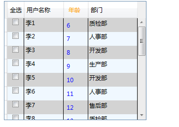
DataGrid演示代码
<DataGrid FontSize="30" Name="grid1" ItemsSource="{Binding}" AutoGenerateColumns="False"
          CanUserAddRows="False"  GridLinesVisibility="Vertical" >
  <DataGrid.Columns>
    <DataGridTextColumn Header="用户姓名" Binding="{Binding Name}"></DataGridTextColumn>
    <DataGridTextColumn Header="年龄" Binding="{Binding Age}"></DataGridTextColumn>
    <!--<DataGridCheckBoxColumn Header="复选列"></DataGridCheckBoxColumn>-->
    <DataGridComboBoxColumn x:Name="depts" Header="部门" SelectedValueBinding="{Binding DeptId}">

    </DataGridComboBoxColumn>

    <!--自定义模板列-->
    <DataGridTemplateColumn>
      <!--自定义列头-->
      <DataGridTemplateColumn.Header>
        <TextBlock>列表4</TextBlock>
      </DataGridTemplateColumn.Header>
      <!--自定义单元格-->
      <DataGridTemplateColumn.CellTemplate>
        <DataTemplate>
          <TextBlock Text="{Binding Name}"></TextBlock>
        </DataTemplate>
      </DataGridTemplateColumn.CellTemplate>
    </DataGridTemplateColumn>
  </DataGrid.Columns>

        </DataGrid>
TreeView演示代码
private void Window_Loaded(object sender, RoutedEventArgs e)
{
    //设置treeView1的数据上下文
    this.treeView1.DataContext = MenuHelper.CreateMenus();

        }
        <!--硬代码 写死 树-->
        <!--<TreeView FontSize="30" >

            <TreeViewItem Header="部门" IsExpanded="True">

                <TreeViewItem Header="销售部" >
                    <TreeViewItem Header="销售1部">
                    </TreeViewItem>
                    <TreeViewItem Header="销售2部">

                    </TreeViewItem>
                </TreeViewItem>
                <TreeViewItem Header="财务部">

                </TreeViewItem>
                <TreeViewItem Header="技术部">

                </TreeViewItem>
                <TreeViewItem Header="人事部">

                </TreeViewItem>

            </TreeViewItem>
        </TreeView>-->


        <TreeView FontSize="30" Name="treeView1" ItemsSource="{Binding}"
                  >
            <!--<TreeView.ItemContainerStyle>
                <Style TargetType="{x:Type MenuItem}">
                    <Setter Property="Command" Value="{Binding ICommand}"></Setter>
                </Style>
            </TreeView.ItemContainerStyle>-->
            <TreeView.ItemTemplate>
                <HierarchicalDataTemplate  DataType="{x:Type et:MenuInfo}" ItemsSource="{Binding SubMenus}">
                    <StackPanel Orientation="Horizontal">
                        <Image Source="../Images/touxiang.jpg" Width="50" Height="50"></Image>
                        <TextBlock   Text="{Binding MenuName}"></TextBlock>
                    </StackPanel>
                </HierarchicalDataTemplate>
            </TreeView.ItemTemplate>

        </TreeView>
Grid演示代码
 <Grid ShowGridLines="True">

        <!--自定义列-->
        <Grid.ColumnDefinitions>
            <ColumnDefinition Width="200"></ColumnDefinition>
            <ColumnDefinition Width="500"></ColumnDefinition>
            <ColumnDefinition></ColumnDefinition>
        </Grid.ColumnDefinitions>

        <!--自定义行-->
        <Grid.RowDefinitions>
            <RowDefinition Height="100"></RowDefinition>
            <RowDefinition Height="200"></RowDefinition>
            <RowDefinition></RowDefinition>
            <RowDefinition></RowDefinition>
        </Grid.RowDefinitions>


        <TextBlock Grid.Row="1" Grid.Column="0">我是TextBlock</TextBlock>


        <TabControl Grid.Row="1" Grid.Column="1">
            <TabItem Header="tab1"></TabItem>
            <TabItem Header="tab2"></TabItem>
            <TabItem Header="tab3"></TabItem>

        </TabControl>

    </Grid>
StackPanel演示代码
<StackPanel Orientation="Horizontal" Opacity="0.5">
  <Label  Width="180" Height="30" Content="我是个label控件"
         VerticalAlignment="Top" Margin="0,10" FontSize="18" Foreground="Blue"/>
  <Label  Width="180" Height="30" Content="我是个label控件"
         VerticalAlignment="Top" Margin="0,10" FontSize="18" Foreground="Blue"/>

  <TextBlock>我是个TextBlock</TextBlock>

  <TabControl Grid.Row="1" Grid.Column="1">
    <TabItem Header="tab1"></TabItem>
    <TabItem Header="tab2"></TabItem>
    <TabItem Header="tab3"></TabItem>

  </TabControl>
        </StackPanel>
DockPanel演示代码
        <DockPanel Background="Beige" LastChildFill="True">

            <!--<DockPanel DockPanel.Dock="Left" Background="Red" Width="50"></DockPanel>
            <DockPanel DockPanel.Dock="Left" Background="Red" Width="50"></DockPanel>
            <DockPanel DockPanel.Dock="Left" Background="Red" Width="50"></DockPanel>
            <DockPanel DockPanel.Dock="Left" Background="Green" Width="200"></DockPanel>-->

            <StackPanel DockPanel.Dock="Left" Background="Red" Width="50"></StackPanel>
            <StackPanel DockPanel.Dock="Top" Background="Black" Height="100"></StackPanel>
            <StackPanel DockPanel.Dock="Bottom" Background="Green" Height="100"></StackPanel>
            <StackPanel DockPanel.Dock="Right" Background="White" Width="100"></StackPanel>

            <DockPanel DockPanel.Dock="Right" Background="Purple" LastChildFill="False" >
                <!--<DockPanel DockPanel.Dock="Right" Background="Teal" Width="30">

                </DockPanel>-->
            </DockPanel>
        </DockPanel>
WrapPanel演示代码
 <!--
        WrapPanel重点掌握
        1.它是对控件进行超出宽度或高度时换行并不是真的控件的内容进行换行
        2.Orientation 默认是水平排列的
        -->
        <WrapPanel Width="700" Orientation="Vertical">
            <!--<Label FontSize="20">按从左到右的顺序位置定位子元素</Label>
            <Label FontSize="20">在包含框的边缘处将内容切换到下一行。</Label>-->
            <StackPanel Width="300" Height="100" Background="Teal"></StackPanel>
            <StackPanel Width="300" Height="100" Background="Teal" Orientation="Vertical">
                <Label FontSize="20">按从左到右的顺序位置定位子元素</Label>
                <Label FontSize="20">在包含框的边缘处将内容切换到下一行。</Label>
            </StackPanel>
            <StackPanel Width="300" Height="100" Background="Red">

            </StackPanel>

        </WrapPanel>
Canvas演示代码
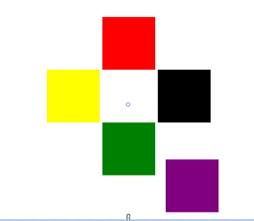
<Canvas Width="500" Height="500" >

            <StackPanel Width="100" Height="100" Background="Red" Canvas.Top="50" Canvas.Left="200"></StackPanel>
            <StackPanel Width="100" Height="100" Background="Green" Canvas.Top="250" Canvas.Left="200"></StackPanel>
            <StackPanel Width="100" Height="100" Background="Yellow" Canvas.Top="150" Canvas.Left="95"></StackPanel>
            <WrapPanel Width="100" Height="100" Background="Black" Canvas.Top="150" Canvas.Left="305"></WrapPanel>

            <WrapPanel Width="100" Height="100" Background="Purple"   Canvas.Bottom="80" Canvas.Right="80"></WrapPanel>
        </Canvas>
Calendar演示代码
<Calendar SelectionMode="MultipleRange" DisplayDate="2022-01-01" SelectedDate="2022-01-01"
                  DisplayDateStart="2022-01-01" DisplayDateEnd="2022-03-01">

        </Calendar>
Image演示代码
 <!--
        Source的写法
        1.相对路径 例如../Images/avatar.png 【图片是嵌入资源或生成到内容 都可以获取到】
        2.pack://application:,,,    (这个代表获取应用下的路径)【图片是嵌入资源或生成到内容 都可以获取到】
        3.pack://siteoforigin:,,,    (这个代表获取站点下的路径)【图片是生成到内容 都可以获取到】
        -->
        <!--<Image Source="../Images/avatar.png" Stretch="Uniform"/>-->
        <!--<Image Source="pack://application:,,,/Images/avatar.png" Stretch="Uniform"/>-->
        <!--<Image Source="pack://siteoforigin:,,,/Images/avatar.png" Stretch="Uniform"/>-->


        <!--
            2.实现特定的文字背景图片
        -->

        <TextBlock Background="Orange" Width="300" Height="80" FontSize="60pt"
            FontFamily="华文行楷" TextAlignment="Center" VerticalAlignment="Center">

            <TextBlock.Foreground>
                <ImageBrush ImageSource="../Images/avatar.png" TileMode="FlipX" Viewport="0,0,30,30" ViewportUnits="Absolute">

                </ImageBrush>
            </TextBlock.Foreground>
            Text
        </TextBlock>
ProgressBar演示代码
        <!--<ProgressBar Name="pro" Foreground="Blue" Background="AliceBlue" Width="300"
                     Minimum="10" Maximum="100"
                  IsIndeterminate="False" Orientation="Vertical" Margin="250,182,250,83"  />-->

        <ProgressBar Width="300" Height="50"
                 Name="progressBar1">
            <!--
            使用了触发器 Triggers
               事件触发器EventTrigger 使用了路由事件绑定了该控件的加载事件
                使用了动画效果DoubleAnimation
            -->
            <ProgressBar.Triggers>
                <EventTrigger RoutedEvent="ProgressBar.Loaded">
                    <BeginStoryboard>
                        <Storyboard>
                            <DoubleAnimation
                Storyboard.TargetName="progressBar1"
                Storyboard.TargetProperty="Value"
                From="0" To="100" Duration="1:1:5"  />
                        </Storyboard>
                    </BeginStoryboard>
                </EventTrigger>
            </ProgressBar.Triggers>
        </ProgressBar>
Rectangle的演示代码
<Rectangle Stroke="Green"  HorizontalAlignment ="Left" VerticalAlignment="Center"
           StrokeDashArray="2" RadiusX="200"  RadiusY="200"    StrokeThickness="20"  Width="400" Height="400"  Margin="20,0">

<Rectangle.Fill>
  <!--
            1.VisualBrush 使用可视化画笔
        -->
  <!--<VisualBrush>
                    <VisualBrush.Visual>
                        <StackPanel>
                            <TextBlock FontSize="12" HorizontalAlignment="Center">图片															</TextBlock>
                            <Image Source="../Images/avatar.png" ></Image>
                        </StackPanel>
                    </VisualBrush.Visual>
                </VisualBrush>-->
  <!--
        2.DrawingBrush 图片画笔
        -->
  <DrawingBrush>
    <DrawingBrush.Drawing>
      <!--Rect必须设置 否则图片不展示-->
      <ImageDrawing ImageSource="../Images/avatar.png" Rect="0,0,200,200"></ImageDrawing>
    </DrawingBrush.Drawing>
  </DrawingBrush>
</Rectangle.Fill>

</Rectangle>
其他
WPF 还包括增强属性和事件的其他编程构造 依赖项属性 和 路由事件。
依赖性示例:
<DockPanel>
  <Button Background="{DynamicResource MyBrush}" Content="I am gold"  Width="200px" Height=" 30px" />

  <DockPanel.Resources>
    <SolidColorBrush x:Key="MyBrush" Color="Gold" />
  </DockPanel.Resources>
</DockPanel>
路由事件:
(路由是指网络数据包发送到目的地址的路线)
     <StackPanel>
            <StackPanel.Resources>
                <Style TargetType="{x:Type Button}">
                    <EventSetter Event="Click" Handler="SetColor"/>
                </Style>
            </StackPanel.Resources>
            <Button>Click me</Button>
            <Button Name="ThisButton" Click="HandleThis">
                Raise event, handle it, use handled=true handler to get it anyway.
            </Button>
        </StackPanel>
private void SetColor(object sender, RoutedEventArgs e)
{
    MessageBox.Show("点击了按钮:"+(e.OriginalSource is Button));
}

private void HandleThis(object sender, RoutedEventArgs e)
{
    MessageBox.Show("点击了按钮:");
}
WPF 中的代码隐藏和 XAML
<Page
  xmlns="http://schemas.microsoft.com/winfx/2006/xaml/presentation"
  xmlns:x="http://schemas.microsoft.com/winfx/2006/xaml"
  x:Class="MyNamespace.MyCanvasCodeInline"
>
  <Button Name="button1" Click="Clicked">Click Me!</Button>
  <x:Code><![CDATA[
    void Clicked(object sender, RoutedEventArgs e)
    {
        button1.Content = "Hello World";
    }
  ]]></x:Code>
</Page>
绑定标记扩展
将属性值延迟为数据绑定值从而创建中间表达式对象并解释应用于元素及其绑定的数据上下文。
绑定表达式用法
<object property="{Binding}" .../>

<object property="{Binding  bindProp1=value1[, bindPropN=valueN]*}" ...  />
<object property="{Binding path}" .../>
<object property="{Binding path[, bindPropN=valueN]*}" .../>
语法说明
在这些语法中 和 []* 不是文本。 它们是表示法的一部分用于指示可以使用零个或多个 bindPropvalue=, 对并且它们与前面的 bindPropvalue= 对之间具有分隔符。
可以改为使用对象元素的属性设置"可以使用绑定扩展设置的绑定属性"部分中列出的任何 Binding 属性。 但是这不是 真正的标记扩展用法 Binding它只是设置 CLR 类属性的属性的常规 XAML Binding 处理。 换句话说<Binding_bindProp1value1bindPropNvalueN_=“”[=“”]*/>Binding 是对象元素用法的属性的等效语法而不是表达式Binding用法。
- Mode value 是枚举中的常量 BindingMode 名称。 例如{Binding Mode=OneWay}。
- Path一个字符串用于描述数据对象或常规对象模型的路径。 格式提供了几种不同的约定用于遍历本主题中无法充分描述的对象模型。 请参阅 PropertyPath XAML 语法。
- RelativeSource与 和 互斥ElementNameSource;其中每个绑定属性都表示特定的绑定方法。 请参阅 数据绑定概述。 需要嵌套 的 RelativeSource MarkupExtension 用法来指定值。
- Source互斥与 RelativeSource 和 ElementName;其中每个绑定属性都表示特定的绑定方法。 请参阅 数据绑定概述。 需要使用嵌套扩展通常是引用键键资源字典中的对象数据源的 StaticResource 标记扩展。
- StringFormat一个字符串描述绑定数据的字符串格式约定。 这是一个相对高级的绑定概念;请参阅 的参考页 StringFormat。
- XPath一个字符串描述 XML 数据源的 XMLDOM 的路径。 请参阅 使用 XMLDataProvider 和 XPath 查询绑定到 XML 数据。
其他标记扩展
| 属性 | 作用 |
|---|---|
| StaticResource | 通过查找对已定义的资源的引用为任何 XAML 属性属性提供值。 |
| DynamicResource | 通过将任何 XAML 属性属性的值延迟为对已定义资源的引用为该属性提供值。 |
| RelativeSource | 指定绑定源的属性 RelativeSource 以便在 绑定标记扩展中使用或在设置 RelativeSource 在 XAML 中建立的元素的属性 Binding 时使用。 |
| TemplateBinding | 连接某一控件模板中的属性值使之成为模板化控件上另一个属性的值。 |
| ThemeDictionary | 为集成第三方控件的自定义控件创作者或应用程序提供一种方法用于加载要在设置控件样式时使用的特定于主题的资源字典。 |
| ColorConvertedBitmap | 提供一种方法用于指定没有嵌入的配置文件的位图源。 颜色上下文/配置文件由 URI 指定与映像源 URI 相同。 |
数据绑定与自定义路由
官方文档https://docs.microsoft.com/zh-cn/dotnet/desktop/wpf/data/?view=netdesktop-6.0
创建绑定
前面部分中讨论的一些概念可以重申为使用 Binding 对象建立绑定且每个绑定通常具有四个组件绑定目标、目标属性、绑定源以及指向要使用的源值的路径。
绑定源绑定到元素的活动 DataContext。 如果元素没有显式定义 DataContext则会自动继承。
请考虑以下示例其中的绑定源对象是一个名为 MyData 的类该类在** Ken.Wpf.Entity**命名空间中定义。 出于演示目的MyData 具有名为 ColorName 的字符串属性其值设置为“Red”。 因此此示例生成一个具有红色背景的按钮。
<Window x:Class="Ken.Wpf.MainWindow"
        xmlns="http://schemas.microsoft.com/winfx/2006/xaml/presentation"
        xmlns:x="http://schemas.microsoft.com/winfx/2006/xaml"
        xmlns:d="http://schemas.microsoft.com/expression/blend/2008"
        xmlns:mc="http://schemas.openxmlformats.org/markup-compatibility/2006"
        xmlns:local="clr-namespace:Ken.Wpf"
        xmlns:c="clr-namespace:Ken.Wpf.Entity"
        mc:Ignorable="d"
        Title="MainWindow" Height="450" Width="800">

    <Grid >
        <Grid.Resources>
            <c:MyData x:Key="myDataSource"/>
        </Grid.Resources>
        <Grid.DataContext>
            <Binding Source="{StaticResource myDataSource}"/>
        </Grid.DataContext>
        <Button Background="{Binding Path=ColorName}"
          Width="150" Height="30">
            I am bound to be RED!
        </Button>
    </Grid>
</Window>
创建自定义路由
以下示例在自定义控件 CustomButton 库中实现 类。 派生 CustomButton 自 的 类 Button
- 使用 方法 RoutedEvent 注册 ConditionalClick 名为 RegisterRoutedEvent 的 并指定 注册期间冒泡 策略。
- 将注册 RoutedEvent 调用返回的实例分配给名为 的静态只读字段 ConditionalClickEvent。
- 定义 CLR 添加和删除事件访问器。
- 添加自定义逻辑以在单击 并 CustomButton 应用外部条件时引发自定义路由事件。 尽管示例代码从重写 ConditionalClick 的虚拟方法 OnClick 中引发路由事件但你可以以任何选择的方式引发事件。
public class CustomButton : Button
{
    // Register a custom routed event using the Bubble routing strategy.
    public static readonly RoutedEvent ConditionalClickEvent = EventManager.RegisterRoutedEvent(
        name: "ConditionalClick",
        routingStrategy: RoutingStrategy.Bubble,
        handlerType: typeof(RoutedEventHandler),
        ownerType: typeof(CustomButton));

    // Provide CLR accessors for assigning an event handler.
    public event RoutedEventHandler ConditionalClick
    {
        add { AddHandler(ConditionalClickEvent, value); }
        remove { RemoveHandler(ConditionalClickEvent, value); }
    }

    void RaiseCustomRoutedEvent()
    {
        // Create a RoutedEventArgs instance.
        RoutedEventArgs routedEventArgs = new(routedEvent: ConditionalClickEvent);

        // Raise the event, which will bubble up through the element tree.
        RaiseEvent(routedEventArgs);
    }

    // For demo purposes, we use the Click event as a trigger.
    protected override void OnClick()
    {
        // Some condition combined with the Click event will trigger the ConditionalClick event.
        if (DateTime.Now > new DateTime())
            RaiseCustomRoutedEvent();

        // Call the base class OnClick() method so Click event subscribers are notified.
        base.OnClick();
    }
}
该示例包括一个单独的 WPF 应用程序该应用程序使用 XAML CustomButtonStackPanel标记将 的实例添加到 Handler_ConditionalClickConditionalClick并将 方法分配为 和 元素StackPanel1的事件CustomButton处理程序。
<Window x:Class="CodeSample.MainWindow"
    xmlns="http://schemas.microsoft.com/winfx/2006/xaml/presentation"
    xmlns:x="http://schemas.microsoft.com/winfx/2006/xaml"
    xmlns:custom="clr-namespace:WpfControl;assembly=WpfControlLibrary"
        Title="How to create a custom routed event" Height="100" Width="300">

    <StackPanel Name="StackPanel1" custom:CustomButton.ConditionalClick="Handler_ConditionalClick">
        <custom:CustomButton
            Name="customButton"
            ConditionalClick="Handler_ConditionalClick"
            Content="Click to trigger a custom routed event"
            Background="LightGray">
        </custom:CustomButton>
    </StackPanel>
</Window>
在代码隐藏中WPF 应用程序定义事件 Handler_ConditionalClick 处理程序方法。 只能在代码隐藏中实现事件处理程序方法。
// The ConditionalClick event handler.
private void Handler_ConditionalClick(object sender, RoutedEventArgs e)
{
    string senderName = ((FrameworkElement)sender).Name;
    string sourceName = ((FrameworkElement)e.Source).Name;

    Debug.WriteLine($"Routed event handler attached to {senderName}, " +
                    $"triggered by the ConditionalClick routed event raised on 				{sourceName}.");
}

// Debug output when CustomButton is clicked:
// Routed event handler attached to CustomButton,
//     triggered by the ConditionalClick routed event raised on CustomButton.
// Routed event handler attached to StackPanel1,
//     triggered by the ConditionalClick routed event raised on CustomButton.
单击 CustomButton 时
- 路由 ConditionalClick 事件在 上引发 CustomButton。
- 将 Handler_ConditionalClick 触发附加到 CustomButton 的事件处理程序。
- 路由 ConditionalClick 事件将元素树向上遍历到 StackPanel1。
- 将 Handler_ConditionalClick 触发附加到 StackPanel1 的事件处理程序。
- 路由 ConditionalClick 事件继续上移元素树可能会触发附加到 ConditionalClick 其他遍历元素的其他事件处理程序。
事件 Handler_ConditionalClick 处理程序获取有关触发它的事件的以下信息
- 发送方对象它是事件处理程序附加到的元素。 将 sender 第一 CustomButton 次运行处理程序第二 StackPanel1 次运行。
- 对象 RoutedEventArgs.Source 它是最初引发事件的元素。 此示例中 始终 Source 为 CustomButton。
备注
路由事件和 CLR 事件之间的主要区别在于路由事件遍历元素树查找处理程序而 CLR 事件不遍历元素树处理程序只能附加到引发事件的源对象。 因此路由事件 sender 可以是元素树中任何遍历的元素。
可以像冒泡事件一样创建隧道事件只不过你将在事件注册调用中将路由策略设置为 Tunnel。 有关隧道事件详细信息请参阅 WPF 输入事件。