CSS(基础,面试,常见用例)
| 阿里云国内75折 回扣 微信号:monov8 |
| 阿里云国际,腾讯云国际,低至75折。AWS 93折 免费开户实名账号 代冲值 优惠多多 微信号:monov8 飞机:@monov6 |
CSS规则
- 【*】CSS选择器
- 【*】盒模型
- 【*】em/px/rem/vh/vw的区别
- 【*】设备像素、css像素、设备独立像素、dpr、ppi 之间的区
- 【*】CSS中隐藏页面元素的方式
- display属性
- 【*】BFC
- 【*】元素水平垂直居中
- 【*】position定位
- 【*】如何实现两栏布局右侧自适应三栏布局中间自适应
- 【*】flex弹性布局
- 【*】Grid网格布局
- 【*】CSS3新特性
- 【*】css动画
- 【*】回流 & 重绘
- 【*】响应式设计
- 【*】CSS性能优化
- 【*】单行、多行文本溢出
- 二、多行文本溢出省略
- 【*】视差滚动
- 【*】三角形
- 【*】实现一个广告跑马灯效果
- 【*】实现弹幕
- 【*】实现一个文字颜色跑马灯效果
- 【*】实现一个简单的幻灯片效果
- 【*】实现一个手机版淘宝商品并列显示
- 【*】设计一个满屏品字布局
【*】CSS选择器
一、 CSS选择器
CSS选择器是CSS规则的第一部分

它是元素和其他部分组合起来告诉浏览器哪个HTML元素应当是被选为应用规则中的CSS属性值的方式

选择器所选择的元素叫做“选择器的对象”
<div id="box">
    <div class="one">
        <p class="one_1">
        </p>
        <p class="one_1" ref="p_1">
        </p>
    </div>
    <div class="two"></div>
    <div class="two"></div>
    <div class="two"></div>
</div>
常用的有
- id
#box选择id为box的元素 - 类
.one选择类名为one的所有元素 - 标签
div选择标签为div的所有元素 - 后代
#box div选择id为box元素内部所有的div元素 - 子
.one>one_1选择父元素为.one的所有.one_1的元素 - 相邻
.one+.two选择紧接在.one之后的所有.two元素 - 层次
div~p选择前面有div元素的每个p元素 - 群组
div,p选择div、p的所有元素
- 伪类
a:hover - 伪元素
其他选择器
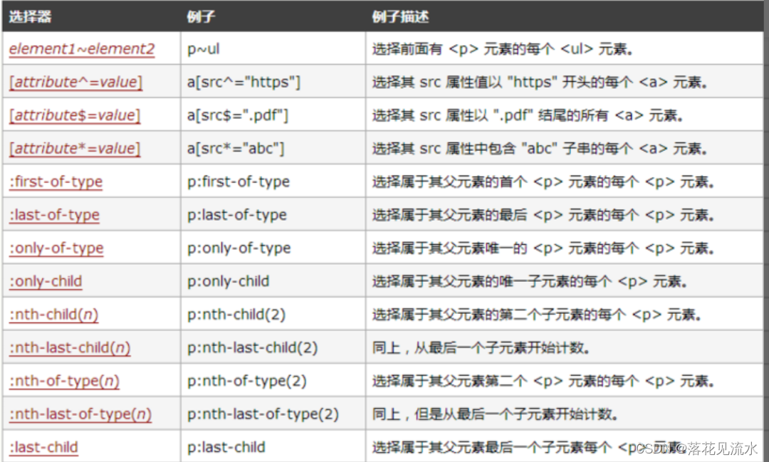
- 属性
[attribute] 选择带有attribute属性的元素
[attribute=value] 选择所有使用attribute=value的元素
[attribute~=value] 选择attribute属性包含value的元素
[attribute|=value]选择attribute属性以value开头的元素
es6:
[attribute*=value]选择attribute属性值包含value的所有元素
[attribute^=value]选择attribute属性开头为value的所有元素
[attribute$=value]选择attribute属性结尾为value的所有元素
- 通配符
*全部 - 伪类
伪类pseudo-class是一个以冒号作为前缀被添加到一个选择器末尾的关键字当你希望样式在特定状态才被呈现到指定的元素时你可以往元素的选择器后面加上对应的伪类。

伪类是通过在元素选择器上加入伪类改变元素状态
:link 选择未被访问的链接
:visited选取已被访问的链接
:active选择活动链接
:hover 鼠标指针浮动在上面的元素
:focus 选择具有焦点的
:first-child 父元素的首个子元素
es6:
:first-of-type 父元素的首个元素
:last-of-type 父元素的最后一个元素
:only-of-type 父元素的特定类型的唯一子元素
:only-child 父元素中唯一子元素
:nth-child(n) 选择父元素中第N个子元素
:nth-last-of-type(n) 选择父元素中第N个子元素从后往前
:last-child 父元素的最后一个元素
:root 设置HTML文档
:empty 指定空的元素
:enabled 选择被禁用元素
:disabled 选择被禁用元素
:checked 选择选中的元素
:not(selector) 选择非 <selector> 元素的所有元素
- 伪元素
伪元素用于创建一些不在文档树中的元素并为其添加样式
伪元素通过对元素的操作进行对元素的改变
:first-letter 用于选取指定选择器的首字母
:first-line 选取指定选择器的首行
:before : 选择器在被选元素的内容前面插入内容
:after : 选择器在被选元素的内容后面插入内容
二、选择器匹配原理
从右向左 的顺序来匹配选择器。从最具体的选择器开始。
三、优先级 / 权重
三条规则
- 权重不同的样式作用于同一元素时权重高的规则生效
- 权重相同的样式作用于同一元素时后声明的规则生效
- 直接作用于元素的样式优先级高于从祖先元素继承的规则
优先级与权重值
- !important 1000
- 内联 = 外联 1000
- ID选择器 100
- 类选择器 = 伪类选择器 = 属性选择器 10
- 标签选择器 = 伪元素选择器 1
- 通配选择器 = 后代选择器 = 兄弟选择器 0
div{ /*1*/ }
.class1{ /*10*/ }
#id1{ /*100*/ }
#id1 div{ /*100 + 1*/ }
四、可继承 / 不可继承样式属性
在css中继承是指的是给父元素设置一些属性后代元素会自动拥有这些属性
可继承
字体文本元素可见性表格布局属性列表属性引用光标属性
- 字体系列属性
font:组合字体
font-family:规定元素的字体系列
font-weight:设置字体的粗细
font-size:设置字体的尺寸
font-style:定义字体的风格
font-variant:偏大或偏小的字体
- 文本系列属性
text-indent:文本缩进
text-align:文本水平
line-height:行高
word-spacing:增加或减少单词间的空白
letter-spacing:增加或减少字符间的空白
text-transform:控制文本大小写
direction:规定文本的书写方向
color:文本颜色
- 元素可见性
visibility: hidden;
- 表格布局属性
caption-side:定位表格标题位置
border-collapse:合并表格边框
border-spacing:设置相邻单元格的边框间的距离
empty-cells:单元格的边框的出现与消失
table-layout:表格的宽度由什么决定
- 列表属性
list-style-type:文字前面的小点点样式
list-style-position:小点点位置
list-style:以上的属性可通过这属性集合
- 引用
quotes:设置嵌套引用的引号类型
- 光标属性
cursor: 箭头可以变成需要的形状
特殊
- a 标签的字体颜色不能被继承
- h1-h6标签字体的大下也是不能被继承的
不可继承
1、display
2、文本属性vertical-align、text-decoration
3、盒子模型的属性宽度、高度、内外边距、边框等
4、背景属性背景图片、颜色、位置等
5、定位属性浮动、清除浮动、定位position等
6、生成内容属性content、counter-reset、counter-increment
7、轮廓样式属性outline-style、outline-width、outline-color、outline
8、页面样式属性size、page-break-before、page-break-after
【*】盒模型
一、盒模型
当对一个文档进行布局layout的时候浏览器的渲染引擎会根据标准之一的 CSS 基础框盒模型CSS basic box model将所有元素表示为一个个矩形的盒子box

一个盒子由四个部分组成content、padding、border、margin
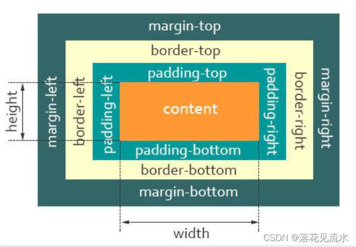
content即实际内容显示文本和图像
boreder即边框围绕元素内容的内边距的一条或多条线由粗细、样式、颜色三部分组成
padding即内边距清除内容周围的区域内边距是透明的取值不能为负受盒子的background属性影响
margin即外边距在元素外创建额外的空白空白通常指不能放其他元素的区域
在CSS中盒子模型可以分成
- W3C 标准盒子模型
- IE 怪异盒子模型
默认情况下盒子模型为W3C 标准盒子模型
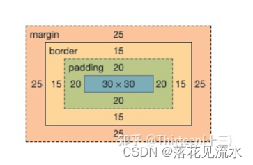
1、标准盒子模型

盒子总宽度 = width + padding + border + margin;
盒子总高度 = height + padding + border + margin
width/height 只是内容高度不包含 padding 和 border值
eg:
.box {
    width:100px;
    height:100px;
    margin:25px;
    padding:20px;
    border:15px solid #000;
}
box总宽度 = 100 + 20 + 20 + 15 +15 = 170
内容的宽度 = width(100)
2、IE 怪异盒子模型
盒子总宽度 = width + margin;
盒子总高度 = height + margin;

也就是width/height 包含了 padding和 border值
eg:
.box {
    width:100px;
    height:100px;
    margin:25px;
    padding:20px;
    border:15px solid #000;
    box-sizing: border-box;
}
box总宽度 = 100
内容的宽度 = width(100 - 20 - 20 - 15 -15 = 30)
二、box-sizing属性
CSS 中的 box-sizing 属性定义了引擎应该如何计算一个元素的总宽度和总高度
box-sizing: content-box|border-box|inherit:

content-box 默认值元素的 width/height 不包含paddingborder与标准盒子模型表现一致

border-box 元素的 width/height 包含 paddingborder与怪异盒子模型表现一致

inherit 指定 box-sizing 属性的值应该从父元素继承
三、offsetWidth、clientWidth、scrollWidth**
offsetWidth/offsetHeight = content + padding + borderclientWidth/clientHeight = content + paddingscrollWidth/scrollHeight = content + padding + border + 滚动条
【*】em/px/rem/vh/vw的区别
一、CSS单位
传统的项目开发中我们只会用到px、%、em这几个单位它可以适用于大部分的项目开发且拥有比较良好的兼容性

从CSS3开始浏览器对计量单位的支持又提升到了另外一个境界新增了rem、vh、vw、vm等一些新的计量单位

利用这些新的单位开发出比较良好的响应式页面适应多种不同分辨率的终端包括移动设备等
在css单位中可以分为长度单位、绝对单位。
相对长度单位em、ex、ch、rem、vw、vh、vmin、vmax、%
绝对长度单位cm、mm、in、px、pt、pc
二、px
像素所谓像素就是呈现在我们显示器上的一个个小点每个像素点都是大小等同的

px 的最小单位是1所以小数的度量没有意义
三、em
相对于当前对象内文本的字体尺寸。如当前对行内文本的字体尺寸未被人为设置则相对于浏览器的默认字体尺寸1em = 16px

为了简化 font-size 的换算我们需要在css中的 body 选择器中声明font-size= 62.5%这就使 em 值变为 16px*62.5% = 10px

这样 12px = 1.2em, 10px = 1em, 也就是说只需要将你的原来的px 数值除以 10然后换上 em作为单位就行了
特点
- em 的值并不是固定的
- em 会继承父级元素的字体大小
- em 是相对长度单位。相对于当前对象内文本的字体尺寸。如当前对行内文本的字体尺寸未被人为设置则相对于浏览器的默认字体尺寸
- 任意浏览器的默认字体高都是 16px
eg
<div class="big">
    我是14px=1.4rem<div class="small">我是12px=1.2rem</div>
</div>

<style>
    html {font-size: 10px;  } /*  公式16px*62.5%=10px  */
    .big{font-size: 1.4em}
    .small{font-size: 1.2em}
</style>

这时候.big元素的font-size为14px而.small元素的font-size为12px
四、rem
rem相对单位相对的只是HTML根元素font-size的值

同理如果想要简化font-size的转化我们可以在根元素html中加入font-size: 62.5%
html {font-size: 62.5%;  } /*  公式16px*62.5%=10px  */

1rem=10px、1.2rem=12px、1.4rem=14px、1.6rem=16px;
特点
- rem单位可谓集相对大小和绝对大小的优点于一身
- 和em不同的是rem总是相对于根元素而不像em一样使用级联的方式来计算尺寸
五、vh、vw
vw 就是根据窗口的宽度分成100等份100vw就表示满宽50vw就表示一半宽。vw 始终是针对窗口的宽同理vh则为窗口的高度
这里的窗口分成几种情况
- 在桌面端指的是浏览器的可视区域
- 移动端指的就是布局视口
像vw、vh比较容易混淆的一个单位是%不过百分比宽泛的讲是相对于父元素
六、%百分比
像vw、vh比较容易混淆的一个单位是%不过百分比宽泛的讲是相对于父元素
- 对于普通定位元素就是我们理解的父元素
- 对于position: absolute;的元素是相对于已定位的父元素
- 对于position: fixed;的元素是相对于 ViewPort可视窗口
总结
- px绝对单位页面按精确像素展示
- em相对单位基准点为父节点字体的大小如果自身定义了font-size按自身来计算整个页面内1em不是一个固定的值
- rem相对单位可理解为root em, 相对根节点html的字体大小来计算
- vh、vw主要用于页面视口大小布局在页面布局上更加方便简单
【*】设备像素、css像素、设备独立像素、dpr、ppi 之间的区
一、背景
在css中我们通常使用px作为单位在PC浏览器中css的1个像素都是对应着电脑屏幕的1个物理像素

这会造成一种错觉我们会认为css中的像素就是设备的物理像素

但实际情况却并非如此css中的像素只是一个抽象的单位在不同的设备或不同的环境中css中的1px所代表的设备物理像素是不同的

当我们做移动端开发时同为1px的设置在不同分辨率的移动设备上显示效果却有很大差异

这背后就涉及了css像素、设备像素、设备独立像素、dpr、ppi的概念
二、CSS像素
适用于web编程在 CSS 中以 px 为后缀是一个长度单位。在 CSS 规范中px是一个相对单位相对的是设备像素device pixel一般情况页面缩放比为11个CSS像素等于1个设备独立像素。
CSS像素又具有两个方面的相对性
- 在同一个设备上每1个 CSS 像素所代表的设备像素是可以变化的比如调整屏幕的分辨率
- 在不同的设备之间每1个 CSS 像素所代表的设备像素是可以变化的比如两个不同型号的手机
三、设备像素
设备像素device pixels又称为物理像素。
指设备能控制显示的最小物理单位不一定是一个小正方形区块也没有标准的宽高只是用于显示丰富色彩的一个“点”而已。
从屏幕在工厂生产出的那天起它上面设备像素点就固定不变了单位为pt
四、设备独立像素
设备独立像素Device Independent Pixel与设备无关的逻辑像素代表可以通过程序控制使用的虚拟像素是一个总体概念包括了CSS像素
在javaScript中可以通过window.screen.width/ window.screen.height 查看
一个设备独立像素里可能包含1个或者多个物理像素点包含的越多则屏幕看起来越清晰
举个例子
iPhone 3GS 和 iPhone 4/4s 两个 3.5 寸的手机但 iPhone 3GS 的分辨率是 320x480iPhone 4/4s 的分辨率是 640x960。意味着它们的物理像素分别是320和640。如果我们按照 320 物理像素进行布局到了 640 物理像素的手机上就会有一半的空白为了避免这种问题就产生了虚拟像素单位。我们统一 iPhone 3GS 和 iPhone 4/4s 都是 320 个虚拟像素只是在 iPhone 3GS 上最终 1 个虚拟像素换算成 1 个物理像素在 iphone 4s 中1 个虚拟像素最终换算成 2 个物理像素
1 个虚拟像素被换算成几个物理像素这个数值我们称之为设备像素比也就是下面介绍的dpr
五、dpr
设备像素比代表设备独立像素到设备像素的转换关系在JavaScript中可以通过 window.devicePixelRatio 获取。
当设备像素比为1:1时使用11×1个设备像素显示1个CSS像素
当设备像素比为2:1时使用42×2个设备像素显示1个CSS像素
当设备像素比为3:1时使用93×3个设备像素显示1个CSS像素
六、ppi
ppi pixel per inch每英寸像素表示每英寸所包含的像素点数目更确切的说法应该是像素密度。数值越高说明屏幕能以更高密度显示图像
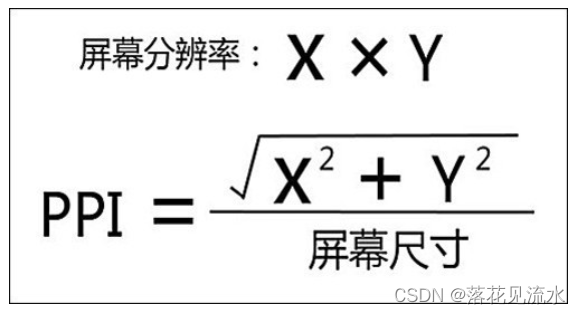
总结
- 无缩放情况下1个CSS像素等于1个设备独立像素
- 设备像素由屏幕生产之后就不发生改变而设备独立像素是一个虚拟单位会发生改变
- PC端中1个设备独立像素 = 1个设备像素 在100%未缩放的情况下
- 在移动端中标准屏幕160ppi下 1个设备独立像素 = 1个设备像素
- 设备像素比dpr = 设备像素 / 设备独立像素
- 每英寸像素ppi值越大图像越清晰
【*】CSS中隐藏页面元素的方式
一、方式
- display:none
- visibility:hidden
- opacity:0
- 设置height、width为0
- position:absolute
- clip-path
display:none
.hide {
    display:none;
}
特点元素不可见不占据空间无法响应点击事件也不会有过渡效果会导致浏览器的重排和重绘
opacity:0
.transparent {
    opacity:0;
}
特点改变元素透明度元素不可见占据页面空间可以响应点击事件子元素不能设置opacity来达到显示的效果不会引发重排一般情况下也会引发重绘
设置height、width属性为0
将元素的marginborderpaddingheight和width等影响元素盒模型的属性设置成0如果元素内有子元素或内容还应该设置其overflow:hidden来隐藏其子元素
.hiddenBox {
    margin:0;
    border:0;
    padding:0;
    height:0;
    width:0;
    overflow:hidden;
}
特点元素不可见不占据页面空间无法响应点击事件
position:absolute
将元素移出可视区域
.hide {
   position: absolute;
   top: -9999px;
   left: -9999px;
}
特点元素不可见不影响页面布局
clip-path
通过裁剪的形式
.hide {
  clip-path: polygon(0px 0px,0px 0px,0px 0px,0px 0px);
}
特点元素不可见占据页面空间无法响应点击事件
总结
最常用的还是display:none和visibility:hidden其他的方式只能认为是奇招它们的真正用途并不是用于隐藏元素所以并不推荐使用它们
二、区别
关于display: none、visibility: hidden、opacity: 0的区别如下表所示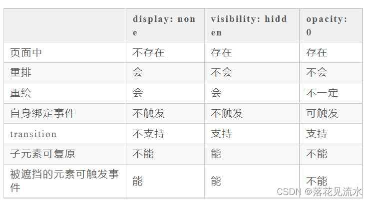
display属性
display: block|inline|inline-block|flex|inline-flex|list-item|table|inherit|none

block 块状元素
inline 行内元素 默认
inline-block 象行内元素一样显示但其内容象块类型元素一样显示。
flex 弹性元素
inline-flex 象行内元素一样显示但其内容象弹性元素一样显示
list-item 象块类型元素一样显示并添加样式列表标记。
table 块级表格元素
inherit 从父元素继承 display 属性的值
none 元素不可见。
【*】BFC
一、介绍
BFCBlock Formatting Context即块级格式化上下文它是页面中的一块渲染区域并且有一套属于自己的渲染规则
- 内部的盒子会在垂直方向上一个接一个的放置
- 对于同一个BFC的俩个相邻的盒子的margin会发生重叠与方向无关。
- 每个元素的左外边距与包含块的左边界相接触从左到右即使浮动元素也是如此
- BFC的区域不会与float的元素区域重叠
- 计算BFC的高度时浮动子元素也参与计算
- BFC就是页面上的一个隔离的独立容器容器里面的子元素不会影响到外面的元素反之亦然
BFC目的是形成一个相对于外界完全独立的空间让内部的子元素不会影响到外部的元素
2、触发条件
包含不限于以下
- 根元素即HTML元素
- 浮动元素float值为left、right
- overflow值不为 visible为 auto、scroll、hidden
- display的值为inline-block、inltable-cell、table-caption、table、inline-table、flex、inline-flex、grid、inline-grid
- position的值为absolute或fixed
- IE下, 可通过zoom:1 触发
三、应用场景
- 防止margin重叠塌陷
eg:
<style>
    p {
        color: #f55;
        background: #fcc;
        width: 200px;
        line-height: 100px;
        text-align:center;
        margin: 100px;
    }
</style>
<body>
    <p>Haha</p>
    <p>Hehe</p>
</body>
两个p元素之间的距离为100px发生了margin重叠塌陷以最大的为准
可以在p外面包裹一层容器并触发这个容器生成一个BFC那么两个p就不属于同一个BFC则不会出现margin重叠
<style>
    .wrap {
        overflow: hidden;// 新的BFC
    }
    p {
        color: #f55;
        background: #fcc;
        width: 200px;
        line-height: 100px;
        text-align:center;
        margin: 100px;
    }
</style>
<body>
    <p>Haha</p>
    <div class="wrap">
        <p>Hehe</p>
    </div>
</body>
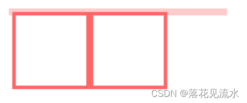
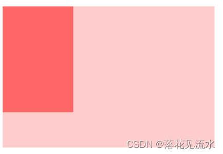
- 清除内部浮动
eg:
<style>
    .par {
        border: 5px solid #fcc;
        width: 300px;
    }

    .child {
        border: 5px solid #f66;
        width:100px;
        height: 100px;
        float: left;
    }
</style>
<body>
    <div class="par">
        <div class="child"></div>
        <div class="child"></div>
    </div>
</body>
页面显示如下
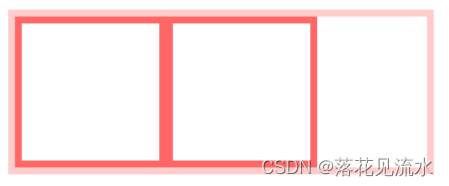
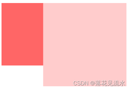
可以将外框容器生成一个BFC在计算高度时内部浮动元素也会计算
.par {
    overflow: hidden;
}
实现效果如下
- 自适应多栏布局
<style>
    body {
        width: 300px;
        position: relative;
    }

    .aside {
        width: 100px;
        height: 150px;
        float: left;
        background: #f66;
    }

    .main {
        height: 200px;
        background: #fcc;
    }
</style>
<body>
    <div class="aside"></div>
    <div class="main"></div>
</body>
前面讲到每个元素的左外边距与包含块的左边界相接触
因此虽然.aslide为浮动元素但是main的左边依然会与包含块的左边相接触
所以我们可以通过触发main生成BFC以此适应两栏布局这时候新的BFC不会与浮动的.aside元素重叠。因此会根据包含块的宽度和.aside的宽度自动变窄
.main {
    overflow: hidden;
}
【*】元素水平垂直居中
一、实现方式
- 利用定位+margin:auto
<style>
    .father{
        width:500px;
        height:300px;
        border:1px solid #0a3b98;
        position: relative;
    }
    .son{
        width:100px;
        height:40px;
        background: #f0a238;
        position: absolute;
        top:0;
        left:0;
        right:0;
        bottom:0;
        margin:auto;
    }
</style>
<div class="father">
    <div class="son"></div>
</div>
父级设置为相对定位子级绝对定位 并且四个定位属性的值都设置了0那么这时候如果子级没有设置宽高则会被拉开到和父级一样宽高
这里子元素设置了宽高所以宽高会按照我们的设置来显示但是实际上子级的虚拟占位已经撑满了整个父级这时候再给它一个marginauto它就可以上下左右都居中了
- 利用定位+margin:负值
<style>
    .father {
        position: relative;
        width: 200px;
        height: 200px;
        background: skyblue;
    }
    .son {
        position: absolute;
        top: 50%;
        left: 50%;
        margin-left:-50px;
        margin-top:-50px;
        width: 100px;
        height: 100px;
        background: red;
    }
</style>
<div class="father">
    <div class="son"></div>
</div>
该方案需要知道子元素自身的宽高
- 利用定位+transform
<style>
    .father {
        position: relative;
        width: 200px;
        height: 200px;
        background: skyblue;
    }
    .son {
        position: absolute;
        top: 50%;
        left: 50%;
  transform: translate(-50%,-50%);
        width: 100px;
        height: 100px;
        background: red;
    }
</style>
<div class="father">
    <div class="son"></div>
</div>
- table布局
设置父元素为display:table-cell子元素设置display: inline-block。利用vertical和text-align可以让所有的行内块级元素水平垂直居中
<style>
    .father {
        display: table-cell;
        width: 200px;
        height: 200px;
        background: skyblue;
        vertical-align: middle;
        text-align: center;
    }
    .son {
        display: inline-block;
        width: 100px;
        height: 100px;
        background: red;
    }
</style>
<div class="father">
    <div class="son"></div>
</div>
- flex弹性布局
<style>
    .father {
        display: flex;
        justify-content: center;
        align-items: center;
        width: 200px;
        height: 200px;
        background: skyblue;
    }
    .son {
        width: 100px;
        height: 100px;
        background: red;
    }
</style>
<div class="father">
    <div class="son"></div>
</div>
display: flex时表示该容器内部的元素将按照flex进行布局
align-items: center表示这些元素将相对于本容器水平居中
justify-content: center也是同样的道理垂直居中
- grid网格布局
<style>
    .father {
            display: grid;
            align-items:center;
            justify-content: center;
            width: 200px;
            height: 200px;
            background: skyblue;

        }
        .son {
            width: 10px;
            height: 10px;
            border: 1px solid red
        }
</style>
<div class="father">
    <div class="son"></div>
</div>
gird网格布局和flex弹性布局都简单粗暴
总结
根据元素标签的性质可以分为
- 内联元素居中布局
- 块级元素居中布局
内联元素居中布局
水平居中
- 行内元素设置
text-align: center - 父元素设置flex布局
display: flex; justify-content: center
垂直居中
- 单行文本父元素确认高度height === line-height
- 多行文本父元素确认高度
disaply: table-cell; vertical-align: middle
块级元素居中布局
水平居中
- 定宽:
margin: 0 auto - 绝对定位+left:50%+margin:负自身一半
垂直居中
- position: absolute设置left、top、margin-left、margin-top(定高)
- display: table-cell
- transform: translate(x, y)
- flex(不定高不定宽)
- grid(不定高不定宽)兼容性相对比较差
eg: 垂直居中一个<img>
.img-box{
    display:table-cell;
    text-align:center;
    vertical-align:middle;
}
eg: 实现一个浮动元素垂直居中
已知元素的高宽
#div1{
  width:200px;
  height:200px;
  background-color:#6699FF;
  position: absolute;        //父元素需要相对定位
  top: 50%;
  left: 50%;
  margin-top: -100px ;   //二分之一的heightwidth
  margin-left: -100px;
}
#div1{
  width: 200px;
  height: 200px;
  background-color: #6699FF;
  position: absolute;        //父元素需要相对定位
  left: 0;
  top: 0;
  right: 0;
  bottom: 0;
  margin:auto;
}
eg: 未知元素的高宽元素垂直居中
Flex布局
.box {
  width: 100vw;
  height: 100vh;
  display: flex;
  align-items: center;
  justify-content: center;
}

.box-center{
  background-color: greenyellow;
}
绝对定位
.box-center{
  background-color: greenyellow;
  position: fixed;
  top: 50%;
  left: 50%;
  transfrom: translate(-50%, -50%);
}
【*】position定位
position: static|inherit|relative|absolute|fixed
static 默认没有定位按照正常文档流进行排列
inherit 规定从父元素继承 position 属性的值
relative相对定位不脱离文档流参考自身静态位置通过 top, bottom, left, right 定位
absolute(绝对定位)参考距其最近一个不为static的父级元素通过top, bottom, left, right 定位
fixed(固定定位)相对于可视窗口进行定位
【*】如何实现两栏布局右侧自适应三栏布局中间自适应
一、两栏布局
往往是以一个定宽栏和一个自适应的栏并排展示存在
1、float浮动
实现思路
- 使用 float 左浮左边栏
- 右边模块使用 margin-left 撑出内容块做内容展示
- 为父级元素添加BFC防止下方元素飞到上方内容
<style>
    .box{
        overflow: hidden; 添加BFC
    }
    .left {
        float: left;
        width: 200px;
        background-color: gray;
        height: 400px;
    }
    .right {
        margin-left: 210px;
        background-color: lightgray;
        height: 200px;
    }
</style>
<div class="box">
    <div class="left">左边</div>
    <div class="right">右边</div>
</div>
2、flex弹性布局
<style>
    .box{
        display: flex;
        align-items: flex-start;
    }
    .left {
        width: 100px;
    }
    .right {
        flex: 1;
    }
</style>
<div class="box">
    <div class="left">左边</div>
    <div class="right">右边</div>
</div>
flex可以说是最好的方案了代码少使用简单
注意的是flex容器的一个默认属性值:align-items: stretch;
这个属性导致了列等高的效果。为了让两个盒子高度自动需要设置: align-items: flex-start
二、三栏布局
三栏布局中间自适应的布局方式有
- 两边使用 float中间使用 margin
- 两边使用 absolute中间使用 margin
- 两边使用 float 和负 margin
- display: table 实现
- flex实现
- grid网格布局
两边使用 float中间使用 margin
原理如下
- 两边固定宽度中间宽度自适应。
- 利用中间元素的margin值控制两边的间距
- 宽度小于左右部分宽度之和时右侧部分会被挤下去
- 需要将中间的内容放在html结构最后否则右侧会臣在中间内容的下方
缺陷
- 主体内容是最后加载的。
- 右边在主体内容之前如果是响应式设计不能简单的换行展示
<style>
    .wrap {
        background: #eee;
        overflow: hidden; <!-- 生成BFC计算高度时考虑浮动的元素 -->
        padding: 20px;
        height: 200px;
    }
    .left {
        width: 200px;
        height: 200px;
        float: left;
        background: coral;
    }
    .right {
        width: 120px;
        height: 200px;
        float: right;
        background: lightblue;
    }
    .middle {
        margin-left: 220px;
        height: 200px;
        background: lightpink;
        margin-right: 140px;
    }
</style>
<div class="wrap">
    <div class="left">左侧</div>
    <div class="right">右侧</div>
    <div class="middle">中间</div>
</div>
两边使用 absolute中间使用 margin
原理如下
- 左右两边使用绝对定位固定在两侧。
- 中间占满一行但通过 margin和左右两边留出10px的间隔
<style>
  .container {
    position: relative;
  }

  .left,
  .right,
  .main {
    height: 200px;
    line-height: 200px;
    text-align: center;
  }

  .left {
    position: absolute;
    top: 0;
    left: 0;
    width: 100px;
    background: green;
  }

  .right {
    position: absolute;
    top: 0;
    right: 0;
    width: 100px;
    background: green;
  }

  .main {
    margin: 0 110px;
    background: black;
    color: white;
  }
</style>

<div class="container">
  <div class="left">左边固定宽度</div>
  <div class="right">右边固定宽度</div>
  <div class="main">中间自适应</div>
</div>
两边使用 float 和负 margin
<style>
  .left,
  .right,
  .main {
    height: 200px;
    line-height: 200px;
    text-align: center;
  }

  .main-wrapper {
    float: left;
    width: 100%;
  }

  .main {
    margin: 0 110px;
    background: black;
    color: white;
  }

  .left,
  .right {
    float: left;
    width: 100px;
    margin-left: -100%;
    background: green;
  }

  .right {
    margin-left: -100px; /* 同自身宽度 */
  }
</style>

<div class="main-wrapper">
  <div class="main">中间自适应</div>
</div>
<div class="left">左边固定宽度</div>
<div class="right">右边固定宽度</div>
实现过程
中间使用了双层标签外层是浮动的以便左中右能在同一行展示
左边通过使用负 margin-left:-100%相当于中间的宽度所以向上偏移到左侧
右边通过使用负 margin-left:-100px相当于自身宽度所以向上偏移到最右侧
缺点
- 增加了 .main-wrapper 一层结构变复杂
- 使用负 margin调试也相对麻烦
display: table 实现
<style>
  .container {
    height: 200px;
    line-height: 200px;
    text-align: center;
    display: table;
    table-layout: fixed;
    width: 100%;
  }

  .left,
  .right,
  .main {
    display: table-cell;
  }

  .left,
  .right {
    width: 100px;
    background: green;
  }

  .main {
    background: black;
    color: white;
    width: 100%;
  }
</style>

<div class="container">
  <div class="left">左边固定宽度</div>
  <div class="main">中间自适应</div>
  <div class="right">右边固定宽度</div>
</div>
实现原理
层通过 display: table设置为表格设置 table-layout: fixed`表示列宽自身宽度决定而不是自动计算。
内层的左中右通过 display: table-cell设置为表格单元。
左右设置固定宽度中间设置 width: 100% 填充剩下的宽度
flex实现
<style type="text/css">
    .wrap {
        display: flex;
        justify-content: space-between;
    }

    .left,
    .right,
    .middle {
        height: 100px;
    }

    .left {
        width: 200px;
        background: coral;
    }

    .right {
        width: 120px;
        background: lightblue;
    }

    .middle {
        background: #555;
        width: 100%;
        margin: 0 20px;
    }
</style>
<div class="wrap">
    <div class="left">左侧</div>
    <div class="middle">中间</div>
    <div class="right">右侧</div>
</div>
实现过程
仅需将容器设置为display:flex;
盒内元素两端对其将中间元素设置为100%宽度或者设为flex:1即可填充空白
盒内元素的高度撑开容器的高度
优点
结构简单直观
可以结合 flex的其他功能实现更多效果例如使用 order属性调整显示顺序让主体内容优先加载但展示在中间
grid网格布局
<style>
    .wrap {
        display: grid;
        width: 100%;
        grid-template-columns: 300px auto 300px;
    }

    .left,
    .right,
    .middle {
        height: 100px;
    }

    .left {
        background: coral;
    }

    .right {
        width: 300px;
        background: lightblue;
    }

    .middle {
        background: #555;
    }
</style>
<div class="wrap">
    <div class="left">左侧</div>
    <div class="middle">中间</div>
    <div class="right">右侧</div>

</div>
【*】flex弹性布局
一、定义
flex意为”弹性布局”可以简便、完整、响应式地实现各种页面布局
采用Flex布局的元素称为flex容器container
它的所有子元素自动成为容器成员称为flex项目item
容器中默认存在两条轴主轴和交叉轴呈90度关系。项目默认沿主轴排列
每根轴都有起点和终点这对于元素的对齐非常重要
二、flex容器属性
- flex-direction
- flex-wrap决定容器内项目是否可换行
- flex-flow是flex-direction属性和flex-wrap属性的简写形式默认值为row nowrap
- justify-content
- align-items
- align-content
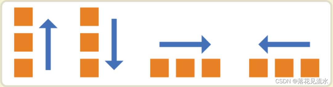
flex-direction
决定主轴的方向(即项目的排列方向)
.container {
    flex-direction: row | row-reverse | column | column-reverse;
}

row默认值主轴为水平方向起点在左端
row-reverse主轴为水平方向起点在右端
column主轴为垂直方向起点在上沿。
column-reverse主轴为垂直方向起点在下沿
flex-wrap
flex-wrap决定容器内项目是否可换行
.container {
    flex-wrap: nowrap | wrap | wrap-reverse;
}

nowrap默认值不换行
wrap换行第一行在上方
wrap-reverse换行第一行在下方
flex-flow
是flex-direction属性和flex-wrap属性的简写形式默认值为row nowrap
.box {
  flex-flow: <flex-direction> || <flex-wrap>;
}
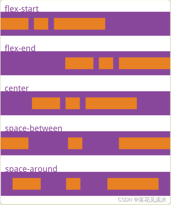
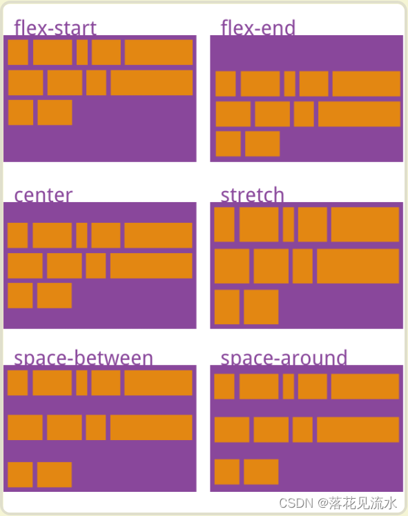
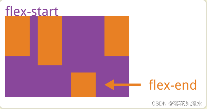
justify-content
定义了项目在主轴上的对齐方式
.box {
    justify-content: flex-start | flex-end | center | space-between | space-around;
}

flex-start默认值左对齐
flex-end右对齐
center居中
space-between两端对齐项目之间的间隔都相等
space-around两个项目两侧间隔相等
align-items
定义项目在交叉轴上如何对齐
.box {
  align-items: flex-start | flex-end | center | baseline | stretch;
}

flex-start交叉轴的起点对齐
flex-end交叉轴的终点对齐
center交叉轴的中点对齐
baseline: 项目的第一行文字的基线对齐
stretch默认值如果项目未设置高度或设为auto将占满整个容器的高度
align-content
定义了多根轴线的对齐方式。如果项目只有一根轴线该属性不起作用
.box {
    align-content: flex-start | flex-end | center | space-between | space-around | stretch;
}

flex-start与交叉轴的起点对齐
flex-end与交叉轴的终点对齐
center与交叉轴的中点对齐
space-between与交叉轴两端对齐轴线之间的间隔平均分布
space-around每根轴线两侧的间隔都相等。所以轴线之间的间隔比轴线与边框的间隔大一倍
stretch默认值轴线占满整个交叉轴
三、容器成员项目属性
- order
- flex-grow
- flex-shrink
- flex-basis
- flex
- align-self
order
定义项目的排列顺序。数值越小排列越靠前默认为0
.item {
    order: <integer>;
}
flex-grow
当容器设为flex-wrap: nowrap;不换行的时候容器宽度有不够分的情况弹性元素会根据flex-grow来决定
定义项目的放大比例容器宽度>元素总宽度时如何伸展
默认为0即如果存在剩余空间也不放大
.item {
    flex-grow: <number>;
}

如果所有项目的flex-grow属性都为1则它们将等分剩余空间
如果一个项目的flex-grow属性为2其他项目都为1则前者占据的剩余空间将比其他项多一倍
弹性容器的宽度正好等于元素宽度总和无多余宽度此时无论flex-grow是什么值都不会生效
flex-shrink
定义了项目的缩小比例容器宽度<元素总宽度时如何收缩默认为1即如果空间不足该项目将缩小
.item {
    flex-shrink: <number>; /* default 1 */
}
如果所有项目的flex-shrink属性都为1当空间不足时都将等比例缩小
如果一个项目的flex-shrink属性为0其他项目都为1则空间不足时前者不缩小
在容器宽度有剩余时flex-shrink也是不会生效的
flex-basis
设置的是元素在主轴上的初始尺寸所谓的初始尺寸就是元素在flex-grow和flex-shrink生效前的尺寸
浏览器根据这个属性计算主轴是否有多余空间默认值为auto即项目的本来大小如设置了width则元素尺寸由width/height决定主轴方向没有设置则由内容决定
.item {
   flex-basis: <length> | auto; /* default auto */
}
当设置为0的是会根据内容撑开
可以设为跟width或height属性一样的值比如350px则项目将占据固定空间
flex
flex属性是flex-grow, flex-shrink 和 flex-basis的简写默认值为0 1 auto
.item {
  flex: none | [ <'flex-grow'> <'flex-shrink'>? || <'flex-basis'> ]
}
flex: 0 ,绝对弹性元素,在伸缩的时候不需要考虑我的尺寸
flex: 1 = flex: 1 1 0%
flex: 2 = flex: 2 1 0%
flex: auto = flex: 1 1 auto
flex: none = flex: 0 0 auto常用于固定尺寸不伸缩
align-self
允许单个项目有与其他项目不一样的对齐方式可覆盖align-items属性
默认值为auto表示继承父元素的align-items属性如果没有父元素则等同于stretch
.item {
    align-self: auto | flex-start | flex-end | center | baseline | stretch;
}
【*】Grid网格布局
一、定义
Grid 布局即网格布局是一个二维的布局方式由纵横相交的两组网格线形成的框架性布局结构能够同时处理行与列
擅长将一个页面划分为几个主要区域以及定义这些区域的大小、位置、层次等关系
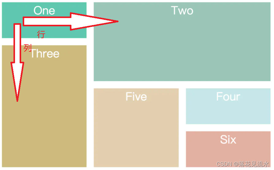
Grid 布局属性可以分为两大类
- 容器属性
- 项目属性
二、容器属性
display 属性
在元素上设置displaygrid 或 displayinline-grid 来创建一个网格容器
- displaygrid 则该容器是一个块级元素
- display: inline-grid 则容器元素为行内元素
grid-template-columns 属性grid-template-rows 属性
grid-template-columns 属性设置列宽grid-template-rows 属性设置行高
.wrapper {
  display: grid;
  /*  声明了三列宽度分别为 200px 200px 200px */
  grid-template-columns: 200px 200px 200px;
  grid-gap: 5px;
  /*  声明了两行行高分别为 50px 50px  */
  grid-template-rows: 50px 50px;
}
通过使用repeat()函数可以简写重复的值
- 第一个参数是重复的次数
- 第二个参数是重复的值
.wrapper {
  display: grid;
  grid-template-columns: repeat(3,200px);
  grid-gap: 5px;
  grid-template-rows:repeat(2,50px);
}
通过auto-fill示自动填充让一行或者一列中尽可能的容纳更多的单元格
grid-template-columns: repeat(auto-fill, 200px)
fr片段为了方便表示比例关系
grid-template-columns: 200px 1fr 2fr
第一个列宽设置为 200px后面剩余的宽度分为两部分宽度分别为剩余宽度的 1/3 和 2/3
minmax产生一个长度范围表示长度就在这个范围之中都可以应用到网格项目中。第一个参数就是最小值第二个参数就是最大值
minmax(100px, 1fr)
表示列宽不小于100px不大于1fr
auto由浏览器自己决定长度
grid-template-columns: 100px auto 100px
表示第一第三列为 100px中间由浏览器决定长度
未完。。。。。
【*】CSS3新特性
一、选择器
二、边框
新增了三个边框属性分别是
border-radius创建圆角边框box-shadow为元素添加阴影border-image使用图片来绘制边框
三、背景
新增了几个关于背景的属性
- background-clip用于确定背景画区
background-clip: border-box; 背景从border开始显示
background-clip: padding-box; 背景从padding开始显示
background-clip: content-box; 背景显content区域开始显示
background-clip: no-clip; 默认属性等同于border-box
- background-origin用来设置是以border的左上角对齐还是以padding的左上角或者content的左上角对齐
background-origin: border-box; 从border开始计算background-position
background-origin: padding-box; 从padding开始计算background-position
background-origin: content-box; 从content开始计算background-position
- background-size用来调整背景图片的大小主要用于设定图片本身。
background-size: contain; 缩小图片以适合元素维持像素长宽比
background-size: cover; 扩展元素以填补元素维持像素长宽比
background-size: 100px 100px; 缩小图片至指定的大小
background-size: 50% 100%; 缩小图片至指定的大小百分比是相对包 含元素的尺寸
- background-break元素可以被分成几个独立的盒子用来控制背景怎样在这些不同的盒子中显示
background-break: continuous; 默认值。忽略盒之间的距离也就是像元素没有分成多个盒子依然是一个整体一样
background-break: bounding-box; 把盒之间的距离计算在内
background-break: each-box; 为每个盒子单独重绘背景
四、文字
**word-wrap **
换行
word-wrap: normal|break-word
normal使用浏览器默认的换行
break-all允许在单词内换行
text-overflow
设置或检索当当前行超过指定容器的边界时如何显示
text-overflow: clip|ellipsis
clip修剪文本
ellipsis显示省略符号来代表被修剪的文本
text-shadow
文本应用阴影。能够规定水平阴影、垂直阴影、模糊距离以及阴影的颜色
text-decoration
对文字的更深层次的渲染
text-fill-color: 设置文字内部填充颜色
text-stroke-color: 设置文字边界填充颜色
text-stroke-width: 设置文字边界宽度
五、颜色
新增了新的颜色表示方式rgba与hsla
rgba分为两部分rgb为颜色值a为透明度
color: rgba(255, 0, 0, 0.75);
color: rgba(#00000, 0.75);
hala分为四部分h为色相s为饱和度l为亮度a为透明度
六、transition 过渡
transition属性可以被指定为一个或多个CSS属性的过渡效果多个属性之间用逗号进行分隔必须规定两项内容
- 过度效果
- 持续时间
ransition CSS属性花费时间效果曲线(默认ease)延迟时间(默认0)


transition-property: width;
transition-duration: 1s;
transition-timing-function: linear;
transition-delay: 2s;
七、transform 转换
transform属性允许你旋转缩放倾斜或平移给定元素
transform-origin转换元素的位置围绕那个点进行转换默认值为(x,y,z):(50%,50%,0)
transform: translate(120px, 50%)位移
transform: scale(2, 0.5)缩放
transform: rotate(0.5turn)旋转
transform: skew(30deg, 20deg)倾斜
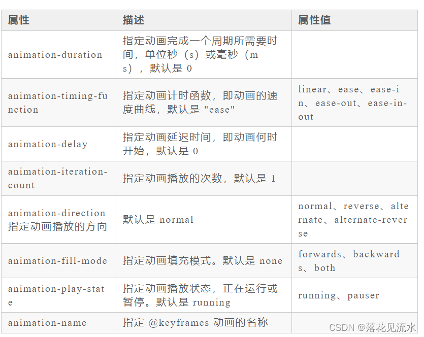
八、animation 动画
animation也有很多的属性
- animation-name动画名称
- animation-duration动画持续时间
- animation-timing-function动画时间函数
- animation-delay动画延迟时间
- animation-iteration-count动画执行次数可以设置为一个整数也可以设置为infinite意思是无限循环
- animation-direction动画执行方向
- animation-paly-state动画播放状态
- animation-fill-mode动画填充模式
九、渐变
css3渐变包括
- linear-gradient线性渐变
background-image: linear-gradient(direction, color-stop1, color-stop2, ...);
- radial-gradient径向渐变
linear-gradient(0deg, red, green);
十、其他
- flex弹性布局
- Grid栅格布局
【*】css动画
css实现动画的方式有如下几种
- transition 实现渐变动画
- transform 转变动画
- animation 实现自定义动画
一、transition 实现渐变动画
transition的属性如下
- property:填写需要变化的css属性
- duration:完成过渡效果需要的时间单位(s或者ms)
- timing-function:完成效果的速度曲线
- delay: 动画效果的延迟触发时间
transform不支持inline元素使用前把它变成block
transition-timing-function:linear|ease|ease-in|ease-out|ease-in-out
linear 匀速
ease 从慢到快再到慢
ease-in 慢慢变快
ease-out 慢慢变慢
ease-in-out 先变快再到慢
eg实现鼠标移动上去发生变化动画效果
<style>
       .base {
            width: 100px;
            height: 100px;
            display: inline-block;
            background-color: #0EA9FF;
            border-width: 5px;
            border-style: solid;
            border-color: #5daf34;
            transition-property: width, height, background-color, border-width;
            transition-duration: 2s;
            transition-timing-function: ease-in;
            transition-delay: 500ms;
        }

        /*简写*/
        /*transition: all 2s ease-in 500ms;*/
        .base:hover {
            width: 200px;
            height: 200px;
            background-color: #5daf34;
            border-width: 10px;
            border-color: #3a8ee6;
        }
</style>
<div class="base"></div>
二 、transform 转变动画
包含四个常用的功能
- translate位移
- scale缩放
- rotate旋转
- skew倾斜
一般配合transition过度使用
<style>
    .base {
        width: 100px;
        height: 100px;
        display: inline-block;
        background-color: #0EA9FF;
        border-width: 5px;
        border-style: solid;
        border-color: #5daf34;
        transition-property: width, height, background-color, border-width;
        transition-duration: 2s;
        transition-timing-function: ease-in;
        transition-delay: 500ms;
    }
    .base2 {
        transform: none;
        transition-property: transform;
        transition-delay: 5ms;
    }

    .base2:hover {
        transform: scale(0.8, 1.5) rotate(35deg) skew(5deg) translate(15px, 25px);
    }
</style>
 <div class="base base2"></div>
三、animation 实现自定义动画
animation是由 8 个属性的简写
CSS 动画只需要定义一些关键的帧而其余的帧浏览器会根据计时函数插值计算出来
通过 @keyframes 来定义关键帧
eg让元素旋转一圈
@keyframes rotate{
    from{
        transform: rotate(0deg);
    }
    to{
        transform: rotate(360deg);
    }
}
from 表示最开始的那一帧to 表示结束时的那一帧
也可以使用百分比刻画生命周期
@keyframes rotate{
    0%{
        transform: rotate(0deg);
    }
    50%{
        transform: rotate(180deg);
    }
    100%{
        transform: rotate(360deg);
    }
}
定义好了关键帧后下来就可以直接用它了
animation: rotate 2s;
【*】回流 & 重绘
一、定义
在HTML中每个元素都可以理解成一个盒子在浏览器解析过程中会涉及到回流与重绘
- 回流布局引擎会根据各种样式计算每个盒子在页面上的大小与位置
- 重绘当计算好盒模型的位置、大小及其他属性后浏览器根据每个盒子特性进行绘制
二、回流触发时机
回流这一阶段主要是计算节点的位置和几何信息那么当页面布局和几何信息发生变化的时候就需要回流如下面情况
- 页面一开始渲染的时候这避免不了
- 添加或删除可见的DOM元素
- 元素的位置发生变化
- 元素的尺寸发生变化包括外边距、内边框、边框大小、高度和宽度等
- 内容发生变化比如文本变化或图片被另一个不同尺寸的图片所替代
- 浏览器的窗口尺寸变化因为回流是根据视口的大小来计算元素的位置和大小的
还有一些容易被忽略的操作获取一些特定属性的值这些属性有一个共性就是需要通过即时计算得到。因此浏览器为了获取这些值也会进行回流
offsetTop、offsetLeft、 offsetWidth、offsetHeight、scrollTop、scrollLeft、scrollWidth、scrollHeight、clientTop、clientLeft、clientWidth、clientHeight除此还包括getComputedStyle方法
三、重绘触发时机
触发回流一定会触发重绘
除此之外还有一些其他引起重绘行为
- 颜色的修改
- 文本方向的修改
- 阴影的修改
四、如何减少回流和重绘
避免回流的经验
- 如果想设定元素的样式通过改变元素的 class 类名 (尽可能在 DOM 树的最里层)
- 避免设置多项内联样式
- 应用元素的动画使用 position 属性的 fixed 值或 absolute 值
- 避免使用 table 布局
- 对于那些复杂的动画对其设置 position: fixed/absolute尽可能地使元素脱离文档流从而减少对其他元素的影响
- 使用css3硬件加速可以让transform、opacity、filters这些动画不会引起回流重绘
- 避免使用 CSS 的 JavaScript 表达式
- 在使用 JavaScript 动态插入多个节点时, 可以使用
DocumentFragment.创建后一次插入. 就能避免多次的渲染性能 - 在使用 JavaScript 计算修改一个元素布局的时候可以使用变量的形式缓存起来待计算完毕再提交给浏览器
eg:
// 缓存offsetLeft与offsetTop的值
const el = document.getElementById('el')
let offLeft = el.offsetLeft, offTop = el.offsetTop

// 在JS层面进行计算
for(let i=0;i<10;i++) {
  offLeft += 10
  offTop  += 10
}

// 一次性将计算结果应用到DOM上
el.style.left = offLeft + "px"
el.style.top = offTop  + "px"
- 避免改变样式使用类名去合并样式
const container = document.getElementById('container')
container.style.width = '100px'
container.style.height = '200px'
container.style.border = '10px solid red'
container.style.color = 'red'

替换成
<style>
    .basic_style {
        width: 100px;
        height: 200px;
        border: 10px solid red;
        color: red;
    }
</style>
<script>
    const container = document.getElementById('container')
    container.classList.add('basic_style')
</script>
【*】响应式设计
一、定义
响应式网站设计Responsive Web design是一种网络页面设计布局页面的设计与开发应当根据用户行为以及设备环境(系统平台、屏幕尺寸、屏幕定向等)进行相应的响应和调整
响应式网站常见特点
- 同时适配PC + 平板 + 手机等
- 标签导航在接近手持终端设备时改变为经典的抽屉式导航
- 网站的布局会根据视口来调整模块的大小和位置
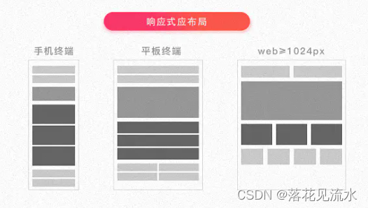
二、实现方式
实现响应式布局的方式
- 媒体查询
- 百分比
- vw/vh
- rem
- 利用主流UI框架如element ui、antd提供的栅格布局实现响应式
媒体查询
使用@Media查询可以针对不同的媒体类型定义不同的样式
为了处理移动端页面头部必须有meta声明viewport
<meta name="viewport" content="width=device-width, initial-scale=1, maximum-scale=1, user-scalable=no”>

width=device-width: 是自适应手机屏幕的尺寸宽度
maximum-scale:是缩放比例的最大值
inital-scale:是缩放的初始化
user-scalable:是用户的可以缩放的操作
@media screen and (max-width: 1920px) { ... }

@media screen (min-width: 375px) and (max-width: 600px) {
  body {
    font-size: 18px;
  }
}
百分比
通过百分比单位 " % " 来实现响应式的效果。单纯用这种写起来会很复杂
vw/vh
vw表示相对于视图窗口的宽度vh表示相对于视图窗口高度。任意层级元素在使用vw单位的情况下1vw都等于视图宽度的百分之一
这种最好是用在需要满屏做响应的项目中
rem
rem是相对于根元素html的font-size属性默认情况下浏览器字体大小为16px此时1rem = 16px
可以利用前面提到的媒体查询针对不同设备分辨率改变font-size的值如下
@media screen and (max-width: 414px) {
  html {
    font-size: 18px
  }
}

@media screen and (max-width: 375px) {
  html {
    font-size: 16px
  }
}

@media screen and (max-width: 320px) {
  html {
    font-size: 12px
  }
}
为了更准确监听设备可视窗口变化我们可以在css之前插入script标签内容如下
//动态为根元素设置字体大小
function init () {
    // 获取屏幕宽度
    var width = document.documentElement.clientWidth
    // 设置根元素字体大小。此时为宽的10等分
    document.documentElement.style.fontSize = width / 10 + 'px'
}

//首次加载应用设置一次
init()
// 监听手机旋转的事件的时机重新设置
window.addEventListener('orientationchange', init)
// 监听手机窗口变化重新设置
window.addEventListener('resize', init)
【*】CSS性能优化
实现方式
-
内联首屏关键CSS
较大的css代码并不合适内联初始拥塞窗口、没有缓存而其余代码则采取外部引用方式 -
异步加载CSS
设置link标签media属性为noexis浏览器会认为当前样式表不适用当前类型会在不阻塞页面渲染的情况下再进行下载。加载完成后将media的值设为screen或all从而让浏览器开始解析CSS
<link rel="stylesheet" href="mystyles.css" media="noexist" onload="this.media='all'">
通过rel属性将link元素标记为alternate可选样式表也能实现浏览器异步加载。同样别忘了加载完成之后将rel设回stylesheet
<link rel="alternate stylesheet" href="mystyles.css" onload="this.rel='stylesheet'">
-
资源压缩
利用webpack、gulp/grunt、rollup等模块化工具将css代码进行压缩使文件变小大大降低了浏览器的加载时间 -
合理使用选择器
编写选择器的时候可以遵循以下规则 -
1、不要嵌套使用过多复杂选择器最好不要三层以上
-
2、使用id选择器就没必要再进行嵌套
-
3、通配符和属性选择器效率最低避免使用
-
减少使用昂贵的属性
在页面发生重绘的时候昂贵属性如box-shadow/border-radius/filter/透明度/:nth-child等会降低浏览器的渲染性能 -
不要使用@import
css样式文件有两种引入方式一种是link元素另一种是@import
@import会影响浏览器的并行下载且多个@import可能会导致下载顺序紊乱
- 减少重排操作以及减少不必要的重绘
- 了解哪些属性可以继承而来避免对这些属性重复编写
- cssSprite合成所有icon图片用宽高加上backgroud-position的背景图方式显现出我们要的icon图减少了http请求
- 把小的icon图片转成base64编码
- CSS3动画或者过渡尽量使用transform和opacity来实现动画不要使用left和top属性
【*】单行、多行文本溢出
一、单行文本溢出省略
 {
        overflow: hidden;
        text-overflow: ellipsis;
        white-space: nowrap;
 }

text-overflow规定当文本溢出时显示省略符号来代表被修剪的文本
white-space设置文字在一行显示不能换行
overflow文字长度超出限定宽度则隐藏超出的内容
二、多行文本溢出省略
- 基于高度截断
<style>
    .demo {
        position: relative;
        line-height: 20px;
        height: 40px;
        overflow: hidden;
    }
    .demo::after {
        content: "...";
        position: absolute;
        bottom: 0;
        right: 0;
        padding: 0 20px 0 10px;
    }
</style>

<body>
    <div class='demo'>这是一段很长的文本</div>
</body>
优点 兼容性好响应式截断
最好设置word-break: break-all使一个单词能够在换行时进行拆分
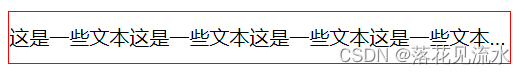
- 基于行数截断
<style>
    p {
        width: 400px;
        border-radius: 1px solid red;
        -webkit-line-clamp: 2;
        display: -webkit-box;
        -webkit-box-orient: vertical;
        overflow: hidden;
        text-overflow: ellipsis;
    }
</style>
<p>
    这是一些文本这是一些文本这是一些文本这是一些文本这是一些文本
    这是一些文本这是一些文本这是一些文本这是一些文本这是一些文本
</p>
【*】视差滚动
视差滚动Parallax Scrolling是指多层背景以不同的速度移动形成立体的运动效果带来非常出色的视觉体验
实现方式有
- background-attachment
- transform:translate3D
background-attachment
作用是设置背景图像是否固定或者随着页面的其余部分滚动
值分别有如下
scroll默认值背景图像会随着页面其余部分的滚动而移动
fixed当页面的其余部分滚动时背景图像不会移动
inherit继承父元素background-attachment属性的值
<style>
div {
            height: 100vh;
            background: rgba(0, 0, 0, .7);
            color: #fff;
            line-height: 100vh;
            text-align: center;
            font-size: 20vh;
        }

        .a-img1 {
            background-image: url(https://images.pexels.com/photos/1097491/pexels-photo-1097491.jpeg);
            background-attachment: fixed;
            background-size: cover;
            background-position: center center;
        }

        .a-img2 {
            background-image: url(https://images.pexels.com/photos/2437299/pexels-photo-2437299.jpeg);
            background-attachment: fixed;
            background-size: cover;
            background-position: center center;
        }

        .a-img3 {
            background-image: url(https://images.pexels.com/photos/1005417/pexels-photo-1005417.jpeg);
            background-attachment: fixed;
            background-size: cover;
            background-position: center center;
        }
</style>
 <div class="a-text">1</div>
    <div class="a-img1">2</div>
    <div class="a-text">3</div>
    <div class="a-img2">4</div>
    <div class="a-text">5</div>
    <div class="a-img3">6</div>
    <div class="a-text">7</div>
未完来自JS每日一题。。。。
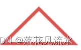
【*】三角形
一、原理
<style>
    .border {
        width: 50px;
        height: 50px;
        border: 2px solid;
        border-color: #96ceb4 #ffeead #d9534f #ffad60;
    }
</style>
<div class="border"></div>
将border设置50px:
将widthheight设置0:
div {
    width: 0;
    height: 0;
    border: 50px solid;
    border-color: #96ceb4 #ffeead #d9534f #ffad60;
}

只需要将上、左、右边框设置为透明就可以得到下方的红色三角形
虽然视觉上是实现了三角形但实际上隐藏的部分任然占据部分高度需要将上方的宽度去掉
.border {
    width: 0;
    height: 0;
    border-style:solid;
    border-width: 0 50px 50px;
    border-color: transparent transparent #d9534f;
}
想要实现一个只有边框是空心的三角形由于这里不能再使用border属性所以最直接的方法是利用伪类新建一个小一点的三角形定位上去
.border {
    width: 0;
    height: 0;
    border-style:solid;
    border-width: 0 50px 50px;
    border-color: transparent transparent #d9534f;
    position: relative;
}
.border:after {
    content: '';
    border-style: solid;
    border-width: 0 40px 40px;
    border-color: transparent transparent #96ceb4;
    position: absolute;
    top: 6px;
    left: -40px;
}
伪类元素定位参照对象的内容区域宽高都为0则内容区域即可以理解成中心一点所以伪元素相对中心这点定位
【*】实现一个广告跑马灯效果
单行文字跑起来
<div class="box">
	<p class="text">跑马灯效果,跑起来~~</p>
</div>
.box{
    width: 400px;
    border: 1px solid #000;
    overflow: hidden;
}
.text{
    font-size: 24px;
    color: red;
    line-height: 60px;
    display: inline-block;
    width: 100%;
    animation: 10s loop linear infinite normal;
}
@keyframes loop {
    0%{
        transform: translateX(0px);
    }
    100% {
        transform: translateX(100%);
    }
}
【*】实现弹幕
【*】实现一个文字颜色跑马灯效果
<div class="box">
	<p class="text">文字颜色跑马灯效果,跑起来~~</p>
</div>
.box{
    width: 400px;
    border: 1px solid #000;
    overflow: hidden;
}
.text{
    font-size: 24px;
    line-height: 60px;
    background-image: linear-gradient(90deg,#ffffff,#ff0000 6.25%,#ff7d00 12.5%,#ffff00 18.75%, #00ff00 25%,#ffff00 50%,#ffff00 100%);
    -webkit-background-clip: text;
    color: transparent;
    background-size: 200% 100%;
    animation: 2s loop linear infinite;
}
@keyframes loop {
    0%{
        background-position: 0 0;
    }
    100% {
        background-position: -100% 0;
    }
}
【*】实现一个简单的幻灯片效果
幻灯片自动切换
.box{
	width: 200px;
	height: 200px;
	overflow: hidden;
	background-size: cover;
	background-position: center;
	animation: 'loops' 20s infinite;
}

@-webkit-keyframes "loops" {
    0% {
        background:url(./bg1.jpg) no-repeat;
    }
    25% {
        background:url(./bg2.jpg) no-repeat;
    }
    50% {
        background:url(./bg3.jpg) no-repeat;
    }
    75% {
        background:url(./bg4.jpg) no-repeat;
    }
    100% {
        background:url(./bg5.jpg) no-repeat;
    }
}
【*】实现一个手机版淘宝商品并列显示
<div class="list">
    <div class="item">
        <p class="text">1跑马灯效果,跑起来~~跑马灯效果,跑起来~~</p>
    </div>
    <div class="item">
        <p class="text">2跑马灯效果,跑起来~~</p>
    </div>
    <div class="item">
        <p class="text">3跑马灯效果,跑起来~~跑马灯效果,跑起来~~</p>
    </div>
    <div class="item">
        <p class="text">4跑马灯效果,跑起来~~跑马灯效果,跑起来~~</p>
    </div>
    <div class="item">
        <p class="text">5跑马灯效果,跑起来~~</p>
    </div>
</div>
.list{
    width: 400px; /* 设置宽度 */
    column-count: 2; /* 1~10 列数自定分配宽度 */
    column-gap: 1em; /* 设置列与列之前的间距 */
    margin: 0 auto;
}
.item{
    padding: 10px;
    margin-bottom: 1em;
    border: 1px solid #000;
    border-radius: 10px;
    break-inside: avoid;
}
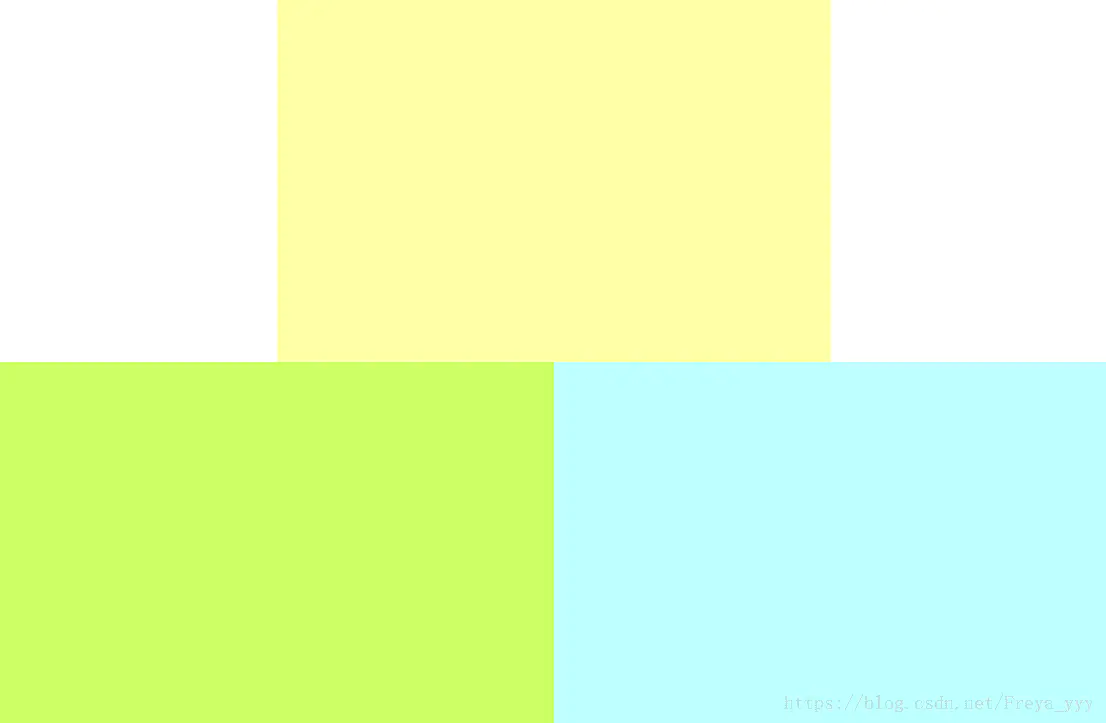
【*】设计一个满屏品字布局
1、div设置成100%子元素分别宽50%
上面那块用float或者display: block;+margin: 0 auto;居中
下面两块用float或者inline-block不换行
<div class="main">
	<div class="header"></div>
    <div class="left"></div>
    <div class="right"></div>
</div>
.main {height: 100%;width: 100%;}
.header {
	display: block;
	width: 50%;
	height: 50%;
	background-color:  rgb(255,2545,167);
	margin: 0 auto;
}
.left {
	display: inline-block; /* float: left; */
	width: 50%;
	height: 100%;
	background-color: rgb(204,255,102);
}
.right {
	display: inline-block; /* float: left; */
	width: 50%;
	height: 100%;
	background-color: rgb(189,255,255);
}
上面那块用margin: 0 auto;居中
下面两块用float或者inline-block不换行
<div class="header"></div>
<div class="main">
    <div class="left"></div>
    <div class="right"></div>
</div>
.header {
	width: 50%;
	height: 50%;
	background-color:  rgb(255,2545,167);
	margin: 0 auto;
}
.main {height: 50%;width: 100%;}
.left {
	display: inine-block; /* float: left; */
	width: 50%;
	height: 100%;
	background-color: rgb(204,255,102);
}
.right {
	display: inine-block; /* float: left; */
	width: 50%;
	height: 100%;
	background-color: rgb(189,255,255);
}