

CSS 特效之心形-彩虹-加载动画
| 阿里云国内75折 回扣 微信号:monov8 |
| 阿里云国际,腾讯云国际,低至75折。AWS 93折 免费开户实名账号 代冲值 优惠多多 微信号:monov8 飞机:@monov6 |
CSS 特效之心形-彩虹-加载动画
参考
| 项目 | 描述 |
|---|---|
| 搜索引擎 | Bing |
| MDN | MDN Web Docs |
描述
| 项目 | 描述 |
|---|---|
| Edge | 109.0.1518.61 (正式版本) (64 位) |
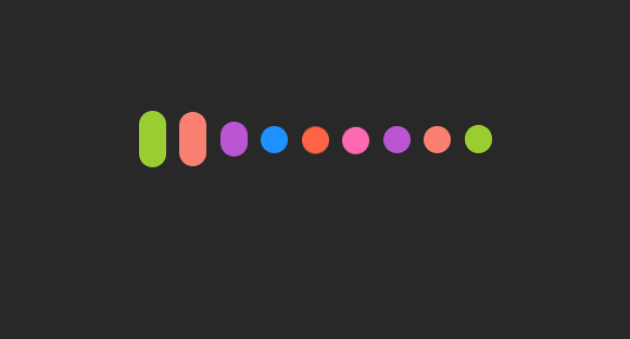
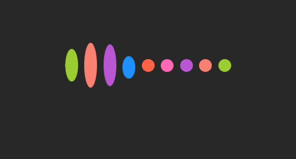
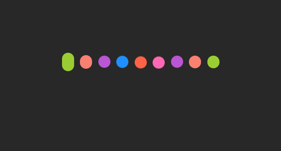
效果
HTML
<!DOCTYPE html>
<html lang="en">
<head>
    <meta charset="UTF-8">
    <meta http-equiv="X-UA-Compatible" content="IE=edge">
    <meta name="viewport" content="width=device-width, initial-scale=1.0">
    <title>CSS 特效之心形-彩虹-加载动画</title>
    <!-- 导入当前工作目录下的 index.css -->
    <link rel="stylesheet" href="./index.css">
</head>
<body>
    <ul>
        <li></li>
        <li></li>
        <li></li>
        <li></li>
        <li></li>
        <li></li>
        <li></li>
        <li></li>
        <li></li>
    </ul>
</body>
</html>
CSS
重置元素的部分默认样式
*{
    margin: 0px;
    padding: 0px;
    box-sizing: border-box;
}
body
body{
    /*
    设置页面最小高度为视口
    (可以理解为浏览器中的可视区域高度 。
    */
    min-height: 100vh;
    /*
    设置 flex 弹性布局
    并将当前元素中的元素进行居中处理。
     */
    display: flex;
    justify-content: center;
    align-items: center;
    /* 设置页面的背景颜色 */
    background-color: #282828;
}
li
li{
    width: 20px;
    height: 20px;
    /*
    设置 li 为行内块元素这样可以使得
    li 排列在一行中当然你也可以通过
    使用 float 属性来达到这一效果。
     */
    display: inline-block;
    /* 为 li 元素设置边框的圆角半径。*/
    border-radius: 20px;
    background-color: dodgerblue;
    /* 为每一个 li 元素设置 10px 的左边距 */
    margin-left: 10px;
}
注
在该段代码中请不要使用 border-radius: 50%; 来代替 border-radius: 20px; 。虽然在这段代码中这两段代码均可以使得 li 元素在初始状态显示为圆形。但是随着程序的运行li 元素将被拉伸该元素的 height 属性将发生变化宽度与高度不相等使用 border-radius: 50% 将导致 li 元素的两端变得异常尖锐。具体效果如下
动画
定义
/*
使用关键字 @keyframes 开始定义动画
在该关键字后花括号前的内容空白字符除外为
被定义动画的名称。
*/
@keyframes oneNine{
	/*
	当动画的进度基准为动画播放一次所需要的时间
	达到 30% 时需要将 li 元素逐渐拉伸至 60px
	在动画的进度为 30%~50% 时动画将保持
	静止状态。
	*/
    30%, 50%{
        height: 60px;
    }
    /*
	当动画的进度基准为动画播放一次所需要的时间
	达到 80% 时需要将 li 元素逐渐缩减至 20px
	在动画的进度为 80%~100% 时动画将保持
	静止状态。
	*/
    80%, 100%{
        height: 20px;
    }
}

@keyframes twoEight{
    30%, 50%{
        height: 100px;
    }
    80%, 100%{
        height: 20px;
    }
}

@keyframes threeSeven{
    30%, 50%{
        height: 140px;
    }
    80%, 100%{
        height: 20px;
    }
}

@keyframes fourSix{
    30%, 50%{
        height: 150px;
        /*
		为实现心形形状需要将部分 li 元素下移
		*/
        transform: translateY(30px);
    }
    80%, 100%{
        height: 20px;
    }
}

@keyframes five{
    30%, 50%{
        height: 160px;
        transform: translateY(50px);
    }
    80%, 100%{
        height: 20px;
    }
}
指定
在该部分代码中我们将为每一个 li 元素指定颜色及需要使用的动画。
ul li:nth-child(1){
    background-color: yellowgreen;
    animation: oneNine 4s infinite;
}

ul li:nth-child(2)
{
    background-color: salmon;
    animation: twoEight 4s 0.15s infinite;
}

ul li:nth-child(3){
    background-color: mediumorchid;
    animation: threeSeven 4s 0.3s infinite;
}

ul li:nth-child(4){
    background-color: dodgerblue;
    animation: fourSix 4s 0.45s infinite;
}

ul li:nth-child(5){
    background-color: tomato;
    animation: five 4s 0.6s infinite;
}

ul li:nth-child(6){
    background-color: hotpink;
    animation: fourSix 4s 0.75s infinite;
}

ul li:nth-child(7){
    background-color: mediumorchid;
    animation: threeSeven 4s 0.9s infinite;
}

ul li:nth-child(8){
    background-color: salmon;
    animation: twoEight 4s 1.05s infinite;
}

ul li:nth-child(9){
    background-color: yellowgreen;
    animation: oneNine 4s 1.2s infinite;
}
animation
animation 在 CSS 中常用来为选中的元素指定使用的动画并对动画的播放进行设置如指定动画的持续时间。
提交给 animation 参数中如果有两个时间参数则第一个参数用于指定动画的持续时间第二个参数用于指定动画的延迟时间在指定当前元素使用的动画后经过指定的时间开始进行动画的播放。
在上述代码中提交给 animation 的第一个参数用于指定使用的动画的名称最后一个参数用于指定动画播放的次数当该参数的值为 infinite 时表示将无限次播放该动画。
ul
ul{
    width: 400px;
    height: 400px;
    display: flex;
    justify-content:center;
    align-items: center;
}
抖动
在该部分代码中你如果没有为 ul 设置宽高则 li 标签在动画过程中将发生轻微的抖动在接 li 标签使用的动画处于静止状态时
这是因为你使用 justify-content 及 align-items 将 ul 中的元素居中显示但没有为其 ul 设置宽高。li 标签在动画过程中会被拉伸导致父元素 ul 的高度被迫上升。此时需要不断对 li 标签进行移动以使其处于居中状态。
在动画进行过程中元素的部分操作会具有过渡效果过渡使 li 标签的移动变得平滑。因此在动画进行时抖动的状况并不会发生而在动画处于静止状态时由于其他 li 元素的动画还在进行ul 的高度仍将发生变化此时由于没有过渡效果导致在移动 li 元素以使其维持居中状态的过程并不平滑从而产生了抖动状态。
代码总汇
*{
    margin: 0px;
    padding: 0px;
    box-sizing: border-box;
}

body{
    /*
    设置页面最小高度为视口
    (可以理解为浏览器中的可视区域高度 。
    */
    min-height: 100vh;
    /*
    设置 flex 弹性布局
    并将当前元素中的元素进行居中处理。
     */
    display: flex;
    justify-content: center;
    align-items: center;
    /* 设置页面的背景颜色 */
    background-color: #282828;
}

ul{
    width: 400px;
    height: 400px;
    display: flex;
    justify-content:center;
    align-items: center;
}

li{
    width: 20px;
    height: 20px;
    /*
    设置 li 为行内块元素这样可以使得
    li 排列在一行中当然你也可以通过
    使用 float 属性来达到这一效果。
     */
    display: inline-block;
    /* 为 li 元素设置边框的圆角半径。*/
    border-radius: 20px;
    background-color: dodgerblue;
    /* 为每一个 li 元素设置 10px 的左边距 */
    margin-left: 10px;
}


ul li:nth-child(1){
    background-color: yellowgreen;
    animation: oneNine 4s infinite;
}

ul li:nth-child(2)
{
    background-color: salmon;
    animation: twoEight 4s 0.15s infinite;
}

ul li:nth-child(3){
    background-color: mediumorchid;
    animation: threeSeven 4s 0.3s infinite;
}

ul li:nth-child(4){
    background-color: dodgerblue;
    animation: fourSix 4s 0.45s infinite;
}

ul li:nth-child(5){
    background-color: tomato;
    animation: five 4s 0.6s infinite;
}

ul li:nth-child(6){
    background-color: hotpink;
    animation: fourSix 4s 0.75s infinite;
}

ul li:nth-child(7){
    background-color: mediumorchid;
    animation: threeSeven 4s 0.9s infinite;
}

ul li:nth-child(8){
    background-color: salmon;
    animation: twoEight 4s 1.05s infinite;
}

ul li:nth-child(9){
    background-color: yellowgreen;
    animation: oneNine 4s 1.2s infinite;
}


/*
使用关键字 @keyframes 开始定义动画
在该关键字后花括号前的内容空白字符除外为
被定义动画的名称。
*/
@keyframes oneNine{
	/*
	当动画的进度基准为动画播放一次所需要的时间
	达到 30% 时需要将 li 元素逐渐拉伸至 60px
	在动画的进度为 30%~50% 时动画将保持
	静止状态。
	*/
    30%, 50%{
        height: 60px;
    }
    /*
	当动画的进度基准为动画播放一次所需要的时间
	达到 80% 时需要将 li 元素逐渐缩减至 20px
	在动画的进度为 80%~100% 时动画将保持
	静止状态。
	*/
    80%, 100%{
        height: 20px;
    }
}

@keyframes twoEight{
    30%, 50%{
        height: 100px;
    }
    80%, 100%{
        height: 20px;
    }
}

@keyframes threeSeven{
    30%, 50%{
        height: 140px;
    }
    80%, 100%{
        height: 20px;
    }
}

@keyframes fourSix{
    30%, 50%{
        height: 150px;
        /*
		为实现心形形状需要将部分 li 元素下移
		*/
        transform: translateY(30px);
    }
    80%, 100%{
        height: 20px;
    }
}

@keyframes five{
    30%, 50%{
        height: 160px;
        transform: translateY(50px);
    }
    80%, 100%{
        height: 20px;
    }
}