

新年第一弹:js、css与高度(宽度)共享
| 阿里云国内75折 回扣 微信号:monov8 |
| 阿里云国际,腾讯云国际,低至75折。AWS 93折 免费开户实名账号 代冲值 优惠多多 微信号:monov8 飞机:@monov6 |
高度共享是高度共享和宽度共享的总称。是笔者总结的一个针对某些问题解决的思路。并不是一个新的技术点或模式 —— 至少目前来说。甚至可能你已经在项目中用过类似的。
它的核心就是降低 js 复杂计算和耗时操作在类似场景中的比重。
没啥说的通过两个业务场景描述一下即可。
宽度共享
有一个很常见的场景侧边栏。侧边栏一般都是 fixed 定位脱离了文档流会造成可能影响旁边的元素内容。
fixed 元素不管怎么说脱离了文档流已经“不可控”。于是大多数网站采用了这样的方式侧边栏固定大小。但是对一种情况来说不是很好响应式。
这时候有两种方法而且都是和 js 相关的
- 根据侧边栏大小的改变动态改变右边内容的
margin-left大小 - 有一个元素能够作为 fixed 元素的“影子”它的大小和 fixed 元素大小保持一致并且不脱离文档流存在
先说这两种方法在这个场景下是基本一致的但是第二种方法可以封装组件复用甚至可以不侵入右边内容的业务逻辑。
而且侧边栏不一定在左边还可能在右边还可能是顶部或底部的 fixed。
我随手写了一个组件可以根据传参进行判断
<template>
	<section class="highly-s-content" :class="{'highly-s-content-column': side[0]=='height'}">
		<div class="highly-shadow" v-if="showSlide" :style='highlyShadowStyle'></div>
		<div :class="['highly-body', highlyShadowClass]" ref="highlyRef">
			<slot name="highlyslide"></slot>
		</div>
		<!-- 要么把右边/左边内容放到slot中要么必须保证这个组件引用位置的父组件有display flex或者行内设置 -->
		<slot name="content"></slot>
	</section>
</template>

<script>
	export default {
		props: {
			showSlide: { //外部传进来的在外部是控制slide是否显示传进来后控制slide的“影子组件”是否显示
				type: Boolean,
				default: false
			},
			side: {
				type: Array,
				default: ()=> { return ['width', 'left'] }
			}
		},
		data() {
			return {
				noHeighlyBox: false,
				innerShareWidth: "100px",
			}
		},
		computed: {
			highlyShadowClass() {
				return this.side[0] == 'width' ? `highly-width-${this.side[1]}-body` : `highly-height-${this.side[1]}-body`;
			},
			highlyShadowStyle() {
				if(this.side[0] == 'width') {
					return { width: this.innerShareWidth, overflow: "hidden", flex: `0 0 ${this.innerShareWidth}`, maxWidth: this.innerShareWidth, minWidth: this.innerShareWidth, transition: "background-color 0.3s ease 0s, min-width 0.3s ease 0s, max-width 0.3s cubic-bezier(0.645, 0.045, 0.355, 1) 0s" }
				} else {
					return { height: this.innerShareWidth, overflow: "hidden", flex: `0 0 ${this.innerShareWidth}`, maxHeight: this.innerShareWidth, minHeight: this.innerShareWidth, transition: "background-color 0.3s ease 0s, min-height 0.3s ease 0s, max-height 0.3s cubic-bezier(0.645, 0.045, 0.355, 1) 0s" }
				}
			}
		},
		mounted() {
			console.log('高度共享组件-初次实践')
			if(this.$refs.highlyRef.children[0]) {
				this.innerShareWidth = window.getComputedStyle(this.$refs.highlyRef.children[0],null)["width"]
			}
		},
		methods: {
			$_resizeBox() {
				if(this.$refs.highlyRef.children[0]) {
					this.innerShareWidth = window.getComputedStyle(this.$refs.highlyRef.children[0],null)["width"]
				}
			}
		}
	}
</script>

<style lang="scss">
	.highly-s-content {
		display: flex;
		&.highly-s-content-column {
			flex-direction: column;
		}
		&>.highly-body {
			position: fixed;
			z-index: 2;
			&.highly-width-left-body {
				top: 0;
				left: 0;
				height: 100%;

			}
			&.highly-width-right-body {
				top: 0;
				right: 0;
				height: 100%;
			}
			&.highly-height-top-body {
				top: 0;
				left: 0;
				width: 100%;
			}
			&.highly-height-bottom-body {
				bottom: 0;
				left: 0;
				width: 100%;
			}
		}
	}
</style>
如果页面改变可以调用组件的 $_resizeBox 方法更新大小。
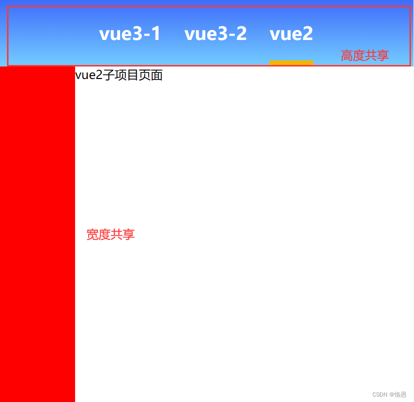
高度共享
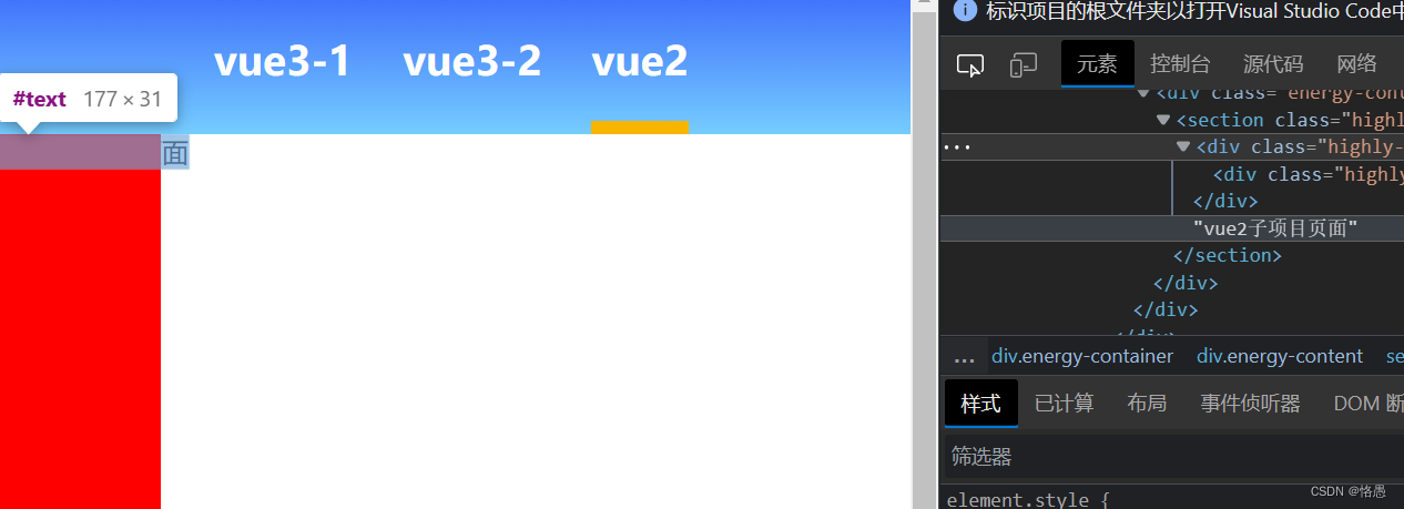
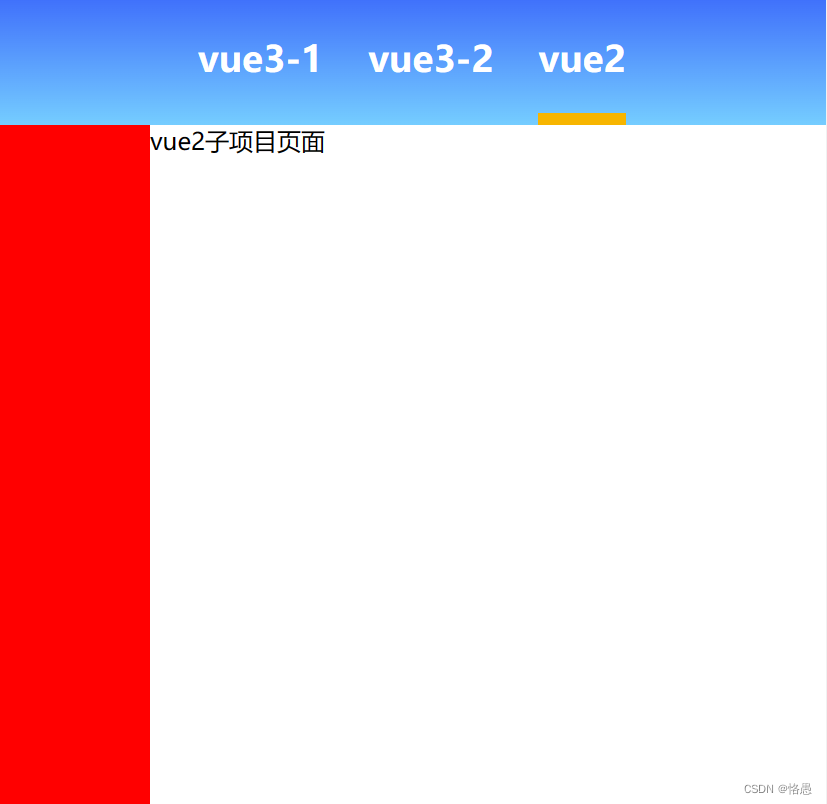
和上面宽度共享是一个道理。拿上面的项目截图来说顶部的内容其实就做了高度共享。而且上面封装的组件是可以通过参数传入决定是高度共享还是宽度共享的。
但是高度共享不止于此。
我前同事曾经告诉我一个场景虽然我至今都想不出设计是怎么想出这个方案的一个商品列表项每行有两列如果某行其中一个有 sku而另一个没有则没有的那个商品展示的高度要和有 sku 的商品展示的高度一致。
简单来说就是每行展示两个商品高度保持一致。
他是这么做的利用 js 遍历商品数组然后判断他们有没有sku再根据是第几个商品返回 true 或 false比如第一个商品有 sku那第一个商品和第二个商品都返回 true。
现在这个需求要求的比较简单几个商品即可这种写法还能支持若是后面迭代要展示几十个或者不限制呢毫无疑问这种写法是不可能上线的。
当时我就已经在进行有关“高度共享”的想法了我当即想到为什么不能在 HTML 结构中以“每一行”为一个整体它拥有一个 min-height然后在 js 中初始时遍历商品数组将一维数组转变成 2 为基数的二维数组呢这样对每一行的每一项都设置 height: 100% 即可轻松解决问题。
so easy~
细想这种思路还可以用在更多的业务场景中解决结构问题、提高代码效率。
我上次文章中提到的toy-micro-web微前端项目已开源至 giteetoy-microWeb项目 欢迎star
本框架是一次test采用“以主应用为主总控所有应用”的方式以“页面级”为维度是我对微前端的探索和第一版产出。
本框架除了尝试微前端还将作为作者提出的“新组件库”和“css架构”想法的试验模板。
| 阿里云国内75折 回扣 微信号:monov8 |
| 阿里云国际,腾讯云国际,低至75折。AWS 93折 免费开户实名账号 代冲值 优惠多多 微信号:monov8 飞机:@monov6 |