

【微信小程序】常用组件及基本使用详解
| 阿里云国内75折 回扣 微信号:monov8 |
| 阿里云国际,腾讯云国际,低至75折。AWS 93折 免费开户实名账号 代冲值 优惠多多 微信号:monov8 飞机:@monov6 |
🖐本节学习目标
✅学会使用常用的组件
文章目录
1.常用的容器类组件的使用
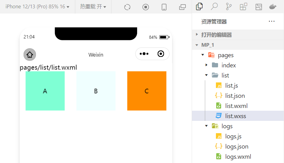
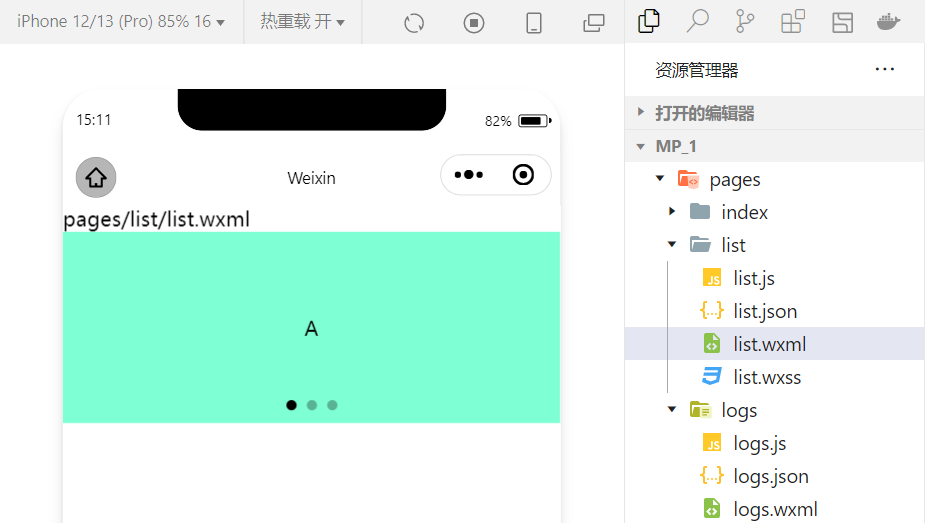
1.view组件的基本使用
🌏view类似于HTML中的div实现了普通的视图区域。
🍁例如使用flex实现横向布局。
wxml代码:
<view class="container1">
<view>A</view>
<view>B</view>
<view>C</view>
</view>
wxss代码
.container1 view{
  width:100px;
  height:100px;
  text-align: center;
  line-height: 100px;
}

.container1 view:nth-child(1){
  background-color: aquamarine;
}
.container1 view:nth-child(2){
  background-color: azure;
}
.container1 view:nth-child(3){
  background-color: darkorange;
}

.container1 {
  display: flex;
  justify-content: space-around;
}
实现效果
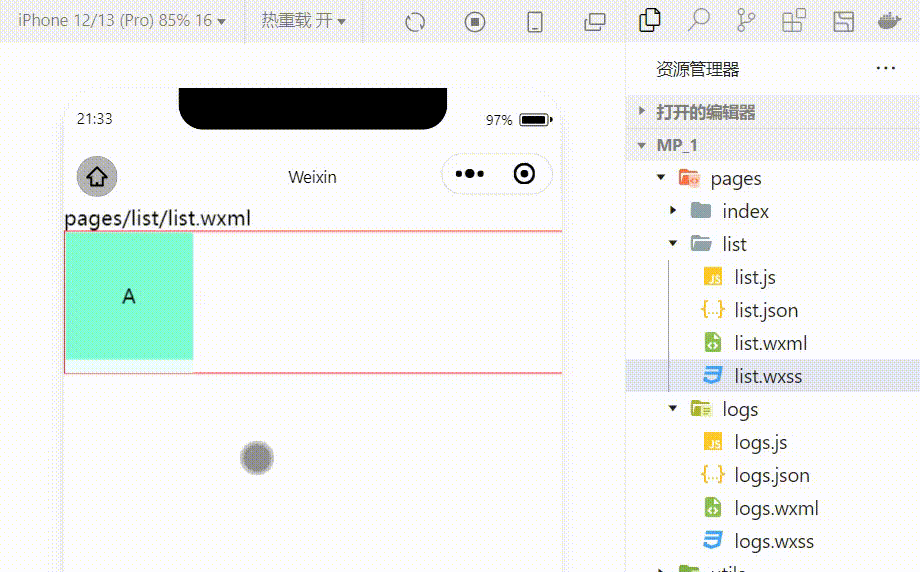
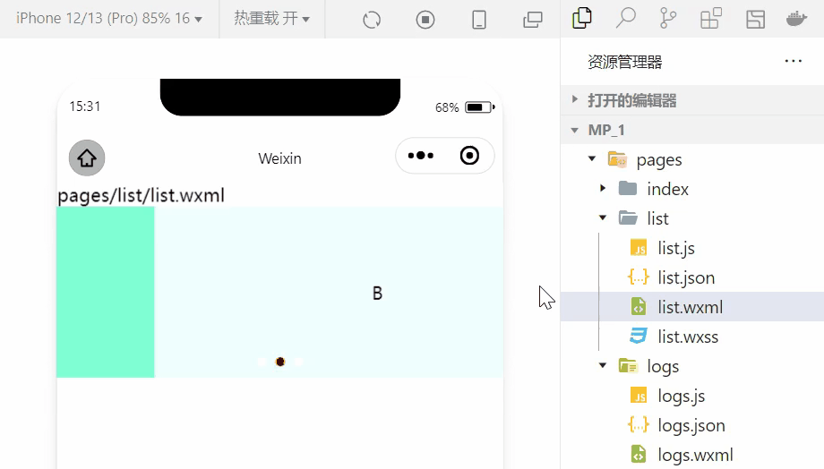
2.scroll-view组件的基本使用
🌏利用scroll-view可以实现滚动的效果这个效果可以是上下滚动也可以是左右滚动。
wxml代码:
<scroll-view class="container1" scroll-y>
<view>A</view>
<view>B</view>
<view>C</view>
</scroll-view>
修改的wxss代码
.container1 {
  border:1px solid red;
  height:110px;
  /*使用scroll-view时设置固定的高度*/
实现效果
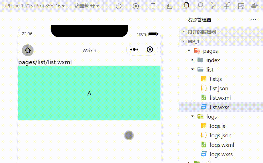
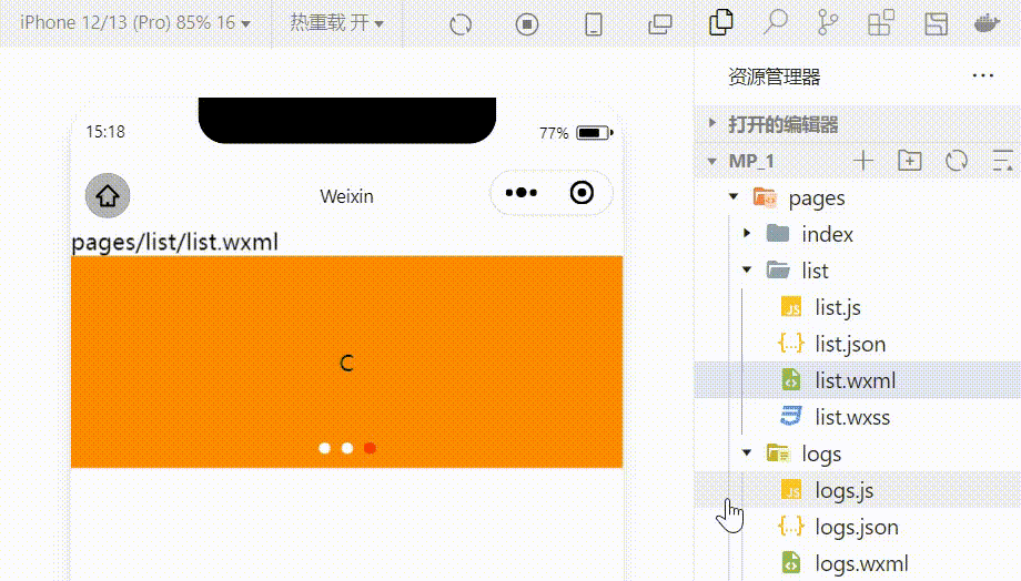
3.swiper和swiper-item组件的基本使用
🌏利用这两个组件可以实现轮播图效果
wxml代码:
<swiper class="swiper-container">
<swiper-item>
<view class="item">A</view>
</swiper-item>
<swiper-item>
  <view class="item">B</view>
</swiper-item>
<swiper-item>
  <view class="item">C</view>
</swiper-item>
</swiper>
wxss代码
.swiper-container{
  height:150px;
}
.item{
  height:100%;
  line-height: 150px;
  text-align: center;
}

swiper-item:nth-child(1) .item{
  background-color: aquamarine;
}
swiper-item:nth-child(2) .item{
  background-color: azure;
}
swiper-item:nth-child(3) .item{
  background-color: darkorange;
}
实现效果
swiper组件的常用属性
| 属性 | 类型 | 默认值 | 说明 |
|---|---|---|---|
| indicator-dots | boolean | false | 是否显示面板指示色 |
| indicator-color | color | rgba(0,0,0,3) | 指示点颜色 |
| indicator-active-color | color | #000000 | 当前选中的指示点的颜色 |
| autoplay | boolean | false | 是否自动切换 |
| interval | number | 5000 | 自动切换时间间隔 |
| circular | boolean | false | 是否采用衔接滑动 |
🍃例显示面板指示色
<swiper class="swiper-container" indicator-dots="true" >
🍃例指定指示点颜色和当前选中知识点颜色
<swiper class="swiper-container" indicator-dots="true" indicator-color="white" indicator-active-color="red">

🍃例设置自动切换间隔设置为1s
<swiper class="swiper-container" indicator-dots="true" indicator-color="white" indicator-active-color="red" autoplay="true" interval="1000">
采用衔接滑动
<swiper class="swiper-container" indicator-dots="true" indicator-color="white" indicator-active-color="red" autoplay="true" interval="1000" circular>
2.常用的基础内容组件的使用
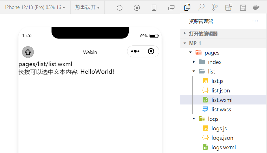
1.text组件的基本使用
🍁例通过 text 组件的user-select 属性可以实现长按选中文本内容的效果。(之前使用的selectable已经被废弃)
<view>
长按可以选中文本内容:
<text user-select>HelloWorld!</text>
</view>
2.rich-text 组件的基本使用
🍁例通过 rich-text 组件的 nodes 属性节点把 HTML 字符串渲染为对应的 UI 结构。
<rich-text nodes="<h1 style='color:red'>标题</h1>"> </rich-text>
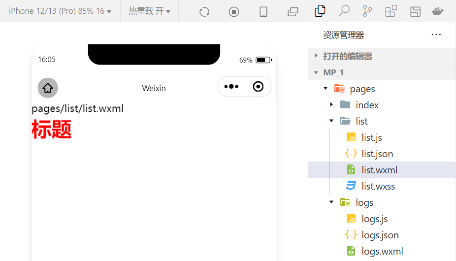
在想要把HTML文档渲染为相应的UI结构时使用该组件。
3.其他常用的组件
1.button组件的使用
🌏小程序中的按钮组件类似于HTML中的按钮组件同时可以调用微信提供的丰富的功能例如获取用户信息获取用户授权转发等。
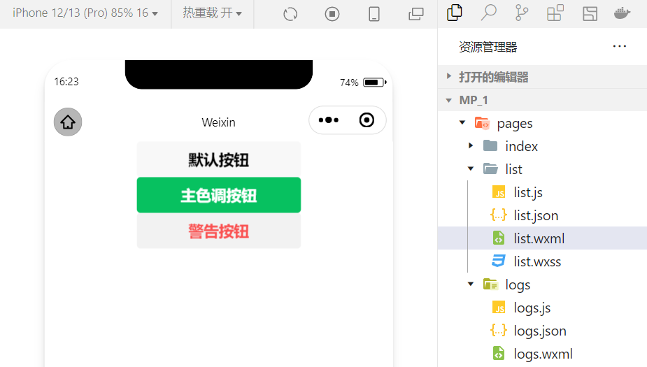
🍁例使用type属性设置按钮的类型
<button >默认按钮</button>
<button type="primary">主色调按钮</button>
<button type="warn">警告按钮</button>
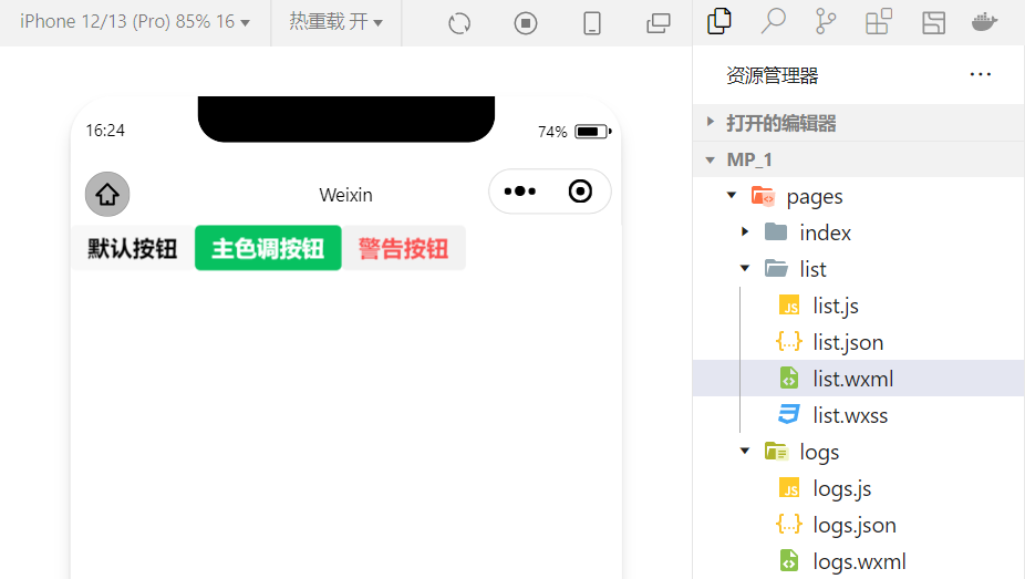
🍁例使用size属性设置按钮的大小
<button size="mini">默认按钮</button>
<button type="primary" size="mini">主色调按钮</button>
<button type="warn" size="mini">警告按钮</button>
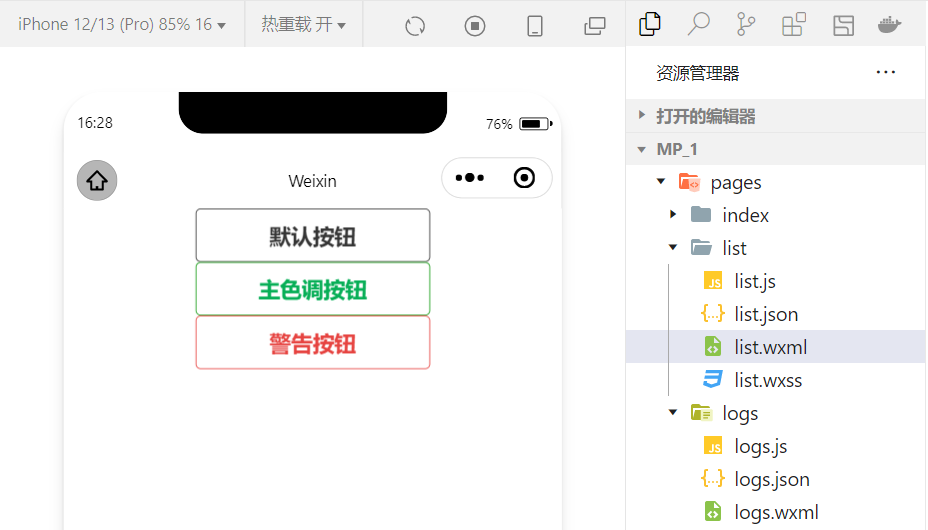
🍁例使用plain属性设置镂空按钮
<button plain>默认按钮</button>
<button type="primary" plain>主色调按钮</button>
<button type="warn" plain>警告按钮</button>
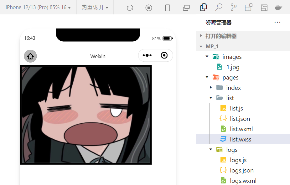
2.image组件的基本使用
wxml代码
<image src="/images/1.jpg"></image>
wxss代码
image{
  border: 5px solid black;
}
实现效果
🍃image 组件的 mode 属性用来指定图片的裁剪和缩放模式常用的 mode 属性值如下
| mode 值 | 说明 |
|---|---|
| scaleToFill | 默认值缩放模式不保持纵横比缩放图片使图片的宽高完全拉伸至填满 image 元素 |
| aspectFit | 缩放模式保持纵横比缩放图片使图片的长边能完全显示出来。也就是说可以完整地将图片显示出来。 |
| aspectFill | 缩放模式保持纵横比缩放图片只保证图片的短边能完全显示出来。也就是说图片通常只在水平或垂直方向是完整的另一个方向将会发生截取。 |
| widthFix | 缩放模式宽度不变高度自动变化保持原图宽高比不变 |
| heightFix | 缩放模式高度不变宽度自动变化保持原图宽高比不变 |
4.总结
本节对几个常用的组件做一个总结实际上小程序拥有十分丰富的组件库在学习的过程中就会慢慢接触并熟练同时组件的学习和使用也是小程序宿主环境的一个重要部分。小程序开发中我们也体会到了技术更新迭代的速度很快所以必须持续的学习新的技术