

Vue3之对Dialog的简单封装
| 阿里云国内75折 回扣 微信号:monov8 |
| 阿里云国际,腾讯云国际,低至75折。AWS 93折 免费开户实名账号 代冲值 优惠多多 微信号:monov8 飞机:@monov6 |
之前使用的UI框架,无论是Element UI/Plus 还是 Ant design其中Dialog组件中的结构和样式都难以修改无论是使用less、deep还是其他方法对其组件中css的修改都不生效不确定是否有其他解决方法所以我就自己简单封装了一个Dialog组件只是简单实现了遮蔽层以及Dialog外框内在具体实现例如Header、Main、Footer的css和其他内容全部交给程序员决定。
以下是Dialog组件代码
<template>
  <teleport to="body" v-if="visible">
    <div class="box">
      <div class="dialog">

        <slot name="header">
          <div class="header">
            <template v-if="title">
              {{title}}
            </template>

            <!-- 下面这行代码是关闭按钮的icon图标即形似 X 的图标以下代码来自于Element Plus Icon库若没有引入Element Plus Icon库建议相应进行修改 -->
            <el-icon class="closeIcon"
                     @click.stop="closeDialog"
                     color="grey">
             <Close />

            </el-icon>
          </div>
        </slot>

        <!--default slot-->
        <slot ></slot>

        <slot name="footer">

        </slot>
      </div>
    </div>
  </teleport>
</template>

<script>
export default {
  name: "Dialog",
  props:{
    visible:{
      type:Boolean,
      required:true
    },
    height:{
      type:String,
      required: false,
      default:'400px'
    },
    width:{
      type:String,
      required:false,
      default: '500px'
    },
    title:{
      type:String,
      required:false
    }
  },
  setup(pros,context){
    //关闭Dialog
    const closeDialog=()=>{
     context.emit('update:visible',false);
    };
    return{
      closeDialog
    }
  }
}
</script>

<style scoped>
.box{
  background-color:rgba(0,0,0,0.5);
  height: 100vh;
  width: 100%;
}
.dialog{
  position: absolute;
  left: 50%;
  top:50%;
  transform: translate(-50%,-50%);
  height: v-bind(height);
  width: v-bind(width);
  background-color: white;
}
.header{
  --height: 50px;
  height: var(--height);
  background-color: #ced6e0;
  line-height: var(--height);
  font-size:22px;
  letter-spacing: 10px;
  text-align: center;
  box-shadow: 0 2px 10px 0 rgb(0 0 0 / 10%);
}
.closeIcon{
  position: absolute;
  right: 6px;
  top: 6px;
  cursor: pointer;
}
</style>
以上代码使用了Vue3的
teleport标签用于之间将teleport标签中的html结构将指定body标签中。
使用了visible属性控制Dialog的存在与消亡剩余的title属性控制组件标题不写则不显示标题height和width分别控制组件高度和宽度不写则使用默认值这两个值都是String类型使用500px、50vh、50em等单位长度都能成功赋值
组件的使用方式:
<Dialog v-model:visible="visible" > </Dialog>
使用v-model:visible使父子组件双向绑定visible属性的值在Vue2中,则是v-model:asyn写法
在<Dialog v-model:visible="visible" > </Dialog>内编写html结构要点:
<template v-slot:header > Here is header </template>
代码中编写组件Header内容包括标题和关闭图标都需要自己编写如果不使用header插槽则使用默认的样式结构<template v-slot:default> Here is default </template>
代码中编写组件的主体内容可以省略这段代码直接写在外层<template v-slot:footer> Here is footer </template>
代码中编写组件的尾部内容主要是编写确定和取消按钮
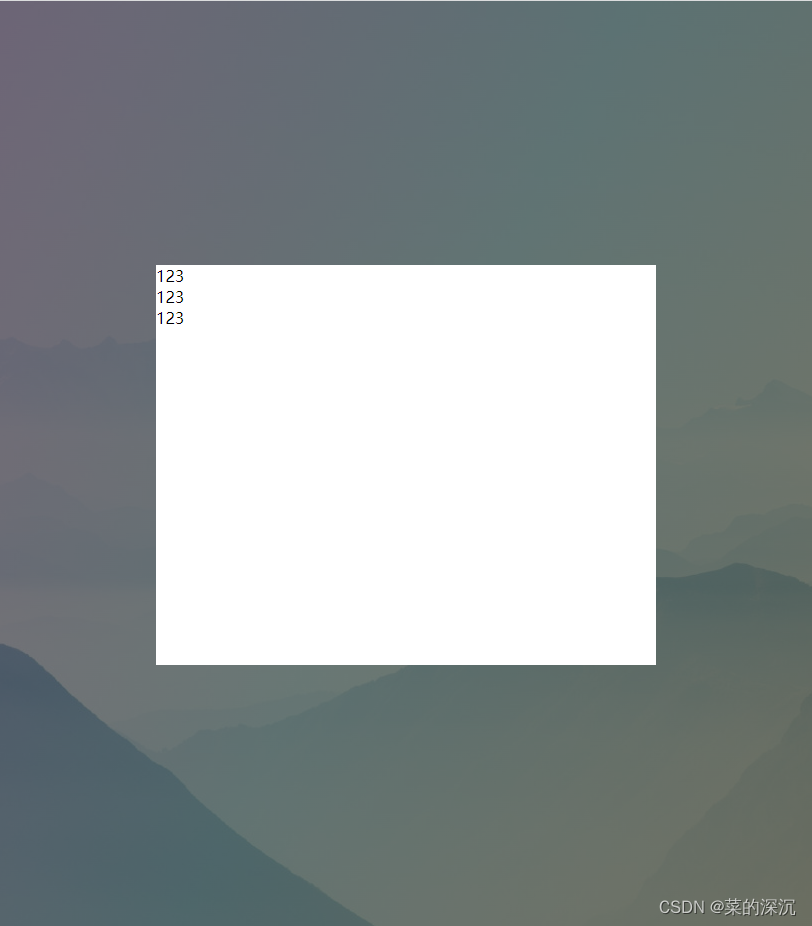
测试代码一
<template>
  <Dialog v-model:visible="visible" >
    <template v-slot:header>
      <div>
        123
      </div>
    </template>

    <template v-slot:default>
      <div>
        123
      </div>
    </template>

    <template v-slot:footer>
      <div>
        123
      </div>
    </template>

  </Dialog>
</template>

<script>
import Dialog from "@/components/Dialog";
import {ref} from "vue";

export default {
  name: "Test",
  components: {Dialog},
  setup(){
    const visible=ref(true);
    return{
      visible
    }
  }
}
</script>

<style scoped>

</style>
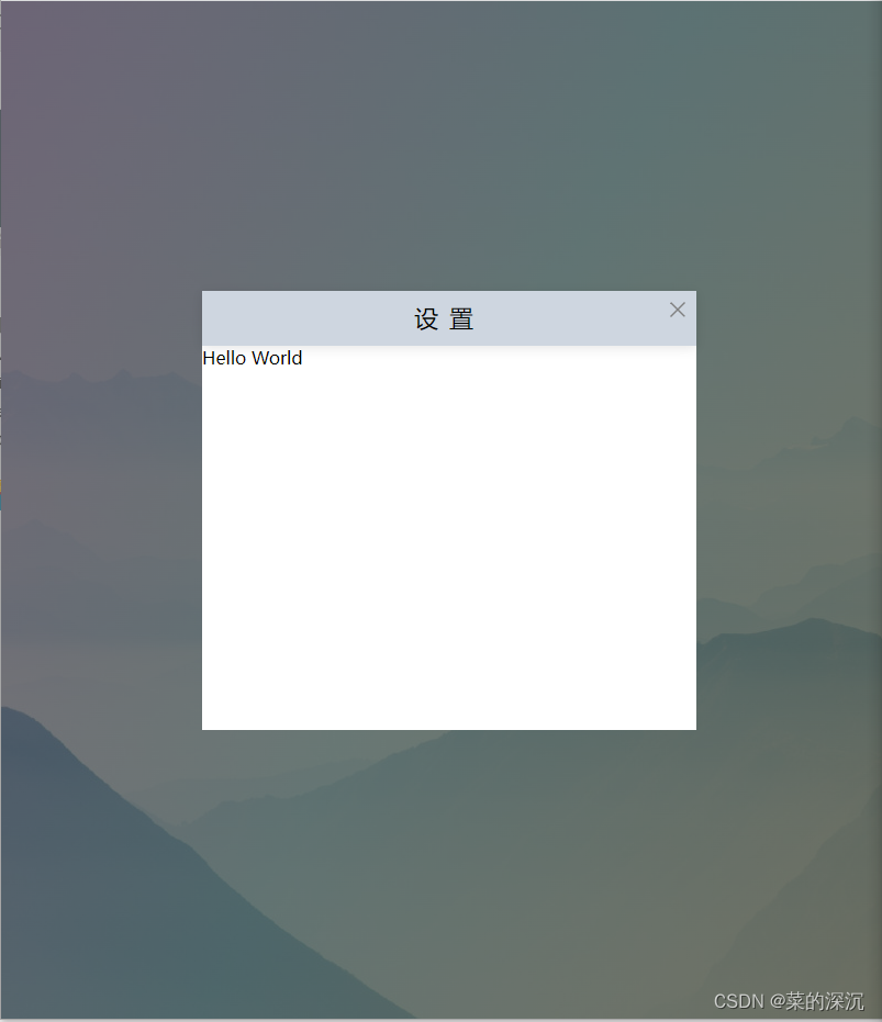
测试代码二
  <Dialog v-model:visible="visible" title="设置" height="400px" width="450px">
    Hello World
  </Dialog>
以上代码仅仅是简单的封装若是想向外暴露控制更多的样式请自行动态绑定class或者使用v-bind()动态赋予样式属性值。