

CSS 常见布局
| 阿里云国内75折 回扣 微信号:monov8 |
| 阿里云国际,腾讯云国际,低至75折。AWS 93折 免费开户实名账号 代冲值 优惠多多 微信号:monov8 飞机:@monov6 |
文章目录
CSS 常见布局
单列布局
单列布局不通栏
实现方式
- 通过对header、content、footer统一设置宽度。
- 再设置margin: 0 auto实现居中。

<!DOCTYPE html>
<html>
	<head>
		<meta charset="utf-8">
		<title>单列布局不通栏</title>
		<style type="text/css">
			* {
				margin: 0;
				padding: 0;
			}

			.header {
				margin: 0 auto;
				max-width: 960px;
				height: 100px;
				background-color: orangered;
			}

			.content {
				margin: 0 auto;
				max-width: 960px;
				height: 400px;
				background-color: seagreen;
			}

			.footer {
				margin: 0 auto;
				max-width: 960px;
				height: 100px;
				background-color: slateblue;
			}
		</style>
	</head>
	<body>
		<div class="header"></div>
		<div class="content"></div>
		<div class="footer"></div>
	</body>
</html>
单列布局通栏
实现方式
- header、footer宽度不设置块元素会充满屏幕。
- content设置width并通过margin: auto实现居中。

<!DOCTYPE html>
<html>
	<head>
		<meta charset="utf-8">
		<title>单列布局通栏</title>
		<style type="text/css">
			* {
				margin: 0;
				padding: 0;
			}

			.header {
				margin: 0 auto;
				height: 100px;
				background-color: orangered;
				overflow: hidden;
			}

			.nav {
				margin: 10px auto 0;
				max-width: 800px;
				background-color: darkgray;
				height: 50px;
			}

			.content {
				margin: 0 auto;
				max-width: 960px;
				height: 400px;
				background-color: seagreen;
			}

			.footer {
				margin: 0 auto;
				height: 100px;
				background-color: slateblue;
			}
		</style>
	</head>
	<body>
		<div class="header">
			<div class="nav"></div>
		</div>
		<div class="content"></div>
		<div class="footer"></div>
	</body>
</html>
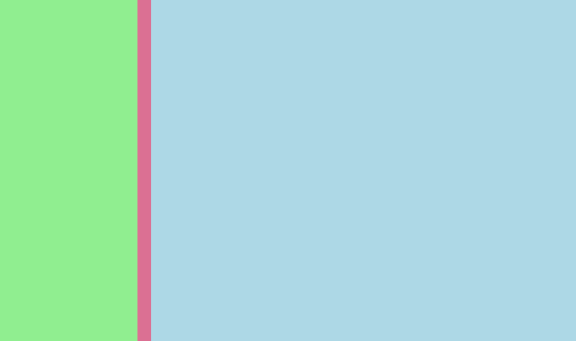
双列布局
双列布局一列固定宽度另一列填充用剩余空间。
float+overflow:hidden
实现方式
- 如果是普通的两列布局通过浮动+普通元素的margin可以实现。
- 如果是自适应的两列布局通过float+overflow:hidden可以实现这种办法主要通过overflow触发BFC而BFC不会重叠浮动元素。
<!DOCTYPE html>
<html>
	<head>
		<meta charset="utf-8">
		<title>双列布局float+overflow:hidden</title>
		<style type="text/css">
			* {
				margin: 0;
				padding: 0;
			}

			.container {
				height: 500px;
				background-color: palevioletred;
				overflow: hidden;
				zoom: 1;
			}

			.left {
				width: 200px;
				height: 100%;
				background-color: lightgreen;
				float: left;
				margin-right: 20px;
			}

			.right {
				height: 100%;
				background-color: lightblue;
				overflow: hidden;
				zoom: 1;
			}
		</style>
	</head>
	<body>
		<div class="container">
			<div class="left"></div>
			<div class="right"></div>
		</div>
	</body>
</html>
flex
实现方式通过flex弹性盒子布局实现。
<!DOCTYPE html>
<html>
	<head>
		<meta charset="utf-8">
		<title>双列布局flex</title>
		<style type="text/css">
			* {
				margin: 0;
				padding: 0;
			}

			.container {
				height: 500px;
				background-color: palevioletred;
				display: flex;
			}

			.left {
				width: 200px;
				height: 100%;
				background-color: lightgreen;
				margin-right: 20px;
			}

			.right {
				height: 100%;
				background-color: lightblue;
				flex: 1;
			}
		</style>
	</head>
	<body>
		<div class="container">
			<div class="left"></div>
			<div class="right"></div>
		</div>
	</body>
</html>
grid
实现方式通过grid布局实现。
<!DOCTYPE html>
<html>
	<head>
		<meta charset="utf-8">
		<title>双列布局grid</title>
		<style type="text/css">
			* {
				margin: 0;
				padding: 0;
			}

			.container {
				height: 500px;
				background-color: palevioletred;
				display: grid;
				grid-template-columns: auto 1fr;
				grid-gap: 20px;
			}

			.left {
				width: 200px;
				background-color: lightgreen;
			}

			.right {
				background-color: lightblue;
			}
		</style>
	</head>
	<body>
		<div class="container">
			<div class="left"></div>
			<div class="right"></div>
		</div>
	</body>
</html>
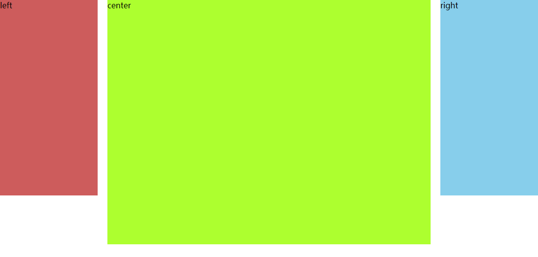
三列布局
三列布局圣杯布局
实现方式
- 通过float: left进行排列。
- 再通过margin-left和postion: relatvie进行位置调整。
<!DOCTYPE html>
<html>
	<head>
		<meta charset="utf-8">
		<title>三列布局圣杯布局</title>
		<style type="text/css">
			* {
				margin: 0;
				padding: 0;
			}

			.container {
				min-width: 600px;
				padding-left: 220px;
				padding-right: 220px;
			}

			.left {
				float: left;
				width: 200px;
				height: 400px;
				background-color: indianred;
				margin-left: -100%;
				position: relative;
				left: -220px;
			}

			.center {
				float: left;
				width: 100%;
				height: 500px;
				background-color: greenyellow;
			}

			.right {
				float: left;
				width: 200px;
				height: 400px;
				background-color: skyblue;
				margin-left: -200px;
				position: relative;
				right: -220px;
			}
		</style>
	</head>
	<body>
		<div class="container">
			<div class="center">center</div>
			<div class="left">left</div>
			<div class="right">right</div>
		</div>
	</body>
</html>
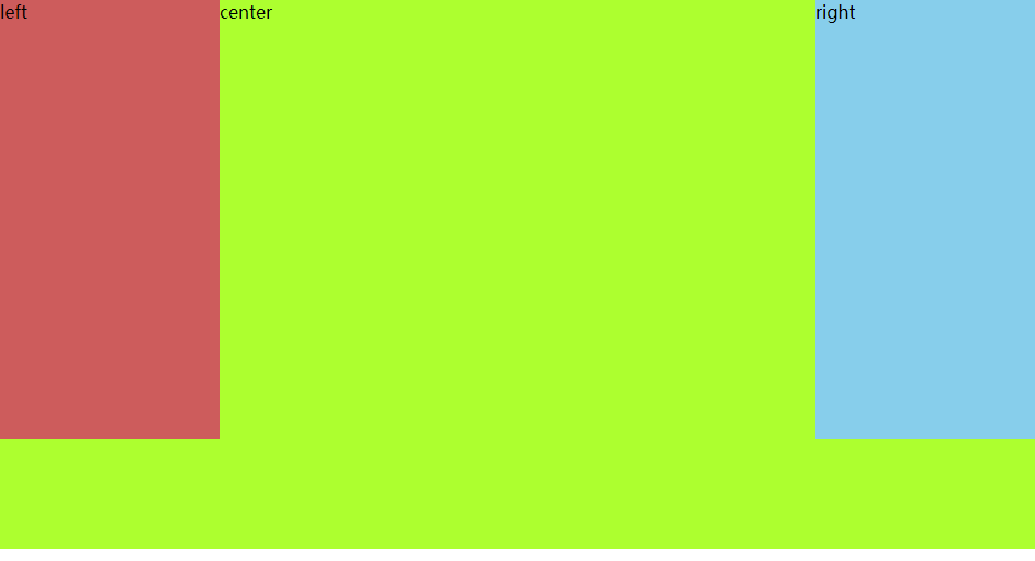
三列布局双飞翼布局
在圣杯布局的基础上进一步优化。
实现方式
- 通过float: left进行排列。
- 再通过margin: left调整位置。
<!DOCTYPE html>
<html>
	<head>
		<meta charset="utf-8">
		<title>三列布局双飞翼布局</title>
		<style type="text/css">
			* {
				margin: 0;
				padding: 0;
			}

			.container {
				min-width: 600px;
			}

			.left {
				float: left;
				width: 200px;
				height: 400px;
				background-color: indianred;
				margin-left: -100%;
			}

			.center {
				float: left;
				width: 100%;
				height: 500px;
				background-color: greenyellow;
			}

			.center .inner {
				margin: 0 200px;
			}

			.right {
				float: left;
				width: 200px;
				height: 400px;
				background-color: skyblue;
				margin-left: -200px;
			}
		</style>
	</head>
	<body>
		<div class="container">
			<div class="center">
				<div class="inner">center</div>
			</div>
			<div class="left">left</div>
			<div class="right">right</div>
		</div>
	</body>
</html>
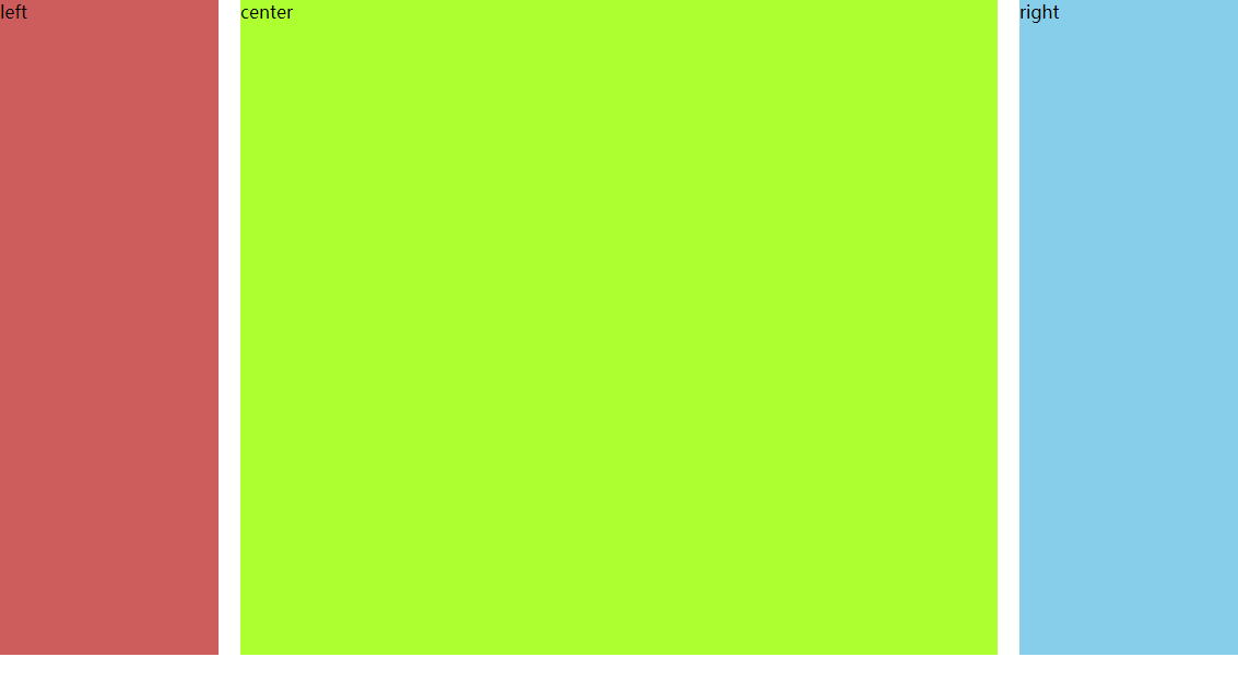
等高布局
等高布局正padding+负margin
实现方式
- 通过padding-bottom和margin-bottom实现等高。
- 再通过overflow: hidden把溢出剪切掉。
<!DOCTYPE html>
<html>
	<head>
		<meta charset="utf-8">
		<title>等高布局正padding+负margin</title>
		<style type="text/css">
			* {
				margin: 0;
				padding: 0;
			}

			.container {
				min-width: 600px;
				height: 600px;
				padding-left: 220px;
				padding-right: 220px;
				overflow: hidden;
			}

			.left {
				float: left;
				width: 200px;
				background-color: indianred;
				margin-left: -100%;
				position: relative;
				left: -220px;
			}

			.center {
				float: left;
				width: 100%;
				background-color: greenyellow;
			}

			.right {
				float: left;
				width: 200px;
				background-color: skyblue;
				margin-left: -200px;
				position: relative;
				right: -220px;
			}

			.center,
			.left,
			.right {
				padding-bottom: 10000px;
				margin-bottom: -10000px;
			}
		</style>
	</head>
	<body>
		<div class="container">
			<div class="center">center</div>
			<div class="left">left</div>
			<div class="right">right</div>
		</div>
	</body>
</html>
仿表格布局
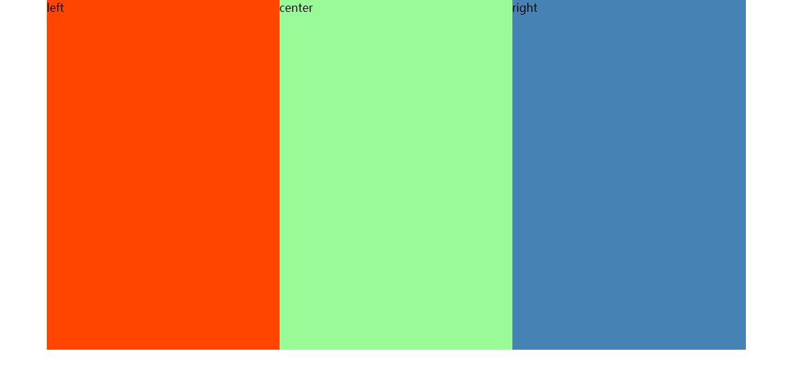
<!DOCTYPE html>
<html>
	<head>
		<meta charset="utf-8">
		<title>仿表格布局</title>
		<style type="text/css">
			* {
				margin: 0;
				padding: 0;
			}

			.table {
				width: auto;
				min-width: 1000px;
				margin: 0 auto;
				display: table;
			}

			.tableRow {
				display: table-row;
			}

			.tableCell {
				display: table-cell;
				width: 33%;
				height: 500px;
			}

			.cell1 {
				background-color: orangered;
			}

			.cell2 {
				background-color: palegreen;
			}

			.cell3 {
				background-color: steelblue;
			}
		</style>
	</head>
	<body>
		<div class="table">
			<div class="tableRow">
				<div class="tableCell cell1">left</div>
				<div class="tableCell cell2">center</div>
				<div class="tableCell cell3">right</div>
			</div>
		</div>
	</body>
</html>
粘连布局
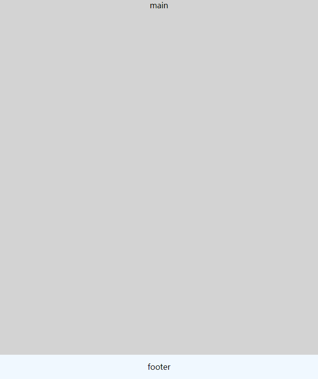
<!DOCTYPE html>
<html>
	<head>
		<meta charset="utf-8">
		<title>粘连布局</title>
		<style type="text/css">
			* {
				margin: 0;
				padding: 0;
			}

			html,
			body {
				height: 100%;
			}

			.content {
				min-height: 100%;
				background-color: lightgrey;
				text-align: center;
				overflow: hidden;
			}

			.content .main {
				padding-bottom: 50px;
			}

			.footer {
				height: 50px;
				line-height: 50px;
				background-color: aliceblue;
				text-align: center;
				margin-top: -50px;
			}
		</style>
	</head>
	<body>
		<div class="content">
			<div class="main">main</div>
		</div>
		<div class="footer">footer</div>
	</body>
</html>